
[Python]健診データから時間と地域を同時に予測するモデルを作成してみた:Kerasによる深層学習モデルの作成

はじめに
こんにちは、機械学習勉強中のあおじるです。
以前の記事で、160次元の医療費データを使って、時間(年度)と地域(都道府県)を予測するモデルを、深層学習ライブラリKerasによる深層学習(ディープラーニング)で作ってみました。
今回は、240次元の健診データで同様のことを試してみます。
言語はPython、環境はGoogle Colaboratoryを使用しました。
予測モデルの作成
データ
以前の記事で作成したデータを用います。
# データ
import pandas as pd
df = pd.read_csv('./df_yt_K15_sn.csv')
print(df.shape)
# (470, 242)
print(df.columns)
# Index(['y', 't', 'WC_1_1', 'WC_1_2', 'WC_1_3', 'WC_1_4', 'WC_1_5', 'WC_1_6',
#        'WC_1_7', 'WC_1_8',
#        ...
#        'eGFR_1_7', 'eGFR_1_8', 'eGFR_2_1', 'eGFR_2_2', 'eGFR_2_3', 'eGFR_2_4',
#        'eGFR_2_5', 'eGFR_2_6', 'eGFR_2_7', 'eGFR_2_8'],
#       dtype='object', length=242)
予測に用いるデータは、470行×240次元のデータです。
$$
\def\arraystretch{1.5}
\begin{array}{c:c|c:c:c:c}
\textsf{y} & \textsf{t} & \textsf{WC\_1\_1} & \textsf{WC\_1\_2} & \cdots & \textsf{eGFR\_2\_8} \\ \hline
2010 & 1 & {} & {} & {} & {} \\
2010 & 2 & {} & {} & {} & {} \\
\vdots & \vdots & \vdots & \vdots & \ddots & \vdots \\
2019 & 47 & {} & {} & {} & {}
\end{array}
$$
# 予測に用いるデータ
X = df.iloc[:,2:]
print(X.shape)
# (470, 240)

# スケーリング
from sklearn import preprocessing
scaler = preprocessing.MinMaxScaler()
X = scaler.fit_transform(X)
print(X.shape)
# (470, 240)医療費データの場合と同様に、年度(y)と都道府県(t)を予測します。
# 予測する答え
y1 = df['y']
y2 = df['t']
print(min(y1), max(y1), min(y2), max(y2))   # 2010 2019 1 47
y1 = y1 - min(y1)
y2 = y2 - min(y2)
from keras.utils.np_utils import to_categorical
y1 = to_categorical(y1)
y2 = to_categorical(y2)
print(y1.shape, y2.shape)   # (470, 10) (470, 47)
y = pd.concat([pd.DataFrame(y1), pd.DataFrame(y2)], axis=1)
print(y.shape)
# (470, 57)   # 57=10+47

y1_lab = list()
for i in range(10):
  y1_lab.append('y{}'.format(i+2010))
print(y1_lab)
# ['y2010', 'y2011', 'y2012', 'y2013', 'y2014',
#  'y2015', 'y2016', 'y2017', 'y2018', 'y2019']
y2_lab = list()
for i in range(47):
  y2_lab.append('t{}'.format(i+1))
print(y2_lab)
# ['t1', 't2', 't3', 't4', 't5', 't6', 't7', 't8', 't9', 't10',
#  't11', 't12', 't13', 't14', 't15', 't16', 't17', 't18', 't19', 't20',
#  't21', 't22', 't23', 't24', 't25', 't26', 't27', 't28', 't29', 't30',
#  't31', 't32', 't33', 't34', 't35', 't36', 't37', 't38', 't39', 't40',
#  't41', 't42', 't43', 't44', 't45', 't46', 't47']
y = pd.concat([pd.DataFrame(y1, columns=y1_lab), pd.DataFrame(y2, columns=y2_lab)],
              axis=1)
print(y.shape)
# (470, 57) # 57=10+47
print(X.shape, y.shape)
# (470, 240) (470, 57)
import numpy as np
num_classes1 = max(np.argmax(y1, 1))+1 # 10
num_classes2 = max(np.argmax(y2, 1))+1 # 47
print(num_classes1, num_classes2)
# 10 47データの分割
データを訓練用とテスト用に 8:2 に分割します。念のため、都道府県に偏りが生じないよう、都道府県で層化して分割しました。
# データの分割
from sklearn.model_selection import train_test_split
X_train, X_test, y_train, y_test = train_test_split(X, y,
                                                    train_size=0.8,
                                                    random_state=0,
                                                    stratify=y2)
print(X_train.shape, X_test.shape, y_train.shape, y_test.shape)
# (376, 240) (94, 240) (376, 57) (94, 57)

y1_train = y_train.iloc[:,:num_classes1]
y2_train = y_train.iloc[:,num_classes1:]
y1_test = y_test.iloc[:,:num_classes1]
y2_test = y_test.iloc[:,num_classes1:]
print(y1_train.shape, y2_train.shape, y1_test.shape, y2_test.shape)
# (376, 10) (376, 47) (94, 10) (94, 47)
モデルの作成
医療費データの場合と同様に、Kerasで深層学習モデルを作成します。
入力は240次元、出力は年度(10クラス)と都道府県(47クラス)をsoftmax関数で分類するものとし、中間層はノードが128、64、32のDense(全結合ニューラルネットワーク)で、途中に2割のDropoutもはさみました。また、Modelを使いました。
# モデルの定義
from keras.models import Model
from keras.layers import Input, Dense, Dropout
input_data = Input(shape=(240,), name='Input')
layer1 = Dense(128, activation='relu', name='Layer1')(input_data)
dropout1 = Dropout(0.2, name='Dropout1')(layer1)
layer2 = Dense(64, activation='relu', name='Layer2')(dropout1)
dropout2 = Dropout(0.2, name='Dropout2')(layer2)
layer3 = Dense(32, activation='relu', name='Layer3')(dropout2)
output1 = Dense(num_classes1, activation='softmax', name='Output1')(layer3)
output2 = Dense(num_classes2, activation='softmax', name='Output2')(layer3)
model1 = Model(inputs=input_data, outputs=[output1, output2])
model1.compile(optimizer='adam',
               loss='categorical_crossentropy',
               metrics=['accuracy'])
model1.summary()
作成されたモデルは次の形です。
Model: "model"
__________________________________________________________________________________________________
 Layer (type)                   Output Shape         Param #     Connected to
==================================================================================================
 Input (InputLayer)             [(None, 240)]        0           []

 Layer1 (Dense)                 (None, 128)          30848       ['Input[0][0]']

 Dropout1 (Dropout)             (None, 128)          0           ['Layer1[0][0]']

 Layer2 (Dense)                 (None, 64)           8256        ['Dropout1[0][0]']

 Dropout2 (Dropout)             (None, 64)           0           ['Layer2[0][0]']

 Layer3 (Dense)                 (None, 32)           2080        ['Dropout2[0][0]']

 Output1 (Dense)                (None, 10)           330         ['Layer3[0][0]']

 Output2 (Dense)                (None, 47)           1551        ['Layer3[0][0]']

==================================================================================================
Total params: 43,065
Trainable params: 43,065
Non-trainable params: 0
__________________________________________________________________________________________________
学習の実行
このモデルで学習を実行します。
バッチサイズは、元のデータが年度(10分類)×都道府県(47分類)順に並んでいるため、都道府県ごとのデータがすべて入る大きさの50としておきました。エポック数はとりあえず1000としました。
# 学習の実行
batch_size = 50
epochs = 1000
history = model1.fit(X_train, [y1_train, y2_train],
                     batch_size=batch_size,
                     epochs=epochs,
                     verbose=1,
                     validation_data=(X_test, [y1_test, y2_test]))
学習曲線をプロットします。
# 学習曲線のプロット
%matplotlib inline
import matplotlib.pyplot as plt
# plt.figure(figsize = (15,4))
fig_history = plt.figure(figsize = (15,4))
# Accuracy
plt.subplot(1, 3, 1)
plt.plot(history.history['Output1_accuracy'], ".-", label="train_acc")
plt.plot(history.history['val_Output1_accuracy'], ".-", label="test_acc")
plt.title("Accuracy (Years)")
plt.xlabel('epoch')
plt.ylabel('accuracy')
plt.legend(['train', 'test'], loc='lower right')   # loc='best'
plt.xlim(-1, epochs)
plt.xticks(np.arange(0, epochs, step=200))
# Accuracy
plt.subplot(1, 3, 2)
plt.plot(history.history['Output2_accuracy'], ".-", label="train_acc")
plt.plot(history.history['val_Output2_accuracy'], ".-", label="test_acc")
plt.title("Accuracy (Prefectures)")
plt.xlabel('epoch')
plt.ylabel('accuracy')
plt.legend(['train', 'test'], loc='lower right')
plt.xlim(-1, epochs)
plt.xticks(np.arange(0, epochs, step=200))
# Loss
plt.subplot(1, 3, 3)
plt.plot(history.history['loss'], ".-", label="train_loss")
plt.plot(history.history['val_loss'], ".-", label="test_loss")
plt.title("Loss")
plt.xlabel('epoch')
plt.ylabel('loss')
plt.legend(['train', 'test'], loc='upper right')
plt.xlim(-1, epochs)
plt.xticks(np.arange(0, epochs, step=200))
plt.show()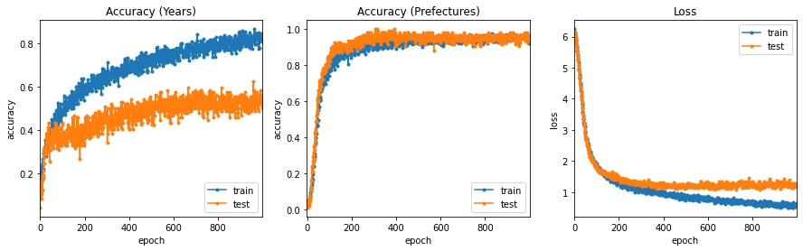
学習曲線が頭打ちになっていますので、エポック数は1000で十分だったようです。
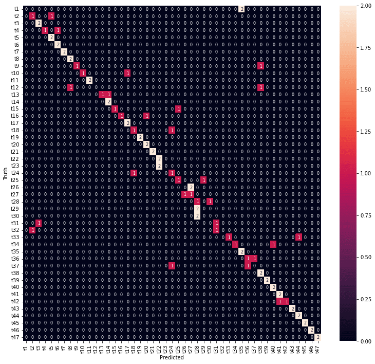
都道府県の分類の方が精度がよくなりました。
結果の表示
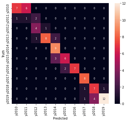
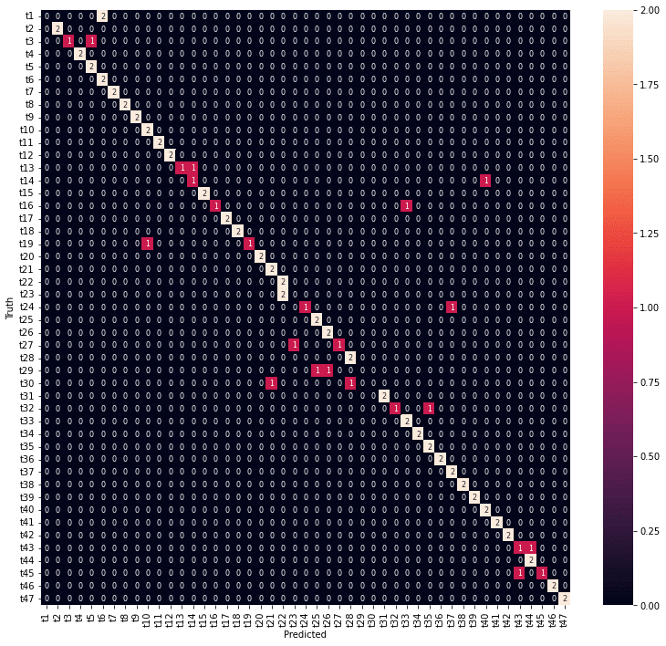
医療費データの場合と同様に、学習の結果の混同行列をヒートマップで表示します。
テストデータで予測した結果です。
# 混同行列の計算, heatmap表示
from sklearn.metrics import confusion_matrix
import seaborn as sn

# y1_test
y1_true = np.argmax(y1_test.values,1)
# print(y1_true)
model_y1 = Model(inputs=input_data, outputs=output1)
model_y1.predict(X_test)
y1_pred = np.argmax(model_y1.predict(X_test), 1)
# print(y1_pred)
confusion_y1 = confusion_matrix(y1_true, y1_pred) # 混同行列
print(confusion_y1)
df_confusion_y1 = pd.DataFrame(confusion_y1, y1_lab, y1_lab)
fig_y1_test = plt.figure(figsize = (7,6))
sn.heatmap(df_confusion_y1, annot=True, annot_kws={"size": 8}, fmt="1.0f")
plt.ylabel('Truth')
plt.xlabel('Predicted')

# y2_test
y2_true = np.argmax(y2_test.values,1)
# print(y2_true)
model_y2 = Model(inputs=input_data, outputs=output2)
y2_pred = np.argmax(model_y2.predict(X_test), 1)
# print(y2_pred)
confusion_y2 = confusion_matrix(y2_true, y2_pred) # 混同行列
print(confusion_y2)
df_confusion_y2 = pd.DataFrame(confusion_y2, y2_lab, y2_lab)
fig_y2_test = plt.figure(figsize = (13,12))
sn.heatmap(df_confusion_y2, annot=True, annot_kws={"size": 8}, fmt="1.0f")
plt.ylabel('Truth')
plt.xlabel('Predicted')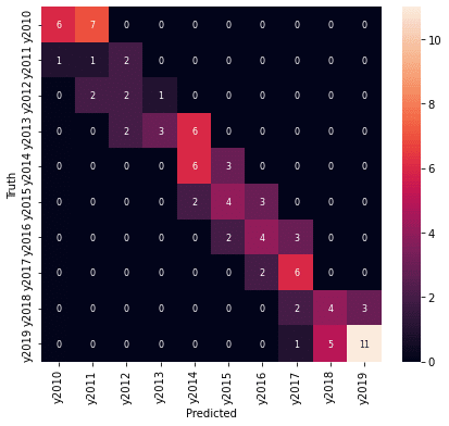

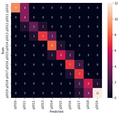
年度の予測結果は、精度としては高くありませんが、混同行列を見ると、予測が外れているところも1年度のずれだけでした。
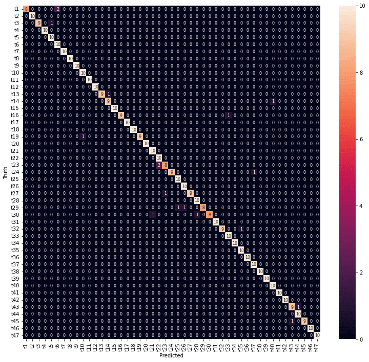
ちなみに、全データで年度と都道府県を予測した結果です。
# y1
y1_true = np.argmax(y1[0:len(y1)],1)
# print(y1_true)
model_y1 = Model(inputs=input_data, outputs=output1)
y1_pred = np.argmax(model_y1.predict(X), 1)
# print(y1_pred)
confusion_y1 = confusion_matrix(y1_true, y1_pred) # 混同行列
print(confusion_y1)
df_confusion_y1 = pd.DataFrame(confusion_y1, y1_lab, y1_lab)
fig_y1_all = plt.figure(figsize = (7,6))
sn.heatmap(df_confusion_y1, annot=True, annot_kws={"size": 8}, fmt="1.0f")
plt.ylabel('Truth')
plt.xlabel('Predicted')

# y2
y2_true = np.argmax(y2[0:len(y2)],1)
# print(y2_true)
model_y2 = Model(inputs=input_data, outputs=output2)
y2_pred = np.argmax(model_y2.predict(X), 1)
# print(y2_pred)
confusion_y2 = confusion_matrix(y2_true, y2_pred) # 混同行列
print(confusion_y2)
df_confusion_y2 = pd.DataFrame(confusion_y2, y2_lab, y2_lab)
fig_y2_all = plt.figure(figsize = (13,12))
sn.heatmap(df_confusion_y2, annot=True, annot_kws={"size": 8}, fmt="1.0f")
plt.ylabel('Truth')
plt.xlabel('Predicted')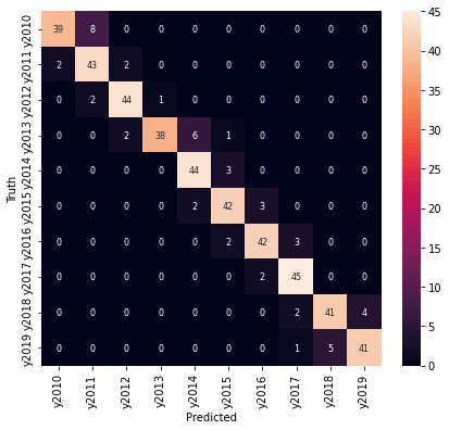

損失のウエイトの調整
医療費データの場合と同様に、損失にウエイトを設定して、予測精度を上げてみます(損失寄与度の重み付け:compileメソッドのloss_weights引数)。とりえあず、クラス数の逆として、年度:都道府県= 47:10 に設定してみました。
# モデルの定義
from keras.models import Model
from keras.layers import Input, Dense, Dropout
input_data = Input(shape=(240,), name='Input')
layer1 = Dense(128, activation='relu', name='Layer1')(input_data)
dropout1 = Dropout(0.2, name='Dropout1')(layer1)
layer2 = Dense(64, activation='relu', name='Layer2')(dropout1)
dropout2 = Dropout(0.2, name='Dropout2')(layer2)
layer3 = Dense(32, activation='relu', name='Layer3')(dropout2)
output1 = Dense(num_classes1, activation='softmax', name='Output1')(layer3)
output2 = Dense(num_classes2, activation='softmax', name='Output2')(layer3)
model2 = Model(inputs=input_data, outputs=[output1, output2])
model2.compile(optimizer='adam',
               loss='categorical_crossentropy',
               loss_weights=[47.0, 10.0],
               metrics=['accuracy'])
model2.summary()
このモデルで学習を実行します。
# 学習の実行
batch_size = 50
epochs = 1000
history = model2.fit(X_train, [y1_train, y2_train],
                     batch_size=batch_size,
                     epochs=epochs,
                     verbose=1,
                     validation_data=(X_test, [y1_test, y2_test]))

# 学習曲線のプロット
# plt.figure(figsize = (15,4))
fig_history = plt.figure(figsize = (15,4))
# Accuracy
plt.subplot(1, 3, 1)
plt.plot(history.history['Output1_accuracy'], ".-", label="train_acc")
plt.plot(history.history['val_Output1_accuracy'], ".-", label="test_acc")
plt.title("Accuracy (Years)")
plt.xlabel('epoch')
plt.ylabel('accuracy')
plt.legend(['train', 'test'], loc='lower right')   # loc='best'
plt.xlim(-1, epochs)
plt.xticks(np.arange(0, epochs, step=200))
# Accuracy
plt.subplot(1, 3, 2)
plt.plot(history.history['Output2_accuracy'], ".-", label="train_acc")
plt.plot(history.history['val_Output2_accuracy'], ".-", label="test_acc")
plt.title("Accuracy (Prefectures)")
plt.xlabel('epoch')
plt.ylabel('accuracy')
plt.legend(['train', 'test'], loc='lower right')
plt.xlim(-1, epochs)
plt.xticks(np.arange(0, epochs, step=200))
# Loss
plt.subplot(1, 3, 3)
plt.plot(history.history['loss'], ".-", label="train_loss")
plt.plot(history.history['val_loss'], ".-", label="test_loss")
plt.title("Loss")
plt.xlabel('epoch')
plt.ylabel('loss')
plt.legend(['train', 'test'], loc='upper right')
plt.xlim(-1, epochs)
plt.xticks(np.arange(0, epochs, step=200))
plt.show()

# 混同行列の計算, heatmap表示
from sklearn.metrics import confusion_matrix
import seaborn as sn

# y1_test
y1_true = np.argmax(y1_test.values,1)
# print(y1_true)
model_y1 = Model(inputs=input_data, outputs=output1)
model_y1.predict(X_test)
y1_pred = np.argmax(model_y1.predict(X_test), 1)
# print(y1_pred)
confusion_y1 = confusion_matrix(y1_true, y1_pred) # 混同行列
print(confusion_y1)
df_confusion_y1 = pd.DataFrame(confusion_y1, y1_lab, y1_lab)
fig_y1_test = plt.figure(figsize = (7,6))
sn.heatmap(df_confusion_y1, annot=True, annot_kws={"size": 8}, fmt="1.0f")
plt.ylabel('Truth')
plt.xlabel('Predicted')

# y2_test
y2_true = np.argmax(y2_test.values,1)
# print(y2_true)
model_y2 = Model(inputs=input_data, outputs=output2)
y2_pred = np.argmax(model_y2.predict(X_test), 1)
# print(y2_pred)
confusion_y2 = confusion_matrix(y2_true, y2_pred) # 混同行列
print(confusion_y2)
df_confusion_y2 = pd.DataFrame(confusion_y2, y2_lab, y2_lab)
fig_y2_test = plt.figure(figsize = (13,12))
sn.heatmap(df_confusion_y2, annot=True, annot_kws={"size": 8}, fmt="1.0f")
plt.ylabel('Truth')
plt.xlabel('Predicted')

# y1
y1_true = np.argmax(y1[0:len(y1)],1)
# print(y1_true)
model_y1 = Model(inputs=input_data, outputs=output1)
y1_pred = np.argmax(model_y1.predict(X), 1)
# print(y1_pred)
confusion_y1 = confusion_matrix(y1_true, y1_pred) # 混同行列
print(confusion_y1)
df_confusion_y1 = pd.DataFrame(confusion_y1, y1_lab, y1_lab)
fig_y1_all = plt.figure(figsize = (7,6))
sn.heatmap(df_confusion_y1, annot=True, annot_kws={"size": 8}, fmt="1.0f")
plt.ylabel('Truth')
plt.xlabel('Predicted')

# y2
y2_true = np.argmax(y2[0:len(y2)],1)
# print(y2_true)
model_y2 = Model(inputs=input_data, outputs=output2)
y2_pred = np.argmax(model_y2.predict(X), 1)
# print(y2_pred)
confusion_y2 = confusion_matrix(y2_true, y2_pred) # 混同行列
print(confusion_y2)
df_confusion_y2 = pd.DataFrame(confusion_y2, y2_lab, y2_lab)
fig_y2_all = plt.figure(figsize = (13,12))
sn.heatmap(df_confusion_y2, annot=True, annot_kws={"size": 8}, fmt="1.0f")
plt.ylabel('Truth')
plt.xlabel('Predicted')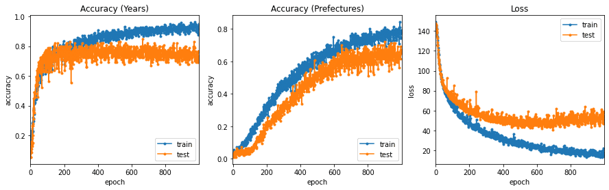
年度のウエイトを上げると都道府県の精度が下がってしまいました。
年度のウエイトを少し下げることにして、 4:1 のウエイトで学習し直しました。
# モデルの定義
from keras.models import Model
from keras.layers import Input, Dense, Dropout
input_data = Input(shape=(240,), name='Input')
layer1 = Dense(128, activation='relu', name='Layer1')(input_data)
dropout1 = Dropout(0.2, name='Dropout1')(layer1)
layer2 = Dense(64, activation='relu', name='Layer2')(dropout1)
dropout2 = Dropout(0.2, name='Dropout2')(layer2)
layer3 = Dense(32, activation='relu', name='Layer3')(dropout2)
output1 = Dense(num_classes1, activation='softmax', name='Output1')(layer3)
output2 = Dense(num_classes2, activation='softmax', name='Output2')(layer3)
model3 = Model(inputs=input_data, outputs=[output1, output2])
model3.compile(optimizer='adam',
               loss='categorical_crossentropy',
               loss_weights=[4.0, 1.0],
               metrics=['accuracy'])
model3.summary()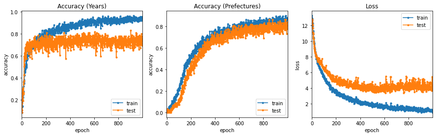

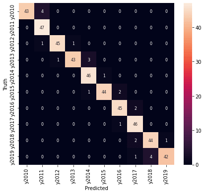
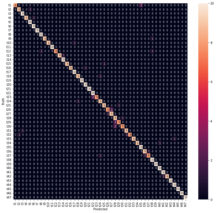
年度、都道府県とも7割以上の予測精度が得られました。年度の予測は外しているところも1年度の違いになっています。
おわりに
今回は、10年度×47都道府県別の240次元の健診データから、年度と都道府県を同時に予測するモデルを作成してみました。
年度、都道府県ともに7割以上の予測精度が達成できました。
次元削減の結果では医療費データの場合ほど年度の違いがはっきりしていませんでしたので、年度の予測は難しいと思われましたが、1年度以内のずれに収まりました。
最後まで読んでいただき、ありがとうございました。
お気づきの点等ありましたら、コメントいただけますと幸いです。
#地域差 , #地域間格差 , #都道府県 , #健診 , #健康診断 , #健診項目 , #健診結果 , #健診データ , #生活習慣病予防健診 , #腹囲 , #BMI , #血圧 , #コレステロール , #中性脂肪 , #血糖 , #尿酸 , #肝機能 , #腎機能 , #クレアチニン , #eGFR , #予測モデル , #深層学習 , #ディープラーニング , #機械学習 , #Keras ,
#Python , #協会けんぽ , #noteで数式
この記事が気に入ったらサポートをしてみませんか?