
[Python]医療費データを160次元から2次元に圧縮してみた:PCA, MDS, t-SNE, UMAPによる次元削減

はじめに
こんにちは、機械学習勉強中のあおじるです。
前回の記事では、医療費データ(160次元)を主成分分析(PCA)してみました。今回は、他の次元削減(次元圧縮)の手法を使って、160次元を2次元に圧縮してみました。
言語はPython、環境はGoogle Colaboratoryを使用しました。
使用するデータ
データは、前回の記事で作成した、全国健康保険協会(協会けんぽ)の加入者基本情報、医療費基本情報から作成した、10年間×47都道府県ごとの医療費の160次元のデータ(性別、年齢階級別の診療種別ごとの「医療費の3要素」)df_yt_C10_sn を使います。
(10年×47都道府県)×(10指標×性別2区分×年齢階級8区分)
= 470行 × 160次元
の形のデータです。
$$
\def\arraystretch{1.5}
\begin{array}{c:c|c:c:c:c}
\textsf{y} & \textsf{t} & \textsf{KperP\_1\_1\_1} & \textsf{KperP\_1\_1\_2} & \cdots & \textsf{TperN\_4\_2\_8} \\ \hline
2010 & 1 & {} & {} & {} & {} \\
2010 & 2 & {} & {} & {} & {} \\
\vdots & \vdots & \vdots & \vdots & \ddots & \vdots \\
2010 & 47 & {} & {} & {} & {} \\
2011 & 1 & {} & {} & {} & {} \\
\vdots & \vdots & \vdots & \vdots & \ddots & \vdots \\
2019 & 47 & {} & {} & {} & {}
\end{array}
$$
y:年度
2010~2019 の10年度分t:都道府県
1:北海道、・・・、47:沖縄 の47都道府県C10_s_n:性別s、年齢階級n別の10指標
KperP_1_1_1、KperP_1_1_2、・・・、TperN_4_2_8 の160項目C10:診療種別ごとの「医療費の3要素」で、XperY_k(診療種別kのYperX、YperX = Y/X)の形の10指標:
KperP_1:1人当たり件数_入院
KperP_2:1人当たり件数_外来
KperP_3:1人当たり件数_歯科
NperK_1:1件当たり日数_入院
NperK_2:1件当たり日数_外来
NperK_3:1件当たり日数_歯科
TperN_1:1日当たり点数_入院
TperN_2:1日当たり点数_外来
TperN_3:1日当たり点数_歯科
TperN_4:1日当たり点数_調剤
s:性別
1:男性、2:女性n:年齢階級
1:0~9歳、2:10~19歳、・・・、7:60~69歳、8:70歳以上
なお、「医療費の3要素」とは、レセプト統計で、1人当たり医療費(あるいは、1人当たり点数)を次の式で分解したときの3つの要素のことをいいます(前回の記事参照)。
$$
\begin{aligned}
\boxed{\frac{点数}{人数}} &= \boxed{\frac{件数}{人数}} \times \boxed{\frac{日数}{件数}} \times \boxed{\frac{点数}{日数}} \\
\boxed{\begin{matrix} {1人} \\ {当たり} \\ {点数} \end{matrix}}
&= \boxed{\begin{matrix} {1人} \\ {当たり} \\ {件数} \end{matrix}}
\times \boxed{\begin{matrix} {1件} \\ {当たり} \\ {日数} \end{matrix}}
\times \boxed{\begin{matrix} {1日} \\ {当たり} \\ {点数} \end{matrix}}
\end{aligned}
$$
# データ
import pandas as pd
df = pd.read_csv('./df_yt_C10_sn.csv')
print(df.shape)
# (470, 162)
print(df.columns)
# Index(['y', 't', 'KperP_1_1_1', 'KperP_1_1_2', 'KperP_1_1_3', 'KperP_1_1_4',
#        'KperP_1_1_5', 'KperP_1_1_6', 'KperP_1_1_7', 'KperP_1_1_8',
#        ...
#        'TperN_4_1_7', 'TperN_4_1_8', 'TperN_4_2_1', 'TperN_4_2_2',
#        'TperN_4_2_3', 'TperN_4_2_4', 'TperN_4_2_5', 'TperN_4_2_6',
#        'TperN_4_2_7', 'TperN_4_2_8'],
#       dtype='object', length=162)
スケールの異なる3要素のデータですので、前回と同じく、スケーリングして用います。
# 数値部分のみ取り出し
X = df.iloc[:,2:]
print(X.shape)
# (470, 160)

# スケーリング
from sklearn import preprocessing
scaler_ym = preprocessing.MinMaxScaler()
X = scaler_ym.fit_transform(X)
print(X.shape)
# (470, 160)
次元削減(次元圧縮)
この160次元のデータを2次元へ圧縮します。次元削減(次元圧縮)の方法として次の方法をそれぞれ試しました。
t-SNE(t -distributed Stochastic Neighborhood Embedding;t分布型確率的近傍埋め込み法)
PCA & UMAP(PCAで次元削減した結果をさらにUMAPで次元削減)
結果の表示は、前回と同じで、年度yごと、都道府県tごとに色分けして図示しました。色分けにはseabornのカラーパレットを使いました。
%matplotlib inline
import matplotlib.pyplot as plt
import seaborn as sns
from sklearn import preprocessing
le = preprocessing.LabelEncoder()
# 年度y
label_y = le.fit_transform(df['y'])
cp = sns.color_palette("hls", n_colors=10+1)
color_y = [cp[x] for x in label_y]
# 都道府県t
label_t = le.fit_transform(df['t'])
cp = sns.color_palette("hls", n_colors=47+1)
color_t = [cp[x] for x in label_t]
0.PCA
比較のために、前回の記事のPCA(Principal Component Analysis;主成分分析)の結果を再掲しておきます。
# PCA
from sklearn.decomposition import PCA
pca = PCA(n_components=2)
PC = pca.fit_transform(X)
print(PC.shape) # (470, 160)
n = 2
for i in range(n-1):
j = i+1
print('PC{} x PC{}'.format(i+1, j+1))
plt.figure(figsize=(12,5))
plt.subplot(1, 2, 1)
plt.title('PC{} x PC{}, colored by y'.format(i+1, j+1))
plt.xlabel('PC{}'.format(i+1))
plt.ylabel('PC{}'.format(j+1))
plt.scatter(x=PC[:,i], y=PC[:,j], c=color_y)
plt.subplot(1, 2, 2)
plt.title('PC{} x PC{}, colored by t'.format(i+1, j+1))
plt.xlabel('PC{}'.format(i+1))
plt.ylabel('PC{}'.format(j+1))
plt.scatter(x=PC[:,i], y=PC[:,j], c=color_t)
plt.show()
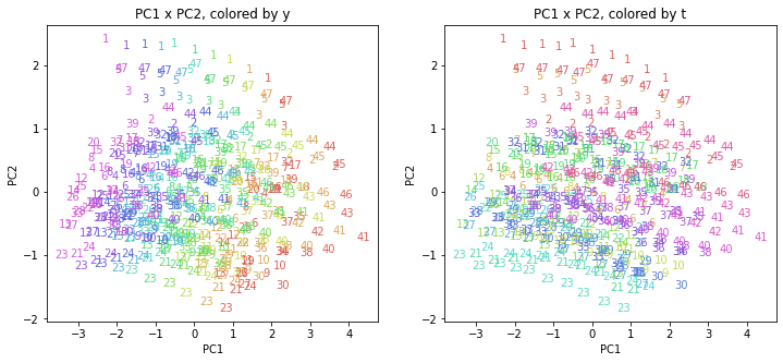
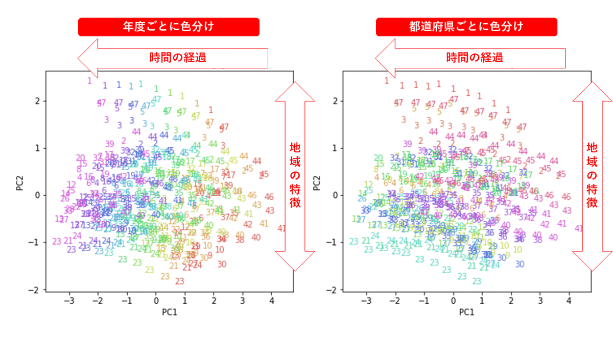
n = 2
for i in range(n):
for j in range(i+1,n):
if (i==0 or j==i+1):
print('PC{} x PC{}'.format(i+1, j+1))
xmin, xmax = min(PC[:,i]), max(PC[:,i])
ymin, ymax = min(PC[:,j]), max(PC[:,j])
plt.figure(figsize=(12,5))
plt.subplot(1, 2, 1)
plt.title('PC{} x PC{}, colored by y'.format(i+1, j+1))
plt.xlabel('PC{}'.format(i+1))
plt.ylabel('PC{}'.format(j+1))
plt.xlim(xmin-(xmax-xmin)/20, xmax+(xmax-xmin)/20)
plt.ylim(ymin-(ymax-ymin)/20, ymax+(ymax-ymin)/20)
for p in range(10*47):
plt.text(x=PC[:,i][p], y=PC[:,j][p], s=df.iloc[:,1][p],
ha='center', va='center', fontsize=10, color=color_y[p])
plt.subplot(1, 2, 2)
plt.title('PC{} x PC{}, colored by t'.format(i+1, j+1))
plt.xlabel('PC{}'.format(i+1))
plt.ylabel('PC{}'.format(j+1))
plt.xlim(xmin-(xmax-xmin)/20, xmax+(xmax-xmin)/20)
plt.ylim(ymin-(ymax-ymin)/20, ymax+(ymax-ymin)/20)
for p in range(10*47):
plt.text(x=PC[:,i][p], y=PC[:,j][p], s=df.iloc[:,1][p],
ha='center', va='center', fontsize=10, color=color_t[p])
plt.show()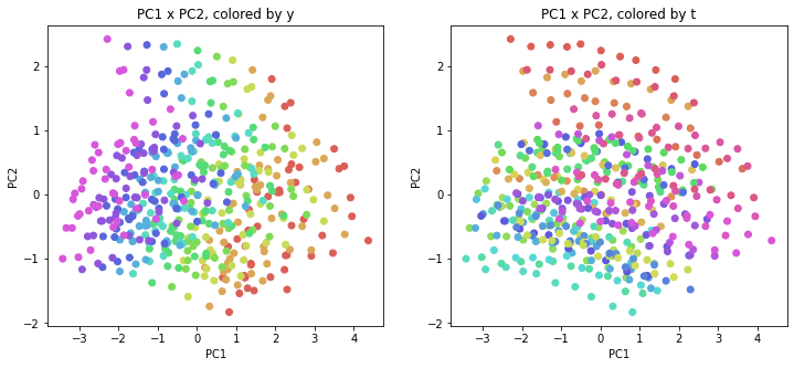
1.MDS
MDS(Multi-Dimensional Scaling;多次元尺度構成法)を試してみます。
1-1.Metric MDS
使用する距離として、通常のユークリッド距離(euclidean_distances)、マンハッタン距離(manhattan_distances)、コサイン距離(cosine_distances)を試しました。
距離:https://scikit-learn.org/stable/modules/classes.html#pairwise-metrics
ユークリッド距離
# MDS, euclidean_distances
from sklearn.manifold import MDS
embedding = MDS(n_components=2, random_state=0)
X_transformed = embedding.fit_transform(X)
print(X_transformed.shape) # (470, 2)

# MDS, euclidean_distances
from sklearn.manifold import MDS
embedding = MDS(n_components=2, dissimilarity='euclidean', random_state=0)
X_transformed = embedding.fit_transform(X)
print(X_transformed.shape) # (470, 2)

# MDS, euclidean_distances
from sklearn.manifold import MDS
from sklearn.metrics.pairwise import euclidean_distances
embedding = MDS(n_components=2, dissimilarity='precomputed', random_state=0)
X_transformed = embedding.fit_transform(euclidean_distances(X))
print(X_transformed.shape) # (470, 2)
結果を図示します。前回と同じく、左は年度ごとの色分け、右は都道府県ごとの色分けです。
alg = 'MDS' # algorithm
param = 'euclidean_distances' # parameter
i = 0
j = 1

print('{}, {}'.format(alg,param))
plt.figure(figsize=(12,5))
plt.subplot(1, 2, 1)
plt.title('{}, {}, colored by y'.format(alg,param))
plt.xlabel('{}_{}'.format(alg,i+1))
plt.ylabel('{}_{}'.format(alg,j+1))
plt.scatter(x=X_transformed[:,i], y=X_transformed[:,j], c=color_y)
plt.subplot(1, 2, 2)
plt.title('{}, {}, colored by t'.format(alg,param))
plt.xlabel('{}_{}'.format(alg,i+1))
plt.ylabel('{}_{}'.format(alg,j+1))
plt.scatter(x=X_transformed[:,i], y=X_transformed[:,j], c=color_t)
plt.show()

print('{}, {}'.format(alg,param))
xmin, xmax = min(X_transformed[:,i]), max(X_transformed[:,i])
ymin, ymax = min(X_transformed[:,j]), max(X_transformed[:,j])
plt.figure(figsize=(12,5))
plt.subplot(1, 2, 1)
plt.title('{}, {}, colored by y'.format(alg,param))
plt.xlabel('{}_{}'.format(alg,i+1))
plt.ylabel('{}_{}'.format(alg,j+1))
plt.xlim(xmin-(xmax-xmin)/20, xmax+(xmax-xmin)/20)
plt.ylim(ymin-(ymax-ymin)/20, ymax+(ymax-ymin)/20)
for p in range(10*47):
  plt.text(x=X_transformed[:,i][p], y=X_transformed[:,j][p], s=df.iloc[:,1][p],
           ha='center', va='center', fontsize=10, color=color_y[p])
plt.subplot(1, 2, 2)
plt.title('{}, {}, colored by t'.format(alg,param))
plt.xlabel('{}_{}'.format(alg,i+1))
plt.ylabel('{}_{}'.format(alg,j+1))
plt.xlim(xmin-(xmax-xmin)/20, xmax+(xmax-xmin)/20)
plt.ylim(ymin-(ymax-ymin)/20, ymax+(ymax-ymin)/20)
for p in range(10*47):
  plt.text(x=X_transformed[:,i][p], y=X_transformed[:,j][p], s=df.iloc[:,1][p],
           ha='center', va='center', fontsize=10, color=color_t[p])
plt.show()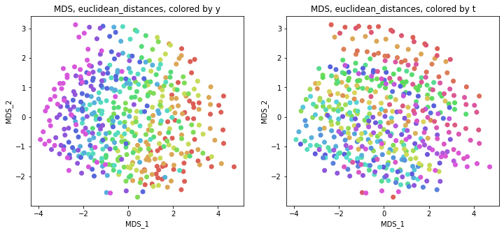
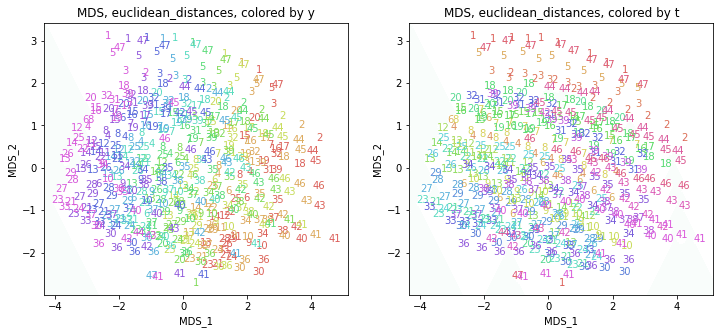
「距離にユークリッド距離を用いた場合は主成分分析と等価」なので、PCAの結果と同じような結果になりました。
マンハッタン距離・コサイン距離
# MDS, manhattan_distances
from sklearn.manifold import MDS
from sklearn.metrics.pairwise import manhattan_distances
embedding = MDS(n_components=2, dissimilarity='precomputed', random_state=0)
X_transformed = embedding.fit_transform(manhattan_distances(X))
print(X_transformed.shape) # (470, 2)

# MDS, cosine_distances
from sklearn.manifold import MDS
from sklearn.metrics.pairwise import cosine_distances
embedding = MDS(n_components=2, dissimilarity='precomputed', random_state=0)
X_transformed = embedding.fit_transform(cosine_distances(X))
print(X_transformed.shape) # (470, 2)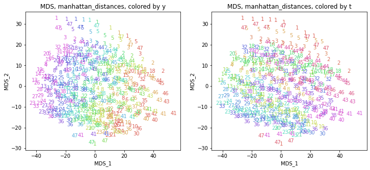
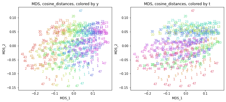
他の距離を使ってもだいたい同じような結果になりました。
1-2.Nonmetric MDS
# Nonmetric MDS
from sklearn.manifold import MDS
embedding = MDS(n_components=2, metric=False, random_state=0)
X_transformed = embedding.fit_transform(X)
print(X_transformed.shape) # (470, 2)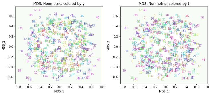
これはうまくいきませんでした。
2.t-SNE
t-SNE(t -distributed Stochastic Neighborhood Embedding;t分布型確率的近傍埋め込み法)を試してみます。
2-1.perplexity=30.0(デフォルト)
まずはパラメータperplexityをデフォルトの設定で実行してみます。
# t-SNE
from sklearn.manifold import TSNE
embedding = TSNE(n_components=2, random_state=0)
# embedding = TSNE(n_components=2, random_state=0, perplexity=30.0)
X_transformed = embedding.fit_transform(X)
print(X_transformed.shape) # (470, 2)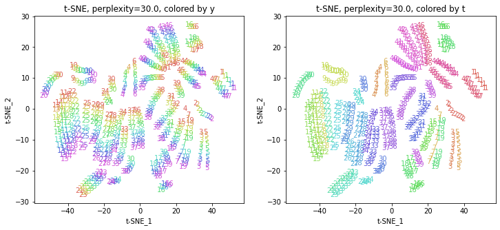
2-2.パラメータperplexityを動かす
パラメータperplexity(デフォルトでは30.0)を変えて実行してみます(小さい方から大きい方へ)。
# t-SNE
from sklearn.manifold import TSNE
embedding = TSNE(n_components=2, random_state=0, perplexity=2.0)
X_transformed = embedding.fit_transform(X)
print(X_transformed.shape) # (470, 2)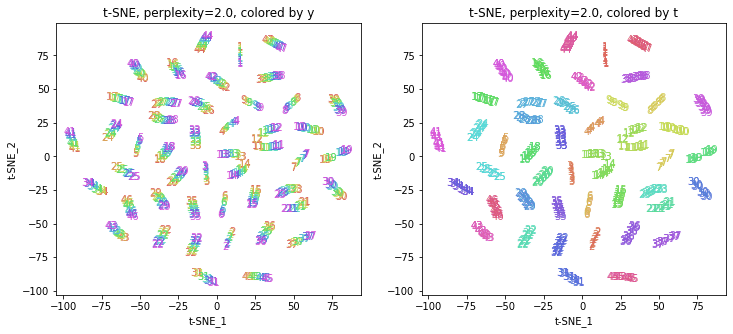
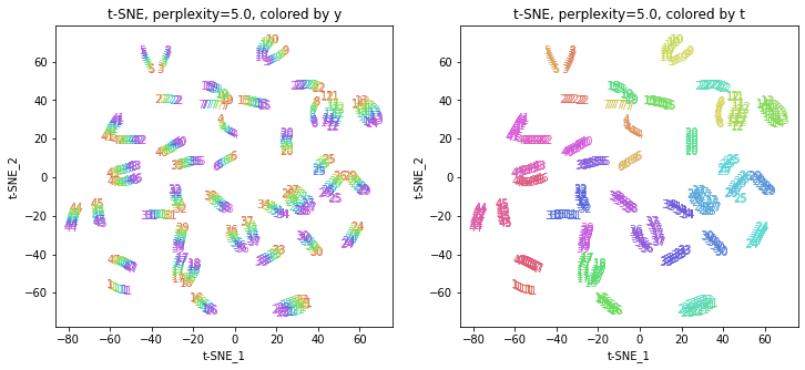
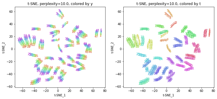
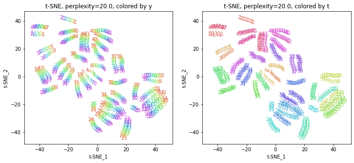
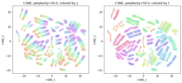
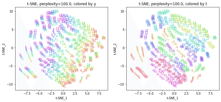
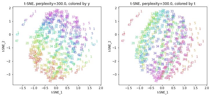
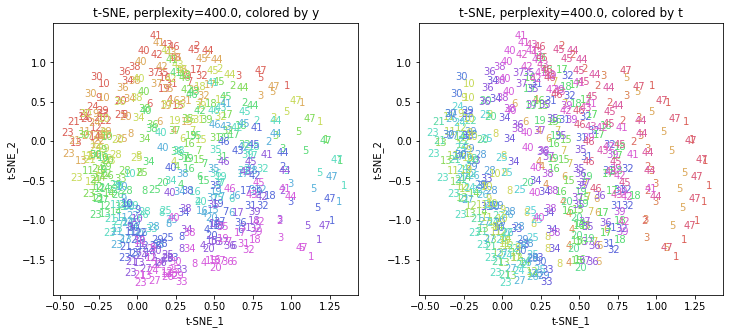
パラメータperplexityの値が小さいと、都道府県ごとにまとまっていて(都道府県が完全に分離)、年度の向きはばらばらです。パラメータperplexityの値を上げていくと、都道府県同士が近づいていき、年度の向きがそろってきます。さらに上げていくと、年度の向きが完全にそろってきて、PCAやMDSの結果に近い形になっています。
中間のperplexity=20.0~50.0あたりが両方のバランスがとれていてよさそうです。色の近い(地理的にも近い)都道府県が固まって分布しているのがわかります。
3.UMAP
UMAP(Uniform Manifold Approximation and Projection)を試してみます。
UMAPはGoogle Colaboratoryにインストールされていないようなので、インストールしてから用いました。
# UMAP
! pip install umap-learn
3-1.n_neighbors=15(デフォルト)
まずはパラメータn_neighborsをデフォルトの設定で実行してみます。
# UMAP
import umap.umap_ as umap
embedding = umap.UMAP(n_components=2, random_state=0)
# embedding = umap.UMAP(n_components=2, n_neighbors=15, random_state=0)
X_transformed = embedding.fit_transform(X)
print(X_transformed.shape) # (470, 2)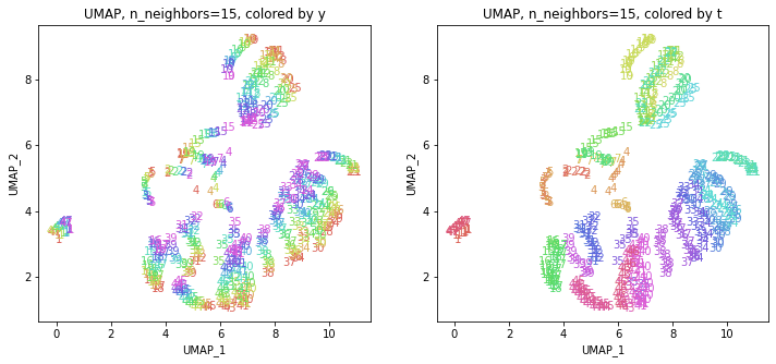
3-2.パラメータn_neighborsを動かす
パラメータn_neighbors(デフォルトでは15)を変えて実行してみます(小さい方から大きい方へ)。
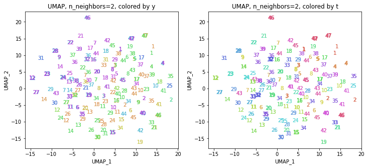
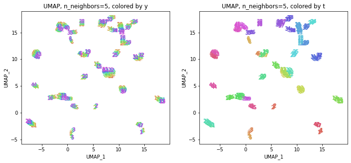
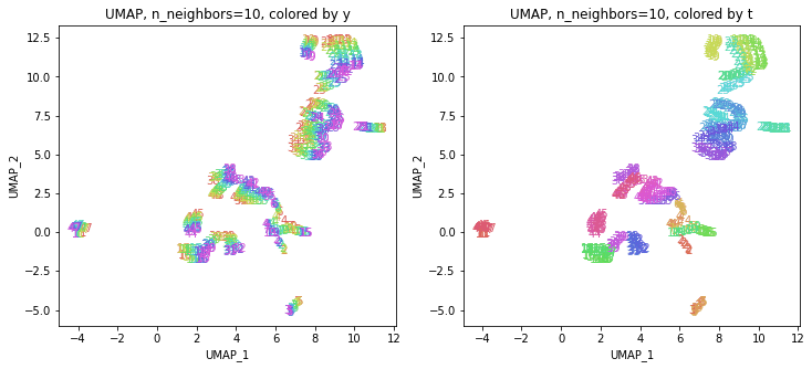
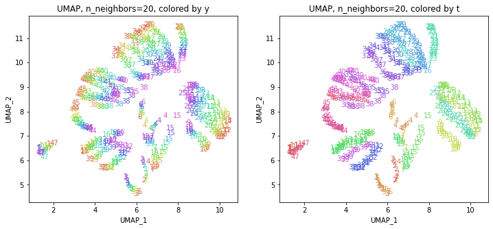
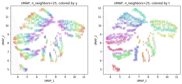
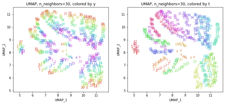
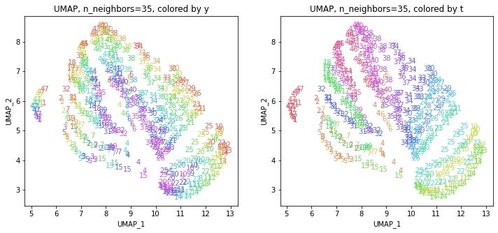
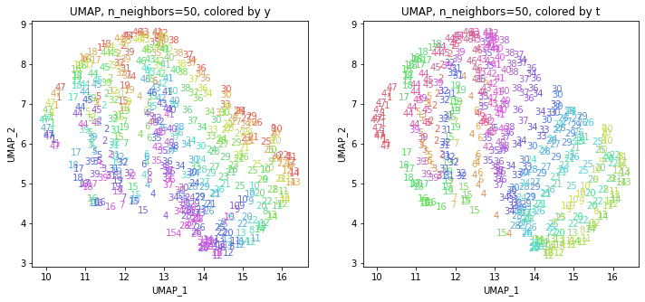
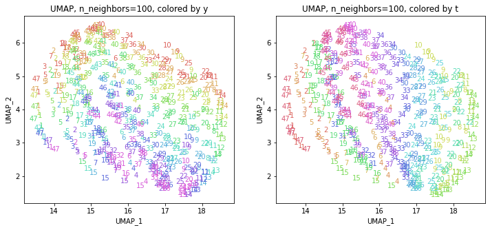
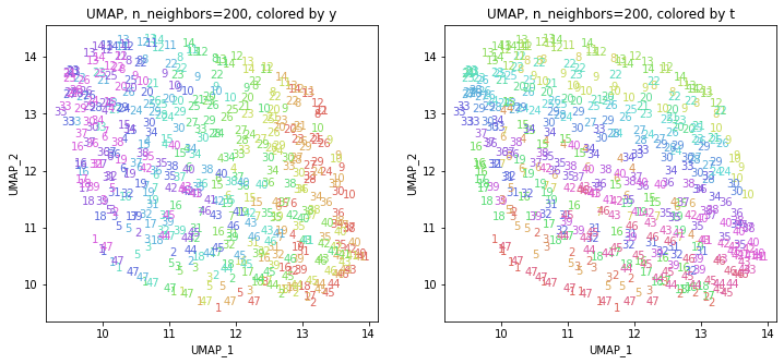
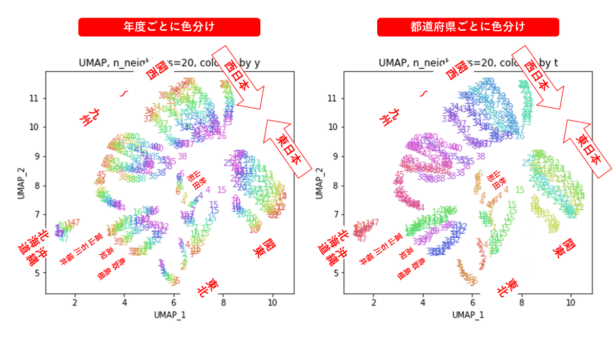
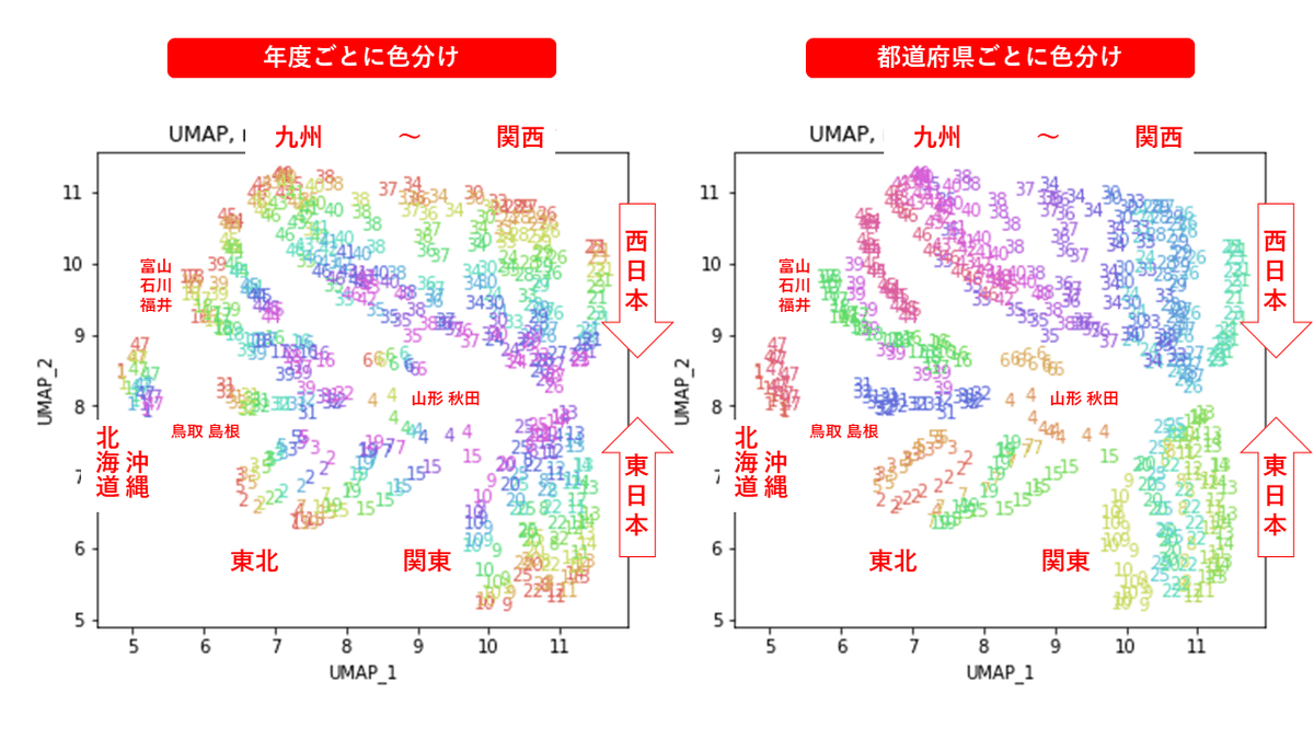
パラメータn_neighborsの値が小さいと、都道府県ごとに分かれていて、パラメータn_neighborsの値を上げていくと、だんだん年度の向きがそろってきます。さらに上げていくと、年度の向きが完全にそろってきて、PCAやMDSの結果に近い形になっています。
中間のn_neighbors=20~30あたりがバランスが取れていてよさそうです。n_neighbors=20の結果を見ると、左上半分に西日本(関西~九州)、右下半分に東日本(関東・東北)の都道府県が、左下に北海道と沖縄が固まっています。
4.PCA & UMAP
UMAPを単独で実行するのではなく、PCAを実行した結果にUMAPを適用するという方法もあるようです。
参考:
【次元低減】UMAP, PCA, t-SNE, PCA + UMAP の比較|はやぶさの技術ノート (cpp-learning.com)
UMAP reveals cryptic population structure and phenotype heterogeneity in large genomic cohorts (plos.org)
4.1.PCAの結果をUMAP
# PCA & UMAP

# PCA
from sklearn.decomposition import PCA
pca = PCA(n_components=160)
PC = pca.fit_transform(X)
print(PC.shape) # (470, 160)

# UMAP
import umap.umap_ as umap
embedding = umap.UMAP(n_components=2, n_neighbors=15, random_state=1)
X_transformed = embedding.fit_transform(PC)
print(X_transformed.shape) # (470, 2)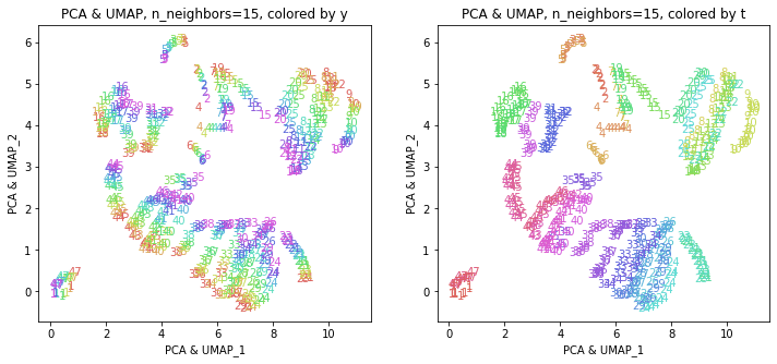
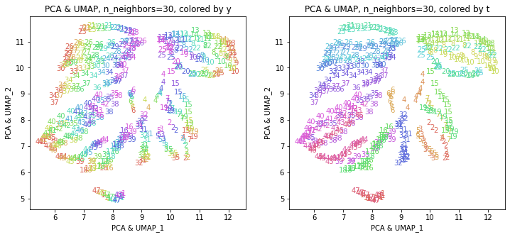
このデータの場合では、UMAP単独の結果とほぼ同じような結果になりました。東日本と西日本に概ね分かれて、地理的に近い都道府県が近くに分布しています。
4.2.PCAの結果の寄与率の高い主成分のみでUMAP
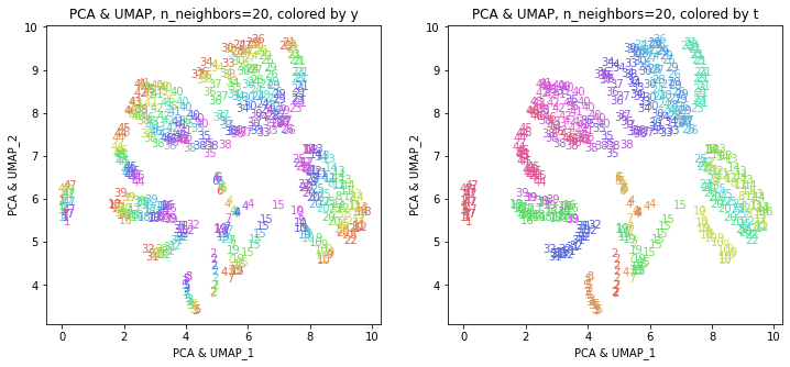
PCAの結果、累積寄与率は第6主成分PC6までで8割、第13主成分PC13までで9割を超えていましたので、PC1~PC6までとPC1~PC13までをそれぞれ使ってUMAPを実行してみます。
import numpy as np
np.set_printoptions(precision=5, suppress=True) # numpyの表示桁数設定
print(pca.explained_variance_ratio_) # 寄与率
print(np.cumsum(pca.explained_variance_ratio_)) # 累積寄与率
# PC6までで8割、PC13までで9割超える

plt.figure()
plt.plot(np.cumsum(pca.explained_variance_ratio_)[:40+1], '-o')
plt.xlabel('principal components')
plt.ylabel('cumulative contribution rate')
plt.grid()
plt.show()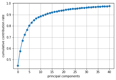
# PCA(PC1-PC6) & UMAP
import umap.umap_ as umap
embedding = umap.UMAP(n_components=2, n_neighbors=15, random_state=1)
X_transformed = embedding.fit_transform(PC[:,:6])
print(X_transformed.shape) # (470, 2)

# PCA(PC1-PC13) & UMAP
import umap.umap_ as umap
embedding = umap.UMAP(n_components=2, n_neighbors=15, random_state=1)
X_transformed = embedding.fit_transform(PC[:,:13])
print(X_transformed.shape) # (470, 2)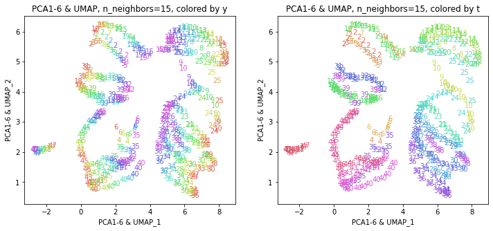
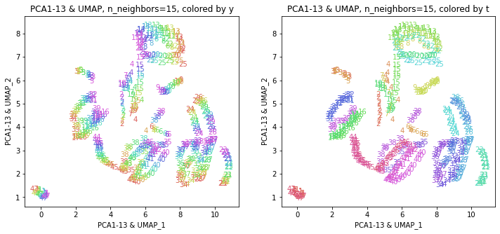
主成分すべてを使った結果と概ね近い結果が得られました。
おわりに
今回は、次元削減のいろいろな手法を使って、160次元の医療費データを2次元に圧縮してみました。2次元まで落としても、年度の推移と地域的な状況をかなりよく表現できていました。また、別の手法を用いても(パラメータによっては)似たような結果になることも確認できました。
最後まで読んでいただき、ありがとうございました。
お気づきの点等ありましたら、コメントいただけますと幸いです。
なお、文中の数式と表は、以下を参考にしました。
#医療費, #医療費の3要素, #医療費分析, #医療費の地域差, #地域差, #地域間格差, #PCA, #MDS, #tSNE, #UMAP, #機械学習, #Python, #協会けんぽ, #noteで数式
この記事が気に入ったらサポートをしてみませんか?