
【Google UX Design】Start the UX Design Process: Empathize, Define, and Ideate (2/7)

前回に引き続き、Google UX Design Professional Certificateでの学びをアウトプットしていきます。
第1回目はこちら:
このCourseではデザイン前のユーザーニーズリサーチやペルソナ設定、ユーザーストーリー、ユーザージャーニーなどプロジェクトの初期段階に行われるデザイン関連のあれこれを学びました。
ここで知ったリサーチ方法や単語たちがよく実務で使われるので役に立ったな〜と思います。
Module1
デザインプロセスはこう流れていきますという概要を学びました。知らない単語に多く遭遇しました。
Empathize with users
Build an empathy map
Understand user pain points
Explore personas
Write user stories
Identify happy paths and edge cases
Discover the benefits of user journey maps
Write problem statements and hypothesis statements
Consider accessibility
このModuleの途中でPortfolio projectのテンプレのパワポを渡され、そして25個のアプリアイデアから1つ選び、デザインを作りなはれ〜と言われました。
私は以下のトピックを選びました。理由としては最近Podcastを聴いていてInstacartについて話しているエピソードに遭遇したことと、コスパ良い買い物大好き民としてよく初めての店で迷うからです。
Design an app and a responsive website for a local grocery store that helps shoppers locate products as they shop in person.
しかし、25個のリストはおそらくアメリカでの利用が想定されたものなんだろうと思いました。ですが私は日本のユーザーのためのサービスを作ろうとしていました。アメリカと違って、特に東京のような都市部では食料品店の面積が小さく、複数の店舗が密集している傾向があります。
私はこのアプリの定義に疑問を持ち始めました。その結果、1つの店舗内で商品を探すアプリのニーズはそれほど強くないかもしれないと思いました。
むしろ近隣の食料品店の価格を比較するアプリの方がニーズが高いかも、とひらめきが浮かびました。そして「よし、じゃあ現在地周辺のスーパーの料金比較アプリにしよう!」と思ったのです。
しかし、現実的に考えると全てのスーパーで同じ商品が売られている訳ではないですし、ましてや生鮮食品なんかは値段の変動や値引きなどもあり、それらを全てアプリに反映するのはかなり難しいのではないかと思いました。
そこで以下のコア要件を抽出して、それらに合致しているようなお店カテゴリーを考えました。
より値段の変動が少ない
店舗ごとに比較したい
日常的に利用する
これらの要件からパッと思いついたのが100均でした。なので以下のようなアプリの定義を考え、これに沿ったアプリデザインをすることにしました。
"An app that revolutionizes the way shoppers approach 100 yen stores shopping. By aggregating real-time price comparisons and inventory levels from local 100 yen stores, it simplifies the decision-making process for consumers."
日本語で表現すると以下のような感じです。
「100均の商品を買いに行く時に在庫があるか、どの店が一番お手頃に購入できるか確認できるアプリ」
この時に想定していたユーザーニーズは以下の通りです。
店舗に足を運んだ際に在庫がないことを避けるため、商品の在庫が一定エリア内の100均(例:最寄り駅周辺の100均→ダイソー、Seria、CanDoなど)であるかないか確認したい
100均の商品はネットで買えない/買うほど重視していない/送料が追加されるので店舗の方が結局安いと考えられるとおもうので、価格と在庫確認が重要かもしれない
ここから講義とアプリデザインを並行して進めていきました。
この記事は私のプロジェクトの話ではないのでここで終わりにします。完成したデザインはこちらからご覧いただけます。
Tips for a good portfolio
良いポートフォリオの条件が結構細かく5~7項目に分かれて説明されていました。以下はその中のいくつかです。
Establish your personal brand
Tell a story
Be concise
Keep your navigation simple and intuitive
加えて、他の2. Start the UX Design Process: Empathize, Define, and Ideate (2/7)以外のCourseでも、1つのポートフォリオには少なくとも3~5つのプロジェクトを載せるべきと繰り返し言われていて、印象的でした。
Determine research goals and questions
この講義のトピックはインタビューのプランニングについての解説でした。以下の3つに分けられて考えられています。
Interview goals: Create research goals to guide the interview questions they ask and the design decisions they make based on users’ responses
Target participant characteristics: Determine the target audience for the product they’re designing for and list key characteristics of the users they want to interview
Interview questions: Write a list of interview questions so they can determine effective questions in advance and ensure consistency across interviews with different users
以下は3つをワークアウトトラッキングアプリに適用した例です。
This example comes from a UX research plan for a workout tracking app called FitTrack.
1.Interview goals:
I want to understand common challenges people face when trying to integrate regular exercise into their daily routine.
I want to identify frustrations people experience during the process of tracking their workouts.
2.Target participant characteristics:
Ages 18–65
Live in urban or suburban areas
People who exercise at least three times a week
Include participants of different genders
Include participants with different fitness levels
3.Interview questions:
What is your current exercise routine like? How do you balance your workouts with other responsibilities?
How often do you use workout tracking apps or tools? When you do, what is your motivation?
What challenges do you face in tracking your workouts? How do these challenges make you feel?
How do you think these challenges could be resolved?
Build an empathy map
私はここで初めて"Empathy map" (共感マップ) という言葉を知りました。 ユーザの態度や振る舞いをビジュアル化するEmpathy mapは、この講義では"Says"、"Thinks"、"Does"、"Feels" で構成されています。
Google UXでは 外部のリソースを紹介することがよくありますが、このトピックについても以下のNielsen Norman Group の記事がお勧めされていました。 2018年のものなので割と古いですが、基礎の理解ということなので問題ないと思います。
この記事で紹介されているEmpathy mapも"Says"、"Thinks"、"Does"、"Feels" で構成されています。


Identify user pain points
pain pointsという言葉は知っていましたが、その定義を細分化しようと考えた事はありませんでした。このように指標として確立されているのは考えやすくなるなと思いました。
Types of Pain Points
Financial
Product
Process
Support
Learn more about personas
Personas build empathy and put a face to the user. They help humanize our users.
そして3~8人のペルソナを作ることはこの講義回以外でも書かれていました。
Generally, creating 3 to 8 personas is enough to represent the majority of a product’s user base.
こちらの教えも、学びを得た&疑問に思ったという意味で印象に残ったので紹介させていただきたいと思います。
意見を集めた後にそれらをどう1つの成果物にしていくかなどの過程についての説明はありませんでした。
Pro tip: Get your team's opinion on the product’s users before you build personas. Then, after you build personas, review those suggestions from your team and compare them to the personas you created.
ちょっと一息😌🏖️
この後もそうですが、方法論だけどんどん詰め込まれる感じがするので一休みコンテンツを紹介させてください。最近聞いたポッドキャストでちょうどペルソナに関しての興味深いトークが繰り広げられていたのでここに載せておきます。
ハイパー起業ラジオの「#2-2ペルソナ、ちゃんと使えてる?(後編)」というエピソードです。お堅い講義感がなく、けんすうさんが主に生徒役的なポジションでトピックについて深掘っていきます。
この番組を聴き始めた頃はMCのお二方を存じ上げず、楽しい感じで勉強になることをおじさん2人が喋ってるなあ〜とだけしか思っていませんでしたが、ご経歴を見て優秀すぎてびっくりしました。
MC:尾原和啓(IT批評家) https://twitter.com/kazobara
サブMC:けんすう(アル株式会社代表取締役) https://twitter.com/kensuu
超おすすめです!ぜひ聞いてみてください〜💁♀️🎧
Module2
このモジュールは主にUser storyとUser journey mapについてでした。これらの単語についても知らなかったので勉強になりました。
User story
User storyは一言で以下のような定義がされていました。
A fictional one-sentence story told from the persona's point of view.
そして実際にどうやってそのone-sentenceを作るのかというと、以下のテンプレートに沿うと綺麗に作れますよーと紹介されていました。
💡 As a [Who] , I want to [What], so that [Why] .
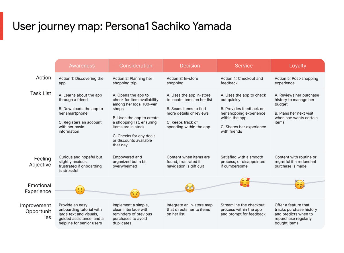
Create a user journey map
User journey mapを作成することでユーザーとデザインとのインタラクションを含め、ユーザが体験するイベントやインタラクションの一連の流れ全体を文書化することができます。
以下のようなテンプレが紹介されて、あなたのプロジェクト作成に活用してくださいと言われました。
実際に作ったものはこんな感じです。
Accessibility during user research
例え障害を持っていなくても、様々な状況によりユーザーはアクセシビリティを必要とすることがあります。
講義では「見る」「聞く」などの感覚と、アクセシビリティを必要とする3つのシチュエーション「Permanent, Temporary, Situational」を紐づけて紹介されており、理解しやすかったです。

例としては以下のようになります:
[ See(視覚)]において[ Temporary ]なdisabilityを持っている人の例として、普段めがねをかけて生活しているけれど朝起きた瞬間などのめがねをしていない時が挙げられます。
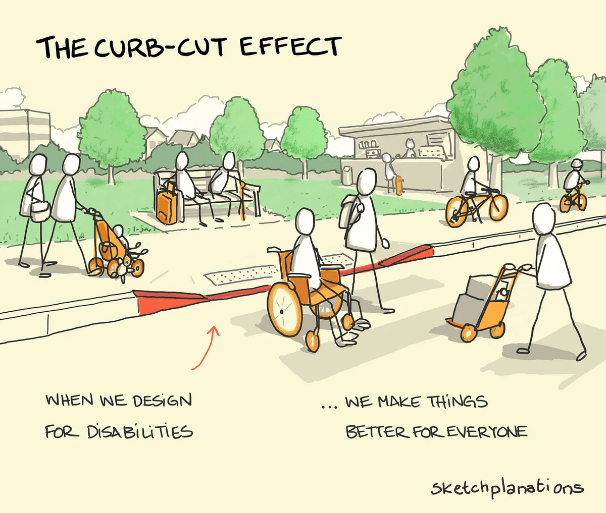
The curb-cut effect
Google UXでの定義は以下の通りです。恥ずかしながらこの歩道と車道を滑らかに繋ぐ斜面?をカーブカットと呼ぶことさえ知りませんでした…😦
The curb-cut effect is a phenomenon that describes how products and policies designed for people with disabilities often end up helping everyone.
こちらの記事で使われているイラストが可愛くてわかりやすいので引用させていただいています。
Module3
Problem statement
Problem statementとは、対応すべきユーザーのニーズの明確な説明と定義されています。そして3つのキーポイントが紹介されました。
Human-centered
Broad enough for creative freedom
Narrow enough to be solved by a design
実際に書く際のテンプレートは以下の通りです:
[User name] is a [User characteristics] who needs [User need] because [insights].
Problem statementを作るためにpain pointsを4つのカテゴリーに分類できると認識することも大事だよ、と解説されていました。
Financial, or money-related pain points.
Product, which are pain points related to quality issues.
Process, which are pain points related to the user’s journey.
Support, which are pain points related to getting help from customer service.
Value proposition
プロダクトの特徴を一言で表す文です。Google UXでの定義は以下の通りです。
Value propositions are short, compelling statements about how a product addresses users’ needs and creates unique value for users.
例としてBertaという高齢の視覚障害者の方がベーカリーの常連さんであるシチュエーションを考えてみましょう。
Problem statement
([User name] is a [User characteristics] who needs [User need] because [insights].)
[Berta] is an [older person with a visual impairment. She is a long-time bakery customer who prefers ordering over the phone.]
She needs [a website and online ordering system that are easy to use, adapt to her vision needs, and mimic the feel and flow of a friendly phone conversation.] [She wants to place her orders with ease and feel like she’s making a personal connection with the bakery.]
上記のような特定のProblemを定義することで的確でユニークなValue propositionを作ることができます。
Value proposition
The bakery’s new website offers a streamlined online ordering system that mimics the feel and flow of a friendly phone conversation. This system is easy to use and enables the bakery’s customer base to order online while maintaining a valuable feeling of personal connection with the bakery staff.
Value proposition list
Value propositionを決めていく時の考え方として、Value proposition listの作成が紹介されていました。
簡単な流れは以下の通りです:
大小問わずにプロダクトの特徴や利点をすべてリストアップ
カテゴリーに分類
特定のユーザーのニーズに最もマッチしそうな機能を紐づける
Human factors
以下のような定義がされています。
Describes the range of variables humans bring to their product interactions
そして印象的だったのが、Human factorsの発展には世界大戦が大きく関わっていたという解説でした。以下に解説の一部を引用させていただきました。
Believe it or not, it took two world wars for designers to consider what we now call the human factor. The human factor describes the range of variables humans bring to their product interactions.
信じられないかもしれないが、現在私たちがヒューマン・ファクターと呼ぶものをデザイナーが考慮するようになるまでには、2つの世界大戦が必要だった。ヒューマン・ファクターとは、人間が製品との相互作用にもたらすさまざまな変数のことである。
Before World War I, the objective was to fit the human to the machine. When planes started being used in war, that changed. Suddenly, untrained soldiers had to learn how to fly. Aviation psychology was introduced, and an attempt was made to mold the machine to fit the human.
第一次世界大戦以前は、人間を機械に適合させることが目的だった。飛行機が戦争で使われ始めると、それは変わった。突然、訓練を受けていない兵士たちが操縦を学ばなければならなくなったのだ。航空心理学が導入され、人間に機械を適合させる試みがなされた。
Common human factors that inform design
以下はhuman factorsの一例です。まあ…あるよね…
Impatience
Limited memory
Needing analogies
Limited concentration
加えて以下の2つも同じ講義内で紹介されていました。言葉自体は聞いたことがあったものの、明確な定義は知りませんでした。
Mental models
Internal maps that allow humans to predict how something will work
Feedback loops
The outcome a user gets at the end of a process
Von Restorff effect (Isolation effect)
これはデザインの4大原則「近接」「整列」「反復」「対比」の「対比」と似ているな〜、と思いました。
When multiple, similar objects are present, the one that differs from the rest is most likely to be remembered.
Module4
Common ways to evaluate ideas
デザインのアイディエーションは、様々なアイデアを生み出すプロセスです。アイデアを評価する際には、以下の3つの基準を用います。
実現可能性(Feasible): 技術的に実現可能か。
望ましさ(Desirable): ユーザーの問題を最もよく解決するか。
持続可能性(Viable): ビジネスにとって経済的に利益があるか。
Goal statements
デザインのスコープを明確にするために、ゴールステートメントを作成することをお勧めしています。これはプロダクトとそのユーザーに対する利益を説明する一文または二文で構成されます。
優れたゴールステートメントは次の要素を含みます。
特定のアクション: ユーザーが取るべき具体的な行動や製品が行うこと。
影響を受ける人々: アクションが主に誰に影響を与えるか。
ポジティブな影響: そのアクションがなぜユーザーのニーズを解決するのか。
成功の基準: アクションの効果を測る方法。
実際に書く際のテンプレートは以下のように構成されています:
Our [1. product (what)] will let users [2. perform specific actions (what)] which will affect [3. describe who the action will affect (who)] by [4. describe how the action will positively affect users (why)].
We will measure effectiveness by [5. describe how you will measure the impact].
以下のようにさらにシンプルにした説明も付け加えられていました。
Product: Start with your product. This could be an app, an object, or anything else.
Action: Describe the specific action your product enables users to perform.
Audience: Describe who the action will primarily affect. This could be the user themselves.
Impact: Describe how the action will positively affect that person.
Criteria: Describe how you’ll measure the action’s effectiveness.
例として、散歩の時間が取れない飼い主のために犬の散歩を代行するdog walking appのGoal statementは以下のように紹介されていました。
Our [dog walking app] will let users [schedule dog walkers quickly and easily] which will affect [Pet owners] by [allowing them to choose the most convenient times and dates to have their dog walked].
We will measure effectiveness by [analyzing the number of daily and weekly appointments].
Competitive audits
直訳すると「競合監査」ですが、日本語だと「競合分析」という言葉の方が広く使われているようです。(以下のGoogle検索結果参考)
「デザイン 競合監査」の検索結果 = About 268,000 results (0.16 seconds)

「デザイン 競合分析」の検索結果 = About 3,320,000 results (0.22 seconds)
Limitations of competitive audits
Stifle creativity
Depend on how well you interpret the findings
Not all designs work in all use cases
Need to be done regularly
Direct/Indirect competitors
Direct competitors:
Organizations that have offerings that are similar to your product and focus on the same audience
Indirect competitors:
Organizations that have a similar set of offerings but focus on a different audience, or have a different set of offerings and focus on the same audience
Competitive audit steps
Outline the goals
Create a spreadsheet with a list of your competitors
Call out the specific aspects you want to compare
Research each company
Analyze findings
Summarize findings in a report
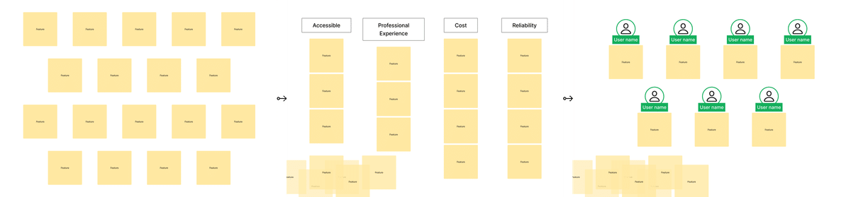
最後の「report」というのはGoogle UXでは以下のようなスライドとして表現されています。

こちらは実際に作ったスライドです。このテーブル形式はGoogle UXで紹介されていませんでしたが、ネットで色々Competitive auditについて調べていたらこの形式が多かったので参考にさせていただきました。

以下のCompetitorのシングルビューのデザインもCompetitive auditとして紹介されていました。以下は私が作ったスライドで、詳細な項目などはテンプレートとは異なります。

How Might We to ideate
簡単な定義は以下の通りです:
"How" - Explore a bunch of ideas
"Might" - Our ideas are possible solutions, not the only solution
"We" - Collaborative effort
コツは以下があるそうです。
Amp up the good
Explore the opposite
Change a status quo
Break the point-of-view into pieces
Crazy Eights - Rapid Sketching to ideate
「Crazy Eights」とも呼ばれるラピッドスケッチは、短時間で多くのアイデアをスケッチする方法です。必要なツールは、問題ステートメント、描画または書くための道具、紙、タイマーです。
8分間で8つのアイデアを描くことを目標にブレインストーミングします。
この機会に初めてやってみたのですが、私的にはめちゃ良い!という印象はありませんでした。
ちょっとズルをしてアイデアのメモ書きを参照しながら取り組みました。それでさえ描き切れなかったのに、アイデア創出からスケッチまでを8分間でやろうとするのが理解できないなあ…と思ってしまいました。焦って良いアイデアが出てきそうにないです、頭の回転能力不足🥲
終わりに
初めて知る単語が多く、このCourseは特にメソッドを多く伝えることが目的のような感じがしました。
良い学びになりましたが、これらの方法が100%正しいとは思わずに様々なな意見やケースも学んでいこうと思います。
ここまでお読みいただきありがとうございました🙇♀️
この記事が参加している募集
この記事が気に入ったらサポートをしてみませんか?