Cocoda! Daily Graphic #006 Banner Design

As part of practicing our graphic design skills, we try working on a fictional design brief for graphic design projects called 'Daily Graphic' that's on a platform called Cocoda! . Unfortunately, Daily Graphic & its broader design training platform, Cocoda Training has recently been discontinued.
However, I'd still like to share the designs done based on the brief provided, as well as taking the opportunity to share my design process.
Today I'll be sharing the process of designing a banner for a designers' meet up event, based on the fictional design brief as follows (it is originally in Japanese, hence it follows with English translation below):

Daily Graphic #6
【006 Banner for Designers' Meet Up 】
Target Audience: Designers who are involved in service development
To create a creative piece that helps gather participants for the meet up event.
Banner Size: 1200x240
Colour Mode: RGB
Before starting on any design piece or project, it is always best to understand the brief, the needs & requirements of the project, its expected output (deliverables), as well as the information currently available at hand.
Since this is a rather simple & open brief, I tried to get an idea what's out there by browsing some designs by other designers that interpreted the brief in their own way.
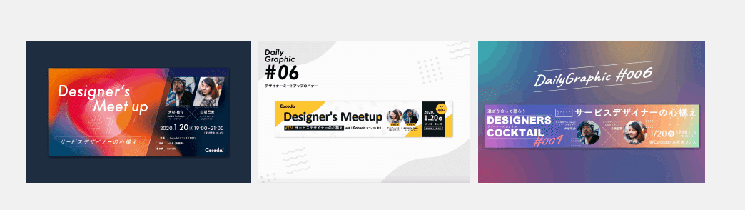
These helped in painting a little idea of how it may look like, as well as what kind of information that needs to be created fictionally to place into the banner.
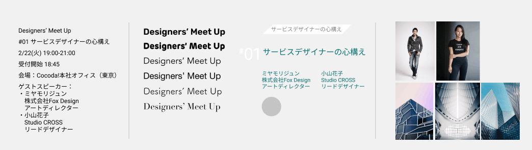
Next, I go into creating some basic fictional information for the event, organize them, grouping the information and experimenting a little with the typefaces. At this stage I also start gathering image resources while considering how they can be used within the banner design.
After a few experimentation and also putting things together in the banner itself, while adjusting & moving pieces of information around to find the best fit, this was the final design that I came up with~! ⭐️
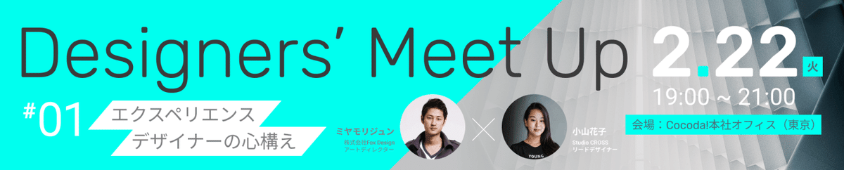
Mostly keeping the colours in the banner limited; mainly grey scale-ish with a bright turquoise as a one-punch colour, it helps keep the design stylishly chic, which may create an appeal for designers & those who appreciate creative simplicity.
Fonts are kept simple, in sans serif for a modern look while having still a bit of that casual feel with the curves in the typeface. Contrast of curves and sharp edged lines/shapes in the various elements & image in the banner helps create a visual play and balance of expressing relatability of the creative industry while keeping a sense of stylishness in design.
Information of the event and the hierarchy of them were also carefully considered; first the main event name & the date of the event, followed by the secondary information such as event theme/topic & the event time & location. Followed by the guest speakers that will grace the event.
All in all, this was a fun brief to work on, with its flexibility to be able to decide on the information and exploring and working within self-set criteria and making them appealing for the target audience of the creative industry.
I hope too, by sharing this design process, it would shed some light on what goes on in thought process and design decision-making while designing pieces like a banner.
Till next time~! ⭐️