
Webデザインの基本 写真とイラスト編

イントロダクション
ウェブデザインにおいて、画像は非常に重要な要素の一つです。適切な画像の選定と効果的な使用は、ウェブサイトのメッセージやストーリーを強化し、ユーザーの関心を引きつけることができます。しかし、ただ画像を配置するだけではなく、様々な工夫と最適化が求められます。本記事では、画像の種類から選び方、加工の方法、高解像度対応やパフォーマンスの最適化まで、ウェブデザインにおける画像のベストプラクティスを解説します。これらのポイントを押さえることで、より魅力的で効果的なウェブサイトを作成する手助けとなるでしょう。
前提
この記事はWebデザインの基本を説明していくシリーズの第3話です。
過去の記事を読んでいただくとよりわかりやすくなります。
過去記事一覧
Webデザインにおける画像のベストプラクティス
1. 画像の種類と選定
画像にはプロダクト写真、ストーリーテリング写真、イラスト、パターンなど様々な種類があります。これらの画像をウェブサイトのメッセージやストーリーをサポートするために使用します。したがって、関連性のある画像のみを使用することが重要です。可能であればオリジナルの画像を使用し、難しい場合はオリジナルに見えるストック画像を選びましょう(一般的なものは避ける)。
2. 画像の加工と組み合わせ
画像はユーザーの感情を引き出すために実際の人々を写したものを使うと効果的です。また、メッセージに合わせて画像をトリミングすることも検討してください。さらに、写真、イラスト、パターンを組み合わせることで独自の表現を試みることができます。以下の方法で画像を工夫してみましょう!
方法1: 画像を部分的または全体的に暗くしたり明るくしたりする(グラデーションを使用)
方法2: 中立的な画像エリアにテキストを配置する
方法3: テキストをボックスに入れる
実際にサンプルを見てみましょう。
前回のHTMLとCSSファイルに手を加えてみました。
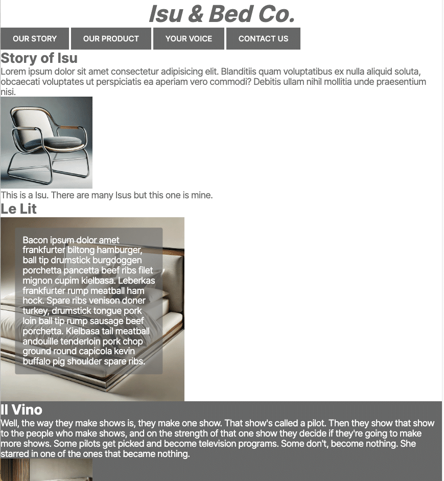
HTMLはこんな感じで
(利便性の事情で前回から若干加筆してます)
<!DOCTYPE html>
<html lang="en">
<head>
<meta charset="UTF-8">
<meta name="viewport" content="width=device-width, initial-scale=1.0">
<link
href="https://fonts.googleapis.com/css2?family=Inter:wght@100..900&display=swap"
rel="stylesheet"
/>
<link rel="stylesheet" href="style.css" />
<title>Isu & Bed Co.</title>
</head>
<header>Isu & Bed Co.</header>
<body>
<nav>
<a class="class_button" href="https:www.google.com">Our Story</a>
<a class="class_button" href="#">Our Product</a>
<a class="class_button" href="#">Your Voice</a>
<a class="class_button" href="#">Contact Us</a>
</nav>
<!--Story Telling-->
<div class="Container_StoryOfIsu">
<div class="Container_Words">
<h1>Story of Isu</h1>
<p>Lorem ipsum dolor sit amet consectetur adipisicing elit. Blanditiis quam voluptatibus ex nulla aliquid soluta, obcaecati voluptates ut perspiciatis ea aperiam vero commodi? Debitis ullam nihil mollitia unde praesentium nisi.</p>
</div>
<div class="Container_PhotoOfIsu">
<img src="pics/isu.jpg" alt="isu" width="240px">
<p>This is a Isu. There are many Isus but this one is mine.</p>
</div>
</div>
<div class="Container_StoryOfBed">
<div class="Container_Bed">
<h1>Le Lit</h1>
<img src="pics/bed.jpg" alt="bed" width="240px">
<div class="Class_BedText">
<p>Bacon ipsum dolor amet frankfurter biltong hamburger, ball tip drumstick burgdoggen porchetta pancetta beef ribs filet mignon cupim kielbasa. Leberkas frankfurter rump meatball ham hock. Spare ribs venison doner turkey, drumstick tongue pork loin ball tip rump sausage beef porchetta. Kielbasa tail meatball andouille tenderloin pork chop ground round capicola kevin buffalo pig shoulder spare ribs.</p>
</div>
</div>
<div class="Container_WineBed">
<h1>Il Vino</h1>
<p>Well, the way they make shows is, they make one show. That show's called a pilot. Then they show that show to the people who make shows, and on the strength of that one show they decide if they're going to make more shows. Some pilots get picked and become television programs. Some don't, become nothing. She starred in one of the ones that became nothing.</p>
<img src="pics/bigwinebed.jpg" alt="winebed" width="240px">
</div>
</div>
<footer><p>Copyright © by フルスタコマツ</p></footer>
</body>
</html>CSSはこんな感じです。
* {
    margin: 0;
    padding: 0;
}

header,
body {
    font-family: "Inter", sans-serif;
    background-color: #fff; /* アクセントカラー */
    color: #676767; /* メインカラー */
}

header {
    font-size: 60px;
    text-align: center;
    font-weight: bold;
    font-style: italic;
    color: #676767; /* メインカラー */
    border-bottom: #676767; /* メインカラー */
}

.class_button {
    background-color: #676767; /* メインカラー */
    color: white; /* アクセントカラー */
    text-decoration: none;
    text-transform: uppercase;
    font-size: 20px;
    font-weight: 500;
    padding: 16px 32px;
    display: inline-block;
}

h1 {
    font-size: 36px;
    font-weight: bold;
    color: #676767; /* メインカラー */
}

p {
    font-size: 24px;
    line-height: 1.1;
    letter-spacing: -1px;
}

footer {
    text-align: center;
}

.Container_WineBed {
    background-color: #676767; /* メインカラー */
    color: white; /* アクセントカラー */
}

.Container_WineBed h1 {
    color: #fff; /* アクセントカラー */
}

.Container_Bed {
    position: relative;
    display: inline-block;
    width: 100%;
}

.Container_Bed img {
    display: block;
    width: 480px;
    height: auto;
}

.Class_BedText {
    position: absolute;
    top: 50%;
    left:20%;
    transform: translate(-50%, -50%);
    color: white;
    background-color: rgb(103, 103, 103,0.6) ;
    padding: 20px;
    border-radius: 5px;
    width: 30%;
}
コンテナと画像の設定
.Container_Bed {
    position: relative;
    display: inline-block;
    width: 100%;
}

.Container_Bed img {
    display: block;
    width: 480px;
    height: auto;
}
画像を含むコンテナに対して相対位置を設定し、その中の画像をブロック表示してサイズを指定しています。
画像の上に文字を配置
.Class_BedText {
    position: absolute;
    top: 50%;
    left: 20%;
    transform: translate(-50%, -50%);
    color: white;
    background-color: rgba(103, 103, 103, 0.6);
    padding: 20px;
    border-radius: 5px;
    width: 30%;
}
この部分が画像の上に文字を配置するためのCSSです。以下の点でデザイン性を向上させています:
position: absolute と transform を使用して、文字を画像の中央に配置しています。
白い文字と半透明の背景色を使用することで、文字が読みやすくなり、視覚的に際立ちます。
padding と border-radius を使用して、文字ボックスに余白を持たせ、角を丸くすることで、デザインに柔らかさを加えています。
3. 高解像度とパフォーマンスの最適化
高解像度の画面に対応するために、画像のサイズは表示サイズの2倍に設定します。これにより、鮮明で美しい表示が可能となります。さらに、画像を圧縮してファイルサイズを小さくし、ウェブサイトのパフォーマンスを向上させましょう。複数の画像を並べて使用する場合は、全ての画像の寸法を正確に揃えることも重要です。
このように、画像を適切に選び、加工し、最適化することで、ユーザーにとって魅力的で効果的なウェブサイトを作成することができます。
Githubでも公開してるよ!
先ほどのコードはGithubで公開しているよ。
ここ見てね!
この記事が気に入ったらサポートをしてみませんか?