
デザトレ!(Dezatore!): Principles of Design - Part 2

In one of the Dezatore sessions, I shared with the design team members some interesting before-after designs that applies Principles of Design to make it more impactful.
This is sort of a continuation of a previous post "デザトレ!(Dezatore!): Principles of Design - Part 1", where I ran through with the team the basic Principles of Design; what they are and how they help make designs more effective.
As a part 2, I decided to share some examples of what a difference it may make when Principles of Design is being applied. Therefore a series of before-after comparisons as well as the thoughts behind them, as shared by Satori Graphics.
The first example is a namecard design.
Here is the before:

It is a nicely designed namecard, however there are 2 things that can be better improved with design principles, first one being Hierarchy.
Hierarchy, basically is organizing of information based on the order of importance.
In this before design, all the texts are in the same font style and font size, making them pretty flat and there's a lack of emphasis in which information ought to be read first.
Here is the design after Principles of Design of Hierarchy is applied:

The name "Tom Satori" and position "Brand Manager" are now in bolder texts and are in font sizes larger that the detailed information below it.
This helps the reader have a flow of which to look at first, in terms of order of importance of information in this namecard. First the name, second the position of the person, and then the contact details.
The second design principle that's being used to improve this design is Balance & Alignment, or spacing, in general. The design currently is a little off to the right, and it could do with some adjustments in balancing out the spacing and alignment amongst all the elements & within the frame of the namecard.

Hence, a sort of grid is being created to ensure all elements are spaced out and aligned nicely. Making them balanced and look good.
And this is the design after both design principles Hierarchy and Balance & Alignment are being applied:

The namecard definitely looks a lot more balanced, clean and with emphasis on introducing the person's name and position at first glance. Making it a more effective design.
The next example shared is that of a logo design.
Here is the before:
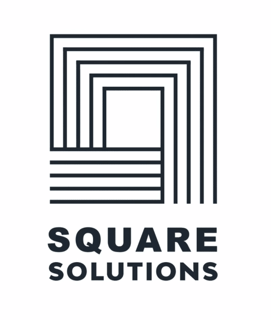
This too, has 2 points that can be greatly improved with design principles. First one being Contrast, in the logo type. Currently as it is, both words "SQUARE" and "SOLUTIONS" are in bold sans serif.
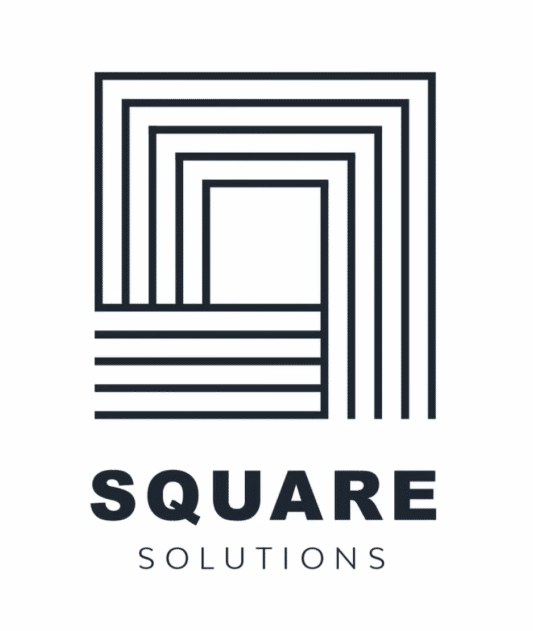
In the improved design, the designer has adjusted it so that the word "SQUARE" is in thick sans serif, and the word "SOLUTIONS" is in a thin sans serif. Thus, creating an interesting contrast and naturally creates visual appeal to the logo type.
Apart from the logo type, there is one more crucial point of improvement on the logo. Which is the logo mark that are made up of thin lines, placed close together. As it is currently, the lines would be too thin and detailed, and run the risk of becoming unrecognizable when scaled down.

Hence, using the design principle of Scale & Proportion, the lines in the logo mark is adjusted to be thicker and better spaced out. Also, on the top right of the image, the designer shows how both logo marks (before and after) would look like if it were to be scaled down. The one on the bottom (after adjustment) is definitely a lot better and safer when it is being used as a scaled down version, say for namecards etc.
There are a number of good before-after examples shared by Satori Graphics in his video, so do check it out if you're interested to dive more into it! :) ☆
After sharing a bunch of these before-after examples, I had the team try a little activity keeping design principles in mind, to do an improved design of a website (template design) that I picked up from Freepik, and provided an optional fictional brief info in case they would like to reference it.

As our team is made up of Japanese and international members, I've provided the fictional brief in both Japanese and English.
Here is a brief look at the designs the team has tried out with the after designs, within a short period of about 15-20 minutes :)
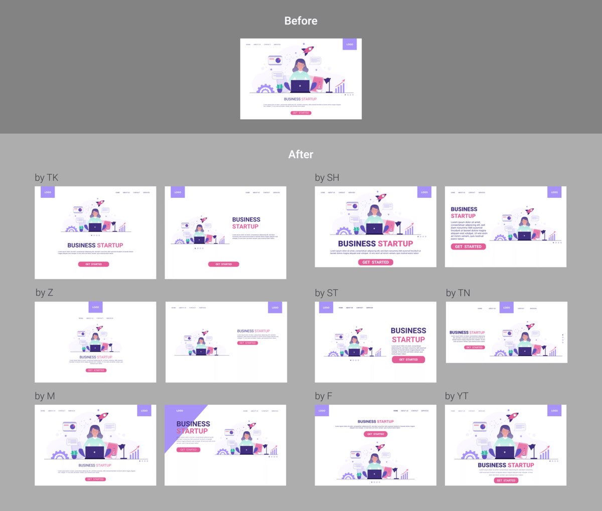
In overall, I think it is good seeing and learning from before-after designs, and trying it hands on with the team as a light exercise. Always interesting to see everyone's own interpretation to the same brief :)
I think there's always value in the smallest, basic things such as design principles, that helps make design that much better when we apply them effectively.
A huge shout out to Satori Graphics for this wonderful tutorial and many other good ones, they're very helpful as refreshers as well as easy to follow educational pieces. Always fun to keep learning and growing as a designer.
Till the next post! ;) ☆
::::::::::::::::::::::::::::::::::::::::::::::::::::::::::::::::::::::::::::::::::::::::::::::::::::::::::::::::::::::::::::
Header credits:
Template Design by asato
この記事が気に入ったらサポートをしてみませんか?