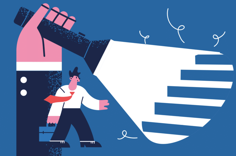
💬 Design Term:デザインシステムの導入を促すクリエーティブ・ブリーフを英語で書いてみた。

デザインシステムとは?
デザインシステムは現在テクノロジーの世界を席巻しています。Airbnb、IBM Carbon、Apple、Google、ShopifyによるPolaris、UBER —これらの企業はそれぞれ、一貫性のある認識可能な企業の声を反映したデザインシステムを通じて、すばらしいユーザーエクスペリエンスを構築してきました。そしてそのほかの多くの企業が独自のデザインシステムの使用に切り替えています。
UXPinが実行した2017〜 2018年のエンタープライズUX業界レポートで調査されたデザイナーの69%が、すでにデザインシステムを使用しているか、現在それを構築することを計画していると述べました。
デザインシステムをワークフローに取り込み込むと、繰り返し使用できるコンポーネントを最大限に活用し、仕事のスピード、効率性を向上させることができます。それにより他社との差別化を図り、ユーザー・エクスペリエンスを向上させることができます。
今回はデザインシステムの導入を促すクリエーティブ・ブリーフを英語で書いてものをご紹介いたします。
クリエーティブブリーフとは?
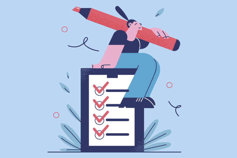
成功するクリエーティブプロジェクトは優れたデザイン・ブリーフの存在が不可欠ともいえます。これはクライアント、チーム全体をプロジェクトを成功に導く為に最も重要なドキュメント、またツールでもあります。
クライアントの期待値設定、目的の明確化、ターゲット、アウトカム、ユーザーに届けたい価値、差別化できる因等、最終的なゴールなど一見デザインには関係ないと思われるような、しかし欠かせない情報を端的にまとめたもの、これらをまとめたドキュメントをデザイン・ブリーフやクリエイティブ・ブリーフなどと呼びます。
キックオフ・ミーティングにおいてクライアントと、チームメンバーと方向性を定める事でその後のズレを避けるのが目的、またプロジェクトのロードマップのようなものとしてみられています。
デザイン・ブリーフは大抵1~2ページ程度の短いドキュメントで、そのプロジェクトにおける戦略などが解説されています。そのプロジェクトの目的を明確にした上で、ゴール達成のためのプランを開始するために必須の書類であると言えます。
下記の記事にもう少し詳しくデザイン・ブリーフの書き方について説明しています。
Design Brief:デザイン・ブリーフ
This document provides a brief description of the project. It outlines the objectives, audience, and assumptions for the project and details the creative concept the team intends to use moving forward. This document should accompany the materials for the Conceptual Design Review.
このドキュメントはプロジェクトの簡潔な概要を記述するために用います。プロジェクトの目的、対象者、仮定の要点をまとめ、プロジェクトチームが将来的に用いようと意図しているクリエイティブコンセプトを詳しく述べます。このドキュメントはコンセプトデザインレビューの資料として用いられます。
[参照記事]
https://blog.btrax.com/jp/brief/
Project Details:プロジェクトの詳細
Date:
記入日:
Prepared by:
制作者:
Phone:
電話番号:
Email:
メールアドレス:
Project name:
プロダクト名
Brief — A style guide and our component library
概要 — コンポーネントライブラリのスタイルガイド
Design Lead:
デザインリード
Product Manager:
プロダクト・マネジャー
Business Lead:
ビジネス・リード
Hand-off to Engineering: (mm/dd/yy)
エンジニアへの受け渡し日
Product Release: (mm/dd/yy)
プロダクト・リリース日
ビジネス概要とコンセプト
クライアントの提供しているビジネスに関する概要や、会社の歴史等を記述します。またこのプロジェクトのコアユーザーバリューを2文程度で簡潔に記述します。
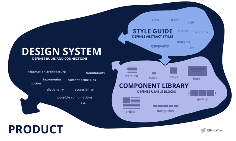
What is a design system?
デザインシステムとは?
An ever-evolving collection of reusable blocks and templates, guided by principles and rules that ensure consistency and speed, by being the single source of truth for product development.
デザインシステムとは、プロダクト開発の唯一の正しい情報源となることにより、一貫性と速度を保証する原則とルールに基づいて、再利用可能なブロックとテンプレートの進化し続けるコレクションのことです。
What's in a design system?
デザインシステムには何が含まれていますか?
プロジェクト予算
このセクションではプロジェクトに対して提供される予算及び時間を記述します。まだプロジェクトの予算、タイムラインが決まっていない場合
→ Budget – TBC
💡TBCとは、「To be confirmed」の略で、「確認中」「未定」を表す英語です。TBCに関連する表現として、「TBA (To be announced, 後日発表)」「TBD (To be determined, 未決定)」があります。
プロジェクトスケジュールと締め切りとゴール
このセクションではプロジェクトのスケジュールと最終締め切りを記述します。またビジネスと製品の目的あるいはゴールを記述します。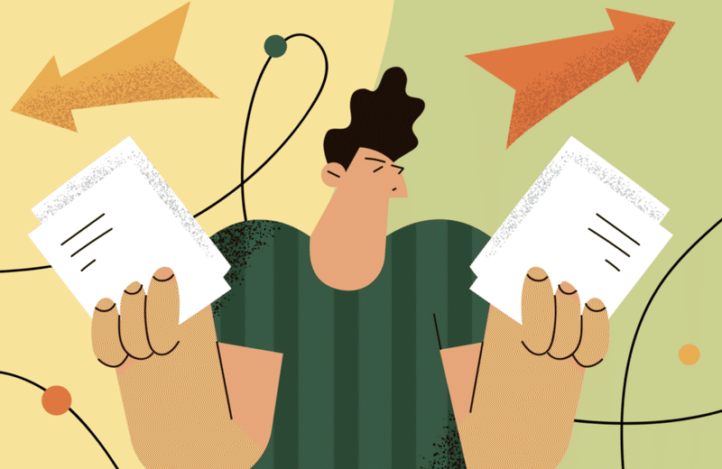
Our goals
私たちのゴール
1. Draft the "Company Name" digital standards by December 2021
1. 2021年12月までに[会社名]デジタル標準の草案を作成する
2. Unify the "Company Name" visual style by February 2022
2. 2022年2月までに[会社名]の視覚スタイルを統一する
3. Apply "Company Name" digital standards and visual style to all products and services currently on the market by September 2022
3. 2022年9月までに現在市場に出ているすべての製品とサービスに[会社名]デジタル標準と視覚スタイルを適用します。
4. "Company Name"'s design system is documented and made available to the public via a password-protected digital asset management platform by December 2022
4. [会社名]のデザインシステムは文書化され、2022年12月までにパスワードで保護されたデジタル資産管理プラットフォームを介して一般に公開されます。
スタイルガイドについて
What is a style guide?
スタイルガイドとは何ですか?
A document that gathers all elements of a brand’s visual style.
ブランドの視覚スタイルのすべての要素を集めたドキュメント。
“A one-stop place for the entire team—from product owners and producers to designers, writers, marketers, and developers—to reference when discussing site changes and iterations.”
「製品の所有者やプロデューサーからデザイナー、ライター、マーケター、開発者まで、チーム全体がサイトの変更や反復について話し合うときに参照できるワンストップです。」
— Susan Robertson, A List Apart
—スーザン・ロバートソン、A List Apart
It should constantly be updated to reflect a brand's visual style as it stretches and evolves to deliver new features, products, and services.
新しい機能、製品、サービスを提供するために拡大および進化するブランドの視覚スタイルを反映するように、常に更新する必要があります。
Why do we need one?
なぜ必要なのですか?
Consistency — a unified visual experience is one of the main qualities of brand identity that helps you create a trustful relationship with your audience.
一貫性—統一された視覚体験は、オーディエンスとの信頼できる関係を構築するのに役立つブランドアイデンティティの主要な品質の1つです。
Shared vocabulary — when a team has one document to refer to, work becomes truly collaborative.
共有語彙—チームが参照するドキュメントを1つ持っている場合、作業は真に共同作業になります。
Efficiency — It changes the pace of creation and innovation.
効率性—創造と革新のペースを変えます。
Onboarding — new designers or delivery partners can be involved in making design decisions from the very first day, improving efficiency.
オンボーディング—新しいデザイナーまたは配信パートナーは、最初の日から設計上の意思決定に関与して、効率を向上させることができます。
スタイルガイドとブランドガイドの違いについて
An important distinction
重要な違い
We must not confuse a style guide with a brand guide.
スタイルガイドとブランドガイドを混同しないでください。
A brand style or brand guidelines is a document listing correct usage of a brand’s name, logo, colours, imagery, and tone for marketing and PR purposes. This document is one element of a style guide.
ブランドスタイルまたはブランドガイドラインは、マーケティングおよびPRの目的で、ブランドの名前、ロゴ、色、画像、およびトーンの正しい使用法をリストしたドキュメントです。 このドキュメントは、スタイルガイドの1つの要素です。
While it can also be used by internal designers, it’s almost no help in creating digital interfaces.
内部のデザイナーも使用できますが、デジタルインターフェースの作成にはほとんど役立ちません。
コンポーネントライブラリについて
What is a component library?
コンポーネントライブラリとは何ですか?
A component library is a single repository that documents how a
brand's visual style has been applied to the building blocks used to design an app or website experience.
コンポーネントライブラリは、アプリやウェブサイトのエクスペリエンスを設計するために使用されるビルディングブロックにブランドの視覚スタイルがどのように適用されているかを文書化する単一のリポジトリです。
A component is constructed in two parts: how it looks (the UI) and how it works (the UX). Examples include buttons, accordions and input elements as well as more advanced components like headers, navigation and tab bars.
コンポーネントは、外観(UI)と動作(UX)の2つの部分で構成されます。 例としては、ボタン、アコーディオン、入力要素のほか、ヘッダー、ナビゲーション、タブバーなどのより高度なコンポーネントがあります。
The library is constructed in the same way a front-end developer would theme a website. It exists of atoms, molecules and organisms. If a new journey or page needs to be designed, you either pick the components from the library and combine them or create new components if needed.
ライブラリは、フロントエンド開発者がWebサイトをテーマにするのと同じ方法で構築されます。 それは原子、分子、生物で構成されています。 新しいジャーニーまたはページをデザインする必要がある場合は、ライブラリからコンポーネントを選択して組み合わせるか、必要に応じて新しいコンポーネントを作成します。
Why do we need one?
なぜ必要なのですか?
Code standardisation — it creates consistent HTML, CSS and JavaScript code so developers can follow the same standards designers do.
コードの標準化—一貫性のあるHTML、CSS、およびJavaScriptコードを作成するため、エンジニアはデザイナーと同じ標準に従うことができます。
Single source of truth — all the HTML, styling and logic can be found in one place. There are no variations implemented in different locations.
信頼できる唯一の情報源—すべてのHTML、スタイル、ロジックを1か所で見つけることができます。 さまざまな場所に実装されているバリエーションはありません。
Maintenance— it reduces the overhead that comes with maintaining multiple repositories. Updating components or adding new features is done once and will be reflected on every implementation of that component.
メンテナンス—複数のリポジトリのメンテナンスに伴うオーバーヘッドを削減します。コンポーネントの更新または新しい機能の追加は1回行われ、そのコンポーネントのすべての実装に反映されます。
Testing — it is easier to create a well thought out test suite for the components in the library when they are grouped and implemented in one place.
テスト—ライブラリ内のコンポーネントをグループ化して1つの場所に実装すると、よく考えられたテストスイートを簡単に作成できます。
現在の状態
Current state
Right now, we have:
現在、次のものがあります。
• No agreed standards for digital design and development
デジタル設計と開発に関する合意された基準はありません
• No single source of truth for digital design and development
デジタルデザインと開発の信頼できる唯一の情報源はありません
• No ability to easily outsource design
デザインを簡単に外部委託する機能がない
• Inconsistent design practices, we're actively designing contradicting experiences across all digital touchpoints
一貫性のないデザイン手法。すべてのデジタルタッチポイントで矛盾するエクスペリエンスを積極的にデザインしています。
• We're re-inventing the wheel for each new feature, product or service without guidelines to ensure the experience is considered as a whole
エクスペリエンスが全体として考慮されるように、ガイドラインなしで新しい機能、製品、またはサービスごとに車輪の再発明を行っています。
• The outcome of this?
これの結果は?
• An inconsistent visual style and experience
一貫性のない視覚スタイルとエクスペリエンス
機能しているデザイン例
What is working? Product name
何が機能していますか? プロダクト名
• Simple templates
シンプルなテンプレート
• Mobile friendly
モバイルフレンドリー
• Calm visual style
落ち着いた視覚スタイル
• A system for use of colour that is accessible
アクセス可能な色を使用するためのシステム
• Logical typographical hierarchy
論理的な活版印刷の階層
• Large touch targets
大きなタッチターゲット
• Gender neutral
ジェンダーニュートラル
What is working? Product name
何が機能していますか? プロダクト名
• Responsivecomponent-basedtemplates
レスポンシブコンポーネントベースのテンプレート
• Calm visual style
落ち着いた視覚スタイル
• A system for use of colour that is accessible
アクセス可能な色を使用するためのシステム
• New fonts that are digitally friendly (greater accessibility and faster to load)
デジタルフレンドリーな新しいフォント(アクセシビリティが向上し、読み込みが速くなります)
• A suite of consistent icons
一貫したアイコンのスイート
• Logical typographical hierarchy
論理的な活版印刷の階層
• Large touch targets
大きなタッチターゲット
• Clear primary and secondary buttons and CTAs
プライマリボタンとセカンダリボタン、およびCTAをクリアします
機会
Opportunities
• Lead the design through mobile-first experience
•モバイルファーストエクスペリエンスを通じてデザインを主導します。
• Identify a balance between illustrations and photography. CX research has shown that people want their experience to be more humanised and to see more photography/imagery. Consider the diversity of talent in imagery.
イラストと写真のバランスを特定します。 CXの調査によると、人々は自分の体験をより人間味のあるものにし、より多くの写真や画像を見たいと望んでいます。 画像の才能の多様性を考慮してください。
• Create a central and accessible library of icons and illustrations.
•アイコンとイラストの中央でアクセス可能なライブラリを作成します。
• This work will be the first cab off the rank. We will then start to iteratively roll out the visual style across other digital products and services.
•このデザインはランク外の最初のタクシーになります。次に、他のデジタル製品やサービス全体に視覚スタイルを繰り返し展開し始めます。
私も色々勉強中なので、皆さまのご意見・ご感想をお聞かせください。
お読み頂きまして、ありがとうございました。
メルボルンを拠点にプロダクトデザイナーとして働いています。 主にデジタル・プロダクトの制作に携わっています。
この記事が気に入ったらサポートをしてみませんか?