
Pythonライブラリ(可視化):Matplotlib

0.概要
Matplotlibは可視化用ライブラリです。グラフ化することで傾向が理解出来たり伝えたいことを一目で理解させることができます。
matplotlibでは様々な図がかけますが本記事では折れ線図をメインとして使用して「サクッときれいな図を複数作る」ことに重きを置いてます。
※結果の体裁は事前に調整しているため、見た目が異なることがあります
なおアニメーション(Gifなど)の作成は別記事にまとめております。
1.Matplotlibの概念
1-1.用語の説明
Matplotlibの各要素と位置関係の理解は重要です(下図参照)。
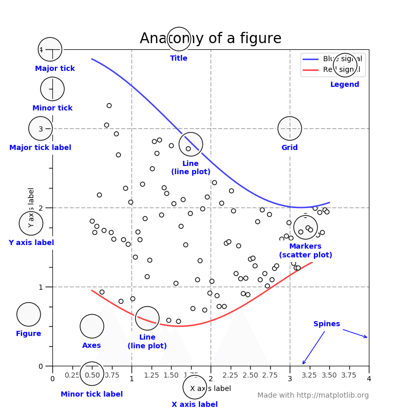
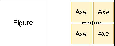
Figureという大きな台紙があり、その上にAxeを描写する感じです。
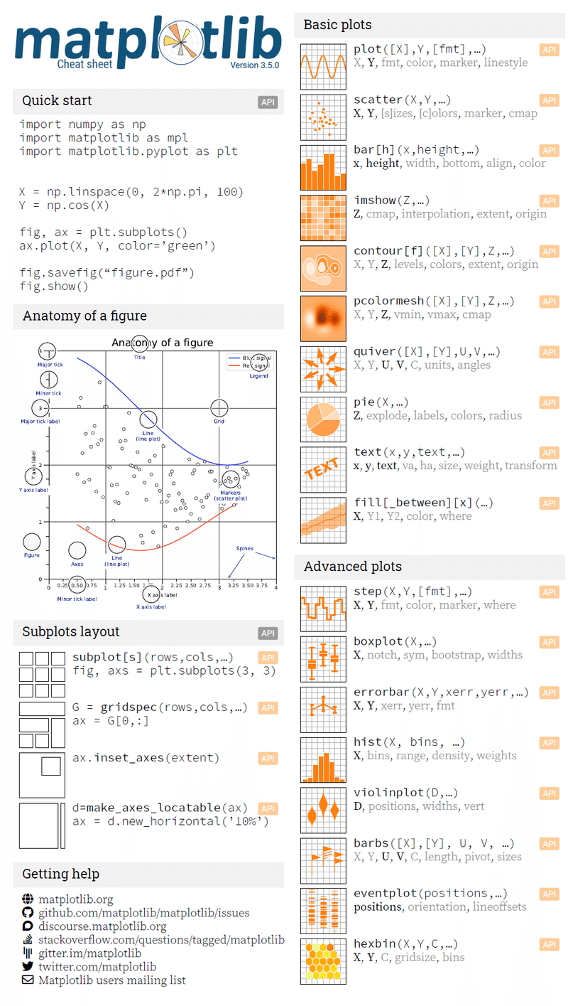
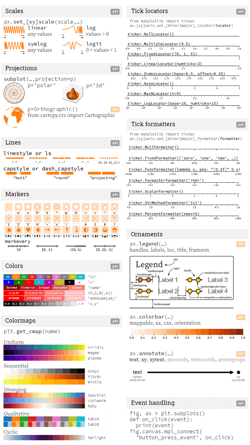
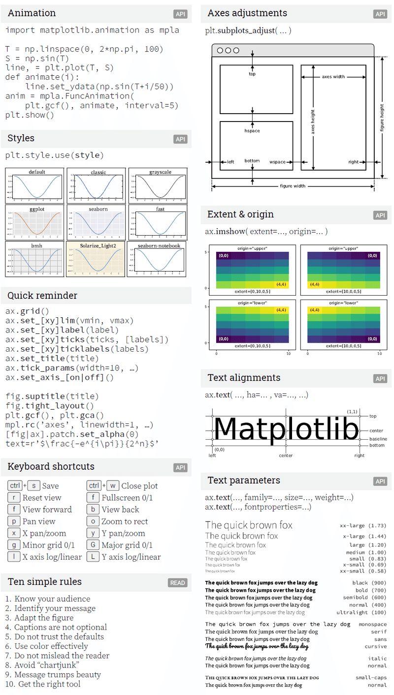
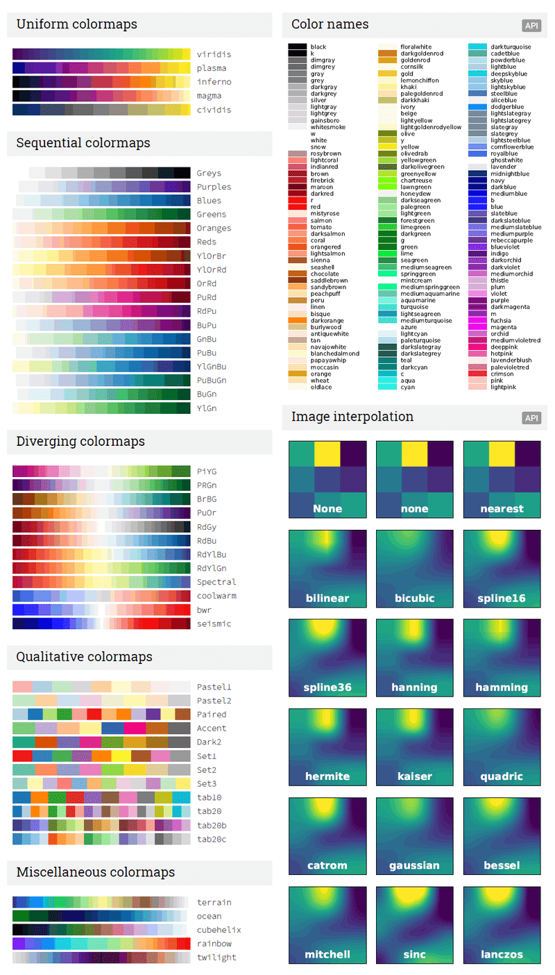
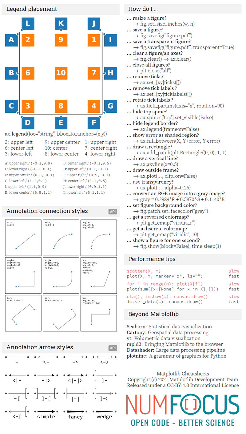
チートシートは「Cheatsheets for Matplotlib users」参照
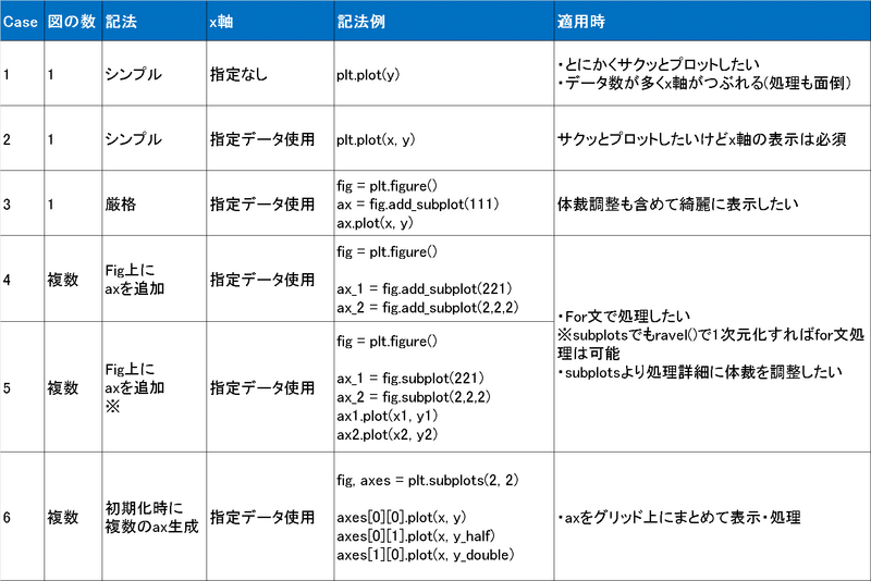
1-2.記法のまとめ
Matplotlibの記法は難しいうえにすぐ忘れるため自分用まとめです。
2.プロット用データ(説明用)
説明用データは下記のとおりです(乱数はnp.random.seed(0)使用)。
[In]
import numpy as np #線形代数を扱うライブラリ
np.random.seed(0) #numpyで生成するランダム値を固定=>再現性を確認できる。
x = np.linspace(0, 1, 11)
y = 2 * x + 0.1 * np.random.randn(11)

[Out]
[0.  0.1 0.2 0.3 0.4 0.5 0.6 0.7 0.8 0.9 1. ]
[0.17640523 0.24001572 0.4978738  0.82408932 0.9867558  0.90227221 1.29500884 1.38486428 1.58967811 1.84105985 2.01440436]
3.一つの図の作成
3-1.シンプルな記法
使用方法はコードの通りで、細かい説明は下記の通りです。
●使用時は import matplotlib.pyplot as plt で読み込む
●折れ線図かつx軸がデータ数(index番号)ならplt.plot(y)で出力できます。
(※サクッと時系列トレンドを出したいときに便利)
●x軸も正しく表示するならplt.plot(x, y)となります。
import matplotlib.pyplot as plt
import numpy as np

#計算用データ作成
np.random.seed(0) #numpyで生成するランダム値を固定=>再現性を確認できる。
x = np.linspace(0, 1, 11) #0から1までを11分割で作成
y = 2 * x + 0.1 * np.random.randn(11) #np.random.randnは標準正規分布のデータをランダムで取得:引数はデータ数

#プロット図作成
plt.plot(y) #plt.plotで折れ線図を作成
plt.show() #plt.show()で図を表示

#x軸も正しく表示するなら
plt.plot(x, y) #plt.plotで折れ線図を作成
plt.show()

[Out]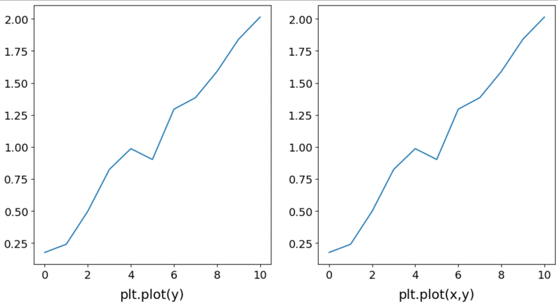
3-2.厳密な作成方法
単一の図であれば上記の記載方法で充分です。
#パターン1
fig = plt.figure(figsize=(6, 4)) #figureの土台を作る。figsize=(width, height)で土台のサイズを決めます。
ax = fig.add_subplot(111) # figureの土台の上に1行1列分のaxeを張り付けて1つ目をaxとする。
ax.plot(x, y)
plt.show()

#パターン2
fig, ax = plt.subplots(figsize=(6, 4)) #figureとaxeをまとめて作成, defaultはplt.subplots(1,1)
ax.plot(x, y)
plt.show()

[Out]
上記のplt.plot(x,y)と同じ図が出ます。
4.プロットを重ねた図を作成
プロットを重ねたい場合は同じfigまたはaxeにプロットを加えてください。
x = np.linspace(0, 1, 11)
y = 2 * x + 0.1 * np.random.randn(11)
y_half = 1/2*y
y_double = 2*y

#同じfigまたはaxの上にプロットする
plt.plot(x, y)
plt.plot(x, y_half)
plt.plot(x, y_double)
plt.show()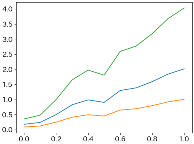
5.複数の図の作成:手動
5-1.fig.add_subplot()
figを作成して、figの上にaxを足していきます。
【作成の流れ】
1.plt.figure()でで土台を作る。
2.土台の上にfig.add_subplot()でプロット用の台紙を載せる
3.axにプロットデータを追加する。(例:ax.plot(x, y))
#プロットデータ作成
x = np.linspace(0, 1, 11)
y = 2 * x + 0.1 * np.random.randn(11)
y_half = 1/2*y
y_double = 2*y

#プロット
fig = plt.figure(figsize=(12, 8))

ax_1 = fig.add_subplot(221) #subplot(行列後のindex)は0ではなく1から開始
ax_2 = fig.add_subplot(2,2,2) #カンマで区切って記載しても問題ない
ax_3 = fig.add_subplot(2,2,3)

ax_1.plot(x, y)
ax_2.plot(x, y_half)
ax_3.plot(x, y_double)

ax_1.set_title('y@fig.add_subplot(221)'); ax_2.set_title('y_half@fig.add_subplot(2,2,2)'); ax_3.set_title('y_double@@fig.add_subplot(2,2,3)') #図にタイトルを付ける
plt.show()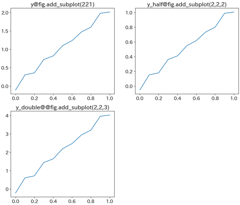
5-2.plt.subplots()
土台のfigureと記載する台のaxeをまとめて作成して、指定位置のaxeにデータをプロットします。
fig, axes = plt.subplots(2, 2, figsize=(14, 8))
print(f'axesの形状{axes.shape}, axesの数:{axes.shape[0]*axes.shape[1]}')

[Out]
axesの形状(2, 2), axesの数:4
この時点で下図のとおり、土台のfigureと2行2列のaxeが生成されている。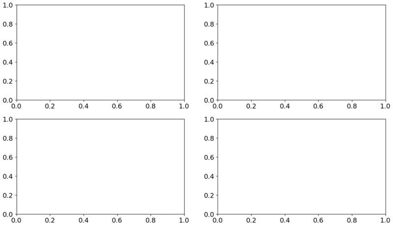
下記の通り位置の指定は2次元配列で実施します。
fig, axes = plt.subplots(2, 2, figsize=(20, 12))
axes[0][0].plot(x, y)
axes[0][1].plot(x, y_half)
axes[1][0].plot(x, y_double)

axes[0][0].set_title('y@axes[0][0] ->row:0, column:0'); axes[0][1].set_title('y@axes[0][1]->row:0, column:1'); axes[1][0].set_title('y_double@axes[1][0]->row:1, column:0') #図にタイトルを付ける
plt.show()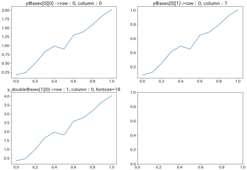
6.複数の図のfor文で作成
6-1.fig.add_subplot()
fig.add_subplotで作成したaxeを一度リストに格納して、プロットする時だけリストから読み出します。
fig = plt.figure(figsize=(12, 10))

figrow, figcol = 2, 2 #fig.add_subplotの行列を指定
axelist = [] #fig.add_subplotで作成したaxeを保管しておくリスト->編集時に呼び出す
y_datas = [y, y_half, y_double] #プロットしたいデータリスト:ここでは3種

for idx, data in enumerate(y_datas):
   axelist.append(fig.add_subplot(figrow, figcol, idx+1)) #リストの中に指定したaxeを追加
   axelist[idx].plot(x, data) #リストから呼び出したaxeにデータをプロット
   axelist[idx].set_title(f'fig.add_subplot({figrow}, {figcol}, {idx+1})', fontsize=16)

plt.show()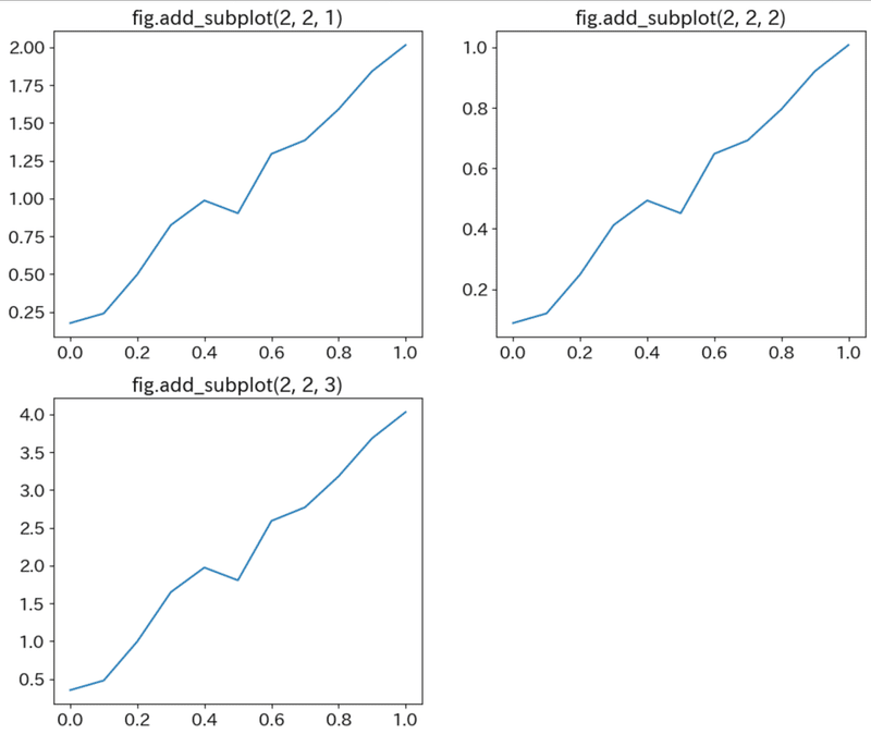
6-2.ax = fig.subplot()
fig.subplot(row, column, 番地)でi番目のax変数を取得してプロットする。
正直上のやつとの違いがわかってない。
fig = plt.figure(figsize=(12, 10))
figrow, figcol = 2, 2 #fig.add_subplotの行列を指定
y_datas = [y, y_half, y_double] #プロットしたいデータリスト:ここでは3種

for idx, data in enumerate(y_datas):
   ax = plt.subplot(figrow, figcol, idx+1)
   ax.plot(x, data) #リストから呼び出したaxeにデータをプロット
   ax.set_title(f'plt.subplot({figrow}, {figcol}, {idx+1})', fontsize=16)

plt.show()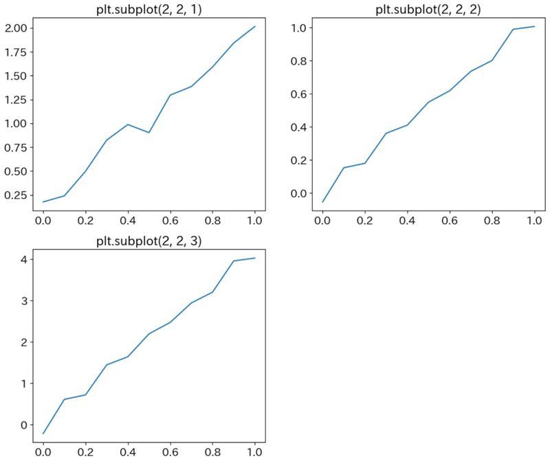
6-3.fig, axes = plt.subplots()->ravel()でaxesを1次元配列化
axesは2次元配列ですが、ravel()メソッドで1次元配列に変更できます。
fig, axes = plt.subplots(2, 2, figsize=(18, 11))
y_datas = [y, y_half, y_double]

for idx, data in enumerate(y_datas):
   axes.ravel()[idx].plot(x, data)
   axes.ravel()[idx].set_title(f'ravel(){idx}のプロット', fontsize=20) #タイトルを付ける
plt.show()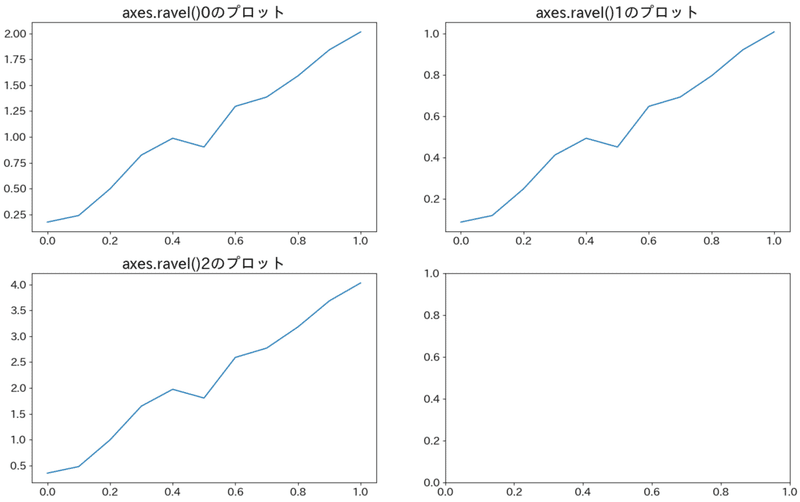
7.データの装飾1:全体
7-1.日本語を使用:japanize-matplotlib()
plt.style.use()後に文字化けがでたらjapanize_matplotlib.japanize()
#インストール
pip install japanize-matplotlib
#使用方法:下記を書くだけ
import japanize_matplotlib
# japanize_matplotlib.japanize() #文字化けが治らないときの対策用
7-2.グラフの表示設定を変える:plt.style.use('style')
Figureを呼び出す前にplt.style.use('style')を記載する。どのようなスタイルがあるかは公式Style sheets referenceを参照のこと。
※体裁はいじっています。fastとseaborn-brightは表示がおかしい??
styles = ['default', 'ggplot', 'seaborn-whitegrid', 'dark_background', 'seaborn-bright', 'fast']

for style in styles:
   plt.style.use(style)
   import japanize_matplotlib #plt.style.use()はfontを指定するためをplt.style.use()より後にjapanize_matplotlibを呼ぶ。
   plt.plot(x, y)
   plt.title(f'{style}')
   plt.show()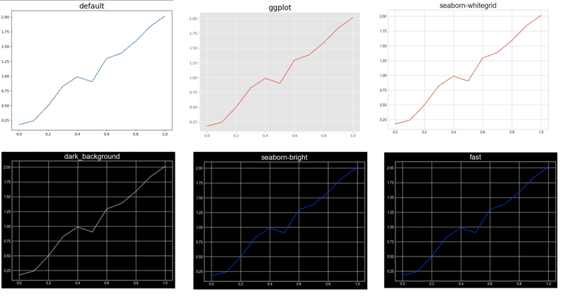
8.データの装飾2:体裁の調整
8-1.図の体裁をまとめて修正:plt.rcParams(編集項目)
plt.rcParams["font.family"] = "Arial" #図のフォントを修正
plt.rcParams["font.size"] = 14 #フォントサイズを修正

plt.rcParams.update(plt.rcParamsDefault) #設定値のリセット
8-2.凡例を枠外の右上に持ってくる:plt.legend()の引数で調整
plt.legend(bbox_to_anchor=(1.05, 1), loc='upper left', borderaxespad=0, fontsize=18)8-3.タイトルを下中央に持ってくる:plt.title()の引数で調整
plt.title('ここにタイトルを入力します。',loc='center', y=-0.15)8-4.figやaxeの背景色変更:patch.set_xxx()
fig.patch.set_facecolor('white')  # 図全体の背景色
fig.patch.set_alpha(0.5)  # 図全体の背景透明度
ax.patch.set_facecolor('black')  # subplotの背景色
ax.patch.set_alpha(0.3)  # subplotの背景透明度
8-5.複数図を作成時の重なり防止
#隣接オブジェクトとぶつからないようにする。
plt.tight_layout()
#隣のaxeとの距離を手動で調整
plt.subplots_adjust(wspace=0.8) #縦方向はhspace
8-6.y軸の表記を指数・通常表記に変換
# 指数表記から普通の表記に変換
plt.ticklabel_format(style='plain',axis='y') #style='plain':普通の表記, style='sci':指数表記
8-7.複数プロットの全体タイトル:plt.suptitle()
plt.show()の前に下記を記載。(引数のcolorは参考用)
plt.suptitle('plt.suptitle(引数で)全体タイトルが記載できます。', color='green')
[Out]
5-1.のplt.show()の上に上記を記載した結果が下図です。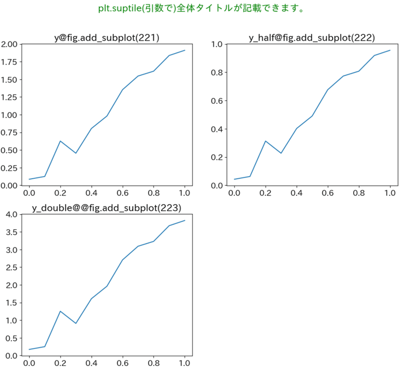
9.データの装飾3:プロット(fig, axe)
どこに何があるかは1.Matplotlibの概念の図を参照。シンプル図(plt.plot)とaxの図(fig.add_subplot)では記載方法が異なるため要注意です。
9-1.シンプル図
下図のとおりに装飾ができます。
#上記と同じデータ群
x, y, y_half, y_double = np.linspace(0, 1, 11), 2 * x + 0.1 * np.random.randn(11) , 1/2*y, 2*y

#プロットデータ
plt.figure(figsize=(12,6))
plt.plot(x, y, label='凡例内のラベル1', linestyle='dashed', c='red', linewidth=5) #線のスタイル、幅、色を調整
plt.plot(x, y_double, label='凡例内のラベル2')

#タイトル及びラベル
plt.title('図のタイトルを記載します。', loc='center', y=-0.2)
plt.xlabel('x軸の名前を記載してください。')
plt.ylabel('y軸の名前を記載してください。')

#軸データ・凡例・グリッド
plt.ylim(0, 5) #軸の最小値・最大値を設定できます。x軸はplt.xlim()です。
plt.xticks([0.0, 0.1, 0.2, 0.3, 0.4, 0.5, 0.6, 0.7, 0.8, 0.9, 1.0]) #x軸の数値幅を設定。リストやnumpyのarray形式で数値を渡す必要があります。
plt.grid() #グリッド表示
plt.legend() #凡例を表示
plt.show()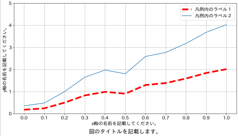
9-2.axeの図
axの場合はメソッドの頭にset_を付けます(参考までに散布図使用)。
#figとaxe作成
fig = plt.figure(figsize=(12,6))
ax = fig.add_subplot(111)

#データプロット
ax.plot(x, y_double, label='ラベル1')
ax.scatter(x, y, label='ラベル2', s=50, c='green', marker='^', alpha=0.5, edgecolors='black') #別図も重ねて表記可能。サイズ:s, 色:c, マーカー形状:marker、透過度:alphaを調整, 線の色:edgecolors

#axeの体裁調整
ax.set_title('図のタイトルを記載します。', loc='center', y=-0.2)
ax.set_xlabel('x軸の名前を記載してください。')
ax.set_ylabel('y軸の名前を記載してください。')
ax.set_ylim(0, 5) #軸の最小値・最大値を設定できます。x軸はax.xlim()です。
ax.set_xticks([0.0, 0.1, 0.2, 0.3, 0.4, 0.5, 0.6, 0.7, 0.8, 0.9, 1.0]) #x軸の数値幅を設定
ax.grid() #グリッドを表示
ax.legend() #凡例を表示
plt.show()

[Out]
下図参照
なおaxの体裁はax.set()により記載できシンプルになります。(結果は同上)
#figとaxe作成
fig = plt.figure(figsize=(12,6))
ax = fig.add_subplot(111)
#データプロット
ax.plot(x,y, label='ラベル1')
ax.scatter(x, y_double, label='ラベル2', s=50, c='green', marker='^', alpha=0.5, edgecolors='black') #別図も重ねて表記可能。サイズ:s, 色:c, マーカー形状:marker、透過度:alphaを調整, 線の色:edgecolors
#axeの体裁調整
ax.set(title='図のタイトルを記載します。',
       xlabel='x軸の名前を記載してください。',
       ylabel='y軸の名前を記載してください。',
       ylim=[0,5],
       xticks=[0.0, 0.1, 0.2, 0.3, 0.4, 0.5, 0.6, 0.7, 0.8, 0.9, 1.0])

ax.grid() #グリッドを表示
ax.legend() #凡例を表示
plt.show()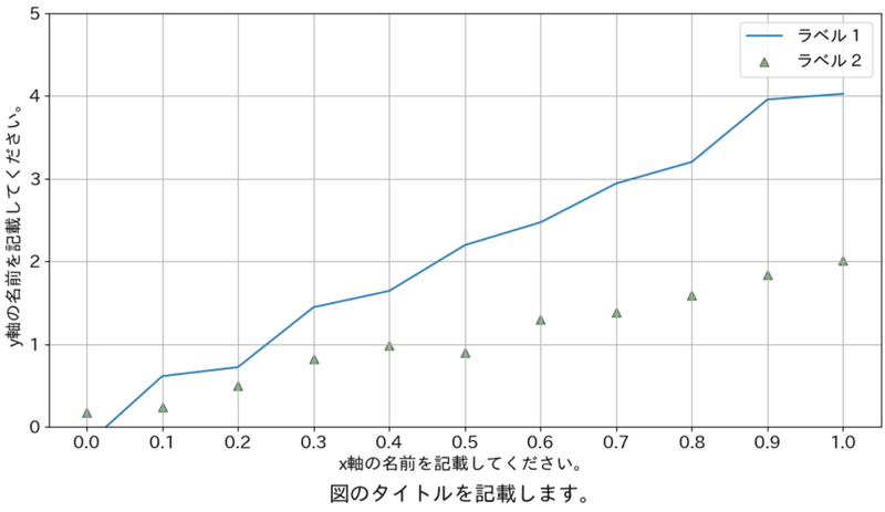
10.データ保存
plt.savefig(filepath.拡張子)で保存できます。
plt.savefig('保存したいファイル名.png') #plt.savefig()はplt.show()より前に記載する必要あり
plt.show()
参考資料
資料1.Matplotlib関連
資料2.実用例
資料3.チートシート
あとがき
自分用では十分なのでとりあえずこのくらいで・・・・、今後は製作時間メモっておこう・・・・
この記事が気に入ったらサポートをしてみませんか?