Photo by
shinsukesugie
Flutter アプリ開発の道 〜その⑦_3 マテリアルデザイン ボタン編〜

前回はマテリアルデザイン アイコン編についての記事を書きました。
今回もマテリアルデザインについての続きの記事です。
3回目はボタンに理解していこうと思います。
デザイナーがいなくてもデザインがイケてるアプリを作成できることを目指します。
ボタン(Button)の種類
基本的なボタンの種類は大体以下の4つになるかと思います。
・TextButton
・OutlinedButton
・ElevatedButton
・ToggleButtons
各種ボタンの表示を確認する
前回と同じサンプルプロジェクトを利用して理解を深めます。
サンプルプロジェクト作成方法は以前紹介しました。
・
・
・
 @override
 Widget build(BuildContext context) {
   return Scaffold(
     ・
     ・
     ・
     body: Center(
       ・
       ・
       ・
       child: Column(
         ・
         ・
         ・
         children: <Widget>[
           const Text(
             'You have pushed the button this many times:',
           ),
           Text(
             '$_counter',
             style: Theme.of(context).textTheme.headline4,
           ),
         ],
         ・
         ・
         ・
↓の部分のコードを変更して検証していきます。
children: <Widget>[
  const Text(
    'You have pushed the button this many times:',
  ),
  Text(
    '$_counter',
    style: Theme.of(context).textTheme.headline4,
  ),
],
TextButton
テキストのみのボタンです。(旧バージョンではFlatButtonという名前でした)
TextButtonを3種類ほど表示されるように実装します。
children: <Widget>[
  TextButton(
    onPressed: (){
      print("button1");
    },
    child: Text('ボタン1')
  ),
  // 文字に色を付ける
  TextButton(
    style: TextButton.styleFrom(
      primary: Colors.red,
    ),
    onPressed: (){
      print("button2");
    },
    child: Text('ボタン2'),
  ),
  // アイコンを付ける
  TextButton.icon(
    icon: Icon(Icons.add),
    onPressed: (){
      print("button3");
    },
    label: Text('ボタン3')
  ),
  const Text(
    'You have pushed the button this many times:',
  ),
  Text(
    '$_counter',
    style: Theme.of(context).textTheme.headline4,
  ),
],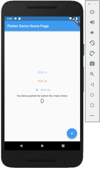
↑のように表示されました。
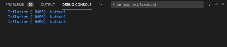
ボタンを押すとエディタのデバックコンソールにログが出ます。
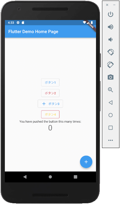
OutlinedButton
ボーダーが付いたボタンです。(旧FlutterバージョンではOutlineButtonという名前でした)
OutlinedButtonを4種類ほど表示されるように実装します。
children: <Widget>[
  OutlinedButton(
    onPressed: (){
      print("button1");
    },
    child: Text('ボタン1')
  ),
  // 文字に色を付ける
  OutlinedButton(
    style: OutlinedButton.styleFrom(
      primary: Colors.red,
    ),
    onPressed: (){
      print("button2");
    },
    child: Text('ボタン2'),
  ),
  // アイコンを付ける
  OutlinedButton.icon(
    icon: Icon(Icons.add),
    onPressed: (){
      print("button3");
    },
    label: Text('ボタン3')
  ),
  // 枠と文字の色を付ける
  OutlinedButton(
    style: OutlinedButton.styleFrom(
      primary: Colors.yellow,
      side: const BorderSide(
        color: Colors.pink,
      )
    ),
    onPressed: (){
      print("button4");
    },
    child: Text('ボタン4')
  ),
  const Text(
    'You have pushed the button this many times:',
  ),
  Text(
    '$_counter',
    style: Theme.of(context).textTheme.headline4,
  ),
],
表示は↓のようにされました。
ElevatedButton
立体的なボタンです。(旧FlutterバージョンではRaisedButtonという名前でした)
使い勝手が一番よさそうです。
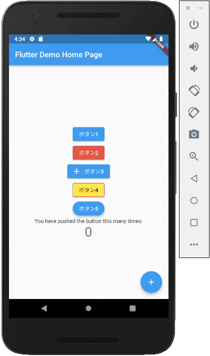
ElevatedButtonを5種類ほど表示されるように実装します。
children: <Widget>[
  ElevatedButton(
    onPressed: (){
      print("button1");
    },
    child: Text('ボタン1')
  ),
  // 背景色を付ける
  ElevatedButton(
    style: ElevatedButton.styleFrom(
      primary: Colors.red,
    ),
    onPressed: (){
      print("button2");
    },
    child: Text('ボタン2'),
  ),
  // アイコンを付ける
  ElevatedButton.icon(
    icon: Icon(Icons.add),
    onPressed: (){
      print("button3");
    },
    label: Text('ボタン3')
  ),
  // 枠と文字の色を付ける
  ElevatedButton(
    style: ElevatedButton.styleFrom(
      primary: Colors.yellow,
      side: const BorderSide(
        color: Colors.pink,
      )
    ),
    onPressed: (){
      print("button4");
    },
    child: Text('ボタン4')
  ),
  // ボタンの形を変更
  ElevatedButton(
    style: ElevatedButton.styleFrom(
      // 影のサイズ
      elevation: 5,
      // 角を丸くする
      shape: RoundedRectangleBorder(
        borderRadius: BorderRadius.circular(50.0),
      )
    ),
    onPressed: (){
      print("button5");
    },
    child: Text('ボタン5')
  )
  const Text(
    'You have pushed the button this many times:',
  ),
  Text(
    '$_counter',
    style: Theme.of(context).textTheme.headline4,
  ),
],
表示は↓のようにされました。
ToggleButtons
複数ボタンをグループでON,OFFの制御をすることができます。
class _MyHomePageState extends State<MyHomePage> {
var _isSelectedList = <bool>[true, false, false];
・
・
・
children: <Widget>[
ToggleButtons(
// ON,OFFの指定
isSelected: _isSelectedList,
// ボタンが押されたとき
onPressed: (index){
setState(() {
_isSelectedList[index] = !_isSelectedList[index];
});
},
children: const [
Padding(
padding: EdgeInsets.all(5.0),
child: Text('ボタン1'),
),
Padding(
padding: EdgeInsets.all(10.0),
child: Text('ボタン2'),
),
Padding(
padding: EdgeInsets.all(20.0),
child: Text('ボタン3'),
),
],
),
const Text(
'You have pushed the button this many times:',
),
Text(
'$_counter',
style: Theme.of(context).textTheme.headline4,
),
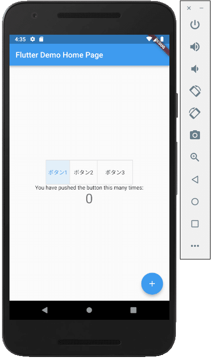
],表示は↓のようにされました。
ボタンを複数選択状態にすることができます。
ボタンの制御は、開発の基本になるのでしっかり理解を深めたいです。
この記事が気に入ったらサポートをしてみませんか?