
Photo by
hamahouse
Flutter アプリ開発の道 〜その⑦_2 マテリアルデザイン アイコン編〜

前回はマテリアルデザイン テキスト編についての記事を書きました。
今回も前回に続きマテリアルデザインについての続きの記事です。
2回目はSystem iconsのアイコンを理解していこうと思います。
System iconsを利用することで自前でリソース作成・準備しなくてもアプリが開発できます。
デザイナーがいなくてもデザインがイケてるアプリを作成できることを目指せます。
System iconsの理解
System icons を理解して利用する為に、以下の公式のドキュメントをまずは一読しましょう。
https://material.io/design/iconography/system-icons.html#design-principles
System iconsで利用できるアイコン一覧
利用できるアイコンは、Googleフォントの公式サイトに記載されています。
https://fonts.google.com/icons
System iconsをサンプルプロジェクトで理解する
前回と同様にサンプルプロジェクトを利用して理解を深めていきましょう。
・
・
・
 @override
 Widget build(BuildContext context) {
   return Scaffold(
     ・
     ・
     ・
     body: Center(
       ・
       ・
       ・
       child: Column(
         ・
         ・
         ・
         children: <Widget>[
           const Text(
             'You have pushed the button this many times:',
           ),
           Text(
             '$_counter',
             style: Theme.of(context).textTheme.headline4,
           ),
         ],
         ・
         ・
         ・
↓の部分のコードを変更して検証していきます。
children: <Widget>[
const Text(
'You have pushed the button this many times:',
),
Text(
'$_counter',
style: Theme.of(context).textTheme.headline4,
),
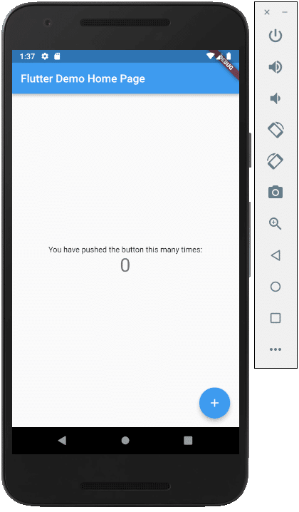
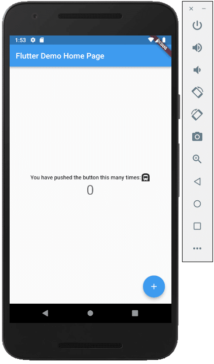
],サンプルプロジェクトのデフォルト表示は↓になります。
1行目にアイコンを挿入してみます。
挿入するアイコンは、なんとなくですが、好きな地下鉄のアイコン(Icon.subway)をチョイスしました。
children: <Widget>[
  const Icon(Icons.subway),
  const Text(
    'You have pushed the button this many times:',
  ),
  Text(
    '$_counter',
    style: Theme.of(context).textTheme.headline4,
  ),
],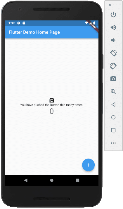
地下鉄のアイコンが表示されました。
アイコンのサイズを変更してみます。
children: <Widget>[
  const Icon(Icons.subway, size: 70,),
  const Text(
    'You have pushed the button this many times:',
  ),
  Text(
    '$_counter',
    style: Theme.of(context).textTheme.headline4,
  ),
],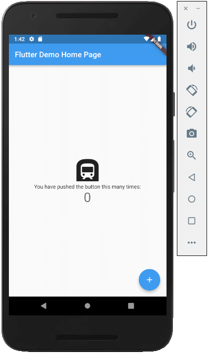
サイズが変更されました。
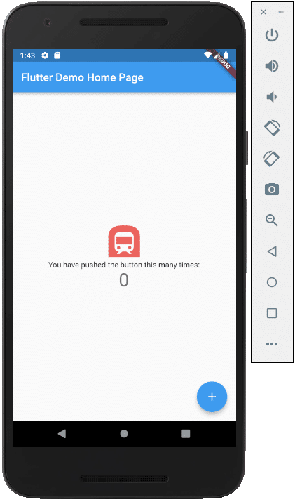
色も変更してみます。
children: <Widget>[
  const Icon(Icons.subway, size: 70, color: Colors.redAccent,),
  const Text(
    'You have pushed the button this many times:',
  ),
  Text(
    '$_counter',
    style: Theme.of(context).textTheme.headline4,
  ),
],
RichTextを利用して文字列の中に並べることも可能です。
@override
Widget build(BuildContext context) {

  final textTheme = Theme.of(context).textTheme;
  ・
  ・
  ・
    children: <Widget>[
      RichText(
        text: TextSpan(
          children: [
            TextSpan(
              text : 'You have pushed the button this many times:',
              style: textTheme.bodyText1
            ),
            const WidgetSpan(
              alignment: PlaceholderAlignment.middle,
              child : Icon(Icons.subway)
            ),
          ]
        ),
      ),
      Text(
        '$_counter',
        style: Theme.of(context).textTheme.headline4,
      ),
    ],
FlutterのMaterialコンポーネントを少しずつ理解していきましょう。
この記事が気に入ったらサポートをしてみませんか?