
Flutter アプリ開発の道 〜その⑦_1 マテリアルデザイン テキスト編〜

前回はVSCodeでの開発環境セットアップ方法の記事を書きました。
今回からマテリアルデザインについて理解していこうと思います。
自分自身にデザイン力がないとUIのイケてるアプリが作れないと思うかもしれません。
Googleのマテリアルデザインを理解することで自分自身のデザイン力やデザイナーがいなくてもイケてるアプリを作成できることを目指します。
マテリアルデザイン1回目はテキストの制御をお題にします。
事前準備
サンプルプロジェクトを用意します。
サンプルプロジェクト作成方法は以前紹介しました。
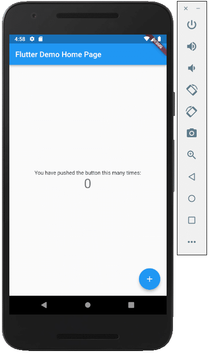
サンプルプロジェクトを実行した時の表示は↓のようになると思います。
その時のソースコードは↓のようになっていると思います。
・
・
・
 @override
 Widget build(BuildContext context) {
   return Scaffold(
     ・
     ・
     ・
     body: Center(
       ・
       ・
       ・
       child: Column(
         ・
         ・
         ・
         children: <Widget>[
           const Text(
             'You have pushed the button this many times:',
           ),
           Text(
             '$_counter',
             style: Theme.of(context).textTheme.headline4,
           ),
         ],
         ・
         ・
         ・
今回は↑のTextの定義の部分を変更して検証していこうと思います。
const Text(
  'You have pushed the button this many times:',
),
TextStyleの理解
テキストの制御にはTextStyleを理解する必要があります。
以下の公式のドキュメントをまずは一読しましょう。
https://api.flutter.dev/flutter/painting/TextStyle-class.html
わからないことがあった場合はこのドキュメントから調べるようにします。
TextStyleの適用①
TextStyleを適用することでテキスト制御ができます。
↓のようにソースコードを変更して表示を確認してみます。
const Text(
'You have pushed the button this many times:',
style: TextStyle(
color: Colors.redAccent,
fontWeight: FontWeight.bold,
fontStyle: FontStyle.normal,
decoration: TextDecoration.none,
fontSize: 20
),
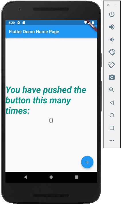
),表示が↓のように変化したことが確認できます。
フォントサイズやカラーが制御できることがわかります。

TextStyleを定義して利用する
TextStyleのStyleを定義しておいてその定義を利用することも可能です。
色々な箇所で同じStyle定義を再利用したい場合に有効です。
@override
Widget build(BuildContext context) {

  const textStyle = TextStyle(
    color: Colors.redAccent,
    fontWeight: FontWeight.bold,
    fontStyle: FontStyle.normal,
    decoration: TextDecoration.none,
    fontSize: 20
  );
  ・
  ・
  ・
  children: <Widget>[
    const Text(
      'You have pushed the button this many times:',
      style: textStyle,
    ),
    ・
    ・
    ・
TextStyleの適用②
↓のようにTextStyleの中身を変更して表示の変化を確認してみます。
const Text(
  'You have pushed the button this many times:',
  style: TextStyle(
    color: Colors.redAccent,
    fontWeight: FontWeight.bold,
    fontStyle: FontStyle.italic,
    decoration: TextDecoration.none,
    fontSize: 40
  ),
),
Property(プロパティ)の定義
行数や文字の省略といった制御もpropertyの定義を利用することで可能です。
最大行数を1行にして、長い場合は文末を省略するProperty定義を追加します。
const Text(
  'You have pushed the button this many times:',
  maxLines: 1,
  overflow: TextOverflow.ellipsis,
  style: TextStyle(
    color: Colors.redAccent,
    fontWeight: FontWeight.bold,
    fontStyle: FontStyle.italic,
    decoration: TextDecoration.none,
    fontSize: 40
  ),
),
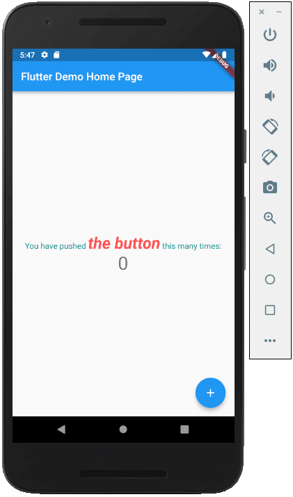
RichText(リッチテキスト)
RichTextを利用する実装方法も可能です。
利用状況に応じて使いわけると良いと思います。
@override
Widget build(BuildContext context) {

  const textStyle1 = TextStyle(
    color: Colors.teal,
    fontWeight: FontWeight.normal,
    fontStyle: FontStyle.normal,
    decoration: TextDecoration.none,
    fontSize: 15
  );

  const textStyle2 = TextStyle(
    color: Colors.redAccent,
    fontWeight: FontWeight.bold,
    fontStyle: FontStyle.italic,
    decoration: TextDecoration.none,
    fontSize: 30
  );
  ・
  ・
  ・
  children: <Widget>[
    RichText(
      text: const TextSpan(
        children: [
          TextSpan(text : 'You have pushed ', style: textStyle1),
          TextSpan(text : 'the button', style: textStyle2),
          TextSpan(text : " this many times:", style: textStyle1)
        ]
      ),
    ),
    ・
    ・
    ・
テキストの制御は、開発の基本になるのでしっかり理解を深めましょう。
この記事が気に入ったらサポートをしてみませんか?