💬 Design Term #デザイナー英語#ブランド戦略 – ブランドの方向性を決めよう!英語で書いてみました。

1. 「プロダクト」と「ブランド」の違い
「プロダクト」と「ブランド」、この二つの言葉は混同して使われますが、明らかに違う意味を持つ言葉です。
「プロダクト」が発売された段階ではまだそれは「名前」でしかありません。顧客がプロダクトを利用し、機能、またサービスを経験した上で、顧客のその商品に対するイメージや評価の蓄積がプロダクトを利用し、機能、またサービスを経験した上で、顧客のその商品に対するイメージや評価の蓄積が「ブランド」の実体を形成していきます。
これが好意的に捉えられているなら、「ブランド価値」があると言えます。こうなれば多少価格が高くても「やっぱりこのブランドがいい」というような、顧客の望ましい態度や行動を引き出していけます。つまりブランドとは、顧客が感じる「機能的価値」+「情緒的価値」の合算で表すことができます。

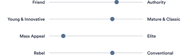
2. ブランドの方向性を決める
ブランドの方向性は、目指す理想の未来像、何を究極の価値とするかを考えることで決まってくるものです。 どんな人にどんな商品やサービスを提供し、どうなってもらうことが最高の価値となるのかを明確にすることです。
今回は、簡単な英語でのMVBブランドの方向性を決めた時の例文をご紹介いたします。
💡MVBとは?
MVBとは、ブランドの中で、必要な視覚的アセットのみを備えた明確な戦略と感情的なメッセージを備えたブランドです。これにより、ビジョンを完全に表現し、アーリー・アダプターを引き付けることができます。また一般的には、「顧客価値があるブランド」と考えられています。
こちらの記事で簡単なMVBのステップ、また英語でブランド・ダイレクションを説明したときの例文をご紹介しています。
3. ブランドの方向性の書き方
ブランドは単なるロゴではありません。それはブランドがコミュニティとつながり、関与する方法を表します。一貫性のあるブランドを維持することで、ブランドを永続的なつながりを築くことができます。ここではブランドの個性と視覚スタイルを書き方をご紹介します。
まずは全体的なブランドの印象を決めていきます。
Overland Brand Direction
オーランドブランドの方向性
Overview
概要
The brand direction is bold, empowering, trustworthy. The brand will appeal to all the different user types and their own personal experiences with disabilities, regardless of how much it impacts their day to day life.
ブランドの方向性は大胆で、力を与え、信頼できるものです。 このブランドは、日常生活にどれほどの影響を与えるかに関係なく、さまざまなユーザータイプと障害を持つ個人的な体験すべてにアピールします。
A world where people with disabilities and their supporters can easily access information that helps them enjoy their right to be fully participating citizens on an equal basis with others.
障害者とその支援者が、他者と平等に市民として完全に参加する権利を享受するのに役立つ情報に簡単にアクセスできる世界。
4. ブランドについて
About
アバウト
We’re a safe, practical resource for people with Overland their families.
私たちは、オーバーランドの人々とその家族にとって安全で実用的なリソースです。
We equip people with tools and provide support where they live, work, play and learn.
人々にツールを装備し、彼らが心地よく生活、仕事、遊び、そして学ぶ場所を提供、サポートします。
We empower people to achieve their best possible life and a place to feel included as they go through life.
私たちは、人々が人生を歩むときに、可能な限り最高の人生と、包摂されていると感じる場所を実現します。
5. ブランド戦略
Our Vision
私たちのビジョン
A world where people with disabilities and their supporters can easily access information that helps them enjoy their right to be fully participating citizens on an equal basis with others.
障害者人とその支援者が、他の人と平等に市民として完全に参加する権利を享受するのに役立つ情報に簡単にアクセスできる世界。
3 Core Values
3つのコアバリュー
1. Trust 2. Inclusivity 3. Person-Centred
1.信頼 2.包括性 3.人中心
Our Brand Strategy
ブランド戦略
Provide trusted, credible and engaging information using a technology solution that meets as many needs as it can throughout the life course .ライフコース全体で可能な限り多くのニーズを満たすテクノロジーソリューションを使用して、信頼できる、信頼できる魅力的な情報を提供します。
6. パーソナリティ特性
パーソナリティ特性(personality trait) を簡単にいえば、「個人を特徴づけるところの思考、 感情、行為に関する、種々の状況を越えて比較的持続的に見られるパターン、また傾向性を表します。
例えば、オーバーランドは、
→ 誠実性、信頼され、自信を持って情報の提供をします。
→ 誠実で正直で、革新的である
→ 多種多様な人口統計をターゲットにしている
7. トーン・オブ・ボイス
👉 トーン・オブ・ボイスとは、話し言葉や書き言葉などの言葉を通してビジネスの特徴を伝えること手段です。 言葉の内容ではなく、むしろ読んだ人や聞いた人全ての印象に残る話し方のことです。 つまり、良いトーン・オブ・ボイスは合理的で楽しいマーケティングを実現する方法なのです。
Tone of Voice
声のトーン
Our aim is to create a personal and intimate relationship between the user and us.
私たちの目的は、ユーザーと私たちの間に個人的で親密な関係を築くことです。
To help achieve this, we utilise the appropriate language through content and messaging to end users.
これを実現するために、コンテンツとエンドユーザーへのメッセージングを通じて適切な言語を利用しています。
Voice Tenets
声の原則または信念
The guidelines we follow when approaching the language direction within the application is as follows:
アプリケーション内で言語の方向性に取り組む際に従うガイドラインは次のとおりです。
→ Confident
自信がある
→ Simplistic
シンプルである
→ Knowledgable
知識豊富である
8. アクセシビリティ
Accessibility
アクセシビリティ
Use only the colour combinations that meet the AA standard in the table to the right. This text colour will ensure that all our communications are clear and legible.
右の表のAA基準を満たす色の組み合わせのみを使用してください。 このテキストの色は、すべてのコミュニケーションが明確で読みやすいことを保証します。
the WCAG 2.0 contrast ratio formula ensuring a ratio of at least 3:1 for AA headlines, 4.5:1 for AA body copy, 4.5:1 for AAA headlines and 7:1 AAA body copy.
WCAG 2.0コントラスト比の式により、AAヘッドラインで少なくとも3:1、AAボディコピーで4.5:1、AAAヘッドラインで4.5:1、AAAボディコピーで7:1の比率が保証されます。
9. ロゴについて
Logomark Construction
ロゴマークの構築
What does our logo mean?
ロゴの背景
Our logo represents our organisation and is the vehicle for brand recognition.
私たちのロゴは私たちの組織を表しており、ブランド認知の手段です。
It’s important to us that it’s used correctly and comprises of these core logo elements.
正しく使用され、これらのコアロゴ要素で構成されていることが重要です。
Even though the Overland logo is comprised of separate elements, it’s always used as a single and unalterable unit.
オーバーランドのロゴは個別の要素で構成されていますが、常に単一の変更不可能なユニットとして使用されます。
When applying the logo, please ensure you use the RGB colour format for all digital applications and CMYK for all printed applications.
ロゴを適用するときは、すべてのデジタルアプリケーションにRGBカラー形式を使用し、すべての印刷アプリケーションにCMYKを使用するようにしてください。
Alignment
アレンジメント・配置
Logo variations depend on the colour of the background or limitations of any kind.
ロゴのバリエーションは、背景の色やあらゆる種類の制限によって異なります。
Where possible the logo should be in full colour. And the other two versions in appropriate circumstances.
可能な場合、ロゴはフルカラーで使用してください。 そして、適切な状況での他の2つのバージョンを使用してください。
Logo Misuse
ロゴの誤用
→ use custom colours, custom background, gradients or shadows
カスタムカラー、カスタム背景、グラデーションまたはシャドウを使用する
→ stretch the logo, change the letter spacing or thickness of each letter
ロゴを引き伸ばし、各文字の文字間隔または太さを変更します
→ change the logo’s orientation
ロゴのオリエンテーションを変更する
10. カラー・配色
Colours
カラー
Our main colour represents trustworthiness, truthful and confidence.
私たちのメインカラーは、信頼性、誠実さ、自信を表しています。
This boldness of colour and type also lends itself to accessibility in design and application.
この大胆な色とタイプは、デザインとアプリケーションのアクセシビリティにも役立ちます。
Three vibrant accent colours represent diversity and will be used to reflect the users as unique individuals and be able to provide a personalised experience.
3つの鮮やかなアクセントカラーは多様性を表しており、ユーザーをユニークな個人として反映し、パーソナライズされたエクスペリエンスを提供できるようにするために使用されます。
Usage
使用法
The core palette will cover the majority of your needs.
コアパレットは、ニーズの大部分をカバーします。
It’s intentionally small in variety so as to not dilute the brand visuals. Use navy blue to highlight things for example an illustration, UI Screens etc
ブランドのビジュアルを薄めないように、意図的に種類を少なくしています。 ネイビーブルーを使用して、イラストやUI画面などを強調します。
11. タイポグラフィ
Typography
タイポグラフィ
→ Poppins - SemiBold & Regular.
ポピンズ-セミボールド&レギュラー
This typeface fits perfectly with almost any font which is particularly useful in today's diverse content sphere.
この書体は、今日の多様なコンテンツ分野で特に役立つほとんどすべてのフォントに完全に適合します。
A wide structure makes the font easy to read in small sizes.
幅の広い構造により、小さいサイズでもフォントが読みやすくなります。
Poppins is available via an open-source license. Poppins - SemiBold & Regular. Poppins is a rounded sans serif typeface.
Poppinsは、オープンソースライセンスを介して入手できます。
ポピンズ-セミボールド&レギュラー。 Poppinsは、丸みを帯びたサンセリフ書体です。
This is a perfect font to add a touch of personality to the design.
これは、デザインに個性を加えるのに最適なフォントです。
→ Why Poppins?
This sans serif typeface provides a friendly vehicle for expressing our core brand values, in a simplistic and legible way.
このサンセリフ書体は、シンプルで読みやすい方法で、コアブランドの価値を表現するためのフレンドリーな手段を提供します。
It is a versatile typeface and should only be used in the specified weights. Poppins is a web-safe Google typeface and is to be used in web applications.
用途の広い書体であり、指定されたウェイトでのみ使用する必要があります。 PoppinsはウェブセーフなGoogle書体であり、ウェブアプリケーションで使用されます。
Our primary typeface is Poppins SemiBold – set predominantly as large headlines, or pull out quotes.
主要な書体はPoppinsSemiBoldです。主に大きな見出しとして設定するか、引用符を引き出します。
Occasionally you can use Poppins bold for short headlines that do not exceed two lines.
場合によっては、2行を超えない短い見出しに太字のポピンを使用できます。
We prefer to use leading of 160% more than the point size. For instance, if the typeface is 15pt, the leading should be 24pt.
ポイントサイズより160%多いリーディングを使用することをお勧めします。 たとえば、書体が15ptの場合、先頭は24ptである必要があります。
Kerning and Tracking Always set ‘Kerning’ to ‘Optical’ for Poppins. Tracking should be set to 0.
カーニングとトラッキングポピンの場合は、常に「カーニング」を「オプティカル」に設定します。 トラッキングは0に設定する必要があります。
Type Hierarchy
タイプ階層
The way we use type is crucial to making our design look thoughtful and professional.
タイプの使い方は、デザインを思慮深くプロフェッショナルに見せるために重要です。
You shouldn’t need more than three weights in any particular design. In most applications, two weights should be more than enough. The sample-set listed here show two weights in use.
特定のデザインでは、3つを超えるウェイトは必要ありません。 ほとんどのアプリケーションでは、2つの重みで十分です。 ここにリストされているサンプル設定は、使用中の2つのウェイトを示しています。

12. シェープ・デザイン
The circular shapes are used to represent completion, wholeness and harmony.
円形は、完成度、全体性、調和を表すために使用されます。
Inclusivity is one of your top values.
包括性は最高の価値観の1つです。
Square shapes for use of photographs are used to give a sense of reliability and give stability.
写真を使用するための正方形の形状は、信頼感と安定性を与えるために使用されます。
13.
フォトグラフィ
Photography
写真
→ Where possible, use people in natural light and in neutral tones.
可能であれば、自然光とニュートラルな色調で人を使用してください。
→ Where possible, use real people in real-life situations.
可能であれば、実際の状況で実際の人を使用してください。
→ Where possible, consider a broad age range and demographic, featuring both individuals and groups
可能であれば、個人とグループの両方を対象とした、幅広い年齢層と人口統計を検討してください。
14. アイコン
Iconography
アイコン
→ Remix Icon
リミックス・アイコン
Remix Icon set is a collection of simply neutral-style open source icons.
Remix Iconセットは、シンプルでニュートラルなスタイルのオープンソースアイコンのコレクションです。
Each icon is designed on a 24x24 grid with an emphasis on simplicity, consistency and readability.
各アイコンは、シンプルさ、一貫性、読みやすさに重点を置いて、24x24グリッド上に設計されています。
All of the icons are free for both personal and commercial use.
すべてのアイコンは、個人使用と商用使用の両方で無料です。
今回は、簡単な英語でのMVBブランドの方向性を英語で書いた例文をご紹介いたしました。これらをまとめて、ブランド・ブックを制作していきます。
私も、色々勉強中なので、皆さまの、ご意見・ご感想をお聞かせください。お読み頂きまして、ありがとうございました。

メルボルンを拠点にビジュアル・デザイナー、UXスペシャリストとして働いています。 主にデジタル・プロダクトの制作に携わっています。
この記事が気に入ったらサポートをしてみませんか?