Facebook 新ロゴコンセプト(雑翻訳と所感

この記事は、google翻訳しつつ、翻訳のおかしいところ直したり、意味が薄いところや勉強資料度の高いところは補足を入れているものです。ご了承ください。(Facebook 新ロゴ紹介 ページはこちら)
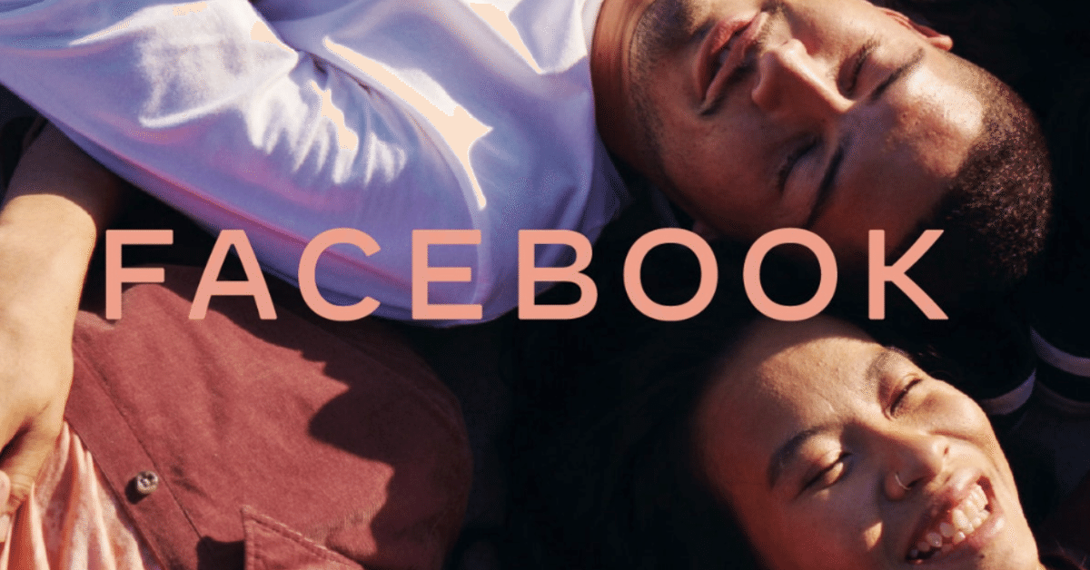
※トップ写真は公式から引用させていただいております(まさかのオレンジ色っぽいロゴの!)
=======んで、翻訳スタート!
Designing the Facebook Company Brand
A NEW BRAND SYSTEM DESIGNED FOR CLARITY, INSPIRED BY PEOPLE.
By Zach Stubenvoll, Sam Halle, Andrew Stirk and Luke Woods
Facebookの新ブランドシステムは、人々にとって明瞭で、感銘を与えるものに。
(デザイナーさんたちは、社内ので作ったみたいですね)
Facebook started as a single app. Now, 15 years later, we offer a suite of products that help people connect to their friends and family, find communities and grow businesses. These apps and technologies have shared infrastructure for years and the teams behind them frequently work together.
Facebookは単一のアプリとして始まりました。 15年経て現在、私たちは人々が友人や家族とつながり、コミュニティを見つけ、ビジネスを成長させるのに役立つ一連の製品を提供しています。これらのアプリとテクノロジーは長年にわたってインフラストラクチャを共有しており、その背後にあるチームは頻繁に連携しています。
(なんとなく製品の振り返り)
This is the next step in our effort to be clearer about the products and services from Facebook. The new company branding is designed to help us better represent the diversity of products we build, establish distinction from the Facebook app and communicate our purpose in the world.
これは、Facebookの製品とサービスをより明確にするため次のステップとなります。新しい会社のブランディングは、私たちが構築する製品の多様性をよりよく表現し、Facebookアプリとの差別化を確立し、世界での目的を伝えるのに役立つように設計されています。
(Facebookは、様々な新サービスや、買収を経て、人々にとってクリアじゃないサービスになっていると考えている模様)
Here is a look into the decisions we made to design our company brand.
んで解決策はこちら!
A COLLABORATIVE PROCESS
共創プロセス
Inspired by how our company builds products, we designed a process to learn, prototype and iterate quickly. We began by building a collective understanding of our company, conducting listening tours with employees and the people and businesses who use our products. We then brought together people from across the company to design and work together. We explored three creative territories, uniting around one final concept inspired by the potential of people when they can come together. We refined the brand system by working with designers across the company to ensure it performs in product, hardware, marketing and physical spaces.
当社が製品をどのように構築するかに触発されて、学習、プロトタイプ作成、反復処理を迅速に行うプロセスを設計しました。私たちはまず、会社についての総合的な理解を深め、従業員と当社の製品を使用する人々や企業との聞き取りツアーを実施しました。その後、会社全体の中から人をピックアップして、設計と共創作業を行いました。私たちは3つの創造的な領域を調査し、最後まで一緒に走りきってくれる人々と、1つの最終コンセプトに結び付けました。こうすることで、最終ブランドシステムは、あらゆる社内の取り組みとリンクし、機能するものとしました。
(社内のデザイナーでもでかすぎて、何が何だか分からずツアーから始めるということ。ただ会社内の開発から発想を得ることで、ただのロゴ、ただの名刺でなく、プロダクト開発の助けになるようなモノづくりをしているとのこと。大事ですね。)
DESIGN BEHAVIORS
設計行動(態度 or 性質)
Through the process, three foundational design behaviors that informed our brand system emerged:
このプロセスを通じて、ブランドシステムに情報を提供する3つの基本的な設計行動(態度 or 性質)が現れました。
(BEHAVIORSはこの場合ちょい日本語訳しにくいです)
Clarity: a brand that simplifies and builds understanding
明瞭性:理解を簡素化し、構築するブランド
Empathy: a system that is respectful of context and environment
共感:文脈と環境を尊重するシステム
Creating Space: design that supports people and their stories
空間創造:人とそのストーリーをサポートする空間
THE WORDMARK
ワードマーク
(この場合、社名をアプリ名からの独立性への取り組みみたいな感じ、かな)
Today, when people hear “Facebook” they think of the Facebook app. This posed a unique design challenge. We needed the wordmark to establish distinction from the Facebook app and allow for a clearer connection to the full family of technologies. The new brand system uses custom typography, rounded corners, open tracking and capitalization to create visual distinction between the company and the app.
現在、人々は「Facebook」と聞くと、Facebookアプリを思い浮かべます。これは、独自の設計上の課題をもたらしました。 Facebookアプリとの区別を確立し、テクノロジーファミリー全体への明確な接続を可能にするために、ワードマークが必要でした。新しいブランドシステムは、カスタムタイポグラフィ、丸い角、オープントラッキング、大文字を使用して、会社とアプリを視覚的に区別します。
(へー、すごいですね。プロダクトから会社名ができた流れのようのですが、今会社は大きくなりすぎたため、プロダクトの同一視は、もはや縛りになってしまっているとのこと。プロダクトの方はどうするんだろうか、、、)
Logo Comparison Animation
ロゴ比較アニメーション
Choosing an all-caps treatment as a way to create distinction from the app made it more important to craft unique letterforms. We designed the new company wordmark with clarity and openness in mind. It’s built on a stable structure through the use of consistent stroke width, harmonized capital letters and a horizontal emphasis. The generous spacing and open letterforms allow clarity at small sizes, and the subtle softening of corners and diagonals adds a sense of optimism.
アプリとの差別化を図るための方法として、すべて大文字の処理を選択することで、独自の文字形式を作成することがより重要になりました。明快さとオープンさを念頭に置いて、新しい会社のワードマークを設計しました。一貫したストローク幅、調和した大文字、水平強調を使用することにより、安定した構造に基づいています。ゆったりとしたスペースとオープンな文字フォームにより、小さいサイズでも明瞭になり、コーナーとダイアゴナルの微妙な柔らかさが楽観的な感覚を加えます。
The wordmark condenses into a “FB” monogram in small spaces. This monogram builds on existing equity: FB is already associated with Facebook, is the company’s stock ticker symbol and is used in domains and employee email addresses. To perform in smaller spaces across product and company touch points, the FB monogram has a heavier weight and extended letterforms.
ワードマークは、小さなスペースで「FB」モノグラムに凝縮されます。このモノグラムは既存のエクイティに基づいています。FBはすでにFacebookに関連付けられており、会社の株式ティッカーシンボルであり、ドメインおよび従業員のメールアドレスで使用されています。製品と会社のタッチポイント全体の小さなスペースで実行するために、FBモノグラムはより重い重量と拡張された文字形式を持っています。
Condensed wordmark FB monogram animation
AN EMPATHETIC COLOR PALETTE
Instead of the company owning a single color, we designed the brand to be responsive to its context and environment. This system allows the wordmark to take on the color of our individual brands, creating a clearer relationship between the company and the products we build.
凝縮されたワードマークFBモノグラムアニメーション
共感的なカラーパレット
単一の色を所有する会社の代わりに、私たちはブランドをそのコンテキストと環境に反応するように設計しました。このシステムにより、ワードマークは個々のブランドの色を帯びることができ、会社と当社が構築する製品との間に明確な関係が生まれます。
Wordmark brand color animation
ワードマークブランドカラーアニメーション
We wanted the brand to connect thoughtfully with the world and the people in it. The dynamic color system does this by taking on the color of its environment.
私たちは、ブランドが世界とその中の人々と思慮深くつながることを望んでいました。動的なカラーシステムは、環境の色を使用してこれを行います。
MOTION
モーション
We use motion in our system to create space for people and their stories. The wordmark itself opens up through tracking and fading, aiming to support and never overshadow.
私たちは、システムでモーションを使用して、人々とそのストーリーのためのスペースを作成します。ワードマーク自体は、追跡とフェードアウトによって開かれ、サポートを目的としており、決して曇ったものにはしないようにします。
ART DIRECTION
アートディレクション
The brand comes to life in the context of people, cultures, communities and relationships. The art direction is designed to capture the emotional connections between people and express a sense of potential when they can come together.
ブランドは、人、文化、コミュニティ、関係の文脈で生き返ります。アートディレクションは、人々の間の感情的なつながりを捉え、彼らが一緒になれるときに可能性の感覚を表現するように設計されています。
(最後1/3は、ほぼgoogle翻訳そのままです。あんまり変なところないのと、この部分は勉強資料性も薄いかなと。クラフトの話です。)
なんとなくまとめ
・アプリから始まり、アプリ以上のことをするための未来的な取組
(実際リブラなど新しい通貨へのでかい挑戦などもあります)
・ロゴはそれ自体はごく一部であり、内部の協力を得て、設計フローなども取り入れることで、社内の真の助けになることを目指した
・クラフト自体は、特に目新しいものがあるわけではなく、動的、多色による多様性のサポートを主軸とする
・この文章では大切なところのいくつかは見えているが、影にもっと巨大な努力とシステムの重要な部分が隠れており、それは公開されないだろう
という感じでしょうか?翻訳ニュアンスおかしいところあったらコメントくださいませ、、、
では:)