ideaboard® Series: Product Development Story #5_Monitor Test |Verification of the Updated Hypothesis

In December 2019, NKC Nakanishi Metal Works Co., Ltd. (referred to as NKC in the following) launched their new whiteboard, “ideaboard®.” Unraveled by the project members themselves, this series records the story of how the ideaboard was brought to life, and into ours.
《Past articles》
ideaboard® Series: Product Development Story #1_ The Idea|On Persistently Nurturing a Seed Idea
ideaboard® Series: Product Development Story #2_Design Development |Prototyping and Updating the Hypothesis
ideaboard® Series: Product Development Story #3_Design Development|Collaborating with Design Agency, 'f/p design'
ideaboard® Series: Product Development Story #4_Intellectual Property Strategy|Envisioning the Revenue Model for Designers
The series continues where we left off with Riku Nagasaki, head of “KAIMEN” (the business design team reporting directly to the president at NKC). After countless hypotheses and verifications, the ideaboard draws close to its final form. However, even at this stage, there were observations made from the actual site of the users—slight reactions evoked by people’s emotions that the designers themselves were not aware of.

Riku Nagasaki
head of KAIMEN
NKC BUSINESS DESIGN CENTER
1. Collaborating with outside partners through monitor tests
—The first monitor product was tested at MTRL Kyoto, mentioned in ideaboard® Series: Product Development Story #2_Design Development. Did you also test it on other users afterward?
I would say our heaviest user was Concent, Inc. Being a leading service design company, we assumed it would be the place where the ideaboard would indeed be used as “a cutting board of ideas” as well as the perfect match for whom we regarded as the “extreme user”—somewhere we could rely on to tell us about the actual usability and possible improvements. We were already aware that they fell in a business category that would contain the highest consumption rate in the surface area of whiteboards. So as soon as we created something like the final form, we loaded them in the car and carried them across over 500km, all the way to Tokyo.
—How were they used at Concent, Inc.?
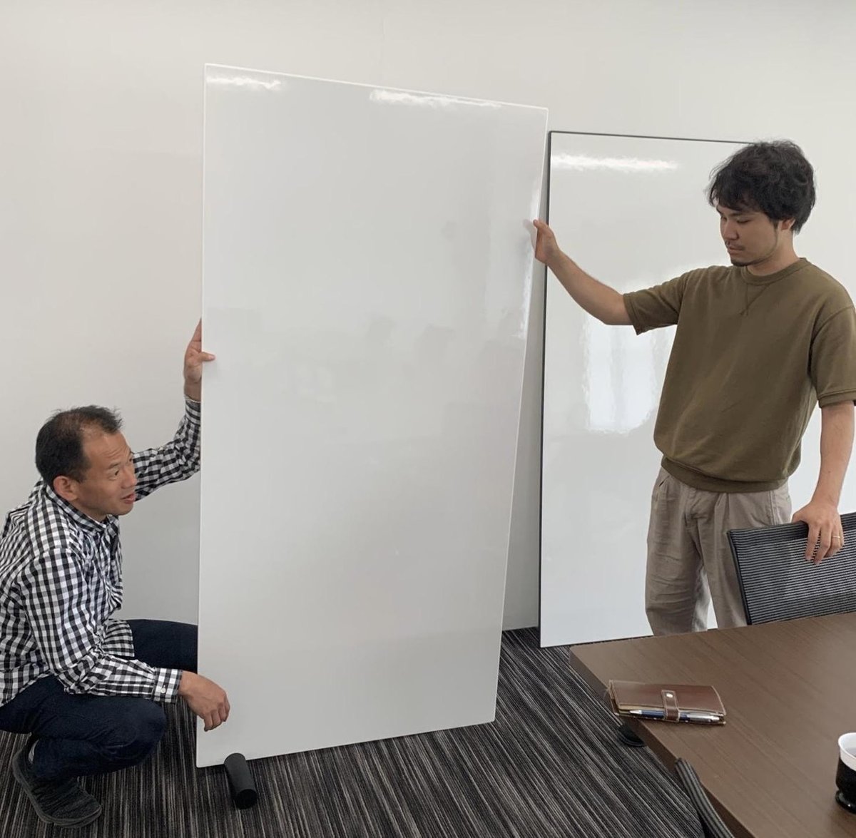
Concent, Inc. genuinely used it as a “cutting board of ideas”— repeatedly writing on it, and using it to communicate with others.They were also the ones who stacked up two ideaboards, making them into a table.

Designing the ideaboard based on the presumption of transforming it into a table’s top board, it required certain durability. Since the ideaboard was designed to be lightweight, we knew it would lack the strength to withhold its weight and bend. However, we knew that the users would most definitely want to lay it flat, so we kept on observing how everyone would use it. Consequently, after stacking up the two ideaboards to create a table, at Concent, Inc., they used three IKEA table legs, instead of the normal two. With only two legs, it would be bend. However, with three, it would stabilize. We were impressed, and are now using this method at our own KAIMEN studio.
2. Recognizing sites which just weren’t for ideaboard
—Were there any other unexpected ways of usage?
In the case of OpenA Co.,Ltd.—an architectural design company that also runs a real estate media platform—it was a good experience in the sense that we didn’t find the scenes we expected to. Since “creation” is a strong point of theirs, we were eager to know how they would use the ideaboards. We had high hopes and had a few installed in their share office which was their main base.
—You mean that there weren’t any occasions where the ideaboard could be used?
The meetings held at this shared office turned out to have strong features of project management, rather than that of brainstorming. Even looking at the written content on the boards, we realized they were often some kind of chart indicating a schedule. For writing this, the 900mm ideaboard appeared narrow and insufficient. In addition, due to the lack of visibility of what was written below waist-high, sometimes the top-half would be the only part with any kind of writing on it.
In other words, we realized that the ideaboard did not fit occasions where one would move forward with decided matters. To be completely honest, a simple, single-surfaced whiteboard would suit that kind of situation better. If one were to use the ideaboard, I thought it might be neat to have an attachment that would allow it to be used horizontally, rather than standing it upright against the wall.

—So by installing it in actual sites, you were able to observe the unexpected ways of using the ideaboard, or the reality of how it would not be used.
Due to its simple shape, there would be an occasional misuse. The cylinders that support the ideaboard to stand on their own are originally made to be inserted from the side, but some people would make the mistake of inserting it from the bottom.
This happened when we were exhibiting the ideaboard in Tokyo. One of the guests accidentally knocked it over and broke it. This issue came up for debate between f/p design (referred to as “f/p” in the following) during the final stages of design. I thought we could make it easier for the users to understand the correct direction by flattening out one of the surfaces. However, f/p claimed it could be more primitive, and that it was unnecessary to add a new element when so much had already been deducted. Furthermore, they pointed out the possibility of the cylinders with a surface being incompatible if the ideaboard’s shape would be altered to perhaps a perfect circle in the future.
Thinking it through, we decided not to flat out any sides. Even if they were to make a mistake the first time, users would learn the correct way of usage rather quickly, and wouldn’t misuse it after that. We concluded on leaving it to the user’s learning skills.
3. The change in users’ behavior caused by differences in the rim’s color
—Were there any changes made to the product resulting from the monitor tests?
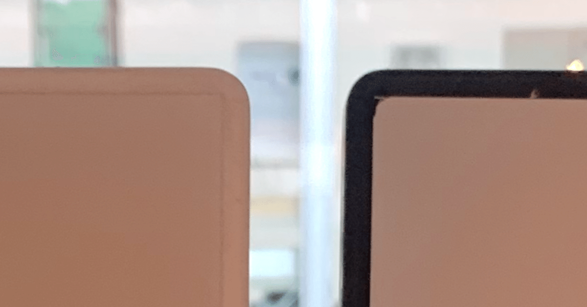
For example, we were pondering whether to make the rim white or black. During the early stages when we were working on prototype ver1.1, we were determined to make the shape and the color as simple as possible—a singular board that looked somewhat like thin tofu. The design could easily be drawn in CG, and f/p agreed with us, convinced we could make it work.
However, through the process of selecting the material, urethane, a concern developed in regard to the white rim. For instance, due to the microscopic holes in the urethane, there was the possibility of the whiteboard markers leaving a stain as the ideaboard would be repeatedly written on / erased. We had many other concerns as well, including the white urethane’s tendency to turn yellow, and the difficulty in shaping the special urethane which was resistant to discoloration.
In relation to product development, I would say selecting the material was what required the most effort. Although I myself couldn’t let go of the idea of the white rim, f/p was positive in making it black. So we decided to create both types, consequently giving the monitors both products, white and black, to test out.

—The black rim and the white rim—what kind of difference could be perceived through the monitor tests?
It’s interesting—people’s behavior changed according to the color of the rim.
When we handed the ideaboard with a white rim, people would gently put it down on the floor. Due to the board being completely white, they would be a bit reluctant to lay it down on the concrete office floor where people had stepped all over with their outside shoes. They would lay it down, gently, from the corner, as if to handle something fragile that might break if they weren’t careful enough.
On the contrary, people seemed to be quite rough with the black-rimmed ideaboard, as if the rim acted like a bumper. It’s a slight difference in terms of design, but you could tell it made a distinct difference in people’s behavior. When I saw that, I knew immediately it should be black. We designed it on the assumption that it would be used by standing it up on the floor and leaned it against the wall, so we wanted to eliminate any kind of concern the users might have, even if the users themselves weren’t vocal about it.
—At first glance, the rim seems to be a matter of merely the design, yet even the difference in color causes an effect on the user’s state of mind and behavior.
From the perspective of someone working at a manufacturing site, black is excellent in the sense of its manufacturability and quality control. Considering the designer’s ego, white might be better. However, from the user’s point of view, the color doesn’t actually matter. All they needed was something that they didn’t have to fuss over putting down on the floor. In the aim to spark active usage in various offices, the fact that the black-colored rim greatly lowered the stakes for people to use was something both f/p and we did not notice, and consequently became one of the final decisive factors.
By then we had built up the hypothesis with high precision, so we spent our days rather working on evaluating the hypothesis, proving each element, one after the other.
To be continued in “ideaboard Series: Product Development Story #6 ”
(Interview by Mone Nishihama, NINI Co., Ltd., translation by Kyoko Yukioka, NINI Co., Ltd., and photos by Yukiya Sonoda)
▼Click below to see the original Japanese version / 原文はこちら