
Design an interface - SwiftUI でプログラミング - 2

Create the features page
もう一つページを作っていきます。アプリの機能を説明するカードのリストを作ります。整理するために、ページ本体用とカード用の画面2 つを作成します。
まず、新規ファイルFeaturesPageを作って、
import SwiftUI

struct FeaturesPage: View {

    var body: some View {
        VStack {
            Text("Features")
                .font(.title)
                .fontWeight(.semibold)
        }
        .padding()
    }
}
もう一つFeatureCardを作ってもちらを最初に作り込んでいきます。
import SwiftUI
struct FeatureCard: View {
let iconName: String
let description: String
var body: some View {
HStack {
Image(systemName: iconName)
.font(.largeTitle)
Text(description)
}
}
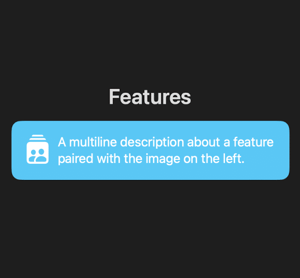
}変数を用意して画像とテキストを表示できるようにします。今回はFeaturesPageに組み込んで表示させるのでFeaturesPageのコードに
FeatureCard(iconName: "person.2.crop.square.stack.fill",
description: "A multiline description about a feature paired with the image on the left.")
引数を入れたものを追加します。
import SwiftUI
struct FeaturesPage: View {
var body: some View {
VStack {
Text("Features")
.font(.title)
.fontWeight(.semibold)
FeatureCard(iconName: "person.2.crop.square.stack.fill",
description: "A multiline description about a feature paired with the image on the left.")
}
.padding()
}
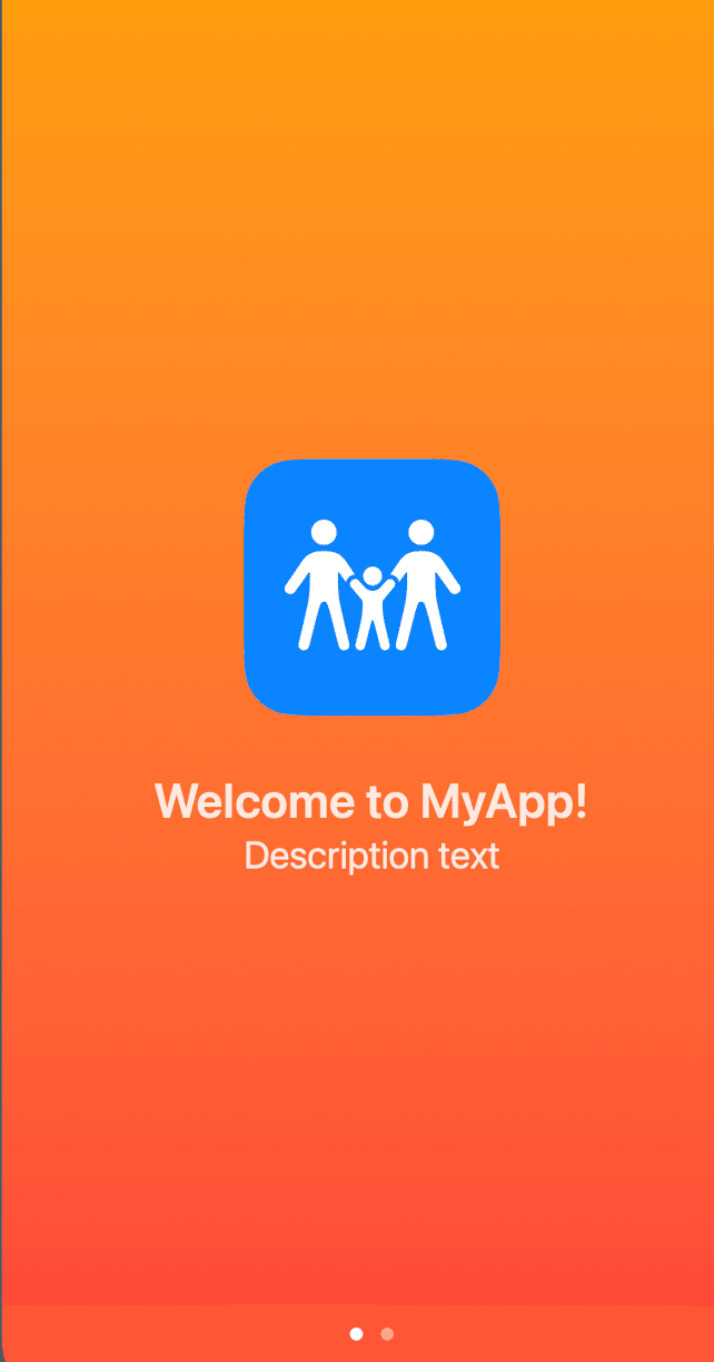
}このFeaturesPageをプレビューしたいのでMyAppファイルのコードを
@main
struct MyApp: App {
    var body: some Scene {
        WindowGroup {
            FeaturesPage()
        }
    }
}
としてプレビューできるように修正します。
Text("Features")
.font(.title)
.fontWeight(.semibold)
.padding(.bottom)
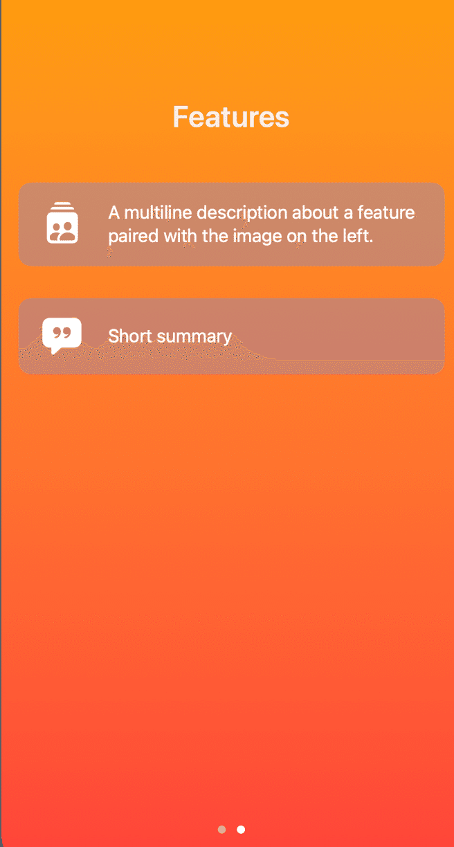
paddingを加えて"Features"の下(.bottom)に余白を入れます。
FeatureCardを追加します。
FeatureCard(iconName: "quote.bubble.fill", description: "Short summary")表示させると2つのカードで文字数も違うことから横幅が違ってきます。これを修正するためにFeatureCard()を編集します。
HStack {
Image(systemName: iconName)
.font(.largeTitle)
.frame(width: 50)
.padding(.trailing, 10)
Text(description)
Spacer()
}
.frame(width: 50) 、.padding(.trailing, 10)、Spacer()を追加してimage()の大きさ余白をきめ、文字の余白を横幅を合わせます。
Combine screens with TabView
TabViewを使って表示画面を切り替えることができるようにConetntViewを作っていきます。
ConetntViewがプレビューできるようにMyAppを修正します。
import SwiftUI

@main
struct MyApp: App {
    var body: some Scene {
        WindowGroup {
            ContentView()
        }
    }
}
ConetntViewに今まで作ってきた表示画面をTabViewで表示できるようにします。 .tabViewStyle(.page)でスライドで切り替える操作にしています。
import SwiftUI

struct ContentView: View {
    var body: some View {
        VStack {
            TabView {
                WelcomePage()
                FeaturesPage()
            }
            .tabViewStyle(.page)
        }
    }
}
Define colors in the asset catalog
ここでは背景をグラデーションさせています。asset catalogを使ったやり方が紹介されていますが、Playgroundsではできないのでコードで書いていきます。ContentViewのVStack以下を修正します。
VStack {
TabView {
WelcomePage()
FeaturesPage()
}
.background(
LinearGradient(gradient: Gradient(colors: [.orange, .red]), startPoint: .top, endPoint: .bottom)
)
.tabViewStyle(.page)
}
.background()でグラデーションを指定します。
Create a theme color and polish the style
背景色とスタイルをカスタマイズします。
FeaturesPage
struct FeaturesPage: View {

    var body: some View {
        VStack(spacing: 30) {
            Text("Features")
                .font(.title)
                .fontWeight(.semibold)
                .padding(.bottom)
                .padding(.top, 100)  // 追加

            FeatureCard(iconName: "person.2.crop.square.stack.fill",

                        description: "A multiline description about a feature paired with the image on the left.")

            FeatureCard(iconName: "quote.bubble.fill", description: "Short summary")

            Spacer()    // 追加

        }
        .padding()
    }
}
.padding(.top, 100)と Spacer() を追加しています。
FeatureCard
struct FeatureCard: View {

    let iconName: String
    let description: String

    var body: some View {

        HStack {
            Image(systemName: iconName)
                .font(.largeTitle)
                .frame(width: 50)
                .padding(.trailing, 10)

            Text(description)

            Spacer()
        }
        .padding()
        .background {
            RoundedRectangle(cornerRadius: 12)
                .foregroundStyle(.tint)
                .opacity(0.25)           //追加
        }
        .foregroundStyle(.white)

    }

}
.opacity(0.25)を追加しています。
最終形のプレビューです。
この記事が気に入ったらサポートをしてみませんか?