Job List Banner Template Redesign

Good day! I hope this post finds you well :)
Today I'll be sharing about a redesign of a template set of job list banners that I have done recently.
Around mid of last year, we launched a recruitment service called Jopus Connecter, that specializes in helping foreigners look for work in Japan. Later in the year, we reviewed it a little and made tweaks and improvements on it. Along with it, we felt a need to redesign the banners (basically the template itself) for job listing articles that appear as cards on the landing page, which are linked up from Jopus, an online portal where international job seekers can discover information and guides about working in Japan.
Since the banners for job listings have been around for quite a while, it was a good time to redesign it to match up with the style of Jopus Connecter and also as an opportunity to relook into making the design more effective in its communication and also more appealing to the eye.
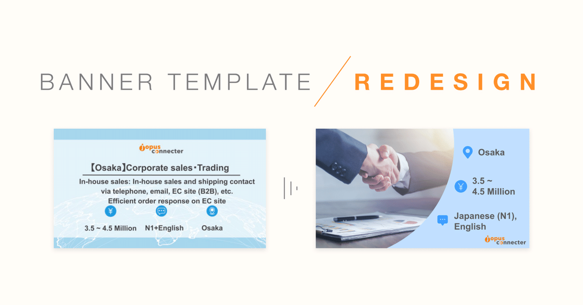
Here are the banners before the redesign, one in English and another in Japanese.


Before redesigning the banner template, I needed to understand the criteria and the situation in it will be used/created, as it involves production by staff members who are non-designers.
The following were the basic criteria that were identified:
・match the look for Jopus Connecter and Jopus
・content will be written in both English and Japanese (possibly Vietnamese too)
・banners are colour-coded according to industry
・to have it as a background template on Google Slides, and the texts content will be filled in by non-designer team members.
・necessary information in the banner are ①location, ②salary, and ③language.
Other things that we also took note of were how these banners would be viewed and where they would appear, so that we will be able to determine the canvas size, image size for delivery and also will help when making design considerations in terms of scale and legibility. The additional notes were as follows:
・to be viewed in various devices (mostly PC and Mobile) and appears on a few online platforms (such as Jopus online portal and shared on social media platforms)
・shows up as:
① job listing article thumbnail on Jopus
② cover banner at the top of the article (when clicked into)
③ card/thumbnail image inside Jopus Connecter landing page (LP)
④ thumbnail image when shared in various social media platforms (e.g. Twitter, LinkedIn and Facebook)
This is how it turned out :) ↓↓

▲ (above image) Sample preview of the before and after look when viewed as a cover banner for the in-article of the job listing in Jopus.
▲ (above image) Sample preview of how it would look like as cards/thumbnail images inside the Jopus Connecter landing page (PC version).

▲ (above image) Sample preview of how it would look like as cards/thumbnail images inside the Jopus Connecter landing page (Mobile/Smartphone version).
In overall, the design as well as organization of the information within the image itself has been simplified, for ease to the eyes and also visually in line with the style of Jopus Connecter and Jopus.
Job titles and descriptions within the image has been omitted to reduce visual clutter, since job titles come with the card labels and when the image is kept simple, viewers can feel more comfortable to click into the post itself to read further in detail.
This also helps open up some space that enables important information for scanning i.e. job requirements (location, salary and language) to be set to larger font size for better legibility and ease of information digestion when it is viewed at a glance.
Instead of an image full of texts, a photo is also inserted in the image to serve as a visual hint of what the position or field of work would be. In addition, the Jopus Connecter logo is also placed on the bottom right instead of the top center, as I believe that the main focus should be on the job information where job seekers would be more interested in when scanning the content.
As for the Google Slides template, this is how it turned out:


I've prepared the set of templates that are easy to copy, paste and edit, for the non-designer staff members to use easily even when they may be busy or tight on time. Along with the templates I have also provided guidelines and set rules so that they can also help with keeping the formats consistent (such as font sizes, writing format and paragraphing etc.), thus ensuring the design is kept neat and tidy as much possible.
All in all it was quite fun and rather fulfilling to work on this and see it turn out looking visually good and functionally easy to use. I may go into further detail about the process and the full range of the categories in a later post in the near future, so do look out for it! :)
Till then, take good care! ☆
この記事が気に入ったらサポートをしてみませんか?