
Graphic Exploration #1 : Ribbon Effect on Text

As a graphic designer, there's a plethora of fun things we can explore and experiment on, though often it takes the conscious decision to carve out time from our busy day-to-day to try out new things. These new things are actually good exercises in our growth as designers in the long run. While I often tend to put work tasks to priority and put off fun exercises,
I realized all work and no play isn't the healthiest way to work, and it's worth acknowledging that play also has an important role in creative thinking & problem solving, and to feed the soul of the designer itself.
Hence, of late, within the design team, we have been encouraged to try various things, some tied to tasked projects, others as part of personal exploration/learning that we can propose freely.
Seeing fellow designer T-san trying out these wonderful typography treatments ↓↓, it did ignite some excitement within me.
I figured it'll be a nice chance to try doing some exploration and experimenting on typography and things graphic design that I've always longed doing. It'll be good to up my skills through these fun exercises too! With encouragement from our department head, W-san, I'll be doing some graphic explorations and sharing them here on Note~!
First off, I browsed for some ideas, and found this list:
within the list, something interesting caught my eye, ribbon text effect~! I remember thinking it's pretty awesome but whether I could really do it, was another matter, so I decided to try it out! Plus, I recall V6 having a single, Timeless, where it's cover art was done in ribbon, probably the real thing, but it'll be fun to figure out how to do it in Illustrator.
In the ideas list, I found a nice looking tutorial from Vectips. The steps were quite detailed and the preview looked good.
It was quite fun at first, using just shapes and shading, and a new learnt function called Shape Builder Tool, shadows and the ribbon effect seem to show...

Because I'm used to the English version of Illustrator and more familiar with the terms in English, I faced difficulty finding the effects and figuring what they were called and where they're located...what is Multiply called in Japanese? ...and where are the blend modes? The figuring out was pretty frustrating...
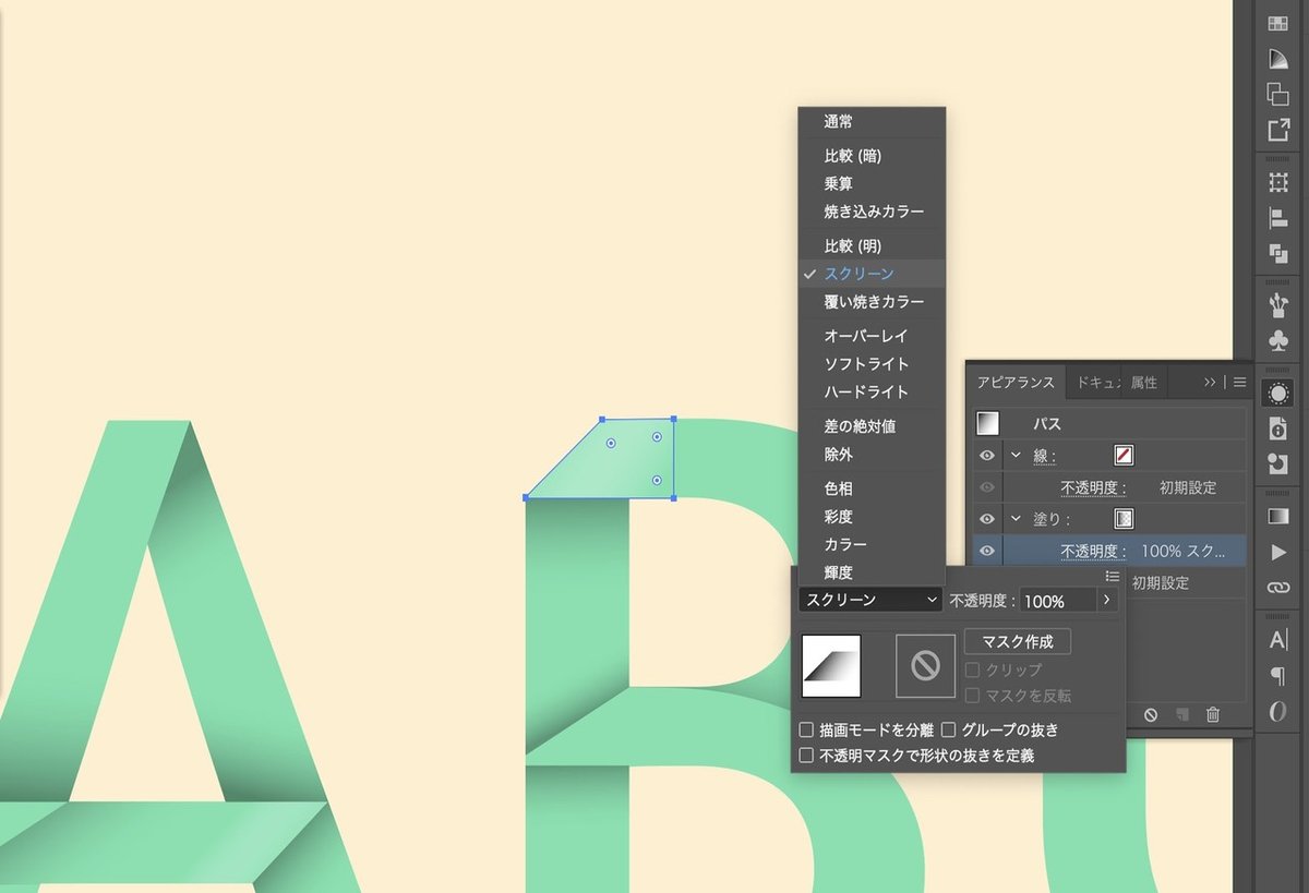
...but being able to see the effect come to life was quite nice. On top of the shadow effects, lighting effects were applied too. It wasn't as simple as it looks, a good grasp on light and shadow is quite necessary in this activity, in order to make it look believable.

Towards the end I kind of got pretty tired and started to wing it more hastily, and left the touching up of the lighting and coherence to later ^^;;
It went from plain text → outlined text with colour → ribbon effect application.

After touching up, here's the final piece! ↓↓
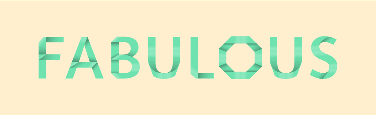
(;´д`) phewh! that was unexpectedly a lot of work, but lots of fun! I'd love to try it out on other texts next time round! Make your text express some class, try it out yourself too! ☆