米株プログラミング[2-6](銘柄分析編)

こんにちわ!トミィ(@toushi_tommy)です!今回は別のyahoo finance モジュールを導入して、銘柄の情報取得をやってみたいと思います。yahoo finance のホームページを見れば情報は集まるのですが、プログラミングで好きな情報だけを集めて出力させることで、日頃の作業の効率化ができると思います。それではやってみます。(GoogleColabを使う為に、必ずモジュール導入編 [0-1], [0-2] を実施してください。)
サークルは無料で運営しております。記事内容も無料です。トミィにジュースでもおごってあげようと思った方は投げ銭いただけると、今後の運営の励みになります。
yahoo finance モジュールインストール
インストールする新しいモジュールはこちらです。
yfinanceですが、利点としてはコンパクトにまとまっている事と、複数銘柄のデータを同時に取ってこれる点になります。既に導入方法はこちらのモジュール導入編 [0-2] に記載済みです。
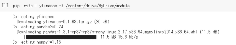
pip install yfinance -t /content/drive/MyDrive/module
これで、モジュール導入完了です。
yahoo finance 情報確認
まず、こちらのコードを実行してみてください。
import sys
sys.path.append('/content/drive/MyDrive/module')
import yfinance as yf
import pandas as pd
import plotly.graph_objects as go

ticker = 'AAPL'
data = yf.Ticker(ticker)

df = pd.DataFrame.from_dict(data.info, orient='index').rename(columns={0:'Data'})
fig = go.Figure(data=[go.Table(
 columnwidth = [8, 20],
 header = dict(values=['Name','Data'], align='center', font_size=16, height=30,
             line_color='black', fill_color='white'
             ),
 cells = dict(values=[df.index, df['Data']],
            line_color='black',align=['center', 'left'],font_size=16, height=30,
            fill_color=[['rgb(235, 235, 235)', 'white']*(int(len(df)/2)+1)],
            )
 )],
)
fig.show()
print(data.info['sector'])
このように出力されます。
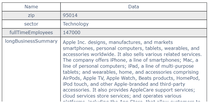
下にスクロールすることで、取得できる内容がそれぞれ確認できます。また、コードの最後に、それぞれのデータの取得方法を書いておりますが、このような形で取り出せます。
print(data.info['sector'])出力はこのようになります。
Technology
その他、以下のコードで様々なデータを取得できます。
配当金、株式分割データ取得
import sys
sys.path.append('/content/drive/MyDrive/module')
import yfinance as yf
ticker = 'AAPL'
data = yf.Ticker(ticker)
# show actions (dividends, splits)
print(data.actions)
# show dividends
print(data.dividends)
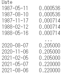
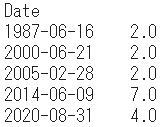
# show splits
print(data.splits)data.actionsで両方同時取得、data.dividendsは配当金、data.splitsが株式分割のデータになります。出力は以下の通り。
両方の場合
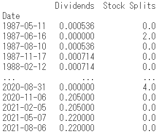
配当金
株式分割
ファイナンスデータ取得
Yahooファイナンスページで取れるデータが以下のコードで取得できます。ファイナンスで取れるデータは、
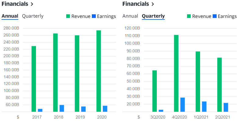
Income Statement(損益計算書)
Yahooファイナンスでのページはこちらになります。
ちなみに、年次、四半期データの切り替えはリンク先のこちらのボタンで切り替えができます。
![]()
年次損益計算書データ
import sys
sys.path.append('/content/drive/MyDrive/module')
import yfinance as yf

ticker = 'AAPL'
data = yf.Ticker(ticker)

data.financials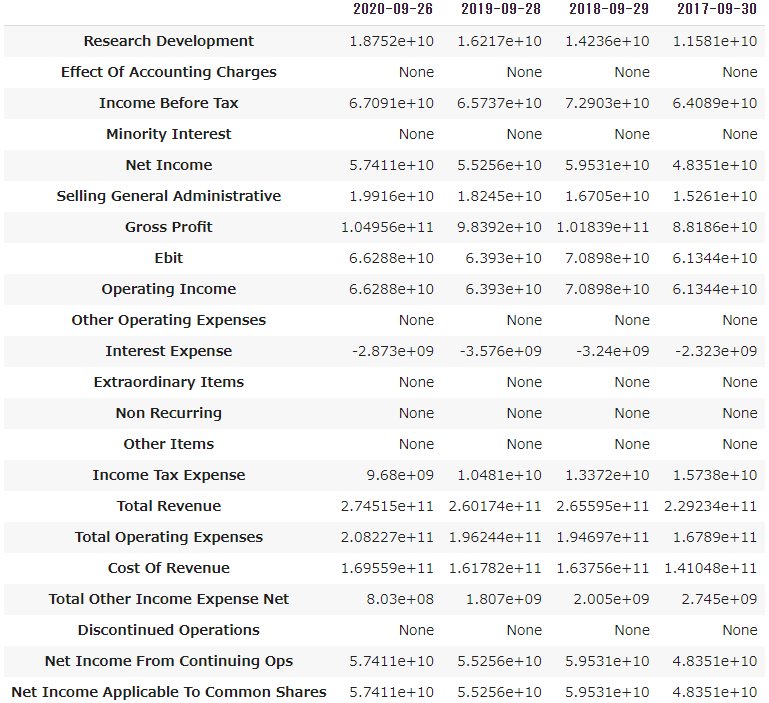
四半期損益計算書データ
import sys
sys.path.append('/content/drive/MyDrive/module')
import yfinance as yf

ticker = 'AAPL'
data = yf.Ticker(ticker)

data.quarterly_financials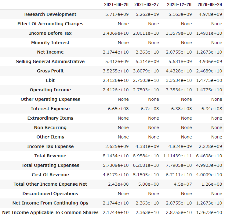
同様にバランスシート(貸借対照表)
data.balance_sheet
data.quarterly_balance_sheet
キャッシュフロー
data.cashflow
data.quarterly_cashflow
で取得できます。
課題
好きな銘柄でバランスシート、キャッシュフローのデータを出力してみましょう。(年次データ、四半期データを出力してみます)
収益データ
四半期ごとの決算発表に使われるデータが四半期収益データになります。こちらのモジュールでも収益データが、年次、四半期を所得することができます。内容はこちらのページの右側の内容になります。
Revenue : 総収入(Income Statement の Total Revenue)
Earnings : 純利益(Cash FlowのNet Income from Continuing Operations)
コードは以下の通りです。
年次収益データ
import sys
sys.path.append('/content/drive/MyDrive/module')
import yfinance as yf

ticker = 'AAPL'
data = yf.Ticker(ticker)

data.earnings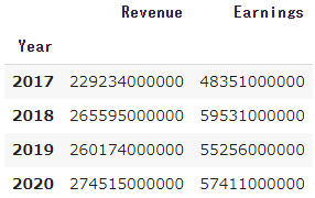
四半期収益データ
import sys
sys.path.append('/content/drive/MyDrive/module')
import yfinance as yf

ticker = 'AAPL'
data = yf.Ticker(ticker)

data.quarterly_earnings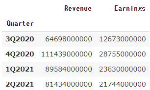
ちなみに、決算で出てくる売上は四半期データのTotal Revenueもしくは、四半期収益のRevenueになります。以下、両方とも同じデータが取れると思います。
total_revenue = data.quarterly_financials.loc['Total Revenue'][0]
total_revenue = data.quarterly_earnings['Revenue'][-1]
またYoY(前年比)はinfoの中のrevenueGrowthにありますので、このようなコードで確認できます。(売り上げは出力フォーマットを変更してます。)
import sys
sys.path.append('/content/drive/MyDrive/module')
import yfinance as yf

ticker = 'AAPL'
data = yf.Ticker(ticker)

#total_revenue = data.quarterly_financials.loc['Total Revenue'][0]
total_revenue = data.quarterly_earnings['Revenue'][-1]
total_revenue = (lambda x: '$%.2f'%(x/float('1E'+str(3*'{:,}'.format(x).count(','))))+['','K','M','B','T']['{:,}'.format(x).count(',')])(total_revenue)
revenue_growth = '{:.2%}'.format(data.info['revenueGrowth'])
print('売上:',total_revenue,' YoY:',revenue_growth)
売上: $81.43B , YoY: 36.40%
その他データ
その他取得できるデータを紹介します。
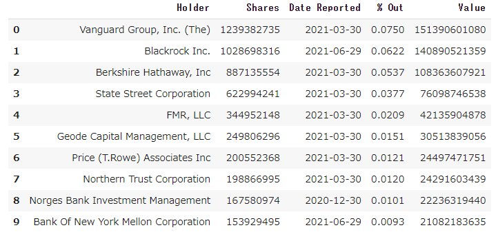
株主情報
data.major_holders
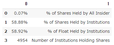
data.institutional_holders
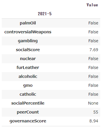
サステイナビリティ(ESG格付け)持続可能性
data.sustainability
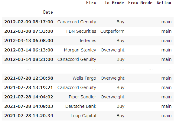
アップグレード・ダウングレード情報
data.recommendations
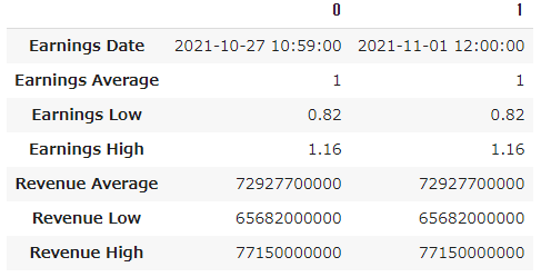
イベントカレンダー
今日以降のイベントの情報を出力します。次回の決算情報が見えます。
data.calendar
ISINコード(国際証券コード)
data.isin
US0378331005
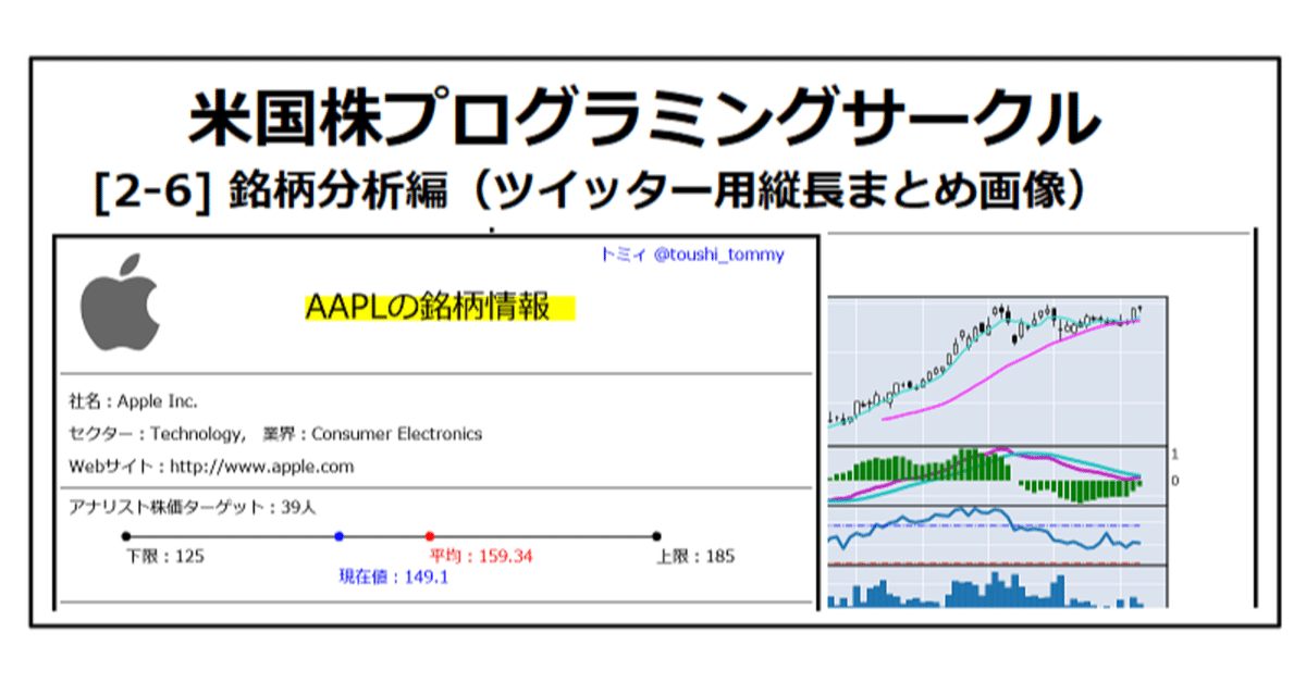
分析資料作成
最後にこれらのデータを使って、ツイッター用の縦長まとめ資料を作ってみます。以下のコードを実行してみてください。(8/28修正:分析結果の出力をアップデートしました)
module_dir = '/content/drive/MyDrive/module/'
output_dir = '/content/drive/MyDrive/output/'
import sys
sys.path.append(module_dir)
import yfinance as yf
from PIL import Image, ImageDraw, ImageFont
import os
import pytz
import IPython
import requests
import datetime as datetime
import mplfinance as mpf
import matplotlib.pyplot as plt
import japanize_matplotlib
import matplotlib.dates as mdates
import pandas as pd
import numpy as np
from bs4 import BeautifulSoup
import re
import requests
today = datetime.datetime.now(pytz.timezone('Asia/Tokyo'))
if not os.path.isdir(output_dir): os.makedirs(output_dir)
tmp_file = output_dir+'tmp.png'
tmp2_file = output_dir+'tmp2.png'
jap_font = '/content/drive/MyDrive/fonts/meiryo.ttc'
if not os.path.exists(jap_font): jap_font = module_dir+'japanize_matplotlib/fonts/ipaexg.ttf'
# 初期設定(ここを変えてください)###################################
ticker = 'MSFT'
signiture = 'トミィ @toushi_tommy'
#####################################################################
#####################################################################
# フォント
font_jap18=ImageFont.truetype(jap_font, 18)
font_jap40=ImageFont.truetype(jap_font, 40)
font_jap20=ImageFont.truetype(jap_font, 20)
font_jap14=ImageFont.truetype(jap_font, 14)
#####################################################################
data = yf.Ticker(ticker)
im = Image.new('RGB', (960, 1280), (255,255,255))
draw = ImageDraw.Draw(im)
# アイコン ##########################################################
open(tmp2_file, 'wb').write(requests.get(data.info['logo_url']).content) #if os.path.getsize(tmp_file)>1: im.paste(Image.open(tmp_file).copy(), (30, 30))
if os.path.getsize(tmp2_file)>1:
image = Image.open(tmp2_file)
image.load()
background = Image.new("RGB", image.size, (255, 255, 255))
if len(image.split())>3: background.paste(image, mask=image.split()[3])
else: background.paste(image)
background.save(tmp2_file,quality=95)
im.paste(Image.open(tmp2_file).copy(), (30, 95-int(image.size[1]/2)))
#####################################################################
# 銘柄説明文取得
japDetail=''
try:
site = requests.get("https://us.kabutan.jp/stocks/"+ticker)
sdat = BeautifulSoup(site.text,'html.parser')
da = sdat.find_all("dd", class_="text-left pt-1 pl-4")
jname = [re.sub('.*>(.*)<.*', r'\1', s) for s in [s.replace('&', '&') for s in [str(i) for i in da]]]
da = sdat.find_all("dd", class_="text-left pt-1 pl-4 text-md")
detail = [re.sub('.*>(.*)<.*', r'\1', s) for s in [s.replace('\n', '').replace('&', '&') for s in [str(i) for i in da]]]
japDetail=jname[0]+':'+detail[0]
except:
pass
#####################################################################
str_dat = ticker+'の銘柄情報'
draw.line((310,100, 330+draw.textsize(str_dat, font_jap40)[0],100), fill='yellow', width=30)
draw.text((320, 70), str_dat, 'black', font=font_jap40)
draw.text((680, 20), signiture, 'blue', font=font_jap20)
draw.text((680, 150), "更新日時:"+today.strftime("%Y/%m/%d"),'blue',font=font_jap20)
draw.rectangle([(10, 10), (950, 1270)], outline='black', width=5)
draw.line((20,180, 940,180), fill='black', width=1)
#####################################################################
draw.text((30, 200), '社名:'+data.info['longName']+', セクター:'+data.info['sector']+', 業界:'+data.info['industry'],
'black', font=font_jap20)
draw.text((50, 235), japDetail[:48], 'black', font=font_jap18)
draw.text((50, 255), japDetail[48:96], 'black', font=font_jap18)
draw.text((50, 275), japDetail[96:144], 'black', font=font_jap18)
draw.text((50, 295), japDetail[144:192], 'black', font=font_jap18)
draw.text((30, 320), 'Webサイト:'+data.info['website'], 'black', font=font_jap20)
# 株価 #####################################################################
draw.line((20,360, 940,360), fill='black', width=1)
draw.text((30, 370), 'アナリスト株価ターゲット:'+str(data.info['numberOfAnalystOpinions'])+'人', 'black', font=font_jap20)
xpos = 100
ypos = 430
length = 650
if(data.info['numberOfAnalystOpinions'] is not None):
lo_price = data.info['currentPrice'] if data.info['currentPrice']<data.info['targetLowPrice'] else data.info['targetLowPrice']
hi_price = data.info['currentPrice'] if data.info['currentPrice']>data.info['targetHighPrice'] else data.info['targetHighPrice']
avg_per = (data.info['targetMeanPrice'] - lo_price)/(hi_price - lo_price)
lo_per = (data.info['targetLowPrice'] - lo_price)/(hi_price - lo_price)
hi_per = (data.info['targetHighPrice'] - lo_price)/(hi_price - lo_price)
cur_per = (data.info['currentPrice'] - lo_price)/(hi_price - lo_price)
draw.line((xpos, ypos, xpos+length, ypos), fill='black', width=2)
draw.ellipse((xpos+length*lo_per-5, ypos-5, xpos+length*lo_per+5, ypos+5), fill=(0, 0, 0))
draw.ellipse((xpos+length*hi_per-5, ypos-5, xpos+length*hi_per+5, ypos+5), fill=(0, 0, 0))
draw.ellipse((xpos+length*avg_per-5, ypos-5, xpos+length*avg_per+5, ypos+5), fill='red')
draw.ellipse((xpos+length*cur_per-5, ypos-5, xpos+length*cur_per+5, ypos+5), fill='blue')
draw.text((xpos+length*lo_per, ypos+10), '下限:'+str(data.info['targetLowPrice']), 'black', font=font_jap20)
draw.text((xpos+length*hi_per, ypos+10), '上限:'+str(data.info['targetHighPrice']), 'black', font=font_jap20)
draw.text((xpos+length*avg_per, ypos-35), '平均:'+str(data.info['targetMeanPrice']), 'red', font=font_jap20)
draw.text((xpos+length*cur_per, ypos+35), '現在値:'+str(data.info['currentPrice']), 'blue', font=font_jap20)
# 決算情報 #####################################################################
draw.line((20,500, 940,500), fill='black', width=1)
conv_str = lambda x: '$%.2f'%(x/float('1E'+str(3*'{:,}'.format(x).count(','))))+['','K','M','B','T']['{:,}'.format(x).count(',')]
total_revenue = conv_str(data.info['totalRevenue']) if (data.info['totalRevenue'] is not None) else str(data.info['totalRevenue'])
quart_revenue = conv_str(data.quarterly_earnings['Revenue'][-1])
market_cap = conv_str(data.info['marketCap'])
per = '%.2f'%(data.info['trailingPE']) if 'trailingPE' in data.info else 'N/A'
psr = '%.2f'%(data.info['marketCap']/4/data.quarterly_earnings['Revenue'][-1]) if(data.quarterly_earnings['Revenue'][-1]>0) else 'N/A'
yoy = '{:.2%}'.format(data.info['revenueGrowth']) if (data.info['revenueGrowth'] is not None) else str(data.info['revenueGrowth'])
draw.text((30, 510), '売上(直近1年):'+total_revenue+', 売上('+data.quarterly_earnings.index[-1]+
'):'+quart_revenue+', YoY:'+yoy, 'black', font=font_jap20)
draw.text((30, 550), '時価総額:'+market_cap+', PER:'+per+', PSR:'+psr, 'black', font=font_jap20)
draw.text((30, 590), '発行済株式数:'+"{:,}".format(data.info['sharesOutstanding']), 'black', font=font_jap20)
draw.text((30, 630), '52週高値:'+'$%.2f'%(data.info['fiftyTwoWeekHigh'])+', 52週安値:'+'$%.2f'%(data.info['fiftyTwoWeekLow']),
'black', font=font_jap20)
# チャート ##########################################################
chart = data.history(period="3mo")
chart['Percent'] = chart['Close'].pct_change()
chart['MACD'] = chart['Close'].ewm(span=12, adjust=False).mean() - chart['Close'].ewm(span=26, adjust=False).mean()
chart['Signal'] = chart['MACD'].rolling(window=9).mean()
chart['Hist'] = chart['MACD'] - chart['Signal']
df_diff = chart['Close'].diff()
df_up, df_down = df_diff.copy(), df_diff.copy()
df_up[df_up < 0] = 0
df_down[df_down > 0] = 0
df_down = df_down * -1
sim14_up = df_up.rolling(window=14).mean()
sim14_down = df_down.rolling(window=14).mean()
chart['RSI'] = sim14_up / (sim14_up + sim14_down) * 100
chart['RSI_hl'] = 70
chart['RSI_ll'] = 30
add_plot=[
mpf.make_addplot(chart['MACD'], color='m', panel=1, secondary_y=False),
mpf.make_addplot(chart['Signal'], color='c', panel=1, secondary_y=False),
mpf.make_addplot(chart['Hist'], type='bar', color='g', panel=1, secondary_y=True),
mpf.make_addplot(chart['RSI'], panel=2),
mpf.make_addplot(chart['RSI_hl'], color='b', panel=2, secondary_y=False,linestyle='-.', width=1),
mpf.make_addplot(chart['RSI_ll'], color='r', panel=2, secondary_y=False,linestyle='-.', width=1)
]
mpf.plot(chart,volume=True, figscale = 0.7, figratio=(4,2),volume_panel=3,type='candle',mav=(5,25),addplot=add_plot
,datetime_format='%Y/%m/%d',savefig=tmp_file)
im.paste(Image.open(tmp_file).copy(), (140, 850))
#####################################################################
# 一週間の値動き
df = yf.download(ticker, interval = "1m", period = "5d")
str_tmp=""
day_split=[]
for i in range(len(df)):
str_data = df.index[i].strftime("%Y-%m-%d")
if str_data != str_tmp: day_split.append(df.index[i])
str_tmp= str_data
day_split.append(df.index[-1])
mpf.plot(df, figscale = 0.31, figratio=(4.5,1),
vlines=dict(vlines=day_split,colors='r',linestyle='-.',linewidths=1),
type='line',datetime_format='', xrotation=0,savefig=tmp_file)
im.paste(Image.open(tmp_file).copy(), (140, 680))
wk = ['月','火','水','木','金','土','日']
draw.text((500, 670), '過去1週間の値動き', 'black', font=font_jap18)
for i in range(0,5):
draw.text((325+i*105, 830), day_split[i].strftime('%m/%d')+'('+wk[day_split[i].weekday()]+')', 'black', font=font_jap14)
draw.text((325+i*105, 845),'['+'{:.2%}'.format(chart['Percent'][-5+i])+']' , ('blue' if chart['Percent'][-5+i] > 0 else 'red'), font=font_jap14)
#####################################################################
draw.text((500, 860), '過去3か月チャート', 'black', font=font_jap18)
draw.line((20,660, 940,660), fill='black', width=1)
draw.text((30, 670), 'チャート:'+chart.index[-1].strftime('%Y/%m/%d'), 'black', font=font_jap20)
draw.text((40, 720), '株価:'+'$%.2f'%(chart['Close'][-1]), 'black', font=font_jap20)
draw.text((40, 750), '始値:'+'$%.2f'%(chart['Open'][-1]), 'black', font=font_jap20)
draw.text((40, 780), '高値:'+'$%.2f'%(chart['High'][-1]), 'black', font=font_jap20)
draw.text((40, 810), '安値:'+'$%.2f'%(chart['Low'][-1]), 'black', font=font_jap20)
draw.text((40, 870), '前日比:'+'{:.2%}'.format(chart['Percent'][-1]), 'black', font=font_jap20)
draw.text((40, 900), 'RSI:'+'{:.2%}'.format(chart['RSI'][-1]/100), 'black', font=font_jap20)
draw.text((40, 930), '52週高値下落:', 'black', font=font_jap20)
draw.text((50, 960), '{:.2%}'.format((chart['Close'][-1]-data.info['fiftyTwoWeekHigh'])/data.info['fiftyTwoWeekHigh']), 'black', font=font_jap20)
draw.text((40, 1070), '出来高:', 'black', font=font_jap20)
draw.text((50, 1100), "{:,}".format(chart['Volume'][-1]), 'black', font=font_jap20)
draw.text((40, 1140), '出来高上昇率:', 'black', font=font_jap20)
draw.text((50, 1170), '%.2f'%(chart['Volume'][-1]/data.info['averageVolume10days'])+'倍', 'black', font=font_jap20)
#####################################################################
outfile = output_dir+ticker+'_'+today.strftime("%Y%m%d_%H%M%S")+'.png'
im.save(outfile)
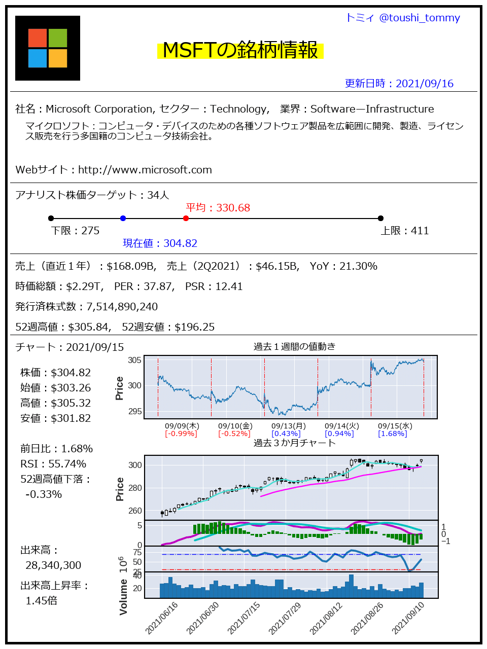
IPython.display.Image(outfile)出力は以下のような感じになります。
好きな情報を出して、自分なりの縦長まとめ情報を作ってください。
課題
銘柄を変えて実行してみてください。また、可能であれば、出力情報を増やしたり変更してみてください。
本日は以上です。
ここから先は
¥ 150
サポートいただけますと、うれしいです。より良い記事を書く励みになります!