
CodeSandboxでReact Three Fiber実験その1

■20240126追記 ここにあるように、投稿したコードのCodeSandbox形式からDevebox形式への変更でコードが正常に表示されなくなる場合があります。 またCodeSandboxの仕様によりDevbox形式コードへの制限時間以上のアクセスがあった場合はアクセスがブロックされるとのことです。
React と Three.jsの合体?したReact Three Fiberというものを見かけたので試してみました。
実験的に作成したコードは以下のCodeSandboxのsiouxcitizenアカウントに置いています。 使用したライブラリは最終的に以下の「使用環境」にあるようなものになりました。
React Three Fiberについての知識はほぼゼロだったので、公式からの大元となるコードを変更・修正していきながら都度その動作を確認しつつ、React Three Fiberを少しづつ理解していくという全体的な流れとなりました。
CodeSandbox siouxcitizen account
使用環境
@emotion/react 11.10.4
@emotion/styled 11.10.4
@fontsource/roboto 4.5.8
@mui/material 5.10.7
@react-three/drei 9.32.1
@react-three/fiber 8.6.2
react 18.2.0
react-dom 18.2.0
react-scripts 5.0.1
three 0.144.0
実験したCodeSandboxのそれぞれのコードは、CodeSandbox投稿タイトルのリンク、またはそのサムネイル画像をクリックすれば開きます。
Practice01は公式サイトからのサンプルをForkしただけのものです。 Practice02~05ではボタン等のユーザーインターフェースの実験をしています。 Practice06~10では、Box、Plane、Shere等の基礎的な3Dオブジェクトを表示しています。 Practice11~13では、それぞれBox、Plane、Sphereにテクスチャを貼り付けたものを表示しています。
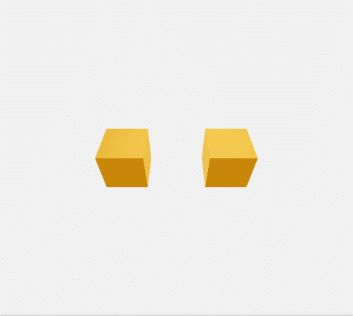
React Three Fiber Practice01
まずは公式サイトにあるコードをそのままForkしたものを作成しました。 こちらの公式サイトにあるリンクから辿れる live demo というCodeSandbox上のコードをそのままForkして作成しました。
React Three Fiber Practice01 のフォルダ構成は
React Three Fiber Practice01 ―┬― public
└―src
となります。
トップレベルのフォルダ(個別CodeSandboxコード上でのrootフォルダ?)にはpackage.jsonと.prettierrcが配置されています。
また、publicフォルダにはindex.htmlが、srcフォルダにはApp.js、index.jsとstyles.cssが配置されています。
.prettierrcは React や React Three Fiber でコードのレイアウト指定を行うために使用するファイルでしょうか? よくわかってませんが、Saveするとレイアウトがピシっと勝手に整えられて心地よいので使用し続けますw。
以下その.prettierrc以外の各ファイルの内容を抜き出してみます。
package.json
{
  "name": "react-three-fiber-practice01",
  "version": "1.0.0",
  "description": "",
  "keywords": [],
  "main": "src/index.js",
  "dependencies": {
    "@react-three/fiber": "8.6.2",
    "react": "18.2.0",
    "react-dom": "18.2.0",
    "react-scripts": "5.0.1",
    "three": "0.144.0"
  },
  "devDependencies": {},
  "scripts": {
    "start": "react-scripts start",
    "build": "react-scripts build",
    "test": "react-scripts test --env=jsdom",
    "eject": "react-scripts eject"
  },
  "browserslist": [
    ">0.2%",
    "not dead",
    "not ie <= 11",
    "not op_mini all"
  ]
}
index.html
<!DOCTYPE html>
<html lang="en">

<head>
	<meta charset="utf-8">
	<meta name="viewport" content="width=device-width, initial-scale=1, shrink-to-fit=no">
	<meta name="theme-color" content="#000000">
	<!--
      manifest.json provides metadata used when your web app is added to the
      homescreen on Android. See https://developers.google.com/web/fundamentals/engage-and-retain/web-app-manifest/
    -->
	<link rel="manifest" href="%PUBLIC_URL%/manifest.json">
	<link rel="shortcut icon" href="%PUBLIC_URL%/favicon.ico">
	<!--
      Notice the use of %PUBLIC_URL% in the tags above.
      It will be replaced with the URL of the `public` folder during the build.
      Only files inside the `public` folder can be referenced from the HTML.

      Unlike "/favicon.ico" or "favicon.ico", "%PUBLIC_URL%/favicon.ico" will
      work correctly both with client-side routing and a non-root public URL.
      Learn how to configure a non-root public URL by running `npm run build`.
    -->
	<title>React App</title>
</head>

<body>
	<noscript>
		You need to enable JavaScript to run this app.
	</noscript>
	<div id="root"></div>
	<!--
      This HTML file is a template.
      If you open it directly in the browser, you will see an empty page.

      You can add webfonts, meta tags, or analytics to this file.
      The build step will place the bundled scripts into the <body> tag.

      To begin the development, run `npm start` or `yarn start`.
      To create a production bundle, use `npm run build` or `yarn build`.
    -->
</body>

</html>
App.js
import { useRef, useState } from 'react'
import { Canvas, useFrame } from '@react-three/fiber'

function Box(props) {
  // This reference gives us direct access to the THREE.Mesh object
  const ref = useRef()
  // Hold state for hovered and clicked events
  const [hovered, hover] = useState(false)
  const [clicked, click] = useState(false)
  // Subscribe this component to the render-loop, rotate the mesh every frame
  useFrame((state, delta) => (ref.current.rotation.x += delta))
  // Return the view, these are regular Threejs elements expressed in JSX
  return (
    <mesh
      {...props}
      ref={ref}
      scale={clicked ? 1.5 : 1}
      onClick={(event) => click(!clicked)}
      onPointerOver={(event) => hover(true)}
      onPointerOut={(event) => hover(false)}>
      <boxGeometry args={[1, 1, 1]} />
      <meshStandardMaterial color={hovered ? 'hotpink' : 'orange'} />
    </mesh>
  )
}

export default function App() {
  return (
    <Canvas>
      <ambientLight intensity={0.5} />
      <spotLight position={[10, 10, 10]} angle={0.15} penumbra={1} />
      <pointLight position={[-10, -10, -10]} />
      <Box position={[-1.2, 0, 0]} />
      <Box position={[1.2, 0, 0]} />
    </Canvas>
  )
}
index.js
import { createRoot } from 'react-dom/client'
import './styles.css'
import App from './App'

createRoot(document.getElementById('root')).render(<App />)
styles.css
* {
  box-sizing: border-box;
}

html,
body,
#root {
  width: 100%;
  height: 100%;
  margin: 0;
  padding: 0;
}

body {
  background: #f0f0f0;
}
Reactについては今回使用するのが初めてだったので、
・Reactチュートリアル1:犬画像ギャラリーを作ろう
や
・チュートリアル:React の導入
を参考にしながら、「動けばよかろうなのだァァァァッ!!」のジョジョ風?精神で話半分の理解ほどで使用していますw。
あとuseStateやuseEffectについては
・React hooksを基礎から理解する (useState編)
・React hooksを基礎から理解する (useEffect編)
も参考にさせていだきました。
同じように今回が初めての使用であるReact Three Fiberの知識については
・驚くほど簡単に3Dシーンを構築!React Three Fiberを使ってみた
や
・Reactで3D表現!react-three-fiberを使ってみよう
でReact Three Fiber使用についての動機や知識をつけてから作業を開始しました。
これより以降の作業は、基本的にこの「React Three Fiber Practice01」で作成した(公式サイトからForkした)コードに修正を行いながら進めていく作業となります。
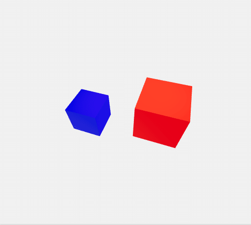
React Three Fiber Practice02 Box Rotation by Mouse Move
次にマウスの動きにあわせてBoxが回転するコードを作成しました。
React Three Fiber Practice02 Box Rotation by Mouse Move
フォルダ構成はPractice01 のものと同じです。 ファイル内容の変更はPractice01 と比較して、App.jsとstyles.cssに対してのみ行っています。
App.js
import { useRef, useState } from 'react'
import { Canvas, useFrame } from '@react-three/fiber'
import { Mesh, Vector3 } from 'three'

function Box(props) {
  const ref = useRef()

  const [hovered, hover] = useState(false)
  const [clicked, click] = useState(false)

  useFrame((state) => {
    ref.current.rotation.x = state.mouse.x * 5
    ref.current.rotation.y = state.mouse.y * 5
  }, [])

  return (
    <mesh
      {...props}
      ref={ref}
      scale={clicked ? 1.5 : 1}
      onClick={(event) => click(!clicked)}
      onPointerOver={(event) => hover(true)}
      onPointerOut={(event) => hover(false)}>
      <boxGeometry args={[1, 1, 1]} />
      <meshStandardMaterial color={hovered ? 'red' : 'blue'} />
    </mesh>
  )
}

export default function App() {
  return (
    <Canvas>
      <ambientLight intensity={0.5} />
      <spotLight position={[10, 10, 10]} angle={0.15} penumbra={1} />
      <pointLight position={[-10, -10, -10]} />
      <Box position={[-1.2, 0, 0]} />
      <Box position={[1.2, 0, 0]} />
    </Canvas>
  )
}
上記App.jsのコードでは
Practice01の
useFrame((state, delta) => (ref.current.rotation.x += delta))を
Practice02で
useFrame((state) => {
    ref.current.rotation.x = state.mouse.x * 5
    ref.current.rotation.y = state.mouse.y * 5
  }, [])
と変更して、Boxの回転がマウスのXとYの動きに連動するように変更しています。
また、Practice01の
<meshStandardMaterial color={hovered ? 'hotpink' : 'orange'} />を
Practice02で
<meshStandardMaterial color={hovered ? 'red' : 'blue'} />と変更して、Boxのマテリアルの色を変えています。 あとはコード中のコメントを作業中見やすいようにと全部削除しています。
import { Mesh, Vector3 } from 'three' は消し忘れですw。
styles.cssはよくわかっていない「box-sizing」の項目を削除して以下のようにしました。
html,
body,
#root {
width: 100%;
height: 100%;
margin: 0;
padding: 0;
}
body {
background: #f0f0f0;
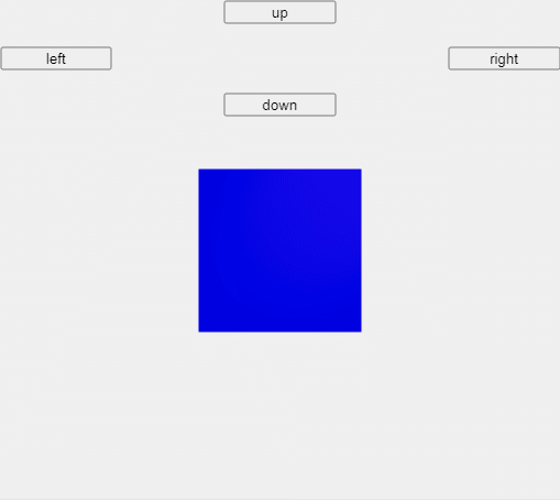
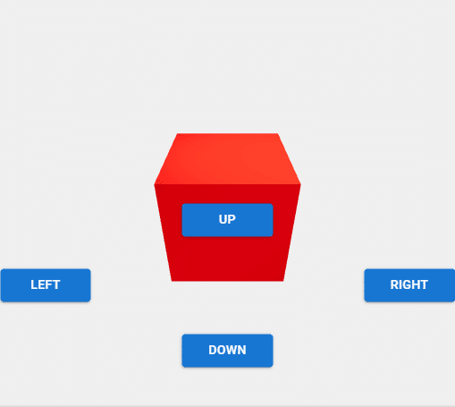
}React Three Fiber Practice03 GUI Test by HTML&CSS
ここで、CSSのGridレイアウトの機能を使用してHTML要素によるボタンの配置を行ってみました。
React Three Fiber Practice03 GUI Test by HTML&CSS
フォルダ構成はそのままに、App.jsとstyles.cssのファイル内容を以下のように変更しています。
App.js
import { useRef, useState } from 'react'
import { Canvas, useFrame } from '@react-three/fiber'
import { Html } from '@react-three/drei'
import './styles.css'

function Box(props) {
  const ref = useRef()

  const [hovered, hover] = useState(false)
  const [clicked, click] = useState(false)

  useFrame((state) => {
    ref.current.rotation.x += props.up ? -0.1 : 0
    ref.current.rotation.x += props.down ? 0.1 : 0
    ref.current.rotation.y += props.left ? -0.1 : 0
    ref.current.rotation.y += props.right ? 0.1 : 0
  }, [])

  return (
    <mesh
      position={props.position}
      ref={ref}
      scale={clicked ? 1.5 : 1}
      onClick={(event) => click(!clicked)}
      onPointerOver={(event) => hover(true)}
      onPointerOut={(event) => hover(false)}>
      <boxGeometry args={[2, 2, 2]} />
      <meshStandardMaterial color={hovered ? 'red' : 'blue'} />
    </mesh>
  )
}

export default function App() {
  const [up, toggleUp] = useState(false)
  const [down, toggleDown] = useState(false)
  const [left, toggleLeft] = useState(false)
  const [right, toggleRight] = useState(false)
  return (
    <Canvas>
      <Html fullscreen>
        <div class="wrapper">
          <button
            class="upButton"
            onPointerDown={() => toggleUp(true)}
            onPointerUp={() => toggleUp(false)}
            onPointerLeave={() => toggleUp(false)}
            onPointerOut={() => toggleUp(false)}>
            up
          </button>
          <button
            class="leftButton"
            onPointerDown={() => toggleLeft(true)}
            onPointerUp={() => toggleLeft(false)}
            onPointerLeave={() => toggleLeft(false)}
            onPointerOut={() => toggleLeft(false)}>
            left
          </button>
          <button
            class="rightButton"
            onPointerDown={() => toggleRight(true)}
            onPointerUp={() => toggleRight(false)}
            onPointerLeave={() => toggleRight(false)}
            onPointerOut={() => toggleRight(false)}>
            right
          </button>
          <button
            class="downButton"
            onPointerDown={() => toggleDown(true)}
            onPointerUp={() => toggleDown(false)}
            onPointerLeave={() => toggleDown(false)}
            onPointerOut={() => toggleDown(false)}>
            down
          </button>
        </div>
      </Html>

      <ambientLight intensity={0.5} />
      <spotLight position={[10, 10, 10]} angle={0.15} penumbra={1} />
      <pointLight position={[-10, -10, -10]} />
      <Box position={[0, 0, 0]} up={up} down={down} left={left} right={right} />
    </Canvas>
  )
}
App.jsでは
useStateを使用した、ボタン操作による状態を保持する
  const [up, toggleUp] = useState(false)
  const [down, toggleDown] = useState(false)
  const [left, toggleLeft] = useState(false)
  const [right, toggleRight] = useState(false)
と
ボタンを作成する
      <Html fullscreen>
        <div class="wrapper">
          <button
            class="upButton"
            onPointerDown={() => toggleUp(true)}
            onPointerUp={() => toggleUp(false)}
            onPointerLeave={() => toggleUp(false)}
            onPointerOut={() => toggleUp(false)}>
            up
          </button>
          <button
            class="leftButton"
            onPointerDown={() => toggleLeft(true)}
            onPointerUp={() => toggleLeft(false)}
            onPointerLeave={() => toggleLeft(false)}
            onPointerOut={() => toggleLeft(false)}>
            left
          </button>
          <button
            class="rightButton"
            onPointerDown={() => toggleRight(true)}
            onPointerUp={() => toggleRight(false)}
            onPointerLeave={() => toggleRight(false)}
            onPointerOut={() => toggleRight(false)}>
            right
          </button>
          <button
            class="downButton"
            onPointerDown={() => toggleDown(true)}
            onPointerUp={() => toggleDown(false)}
            onPointerLeave={() => toggleDown(false)}
            onPointerOut={() => toggleDown(false)}>
            down
          </button>
        </div>
      </Html>
により操作対象Boxを操作するためのボタンを作成しました。<Html fullscreen>と</Html>で挟んだ領域にはHTML要素を表示できるようでした。
また、操作対象として2つのBoxが表示される
      <Box position={[-1.2, 0, 0]} />
      <Box position={[1.2, 0, 0]} />
から
<Box position={[0, 0, 0]} up={up} down={down} left={left} right={right} />へ修正して、Boxは1つだけが表示されるようにし、Boxの位置とボタンの状態のパラメーターを渡すようにしました。
そしてそのボタン状態パラメーターを受けて
  useFrame((state) => {
    ref.current.rotation.x += props.up ? -0.1 : 0
    ref.current.rotation.x += props.down ? 0.1 : 0
    ref.current.rotation.y += props.left ? -0.1 : 0
    ref.current.rotation.y += props.right ? 0.1 : 0
  }, [])
でボタンの状態判定をしてBoxを上下左右に回転させるようにしています。
ボタンの位置のほうは
    <mesh
      position={props.position}
の部分で設定しています。
styles.css
html,
body,
#root {
  width: 100%;
  height: 100%;
  margin: 0;
  padding: 0;
}

body {
  background: #f0f0f0;
}
.wrapper {
  display: grid;
  grid-template-columns: 1fr 1fr 1fr 1fr 1fr;
  grid-auto-rows: 1fr 1fr 1fr 1fr 1fr;
}
.upButton {
  grid-column: 3;
  grid-row: 1;
}
.leftButton {
  grid-column: 1;
  grid-row: 3;
}
.rightButton {
  grid-column: 5;
  grid-row: 3;
}
.downButton {
  grid-column: 3;
  grid-row: 5;
}
styles.cssでは以下のようなCSSを追加し、Gridレイアウトを使ってボタンの配置を行っています。
.wrapper {
display: grid;
grid-template-columns: 1fr 1fr 1fr 1fr 1fr;
grid-auto-rows: 1fr 1fr 1fr 1fr 1fr;
}
.upButton {
grid-column: 3;
grid-row: 1;
}
.leftButton {
grid-column: 1;
grid-row: 3;
}
.rightButton {
grid-column: 5;
grid-row: 3;
}
.downButton {
grid-column: 3;
grid-row: 5;
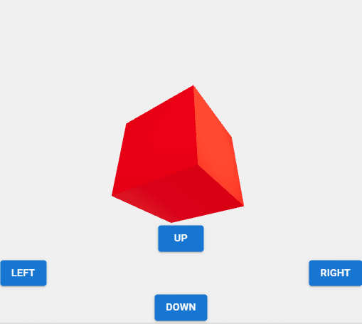
}React Three Fiber Practice04 GUI Test by Material UI
次に、ただのHTMLによるボタンだと見た目がさみしいので、かわりにMaterial UIというものを使用したボタンインターフェースを作成してみました。 Gridの機能もそのMaterial UIのものを使用しました。
React Three Fiber Practice04 GUI Test by Material UI
このPractice04で修正したindex.html、App.jsとstyles.cssのファイル内容は以下のようになります。 index.htmlはMaterial UIのためのフォントを取り込む部分の追加だけ行っています。 そして、ここでそれらの変更のために取り込んだライブラリの追加により、このnoteの最初に紹介した「使用環境」と同じ状態になりました。
indes.html
<!DOCTYPE html>
<html lang="en">
  <head>
    <meta charset="utf-8" />
    <meta name="viewport" content="width=device-width, initial-scale=1, shrink-to-fit=no" />
    <meta name="theme-color" content="#000000" />
    <!--
      manifest.json provides metadata used when your web app is added to the
      homescreen on Android. See https://developers.google.com/web/fundamentals/engage-and-retain/web-app-manifest/
    -->
    <link rel="manifest" href="%PUBLIC_URL%/manifest.json" />
    <link rel="shortcut icon" href="%PUBLIC_URL%/favicon.ico" />
    <!--
      Notice the use of %PUBLIC_URL% in the tags above.
      It will be replaced with the URL of the `public` folder during the build.
      Only files inside the `public` folder can be referenced from the HTML.

      Unlike "/favicon.ico" or "favicon.ico", "%PUBLIC_URL%/favicon.ico" will
      work correctly both with client-side routing and a non-root public URL.
      Learn how to configure a non-root public URL by running `npm run build`.
    -->
    <link rel="stylesheet" href="https://fonts.googleapis.com/css?family=Roboto:300,400,500,700&display=swap" />
    <title>React App</title>
  </head>

  <body>
    <noscript>
      You need to enable JavaScript to run this app.
    </noscript>
    <div id="root"></div>
    <!--
      This HTML file is a template.
      If you open it directly in the browser, you will see an empty page.

      You can add webfonts, meta tags, or analytics to this file.
      The build step will place the bundled scripts into the <body> tag.

      To begin the development, run `npm start` or `yarn start`.
      To create a production bundle, use `npm run build` or `yarn build`.
    -->
  </body>
</html>
index.htmlでは
<link rel="stylesheet" href="https://fonts.googleapis.com/css?family=Roboto:300,400,500,700&display=swap" />でMaterial UIで使用するフォントを取り込んでいます。
App.js
// 参考サイト
//@react-three/fiber drei > Html
//https://github.com/pmndrs/drei#html
//
//Button
//https://mui.com/material-ui/react-button/
//
//Grid
//https://mui.com/material-ui/react-grid/
//Grid version 2
//https://mui.com/material-ui/react-grid2/
//Material-UIでGridレイアウトを試す
//https://qiita.com/vimyum/items/5ba06ca166ebe4992617
//
//Material-UI absolute positioning inside a Grid
//https://stackoverflow.com/questions/61941646/material-ui-absolute-positioning-inside-a-grid
//CSSのpositionを総まとめ!absoluteやfixedの使い方は?
//https://saruwakakun.com/html-css/basic/relative-absolute-fixed
//
import { useRef, useState } from 'react'
import { Canvas, useFrame } from '@react-three/fiber'
import { Html } from '@react-three/drei'
import { Button } from '@mui/material'
import Grid from '@mui/material/Grid'
//import Grid2 from '@mui/material/Unstable_Grid2'
import './styles.css'

function Box(props) {
  const ref = useRef()

  const [hovered, hover] = useState(false)
  const [clicked, click] = useState(false)

  useFrame((state) => {
    ref.current.rotation.x += props.up ? -0.1 : 0
    ref.current.rotation.x += props.down ? 0.1 : 0
    ref.current.rotation.y += props.left ? -0.1 : 0
    ref.current.rotation.y += props.right ? 0.1 : 0
  }, [])

  return (
    <mesh
      position={props.position}
      ref={ref}
      scale={clicked ? 1.5 : 1}
      onClick={(event) => click(!clicked)}
      onPointerOver={(event) => hover(true)}
      onPointerOut={(event) => hover(false)}>
      <boxGeometry args={[2, 2, 2]} />
      <meshStandardMaterial color={hovered ? 'red' : 'blue'} />
    </mesh>
  )
}

export default function App() {
  const [up, toggleUp] = useState(false)
  const [down, toggleDown] = useState(false)
  const [left, toggleLeft] = useState(false)
  const [right, toggleRight] = useState(false)
  return (
    <Canvas>
      <Html fullscreen>
        <Grid container rowSpacing={1.5} style={{ position: 'absolute', bottom: '5px' }}>
          <Grid item xs={12} display="flex" justifyContent="center">
            <Button
              variant="contained"
              onPointerDown={() => toggleUp(true)}
              onPointerUp={() => toggleUp(false)}
              onPointerLeave={() => toggleUp(false)}
              onPointerOut={() => toggleUp(false)}>
              up
            </Button>
          </Grid>

          <Grid item xs={6} display="flex" justifyContent="flex-start">
            <Button
              variant="contained"
              onPointerDown={() => toggleLeft(true)}
              onPointerUp={() => toggleLeft(false)}
              onPointerLeave={() => toggleLeft(false)}
              onPointerOut={() => toggleLeft(false)}>
              left
            </Button>
          </Grid>

          <Grid item xs={6} display="flex" justifyContent="flex-end">
            <Button
              variant="contained"
              onPointerDown={() => toggleRight(true)}
              onPointerUp={() => toggleRight(false)}
              onPointerLeave={() => toggleRight(false)}
              onPointerOut={() => toggleRight(false)}>
              right
            </Button>
          </Grid>

          <Grid item xs={12} display="flex" justifyContent="center">
            <Button
              variant="contained"
              onPointerDown={() => toggleDown(true)}
              onPointerUp={() => toggleDown(false)}
              onPointerLeave={() => toggleDown(false)}
              onPointerOut={() => toggleDown(false)}>
              down
            </Button>
          </Grid>
        </Grid>
      </Html>

      <ambientLight intensity={0.5} />
      <spotLight position={[10, 10, 10]} angle={0.15} penumbra={1} />
      <pointLight position={[-10, -10, -10]} />
      <Box position={[0, 0, 0]} up={up} down={down} left={left} right={right} />
    </Canvas>
  )
}
App.jsにコメントで書き込んでいる以下の参考サイトで調べながらなんとか(自分としては)それなりのボタンを表示させることができました。
・@react-three/fiber drei > Html
→React Three Fiberでの<Html>タグ使用時の参考にさせていただきました。
・Material-UI Button
・Material-UI Grid
・Material-UI Grid version 2
・Material-UIでGridレイアウトを試す
→Material UIを使用するときの参考にさせていただきました。
・Material-UI absolute positioning inside a Grid
・CSSのpositionを総まとめ!absoluteやfixedの使い方は?
→CSS使用のレイアウト設定の参考にさせていだたきました。
App.jsではまず、
import { Button } from '@mui/material'
import Grid from '@mui/material/Grid'
でMaterial UIを使用するために必要なものをimportした後、
       <Html fullscreen>
         <Grid container rowSpacing={1.5} style={{ position: 'absolute',
bottom: '5px' }}>
           <Grid item xs={12} display="flex" justifyContent="center">
             <Button
               variant="contained"
               onPointerDown={() => toggleUp(true)}
               onPointerUp={() => toggleUp(false)}
               onPointerLeave={() => toggleUp(false)}
               onPointerOut={() => toggleUp(false)}>
               up
             </Button>
           </Grid>

           <Grid item xs={6} display="flex" justifyContent="flex-start">
             <Button
               variant="contained"
               onPointerDown={() => toggleLeft(true)}
               onPointerUp={() => toggleLeft(false)}
               onPointerLeave={() => toggleLeft(false)}
               onPointerOut={() => toggleLeft(false)}>
               left
             </Button>
           </Grid>

           <Grid item xs={6} display="flex" justifyContent="flex-end">
             <Button
               variant="contained"
               onPointerDown={() => toggleRight(true)}
               onPointerUp={() => toggleRight(false)}
               onPointerLeave={() => toggleRight(false)}
               onPointerOut={() => toggleRight(false)}>
               right
             </Button>
           </Grid>

           <Grid item xs={12} display="flex" justifyContent="center">
             <Button
               variant="contained"
               onPointerDown={() => toggleDown(true)}
               onPointerUp={() => toggleDown(false)}
               onPointerLeave={() => toggleDown(false)}
               onPointerOut={() => toggleDown(false)}>
               down
             </Button>
           </Grid>
         </Grid>
       </Html>
部分でMaterial UIによるボタンの表示と画面上のレイアウトを指定しています。
<Html fullscreen>で指定したReact Three FiberのHTML領域?(DOM領域?)で、Material UIのGrid設定にしたがったレイアウト指定を行いつつ、<Button variant="contained"…. によりMaterial UIによるボタンを表示させました。
また、一番外側の <Grid container…. のタグに
style={{ position: 'absolute', bottom: '5px' }}
を指定して、Grid指定した領域全体が画面下側から5px離れたところに表示されるようにしています。
styles.css
html,
body,
#root {
  width: 100%;
  height: 100%;
  margin: 0;
  padding: 0;
}

body {
  background: #f0f0f0;
}
styles.cssは上記のように変更し、Practice03で設定していたCSSのGridを無効化しました。
Material UIのおかげでインターフェースの見た目はよくなりましたが、以下のようなエラーがよく出てくるようになりました(エラー画面は違うコードのものを使用)。
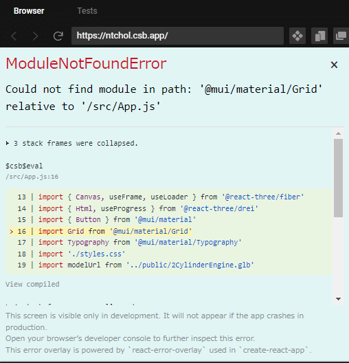
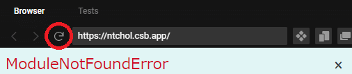
上記のようなエラーが出た場合、以下の赤丸で囲まれた部分を押してリロードすれば?、コードの実行結果の表示がされると思います。 (ライブラリを取り込みすぎて重いせいか?)何回かリロードが必要のときもありますが。。。
20221026追記
Material UI使用後から読み込みが遅くなりがちなので、
・React Three Fiber and NextJS Starter Template
を参考にpackage.jsonに以下を追加してみました。
// sandbox.config.json
{
   "infiniteLoopProtection": true,
   "hardReloadOnChange": false,
   "view": "browser"
}
結果package.jsonは以下のようになりました。
package.json
{
  "name": "react-three-fiber-practice04-gui-test-by-material-ui",
  "version": "1.0.0",
  "description": "",
  "keywords": [],
  "main": "src/index.js",
  "dependencies": {
    "@emotion/react": "11.10.4",
    "@emotion/styled": "11.10.4",
    "@fontsource/roboto": "4.5.8",
    "@mui/material": "5.10.7",
    "@react-three/drei": "9.32.1",
    "@react-three/fiber": "8.6.2",
    "react": "18.2.0",
    "react-dom": "18.2.0",
    "react-scripts": "5.0.1",
    "three": "0.144.0"
  },
  "devDependencies": {},
  "scripts": {
    "start": "react-scripts start",
    "build": "react-scripts build",
    "test": "react-scripts test --env=jsdom",
    "eject": "react-scripts eject"
  },
  "browserslist": [">0.2%", "not dead", "not ie <= 11", "not op_mini all"],
  "infiniteLoopProtection": true,
  "hardReloadOnChange": false,
  "view": "browser"
}
少しはコードの読み込み早くなったかな???
さらに追記です。
結局以下の白い画面が出てしばらく待つという状態はまだ残っていました。 あまりに待ち時間が長い場合は上記にあるようにリロードをお願いします。
React Three Fiber Practice05 GUI Test by Material UI + CSS
で、次のインターフェース実験ではMaterial UIと、HTML&CSSのGrid機能を混ぜて使用してみましたが、いまいち思ったようにレイアウトすることができず。。。
なので、今回のReact Three Fiberの実験では、上記の「React Three Fiber Practice04 GUI Test by Material UI」のインターフェースを主に使用する方針で進めていくことにしました。
React Three Fiber Practice05 GUI Test by Material UI + CSS
いちおうメモ的にApp.jsとstyles.cssを載せておきます。 Practice05は、ボタンをMaterial UIのものにし、GridはHTML&CSSのものを使用して、レイアウト機能ちゃんぽんできないかと試して途中で挫折したものです。 自分の状況ではPractice04で使っていた style={{ position: 'absolute', bottom: '5px' }} がうまく機能しないようでした。
App.js
// 参考サイト
//@react-three/fiber drei > Html
//https://github.com/pmndrs/drei#html
//
//Button
//https://mui.com/material-ui/react-button/
//
//Grid
//https://mui.com/material-ui/react-grid/
//Grid version 2
//https://mui.com/material-ui/react-grid2/
//Material-UIでGridレイアウトを試す
//https://qiita.com/vimyum/items/5ba06ca166ebe4992617
//
//Material-UI absolute positioning inside a Grid
//https://stackoverflow.com/questions/61941646/material-ui-absolute-positioning-inside-a-grid
//CSSのpositionを総まとめ!absoluteやfixedの使い方は?
//https://saruwakakun.com/html-css/basic/relative-absolute-fixed
//
import { useRef, useState } from 'react'
import { Canvas, useFrame } from '@react-three/fiber'
import { Html } from '@react-three/drei'
import { Button } from '@mui/material'
//import Grid from '@mui/material/Grid'
//import Grid2 from '@mui/material/Unstable_Grid2'
import './styles.css'

function Box(props) {
  const ref = useRef()

  const [hovered, hover] = useState(false)
  const [clicked, click] = useState(false)

  useFrame((state) => {
    ref.current.rotation.x += props.up ? -0.1 : 0
    ref.current.rotation.x += props.down ? 0.1 : 0
    ref.current.rotation.y += props.left ? -0.1 : 0
    ref.current.rotation.y += props.right ? 0.1 : 0
  }, [])

  return (
    <mesh
      position={props.position}
      ref={ref}
      scale={clicked ? 1.5 : 1}
      onClick={(event) => click(!clicked)}
      onPointerOver={(event) => hover(true)}
      onPointerOut={(event) => hover(false)}>
      <boxGeometry args={[2, 2, 2]} />
      <meshStandardMaterial color={hovered ? 'red' : 'blue'} />
    </mesh>
  )
}

export default function App() {
  const [up, toggleUp] = useState(false)
  const [down, toggleDown] = useState(false)
  const [left, toggleLeft] = useState(false)
  const [right, toggleRight] = useState(false)
  return (
    <Canvas>
      <Html fullscreen>
        <div id="wrapper" style={{ position: 'relative', top: '50%' }}>
          <Button
            id="upButton"
            variant="contained"
            onPointerDown={() => toggleUp(true)}
            onPointerUp={() => toggleUp(false)}
            onPointerLeave={() => toggleUp(false)}
            onPointerOut={() => toggleUp(false)}>
            up
          </Button>

          <Button
            id="leftButton"
            variant="contained"
            onPointerDown={() => toggleLeft(true)}
            onPointerUp={() => toggleLeft(false)}
            onPointerLeave={() => toggleLeft(false)}
            onPointerOut={() => toggleLeft(false)}>
            left
          </Button>

          <Button
            id="rightButton"
            variant="contained"
            onPointerDown={() => toggleRight(true)}
            onPointerUp={() => toggleRight(false)}
            onPointerLeave={() => toggleRight(false)}
            onPointerOut={() => toggleRight(false)}>
            right
          </Button>

          <Button
            id="downButton"
            variant="contained"
            onPointerDown={() => toggleDown(true)}
            onPointerUp={() => toggleDown(false)}
            onPointerLeave={() => toggleDown(false)}
            onPointerOut={() => toggleDown(false)}>
            down
          </Button>
        </div>
      </Html>

      <ambientLight intensity={0.5} />
      <spotLight position={[10, 10, 10]} angle={0.15} penumbra={1} />
      <pointLight position={[-10, -10, -10]} />
      <Box position={[0, 0, 0]} up={up} down={down} left={left} right={right} />
    </Canvas>
  )
}
styles.css
* {
  box-sizing: border-box;
}

html,
body,
#root {
  width: 100%;
  height: 100%;
  margin: 0;
  padding: 0;
}

body {
  background: #f0f0f0;
}
#wrapper {
  display: grid;
  position: 'absolute';
  bottom: '100px';
  grid-template-columns: 1fr 1fr 1fr 1fr 1fr;
  grid-auto-rows: 1fr 1fr 1fr 1fr 1fr;
}
#upButton {
  grid-column: 3;
  grid-row: 1;
}
#leftButton {
  grid-column: 1;
  grid-row: 3;
}
#rightButton {
  grid-column: 5;
  grid-row: 3;
}
#downButton {
  grid-column: 3;
  grid-row: 5;
}
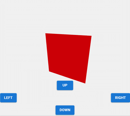
React Three Fiber Practice06 Plane
ここまで使用していたBoxに替えてPlaneオブジェクトを表示しています。 このあたりからの、表示する基本的な3Dオブジェクトを切り替えるだけの作業では、これまでのThree.jsの経験が使いまわせるような変更が増えて少し作業がはかどりました。
React Three Fiber Practice06 Plane
Material UIを使用したボタン・レイアウトを作成したPracitice04からの変更は以下App.jsだけとなります。
App.js
// 参考サイト
//Three.js r110でPlaneを表示
//https://codepen.io/siouxcitizen/pen/eYYqrra
//
//react-three-fiber-plane
//https://codesandbox.io/s/react-three-fiber-plane-2f4yn
//
import { useRef, useState } from 'react'
import { DoubleSide } from 'three'
import { Canvas, useFrame } from '@react-three/fiber'
import { Html } from '@react-three/drei'
import { Button } from '@mui/material'
import Grid from '@mui/material/Grid'
import './styles.css'

function Plane(props) {
  const ref = useRef()

  const [hovered, hover] = useState(false)
  const [clicked, click] = useState(false)

  useFrame((state) => {
    ref.current.rotation.x += props.up ? -0.1 : 0
    ref.current.rotation.x += props.down ? 0.1 : 0
    ref.current.rotation.y += props.left ? -0.1 : 0
    ref.current.rotation.y += props.right ? 0.1 : 0
  }, [])

  return (
    <mesh
      position={props.position}
      ref={ref}
      scale={clicked ? 1.5 : 1}
      onClick={(event) => click(!clicked)}
      onPointerOver={(event) => hover(true)}
      onPointerOut={(event) => hover(false)}>
      <planeGeometry args={[2, 2, 2]} />
      <meshStandardMaterial color={hovered ? 'red' : 'blue'} side={DoubleSide} />
    </mesh>
  )
}

export default function App() {
  const [up, toggleUp] = useState(false)
  const [down, toggleDown] = useState(false)
  const [left, toggleLeft] = useState(false)
  const [right, toggleRight] = useState(false)
  return (
    <Canvas>
      <Html fullscreen>
        <Grid container rowSpacing={1.5} style={{ position: 'absolute', bottom: '5px' }}>
          <Grid item xs={12} display="flex" justifyContent="center">
            <Button
              variant="contained"
              onPointerDown={() => toggleUp(true)}
              onPointerUp={() => toggleUp(false)}
              onPointerLeave={() => toggleUp(false)}
              onPointerOut={() => toggleUp(false)}>
              up
            </Button>
          </Grid>

          <Grid item xs={6} display="flex" justifyContent="flex-start">
            <Button
              variant="contained"
              onPointerDown={() => toggleLeft(true)}
              onPointerUp={() => toggleLeft(false)}
              onPointerLeave={() => toggleLeft(false)}
              onPointerOut={() => toggleLeft(false)}>
              left
            </Button>
          </Grid>

          <Grid item xs={6} display="flex" justifyContent="flex-end">
            <Button
              variant="contained"
              onPointerDown={() => toggleRight(true)}
              onPointerUp={() => toggleRight(false)}
              onPointerLeave={() => toggleRight(false)}
              onPointerOut={() => toggleRight(false)}>
              right
            </Button>
          </Grid>

          <Grid item xs={12} display="flex" justifyContent="center">
            <Button
              variant="contained"
              onPointerDown={() => toggleDown(true)}
              onPointerUp={() => toggleDown(false)}
              onPointerLeave={() => toggleDown(false)}
              onPointerOut={() => toggleDown(false)}>
              down
            </Button>
          </Grid>
        </Grid>
      </Html>

      <ambientLight intensity={0.5} />
      <spotLight position={[10, 10, 10]} angle={0.15} penumbra={1} />
      <pointLight position={[-10, -10, -10]} />
      <Plane position={[0, 0, 0]} up={up} down={down} left={left} right={right} />
    </Canvas>
  )
}
    <mesh
      position={props.position}
      ref={ref}
      scale={clicked ? 1.5 : 1}
      onClick={(event) => click(!clicked)}
      onPointerOver={(event) => hover(true)}
      onPointerOut={(event) => hover(false)}>
      <planeGeometry args={[2, 2, 2]} />
      <meshStandardMaterial color={hovered ? 'red' : 'blue'} side={DoubleSide} />
    </mesh>
にある
<planeGeometry args={[2, 2, 2]} /> でPlaneのジオメトリを指定し、そのすぐ下の行で side={DoubleSide} を指定してPlaneを両面表示設定することによって、自分が想定したPlaneオブジェクトが表示されました。
App.js内でこれまでBoxオブジェクトを使用していたため<Box …. タグを使用していた部分も、Planeオブジェクト使用に合わせて<Plane …. タグの使用に変更しました(←<Box …. タグは変更しなくても動きますが、見た目的に変更しています)。
App.jsのコメントにあるように、React Three FiberでのPlaneオブジェクト表にあたっては以下のコードを参考にさせていただきました。
react-three-fiber-plane
→React Three FiberでのPlaneの使い方を参考にさせていただきました。
Three.js r110でPlaneを表示
→自分で前に作成したThree.jsのコードも参照しました。
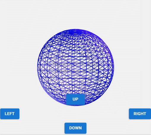
React Three Fiber Practice07 Sphere
次はSphereオブジェクトを表示です。
React Three Fiber Practice07 Sphere
ここでのコード修正もPractice06からApp.jsを修正しただけのものです。 以下にApp.jsを表示します。
App.js
// 参考サイト
//Three.js r110でSphereを表示
//https://codepen.io/siouxcitizen/pen/dyyxjeE
//
//Increase wireframe thickness with react-three-fiber
//https://stackoverflow.com/questions/69554400/increase-wireframe-thickness-with-react-three-fiber
//
import { useRef, useState } from 'react'
import { Canvas, useFrame } from '@react-three/fiber'
import { Html } from '@react-three/drei'
import { Button } from '@mui/material'
import Grid from '@mui/material/Grid'
import './styles.css'

function Sphere(props) {
  const ref = useRef()

  const [hovered, hover] = useState(false)
  const [clicked, click] = useState(false)

  useFrame((state) => {
    ref.current.rotation.x += props.up ? -0.1 : 0
    ref.current.rotation.x += props.down ? 0.1 : 0
    ref.current.rotation.y += props.left ? -0.1 : 0
    ref.current.rotation.y += props.right ? 0.1 : 0
  }, [])

  return (
    <mesh
      position={props.position}
      ref={ref}
      scale={clicked ? 1.5 : 1}
      onClick={(event) => click(!clicked)}
      onPointerOver={(event) => hover(true)}
      onPointerOut={(event) => hover(false)}>
      <sphereGeometry args={[2, 25, 25]} />
      <meshStandardMaterial wireframe color={hovered ? 'red' : 'blue'} />
    </mesh>
  )
}

export default function App() {
  const [up, toggleUp] = useState(false)
  const [down, toggleDown] = useState(false)
  const [left, toggleLeft] = useState(false)
  const [right, toggleRight] = useState(false)
  return (
    <Canvas>
      <Html fullscreen>
        <Grid container rowSpacing={1.5} style={{ position: 'absolute', bottom: '5px' }}>
          <Grid item xs={12} display="flex" justifyContent="center">
            <Button
              variant="contained"
              onPointerDown={() => toggleUp(true)}
              onPointerUp={() => toggleUp(false)}
              onPointerLeave={() => toggleUp(false)}
              onPointerOut={() => toggleUp(false)}>
              up
            </Button>
          </Grid>

          <Grid item xs={6} display="flex" justifyContent="flex-start">
            <Button
              variant="contained"
              onPointerDown={() => toggleLeft(true)}
              onPointerUp={() => toggleLeft(false)}
              onPointerLeave={() => toggleLeft(false)}
              onPointerOut={() => toggleLeft(false)}>
              left
            </Button>
          </Grid>

          <Grid item xs={6} display="flex" justifyContent="flex-end">
            <Button
              variant="contained"
              onPointerDown={() => toggleRight(true)}
              onPointerUp={() => toggleRight(false)}
              onPointerLeave={() => toggleRight(false)}
              onPointerOut={() => toggleRight(false)}>
              right
            </Button>
          </Grid>

          <Grid item xs={12} display="flex" justifyContent="center">
            <Button
              variant="contained"
              onPointerDown={() => toggleDown(true)}
              onPointerUp={() => toggleDown(false)}
              onPointerLeave={() => toggleDown(false)}
              onPointerOut={() => toggleDown(false)}>
              down
            </Button>
          </Grid>
        </Grid>
      </Html>

      <ambientLight intensity={0.5} />
      <spotLight position={[10, 10, 10]} angle={0.15} penumbra={1} />
      <pointLight position={[-10, -10, -10]} />
      <Sphere position={[0, 0, 0]} up={up} down={down} left={left} right={right} />
    </Canvas>
  )
}
App.jsの
      <sphereGeometry args={[2, 25, 25]} />
      <meshStandardMaterial wireframe color={hovered ? 'red' : 'blue'} />
部分の修正で、Practice06のPlaneから、このPractice07のSphere表示に変更されるようにしています。 また、このApp.jsでは<Plane …. タグ使用から<Sphere …. タグ使用への変更も行っています。
App.jsのコメントにあるように、React Three FiberでのSphereオブジェクト表示にあたっては以下のサイト・コードを参考にさせていただきました。
Increase wireframe thickness with react-three-fiber
→React Three FiberでのSphereの使い方を参考にさせていただきました。
Three.js r110でSphereを表示
→自分で前に作成したThree.jsのコードも参照しました。
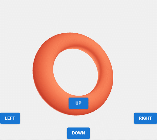
React Three Fiber Practice08 Torus
同じようにTorusオブジェクトを表示しました。
React Three Fiber Practice08 Torus
Practice07と同じようにApp.jsのみ修正しました。 以下のApp.jsになります。
App.js
// 参考サイト
//Three.js r110でTorusを表示
//https://codepen.io/siouxcitizen/pen/wvBwXNZ
//
//react-three-fiber torus instances
//https://codesandbox.io/s/4rubo
//
import { useRef, useState } from 'react'
import { Canvas, useFrame } from '@react-three/fiber'
import { Html } from '@react-three/drei'
import { Button } from '@mui/material'
import Grid from '@mui/material/Grid'
import './styles.css'

function Torus(props) {
  const ref = useRef()

  const [hovered, hover] = useState(false)
  const [clicked, click] = useState(false)

  useFrame((state) => {
    ref.current.rotation.x += props.up ? -0.1 : 0
    ref.current.rotation.x += props.down ? 0.1 : 0
    ref.current.rotation.y += props.left ? -0.1 : 0
    ref.current.rotation.y += props.right ? 0.1 : 0
  }, [])

  return (
    <mesh
      position={props.position}
      ref={ref}
      scale={clicked ? 1.5 : 1}
      onClick={(event) => click(!clicked)}
      onPointerOver={(event) => hover(true)}
      onPointerOut={(event) => hover(false)}>
      <torusGeometry args={[1.2, 0.3, 16, 100]} />
      <meshStandardMaterial color={hovered ? 'tomato' : 'green'} />
    </mesh>
  )
}

export default function App() {
  const [up, toggleUp] = useState(false)
  const [down, toggleDown] = useState(false)
  const [left, toggleLeft] = useState(false)
  const [right, toggleRight] = useState(false)
  return (
    <Canvas>
      <Html fullscreen>
        <Grid container rowSpacing={1.5} style={{ position: 'absolute', bottom: '5px' }}>
          <Grid item xs={12} display="flex" justifyContent="center">
            <Button
              variant="contained"
              onPointerDown={() => toggleUp(true)}
              onPointerUp={() => toggleUp(false)}
              onPointerLeave={() => toggleUp(false)}
              onPointerOut={() => toggleUp(false)}>
              up
            </Button>
          </Grid>

          <Grid item xs={6} display="flex" justifyContent="flex-start">
            <Button
              variant="contained"
              onPointerDown={() => toggleLeft(true)}
              onPointerUp={() => toggleLeft(false)}
              onPointerLeave={() => toggleLeft(false)}
              onPointerOut={() => toggleLeft(false)}>
              left
            </Button>
          </Grid>

          <Grid item xs={6} display="flex" justifyContent="flex-end">
            <Button
              variant="contained"
              onPointerDown={() => toggleRight(true)}
              onPointerUp={() => toggleRight(false)}
              onPointerLeave={() => toggleRight(false)}
              onPointerOut={() => toggleRight(false)}>
              right
            </Button>
          </Grid>

          <Grid item xs={12} display="flex" justifyContent="center">
            <Button
              variant="contained"
              onPointerDown={() => toggleDown(true)}
              onPointerUp={() => toggleDown(false)}
              onPointerLeave={() => toggleDown(false)}
              onPointerOut={() => toggleDown(false)}>
              down
            </Button>
          </Grid>
        </Grid>
      </Html>

      <ambientLight intensity={0.5} />
      <spotLight position={[10, 10, 10]} angle={0.15} penumbra={1} />
      <pointLight position={[-10, -10, -10]} />
      <Torus position={[0, 0, 0]} up={up} down={down} left={left} right={right} />
    </Canvas>
  )
}
App.jsの
      <torusGeometry args={[1.2, 0.3, 16, 100]} />
      <meshStandardMaterial color={hovered ? 'tomato' : 'green'} />
部分修正で、Torusを表示するようにしています。 マテリアルの色も修正です。 また、App.js内では<Torus …. タグを使用するように変更も行っています。
App.jsのコメントにあるように、React Three FiberでのTorusオブジェクト表示にあたっては以下のサイト・コードを参考にさせていただきました。
react-three-fiber torus instances
→React Three FiberでのTorusの使い方を参考にさせていただきました。
Three.js r110でTorusを表示
→自分で前に作成したThree.jsのコードも参照しました。
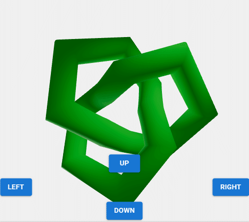
React Three Fiber Practice09 Torusknot
Torusをさらに複雑にしたようなTorusknotオブジェクトも表示してみます。
React Three Fiber Practice09 Torusknot
同じくApp.jsのみ変更です。 以下になります。
App.js
// 参考サイト
//Three.js r110でTorusknotを表示
//https://codepen.io/siouxcitizen/pen/qBEWKGV
//
import { useRef, useState } from 'react'
import { Canvas, useFrame } from '@react-three/fiber'
import { Html } from '@react-three/drei'
import { Button } from '@mui/material'
import Grid from '@mui/material/Grid'
import './styles.css'

function Torusknot(props) {
  const ref = useRef()

  const [hovered, hover] = useState(false)
  const [clicked, click] = useState(false)

  useFrame((state) => {
    ref.current.rotation.x += props.up ? -0.1 : 0
    ref.current.rotation.x += props.down ? 0.1 : 0
    ref.current.rotation.y += props.left ? -0.1 : 0
    ref.current.rotation.y += props.right ? 0.1 : 0
  }, [])

  return (
    <mesh
      position={props.position}
      ref={ref}
      scale={clicked ? 1.5 : 1}
      onClick={(event) => click(!clicked)}
      onPointerOver={(event) => hover(true)}
      onPointerOut={(event) => hover(false)}>
      <torusKnotGeometry args={[1.2, 0.3, 16, 100]} />
      <meshStandardMaterial color={hovered ? 'tomato' : 'green'} />
    </mesh>
  )
}

export default function App() {
  const [up, toggleUp] = useState(false)
  const [down, toggleDown] = useState(false)
  const [left, toggleLeft] = useState(false)
  const [right, toggleRight] = useState(false)
  return (
    <Canvas>
      <Html fullscreen>
        <Grid container rowSpacing={1.5} style={{ position: 'absolute', bottom: '5px' }}>
          <Grid item xs={12} display="flex" justifyContent="center">
            <Button
              variant="contained"
              onPointerDown={() => toggleUp(true)}
              onPointerUp={() => toggleUp(false)}
              onPointerLeave={() => toggleUp(false)}
              onPointerOut={() => toggleUp(false)}>
              up
            </Button>
          </Grid>

          <Grid item xs={6} display="flex" justifyContent="flex-start">
            <Button
              variant="contained"
              onPointerDown={() => toggleLeft(true)}
              onPointerUp={() => toggleLeft(false)}
              onPointerLeave={() => toggleLeft(false)}
              onPointerOut={() => toggleLeft(false)}>
              left
            </Button>
          </Grid>

          <Grid item xs={6} display="flex" justifyContent="flex-end">
            <Button
              variant="contained"
              onPointerDown={() => toggleRight(true)}
              onPointerUp={() => toggleRight(false)}
              onPointerLeave={() => toggleRight(false)}
              onPointerOut={() => toggleRight(false)}>
              right
            </Button>
          </Grid>

          <Grid item xs={12} display="flex" justifyContent="center">
            <Button
              variant="contained"
              onPointerDown={() => toggleDown(true)}
              onPointerUp={() => toggleDown(false)}
              onPointerLeave={() => toggleDown(false)}
              onPointerOut={() => toggleDown(false)}>
              down
            </Button>
          </Grid>
        </Grid>
      </Html>

      <ambientLight intensity={0.5} />
      <spotLight position={[10, 10, 10]} angle={0.15} penumbra={1} />
      <pointLight position={[-10, -10, -10]} />
      <Torusknot position={[0, 0, 0]} up={up} down={down} left={left} right={right} />
    </Canvas>
  )
}
App.jsでは、これまでと同じように<mesh …. タグ内で
<torusKnotGeometry args={[1.2, 0.3, 16, 100]} />と修正を行って、Torusknotが表示されるようにしています。 App.js内の3Dオブジェクト呼び出しタグもこれまでと同じように<Torusknot …. タグを使用するように変更しています。
今回のPractice09では、React Three FiberでのTorusknotオブジェクト表示にあたって以下の自分のコードを参考にするだけですみました。
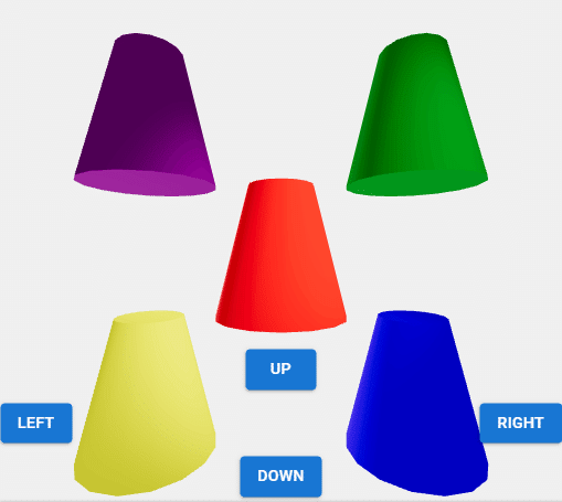
React Three Fiber Practice10 Cylinder
Cylinderオブジェクトでは色を変えつつ複数のものを表示しています。
React Three Fiber Practice10 Cylinder
Practice09からの変更対象App.jsは以下となります。
App.js
// 参考サイト
//Three.js r110でCylinderを表示
//https://codepen.io/siouxcitizen/pen/KKwPeOp
//
import { useRef, useState } from 'react'
import { Canvas, useFrame } from '@react-three/fiber'
import { Html } from '@react-three/drei'
import { Button } from '@mui/material'
import Grid from '@mui/material/Grid'
import './styles.css'

function Cylinder(props) {
  const ref = useRef()

  const [hovered, hover] = useState(false)
  const [clicked, click] = useState(false)

  useFrame((state) => {
    ref.current.rotation.x += props.up ? -0.1 : 0
    ref.current.rotation.x += props.down ? 0.1 : 0
    ref.current.rotation.y += props.left ? -0.1 : 0
    ref.current.rotation.y += props.right ? 0.1 : 0
  }, [])

  return (
    <mesh
      position={props.position}
      ref={ref}
      scale={clicked ? 1.5 : 1}
      onClick={(event) => click(!clicked)}
      onPointerOver={(event) => hover(true)}
      onPointerOut={(event) => hover(false)}>
      <cylinderGeometry args={[0.5, 1, 2, 16]} />
      <meshStandardMaterial color={hovered ? 'orange' : props.color} />
    </mesh>
  )
}

export default function App() {
  const [up, toggleUp] = useState(false)
  const [down, toggleDown] = useState(false)
  const [left, toggleLeft] = useState(false)
  const [right, toggleRight] = useState(false)
  return (
    <Canvas>
      <Html fullscreen>
        <Grid container rowSpacing={1.5} style={{ position: 'absolute', bottom: '5px' }}>
          <Grid item xs={12} display="flex" justifyContent="center">
            <Button
              variant="contained"
              onPointerDown={() => toggleUp(true)}
              onPointerUp={() => toggleUp(false)}
              onPointerLeave={() => toggleUp(false)}
              onPointerOut={() => toggleUp(false)}>
              up
            </Button>
          </Grid>

          <Grid item xs={6} display="flex" justifyContent="flex-start">
            <Button
              variant="contained"
              onPointerDown={() => toggleLeft(true)}
              onPointerUp={() => toggleLeft(false)}
              onPointerLeave={() => toggleLeft(false)}
              onPointerOut={() => toggleLeft(false)}>
              left
            </Button>
          </Grid>

          <Grid item xs={6} display="flex" justifyContent="flex-end">
            <Button
              variant="contained"
              onPointerDown={() => toggleRight(true)}
              onPointerUp={() => toggleRight(false)}
              onPointerLeave={() => toggleRight(false)}
              onPointerOut={() => toggleRight(false)}>
              right
            </Button>
          </Grid>

          <Grid item xs={12} display="flex" justifyContent="center">
            <Button
              variant="contained"
              onPointerDown={() => toggleDown(true)}
              onPointerUp={() => toggleDown(false)}
              onPointerLeave={() => toggleDown(false)}
              onPointerOut={() => toggleDown(false)}>
              down
            </Button>
          </Grid>
        </Grid>
      </Html>

      <ambientLight intensity={0.5} />
      <spotLight position={[10, 10, 10]} angle={0.15} penumbra={1} />
      <pointLight position={[-10, -10, -10]} />
      <Cylinder position={[-2, 2, 0]} color={'purple'} up={up} down={down} left={left} right={right} />
      <Cylinder position={[2, 2, 0]} color={'green'} up={up} down={down} left={left} right={right} />
      <Cylinder position={[0, 0, 0]} color={'red'} up={up} down={down} left={left} right={right} />
      <Cylinder position={[-2, -2, 0]} color={'yellow'} up={up} down={down} left={left} right={right} />
      <Cylinder position={[2, -2, 0]} color={'blue'} up={up} down={down} left={left} right={right} />
    </Canvas>
  )
}
App.jsでは
      <cylinderGeometry args={[0.5, 1, 2, 16]} />
      <meshStandardMaterial color={hovered ? 'orange' : props.color} />
でCylinder用のパラメータの設定を行うように変更しつつ、
      <Cylinder position={[-2, 2, 0]} color={'purple'} up={up} down={down} left={left} right={right} />
      <Cylinder position={[2, 2, 0]} color={'green'} up={up} down={down} left={left} right={right} />
      <Cylinder position={[0, 0, 0]} color={'red'} up={up} down={down} left={left} right={right} />
      <Cylinder position={[-2, -2, 0]} color={'yellow'} up={up} down={down} left={left} right={right} />
      <Cylinder position={[2, -2, 0]} color={'blue'} up={up} down={down} left={left} right={right} />
で複数の<Cylinder …. タグを呼び出しつつ、そのタグによる5つのCylinderオブジェクトのそれぞれの位置、マテリアルの色を変更しながら表示するようにしています。 「LEFT」と「RIGHT」ボタン押したときのCylinderの回転の動きが思うてたんとちがうw
今回のPractice10でも、以下の自分のコードを参考にするだけでなんとかCylinderオブジェクトの表示ができました。
React Three Fiber Practice11 Box Texture
ひととおり基本的な3Dオブジェクトの表示が終わったので、次からはテクスチャを貼り付けた3Dオブジェクトを表示しています。
まずはBoxにテクスチャを貼りつけたものを表示します。
React Three Fiber Practice11 Box Texture
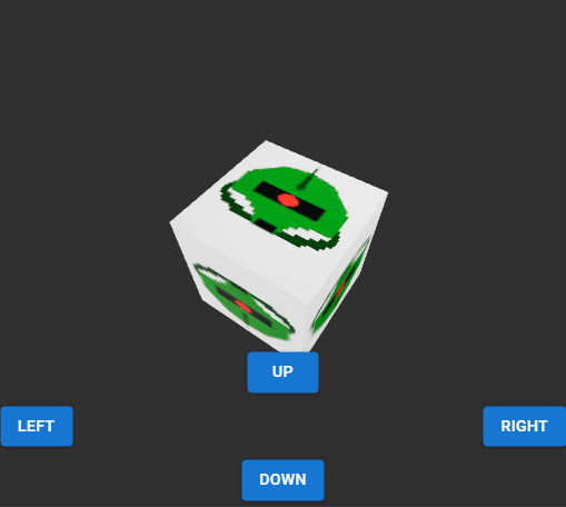
App.jsを以下のように修正して、Boxオブジェクトにテクスチャを貼り付けています。 テクスチャ画像は、ドット絵ソフトで作成した「zaku.jpg」という画像をCodeSandboxのsrcフォルダに置いたものです。
App.js
// 参考サイト
//
//Three.js r110でテクスチャを貼り付けたBoxを表示
//https://codepen.io/siouxcitizen/pen/qBEBEKW
//
//React Three Fiber で 3D の地球をブラウザに表示させる
//https://mseeeen.msen.jp/display-3d-earth-with-react-three-fiber/
//
import { useRef, useState } from 'react'
import * as THREE from 'three'
import { Canvas, useFrame, useLoader } from '@react-three/fiber'
import { Html } from '@react-three/drei'
import { Button } from '@mui/material'
import Grid from '@mui/material/Grid'
import './styles.css'
import img from './zaku.jpg'

function Box(props) {
  const texture = useLoader(THREE.TextureLoader, img)
  const ref = useRef()

  const [clicked, click] = useState(false)

  useFrame((state) => {
    ref.current.rotation.x += props.up ? -0.1 : 0
    ref.current.rotation.x += props.down ? 0.1 : 0
    ref.current.rotation.y += props.left ? -0.1 : 0
    ref.current.rotation.y += props.right ? 0.1 : 0
  }, [])

  return (
    <mesh position={props.position} ref={ref} scale={clicked ? 1.5 : 1} onClick={(event) => click(!clicked)}>
      <boxGeometry args={[2, 2, 2]} />
      <meshStandardMaterial map={texture} />
    </mesh>
  )
}

export default function App() {
  const [up, toggleUp] = useState(false)
  const [down, toggleDown] = useState(false)
  const [left, toggleLeft] = useState(false)
  const [right, toggleRight] = useState(false)
  return (
    <Canvas>
      <Html fullscreen>
        <Grid container rowSpacing={1.5} style={{ position: 'absolute', bottom: '5px' }}>
          <Grid item xs={12} display="flex" justifyContent="center">
            <Button
              variant="contained"
              onPointerDown={() => toggleUp(true)}
              onPointerUp={() => toggleUp(false)}
              onPointerLeave={() => toggleUp(false)}
              onPointerOut={() => toggleUp(false)}>
              up
            </Button>
          </Grid>

          <Grid item xs={6} display="flex" justifyContent="flex-start">
            <Button
              variant="contained"
              onPointerDown={() => toggleLeft(true)}
              onPointerUp={() => toggleLeft(false)}
              onPointerLeave={() => toggleLeft(false)}
              onPointerOut={() => toggleLeft(false)}>
              left
            </Button>
          </Grid>

          <Grid item xs={6} display="flex" justifyContent="flex-end">
            <Button
              variant="contained"
              onPointerDown={() => toggleRight(true)}
              onPointerUp={() => toggleRight(false)}
              onPointerLeave={() => toggleRight(false)}
              onPointerOut={() => toggleRight(false)}>
              right
            </Button>
          </Grid>

          <Grid item xs={12} display="flex" justifyContent="center">
            <Button
              variant="contained"
              onPointerDown={() => toggleDown(true)}
              onPointerUp={() => toggleDown(false)}
              onPointerLeave={() => toggleDown(false)}
              onPointerOut={() => toggleDown(false)}>
              down
            </Button>
          </Grid>
        </Grid>
      </Html>

      <ambientLight intensity={0.5} />
      <spotLight position={[10, 10, 10]} angle={0.15} penumbra={1} />
      <pointLight position={[-10, -10, -10]} />
      <Box position={[0, 0, 0]} up={up} down={down} left={left} right={right} />
    </Canvas>
  )
}
App.jsでは、
import img from './zaku.jpg'const texture = useLoader(THREE.TextureLoader, img) <mesh position={props.position} ref={ref} scale={clicked ? 1.5 : 1} onClick={(event) => click(!clicked)}>
<boxGeometry args={[2, 2, 2]} />
<meshStandardMaterial map={texture} />
</mesh>といったコードで、テクスチャ用画像を取り込んでBoxオブジェクト上に表示させています。
テクスチャ画像の読み込みは(React Three Fiberというよりは)Three.jsの機能を使用して行っているので、App.jsの冒頭で以下のようにThree.jsをimportしています。
import * as THREE from 'three'このPracticeでのBox上でのテクスチャ画像の表示では以下のサイト・コードを参考にさせていただきました。
React Three Fiber で 3D の地球をブラウザに表示させる
→こちらのサイトの説明とコードをもとに修正を加えて、Boxのテクスチャ画像を表示しました。
Three.js r110でテクスチャを貼り付けたBoxを表示
→自分で前に作成したThree.jsのコードも参照しました。
React Three Fiber Practice12 Plane Texture
Planeにテクスチャを貼り付けたものを表示。
React Three Fiber Practice12 Plane Texture
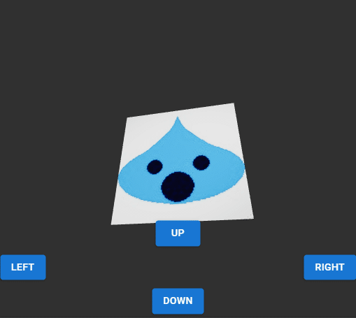
こちらもApp.js修正によりPlaneにテクスチャを張り付けてみました。 以下修正App.jsとなります。
App.js
// 参考サイト
//
//Three.js r110でテクスチャを貼り付けたPlaneを表示
//https://codepen.io/siouxcitizen/pen/qBEBJdd
//
//React Three Fiber で 3D の地球をブラウザに表示させる
//https://mseeeen.msen.jp/display-3d-earth-with-react-three-fiber/
//
import { useRef, useState } from 'react'
import * as THREE from 'three'
import { DoubleSide } from 'three'
import { Canvas, useFrame, useLoader } from '@react-three/fiber'
import { Html } from '@react-three/drei'
import { Button } from '@mui/material'
import Grid from '@mui/material/Grid'
import './styles.css'
import img from './sla.jpg'

function Plane(props) {
  const texture = useLoader(THREE.TextureLoader, img)
  const ref = useRef()

  const [clicked, click] = useState(false)

  useFrame((state) => {
    ref.current.rotation.x += props.up ? -0.1 : 0
    ref.current.rotation.x += props.down ? 0.1 : 0
    ref.current.rotation.y += props.left ? -0.1 : 0
    ref.current.rotation.y += props.right ? 0.1 : 0
  }, [])

  return (
    <mesh position={props.position} ref={ref} scale={clicked ? 1.5 : 1} onClick={(event) => click(!clicked)}>
      <planeGeometry args={[2, 2, 2]} />
      <meshStandardMaterial map={texture} side={DoubleSide} />
    </mesh>
  )
}

export default function App() {
  const [up, toggleUp] = useState(false)
  const [down, toggleDown] = useState(false)
  const [left, toggleLeft] = useState(false)
  const [right, toggleRight] = useState(false)
  return (
    <Canvas>
      <Html fullscreen>
        <Grid container rowSpacing={1.5} style={{ position: 'absolute', bottom: '5px' }}>
          <Grid item xs={12} display="flex" justifyContent="center">
            <Button
              variant="contained"
              onPointerDown={() => toggleUp(true)}
              onPointerUp={() => toggleUp(false)}
              onPointerLeave={() => toggleUp(false)}
              onPointerOut={() => toggleUp(false)}>
              up
            </Button>
          </Grid>

          <Grid item xs={6} display="flex" justifyContent="flex-start">
            <Button
              variant="contained"
              onPointerDown={() => toggleLeft(true)}
              onPointerUp={() => toggleLeft(false)}
              onPointerLeave={() => toggleLeft(false)}
              onPointerOut={() => toggleLeft(false)}>
              left
            </Button>
          </Grid>

          <Grid item xs={6} display="flex" justifyContent="flex-end">
            <Button
              variant="contained"
              onPointerDown={() => toggleRight(true)}
              onPointerUp={() => toggleRight(false)}
              onPointerLeave={() => toggleRight(false)}
              onPointerOut={() => toggleRight(false)}>
              right
            </Button>
          </Grid>

          <Grid item xs={12} display="flex" justifyContent="center">
            <Button
              variant="contained"
              onPointerDown={() => toggleDown(true)}
              onPointerUp={() => toggleDown(false)}
              onPointerLeave={() => toggleDown(false)}
              onPointerOut={() => toggleDown(false)}>
              down
            </Button>
          </Grid>
        </Grid>
      </Html>

      <ambientLight intensity={0.5} />
      <spotLight position={[10, 10, 10]} angle={0.15} penumbra={1} />
      <pointLight position={[-10, -10, -10]} />
      <Plane position={[0, 0, 0]} up={up} down={down} left={left} right={right} />
    </Canvas>
  )
}
App.js冒頭で、
import * as THREE from 'three'
import { DoubleSide } from 'three'
をimportし、
import img from './sla.jpg'const texture = useLoader(THREE.TextureLoader, img) <mesh position={props.position} ref={ref} scale={clicked ? 1.5 : 1} onClick={(event) => click(!clicked)}>
<planeGeometry args={[2, 2, 2]} />
<meshStandardMaterial map={texture} side={DoubleSide} />
</mesh>といったコードでPlane上にテクスチャを表示しています。 Planeの両面にテクスチャ張り付けのため、マテリアルの設定で side={DoubleSide} を使用しています。 Practice11と同じように、テクスチャ用のドット絵作成ソフトによる「sla.jpg」は、CodeSandbox上のsrcフォルダに置いています。
このPracticeでのPlane上でのテクスチャ画像の表示では以下のサイト・コードを参考にさせていただきました。
React Three Fiber で 3D の地球をブラウザに表示させる
→Practice11と同じように、こちらのサイトの説明とコードをもとに修正を加えて、Planeのテクスチャ画像を表示しました。
Three.js r110でテクスチャを貼り付けたPlaneを表示
→自分で前に作成したThree.jsのコードも参照しました。
React Three Fiber Practice13 Sphere Texture
最後にSphereに地球絵テクスチャを貼り付けて、地球っぽくなったSphereオブジェクトを表示です。
React Three Fiber Practice13 Sphere Texture
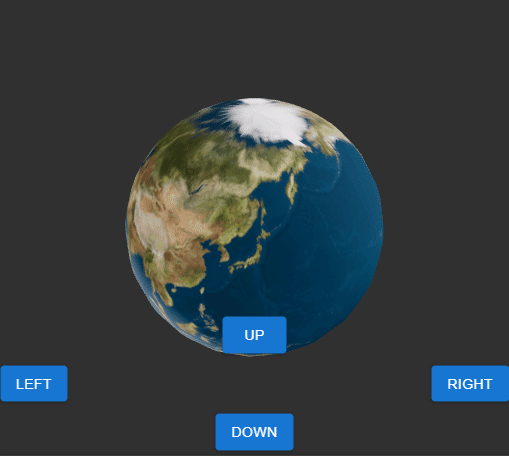
このPractice13が「実験その1」最後のコードとなります。 Sphereによる地球もどきを表示したApp.jsは以下となります。
App.js
// 参考サイト
//
//Three.js r110でテクスチャを貼り付けたPlaneを表示
//https://codepen.io/siouxcitizen/pen/qBEBJdd
//
//React Three Fiber で 3D の地球をブラウザに表示させる
//https://mseeeen.msen.jp/display-3d-earth-with-react-three-fiber/
//
//PLANET TEXTURE MAPS
//http://planetpixelemporium.com/earth.html
//
import { useRef, useState } from 'react'
import * as THREE from 'three'
import { Canvas, useFrame, useLoader } from '@react-three/fiber'
import { Html } from '@react-three/drei'
import { Button } from '@mui/material'
import Grid from '@mui/material/Grid'
import './styles.css'
import img from './earthmap1k.jpg'

function Sphere(props) {
  const texture = useLoader(THREE.TextureLoader, img)
  const ref = useRef()

  const [clicked, click] = useState(false)

  useFrame((state) => {
    ref.current.rotation.x += props.up ? -0.1 : 0
    ref.current.rotation.x += props.down ? 0.1 : 0
    ref.current.rotation.y += props.left ? -0.1 : 0
    ref.current.rotation.y += props.right ? 0.1 : 0
  }, [])

  return (
    <mesh position={props.position} ref={ref} scale={clicked ? 1.5 : 1} onClick={(event) => click(!clicked)}>
      <sphereGeometry args={[2, 25, 25]} />
      <meshStandardMaterial map={texture} />
    </mesh>
  )
}

export default function App() {
  const [up, toggleUp] = useState(false)
  const [down, toggleDown] = useState(false)
  const [left, toggleLeft] = useState(false)
  const [right, toggleRight] = useState(false)
  return (
    <Canvas>
      <Html fullscreen>
        <Grid container rowSpacing={1.5} style={{ position: 'absolute', bottom: '5px' }}>
          <Grid item xs={12} display="flex" justifyContent="center">
            <Button
              variant="contained"
              onPointerDown={() => toggleUp(true)}
              onPointerUp={() => toggleUp(false)}
              onPointerLeave={() => toggleUp(false)}
              onPointerOut={() => toggleUp(false)}>
              up
            </Button>
          </Grid>

          <Grid item xs={6} display="flex" justifyContent="flex-start">
            <Button
              variant="contained"
              onPointerDown={() => toggleLeft(true)}
              onPointerUp={() => toggleLeft(false)}
              onPointerLeave={() => toggleLeft(false)}
              onPointerOut={() => toggleLeft(false)}>
              left
            </Button>
          </Grid>

          <Grid item xs={6} display="flex" justifyContent="flex-end">
            <Button
              variant="contained"
              onPointerDown={() => toggleRight(true)}
              onPointerUp={() => toggleRight(false)}
              onPointerLeave={() => toggleRight(false)}
              onPointerOut={() => toggleRight(false)}>
              right
            </Button>
          </Grid>

          <Grid item xs={12} display="flex" justifyContent="center">
            <Button
              variant="contained"
              onPointerDown={() => toggleDown(true)}
              onPointerUp={() => toggleDown(false)}
              onPointerLeave={() => toggleDown(false)}
              onPointerOut={() => toggleDown(false)}>
              down
            </Button>
          </Grid>
        </Grid>
      </Html>

      <ambientLight intensity={0.5} />
      <spotLight position={[10, 10, 10]} angle={0.15} penumbra={1} />
      <pointLight position={[-10, -10, -10]} />
      <Sphere position={[0, 0, 0]} up={up} down={down} left={left} right={right} />
    </Canvas>
  )
}
このApp.jsでは、これまでの3Dオブジェクトに対するテクスチャ貼り付けと同じように
import * as THREE from 'three'と
import img from './earthmap1k.jpg'によるimportを行い、
作成する<Sphere …. タグの中で
const texture = useLoader(THREE.TextureLoader, img)のコードで、テクスチャ用画像を読み込み、
    <mesh position={props.position} ref={ref} scale={clicked ? 1.5 : 1} onClick={(event) => click(!clicked)}>
      <sphereGeometry args={[2, 25, 25]} />
      <meshStandardMaterial map={texture} />
    </mesh>
のコードで、読み込んだテクスチャを貼り付けた地球もどきSphereを表示指定する、といった流れになっています。
このPracticeでのSphere上でのテクスチャ画像の表示では以下のサイト・コードを参考にさせていただきました。
React Three Fiber で 3D の地球をブラウザに表示させる
→これまでと同じように、こちらのサイトの説明とコードを参考にさせていただきました。 やっと地球Sphere作成できたw。
PLANET TEXTURE MAPS
→上記リンクのサイトで地球テクスチャ用の画像配布場所として紹介されていました。 地球テクスチャ使わせていただきました。
Three.js r110でテクスチャを貼り付けたPlaneを表示
→自分で前に作成したThree.jsのコードも参照しました。
次回
この記事が気に入ったらサポートをしてみませんか?