Tableauには、本当にたくさんのチャートやグラフィックオプションがあり、データの可視化が可能です。
ですが、それ故に、どのチャートを使用すればよいのかを決定することは簡単ではないと感じます。。
ということで、今回は分析の目的ごとに、どのようなチャートを使用すればよいのかをまとめてみようと思います。
それぞれ、なるべく視覚表現アイデアの参考になるように、美しいチャートが集まる下記ページより参考にさせていただきました。
https://public.tableau.com/app/discover/viz-of-the-day
目的1. カテゴリや項目の比較
棒グラフ
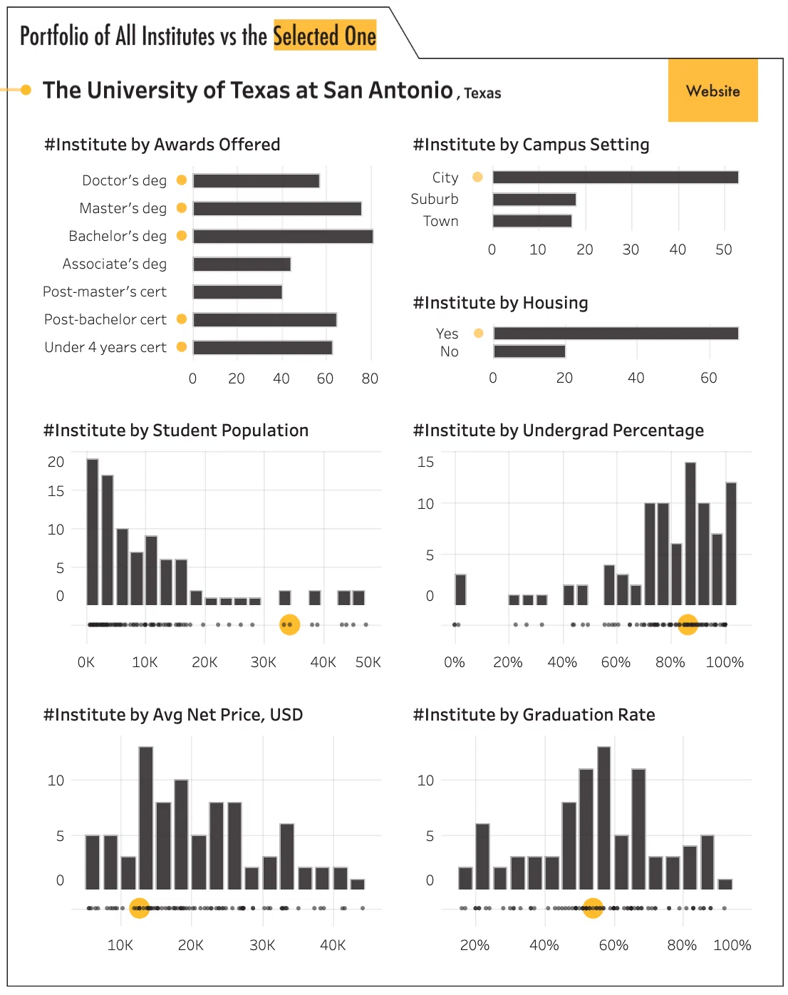 https://public.tableau.com/app/profile/kevin.wee/viz/USHigherEdInstituteswithDataAnalyticsProgram/Dashboard
ドットマトリックスチャート
 https://public.tableau.com/app/profile/chantilly.jaggernauth/viz/TheWorldsDependencyontheTravelIndustry/TheWorldsDependencyontheTravelIndustry
 https://public.tableau.com/app/discover/viz-of-the-day
目的2. 全体に対する割合の表示
円グラフ
 https://public.tableau.com/app/profile/stanke/viz/WOW2022Week49Canyoubuildapiechart/WOW2022W49
積み上げ棒グラフ
 https://public.tableau.com/app/profile/klaus.schulte/viz/DuBoisChallenge2023-Plate31/DuBoisPlate31
目的3. 時間の経過による変動やトレンド
線グラフ
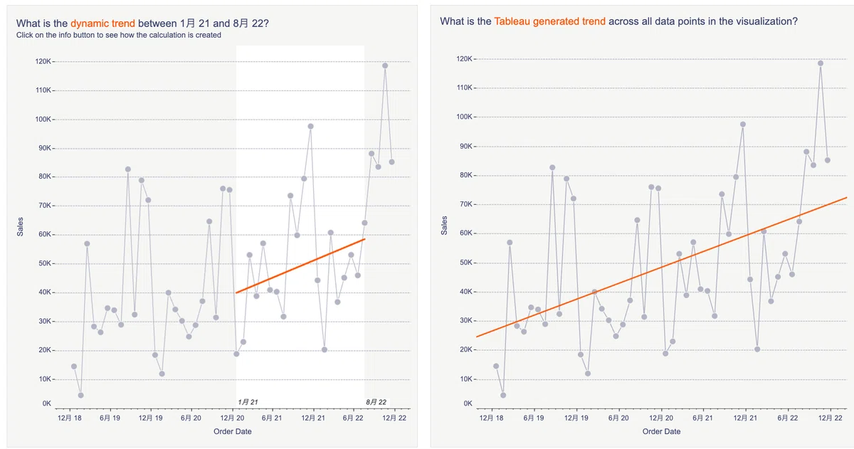 https://public.tableau.com/app/profile/alexander.philipeit/viz/DynamicTrendLine/DynamicTrend
棒グラフ(縦)
 https://public.tableau.com/app/profile/sparsonsdataviz/viz/DynamicZoneZooming-2022_3/ContainerExperiment
スロープチャート
 https://archive.nytimes.com/www.nytimes.com/imagepages/2009/04/06/health/infant_stats.html
エリアチャート
 https://public.tableau.com/app/profile/jessica7027/viz/BeverageofChoice/BeverageofChoice
目的4. 分布を見る
散布図
 https://public.tableau.com/app/profile/unmesh.panigrahy/viz/PenguinsatPalmerStationAntarcticaLTER/Week28
バブルチャート
 https://public.tableau.com/app/profile/takafumi.shukuya/viz/Viz2educateLifeSpanofAnimals/Dashboard1
目的5. 地理的な情報の表示
地図
 https://public.tableau.com/app/profile/lindsay.betzendahl/viz/3142Counties-DisparityofRaceandPoverty/3142Counties-Disparity
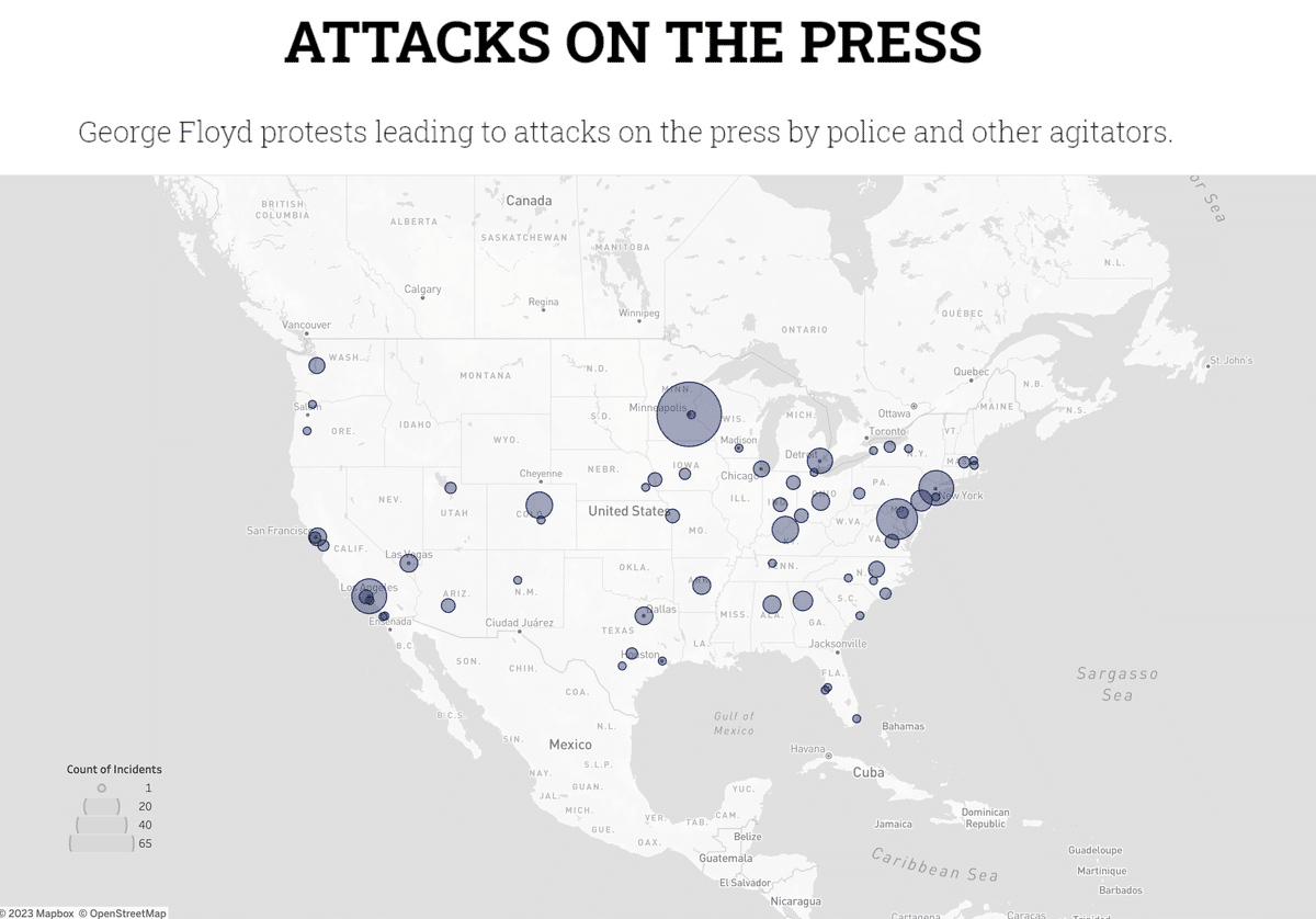 https://public.tableau.com/app/profile/steven.shoemaker/viz/AttacksonPress/Dashboard2
目的6. 階層的データやカテゴリの比較
ツリーマップ
 https://public.tableau.com/app/profile/iameap/viz/WhatsintheCARESAct/WhatsIntheCARESAct
サンバーストチャート
 https://www.rigordatasolutions.com/post/how-to-create-a-sunburst-chart-in-tableau
目的7. データの分布や外れ値の確認
箱ひげ図(ボックスプロット)
 https://public.tableau.com/app/profile/emily.de.padua/viz/TheCostofaDozenRosesB2VB2023Week4/TheCostofaDozenRosesB2VB2023Week4
ドットプロット(ダンベルチャート)
 https://public.tableau.com/app/profile/kashishrastogi/viz/ComparingUKandUSAInflationRate/InflationDash
 https://public.tableau.com/app/profile/zunaira.rasheed/viz/StudentSleepDeficit-MakeoverMondayWeek9/SleepDeficit
ヒストグラム
 https://dataviz.hatenablog.com/entry/2019/03/08/184321
バタフライチャート
 https://public.tableau.com/app/profile/natalia.miteva/viz/MyFirstHalfMarathon/MyFirstHalfMarathon
 https://public.tableau.com/app/profile/hipstervizninja/viz/Book4_15556982970350/PoppinPyramids
目的8. 複数の指標の一括比較
レーダーチャート
 https://blog.truestar.co.jp/tableau/20221225/52802/
 https://public.tableau.com/app/profile/iris6683/viz/BestCitiestoVisitin2023-RadarChart/Radar-All
目的9. 順序やランキングの表示
バンプチャート
 https://public.tableau.com/app/profile/iaroslava/viz/Top5namesofthenewbornbabiesintheLvivregion20082022/Names_ENG
棒グラフ
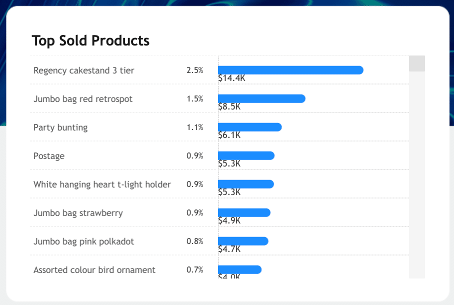 https://public.tableau.com/app/profile/kavin.kumar.g/viz/OnlineRetaildashboard/sales
目的10. 時間や順序に沿ったデータの流れ
サンキーダイアグラム
 https://public.tableau.com/app/profile/adam.green4310/viz/ZisforZoology/ZisforZoology
ウォーターフォールチャート
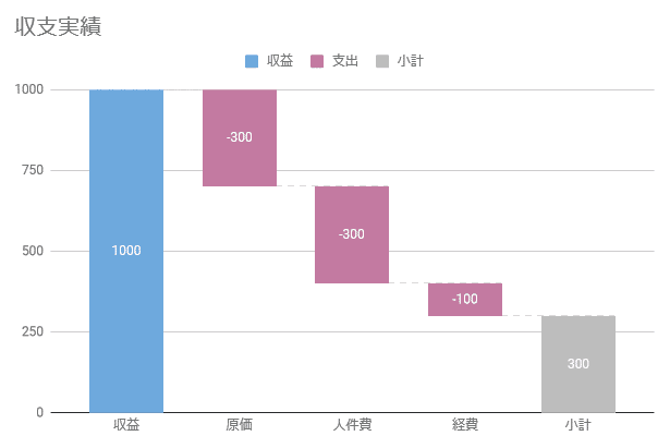 https://spread-sheets.com/useful/data/waterfall-chart/
まとめ
上記のように、目的別でチャートを並べてみて、改めてTableauによるビジュアライズの可能性を感じました。
データ分析により、目的が達成されることが一番ではあるので、その他の要素にこだわりすぎないことも大切です。
とはいえ、リッチなビジュアル表現ができるからこそ、より伝わるものが大きくなる要素もあると感じました。
上記で並べたVizのような表現ができることを目指して、今後も精進していこうと思います。

