
React Native Paper の使い方

「React Native Paper」の使い方をまとめました。
前回
1. React Native Paper
「React Native Paper」は、「React Native」のUIライブラリのひとつです。デフォルトでGoogleのマテリアルデザインガイドラインに準拠します。
2. React Native Paper の使い方
「React Native Paper」の使い方は次のとおりです。
2-1. セットアップ
(1) React Nativeプロジェクトの生成。
npx react-native init my_app
cd my_app
(2) パッケージのインストール。
npm install react-native-paper react-native-safe-area-context react-native-vector-icons
npm install @react-native-community/masked-view
2-2. Androidのセットアップ
(1) android/app/build.gradle(NOT android/build.gradle)に以下の設定を追加。
apply from: file("../../node_modules/react-native-vector-icons/fonts.gradle")2-3. iOSのセットアップ
(1) podのインストール。
cd ios
pod install
cd ..
(2) workspaceを開き、署名し、iPhoneにインストールできることを確認。
(3) 「Info.plist」に以下の項目を追加。
<key>UIAppFonts</key>
<array>
  <string>AntDesign.ttf</string>
  <string>Entypo.ttf</string>
  <string>EvilIcons.ttf</string>
  <string>Feather.ttf</string>
  <string>FontAwesome.ttf</string>
  <string>FontAwesome5_Brands.ttf</string>
  <string>FontAwesome5_Regular.ttf</string>
  <string>FontAwesome5_Solid.ttf</string>
  <string>FontAwesome6_Brands.ttf</string>
  <string>FontAwesome6_Regular.ttf</string>
  <string>FontAwesome6_Solid.ttf</string>
  <string>Foundation.ttf</string>
  <string>Ionicons.ttf</string>
  <string>MaterialIcons.ttf</string>
  <string>MaterialCommunityIcons.ttf</string>
  <string>SimpleLineIcons.ttf</string>
  <string>Octicons.ttf</string>
  <string>Zocial.ttf</string>
  <string>Fontisto.ttf</string>
</array>
2-4. React Native Paper の使い方
(1) PaperProviderの追加。
「PaperProvider」でルートコンポーネントをラップします。
・index.js
import { AppRegistry } from 'react-native';
import { name as appName } from './app.json';
import { Provider as PaperProvider } from 'react-native-paper';
import App from './App';

// ホームスクリーン
const Main = () => (
  <PaperProvider>
    <App />
  </PaperProvider>
);

AppRegistry.registerComponent(appName, () => Main);
(2) コードの編集。
・App.tsx
import * as React from 'react';
import { Button, Text } from 'react-native-paper';
import { SafeAreaView } from 'react-native';

// アプリ
const App: React.FC = () => (
  <SafeAreaView style={{flex: 1, justifyContent: 'center', alignItems: 'center'}}>
    <Text style={{fontSize: 24, marginBottom: 20}}>Hello!</Text>
    <Button icon="camera" mode="contained" onPress={() => console.log('Pressed')}>
      Press me
    </Button>
  </SafeAreaView>
);

export default App;
(3) コードの実行。
npm start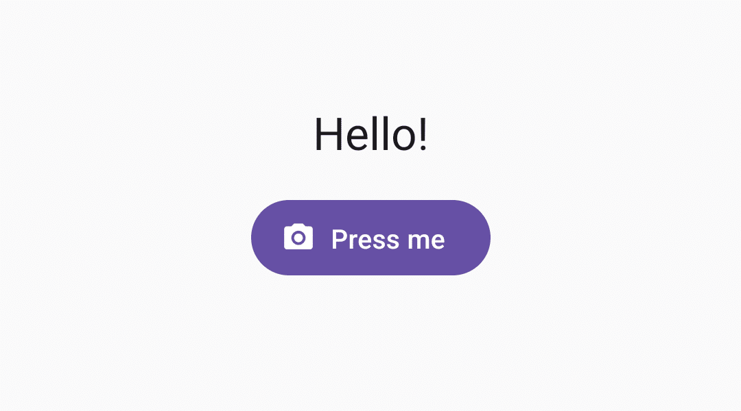
3. テーマのカスタマイズ
(1) カスタムテーマを定義し、PaperProviderのthemeに設定。
import { AppRegistry } from 'react-native';
import { name as appName } from './app.json';
import { MD3DarkTheme, Provider as PaperProvider } from 'react-native-paper';
import App from './App';

// カスタムテーマの作成
const customDarkTheme = {
  ...MD3DarkTheme,
  colors: {
    ...MD3DarkTheme.colors,
    primary: '#ffffff', // プライマリカラー
    background: '#000000', // 背景色
    surface: '#000000', // サーフェイスの色
    onSurface: '#ffffff', // サーフェイス上のテキスト・アイコンの色
  },
};

// ホームスクリーン
const Main = () => (
  <PaperProvider theme={customDarkTheme}>
    <App />
  </PaperProvider>
);

AppRegistry.registerComponent(appName, () => Main);
カスタムテーマは、「DefaultTheme」「MD3LightTheme」「MD3DarkTheme」をベースに作成します。
(2) React Nativeのコンポーネントのstyleにthemeを直接設定。
「React Native Paper」のコンポーネントには直接反映されますが、「React Native」のコンポーネント (SafeAreaViewなど) には直接反映されないため、styleを指定する必要があります。
import * as React from 'react';
import { Button, Text, useTheme } from 'react-native-paper';
import { SafeAreaView } from 'react-native';

// アプリ
const App: React.FC = () => {
  // テーマの取得
  const theme = useTheme();

  // UI
  return (
    <SafeAreaView style={{flex: 1, justifyContent: 'center', alignItems: 'center', backgroundColor: theme.colors.background}}>
      <Text style={{fontSize: 24, marginBottom: 20}}>Hello!</Text>
      <Button icon="camera" mode="contained" onPress={() => console.log('Pressed')}>
        Press me
      </Button>
    </SafeAreaView>
  );
}

export default App;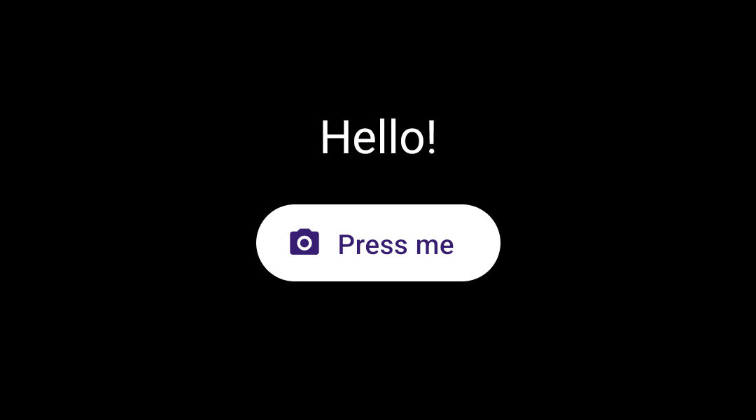
4. コンポーネント一覧
「react-native-paper」のコンポーネント一覧は、以下で確認できます。
・ActivityIndicator
・Appbar
・Avatar
・Badge
・Banner
・BottomNavigation
・Button
・Card
・Checkbox
・Chip
・DataTable
・Dialog
・Divider
・Drawer
・FAB
・HelperText
・Icon
・IconButton
・List
・Menu
・Modal
・Portal
・ProgressBar
・RadioButton
・Searchbar
・SegmentedButtons
・Snackbar
・Surface
・Switch
・Text
・TextInput
・ToggleButton
・Tooltip
・TouchableRipple
4-1. Text
import * as React from 'react';
import { Text } from 'react-native-paper';
import { SafeAreaView } from 'react-native';

// アプリ
const App: React.FC = () => {
  // UI
  return (
    <SafeAreaView style={{flex: 1, justifyContent: 'center', alignItems: 'center'}}>
      <Text variant="displayLarge">Display Large</Text>
      <Text variant="displayMedium">Display Medium</Text>
      <Text variant="displaySmall">Display small</Text>

      <Text variant="headlineLarge">Headline Large</Text>
      <Text variant="headlineMedium">Headline Medium</Text>
      <Text variant="headlineSmall">Headline Small</Text>

      <Text variant="titleLarge">Title Large</Text>
      <Text variant="titleMedium">Title Medium</Text>
      <Text variant="titleSmall">Title Small</Text>

      <Text variant="bodyLarge">Body Large</Text>
      <Text variant="bodyMedium">Body Medium</Text>
      <Text variant="bodySmall">Body Small</Text>

      <Text variant="labelLarge">Label Large</Text>
      <Text variant="labelMedium">Label Medium</Text>
      <Text variant="labelSmall">Label Small</Text>
    </SafeAreaView>
  );
}

export default App;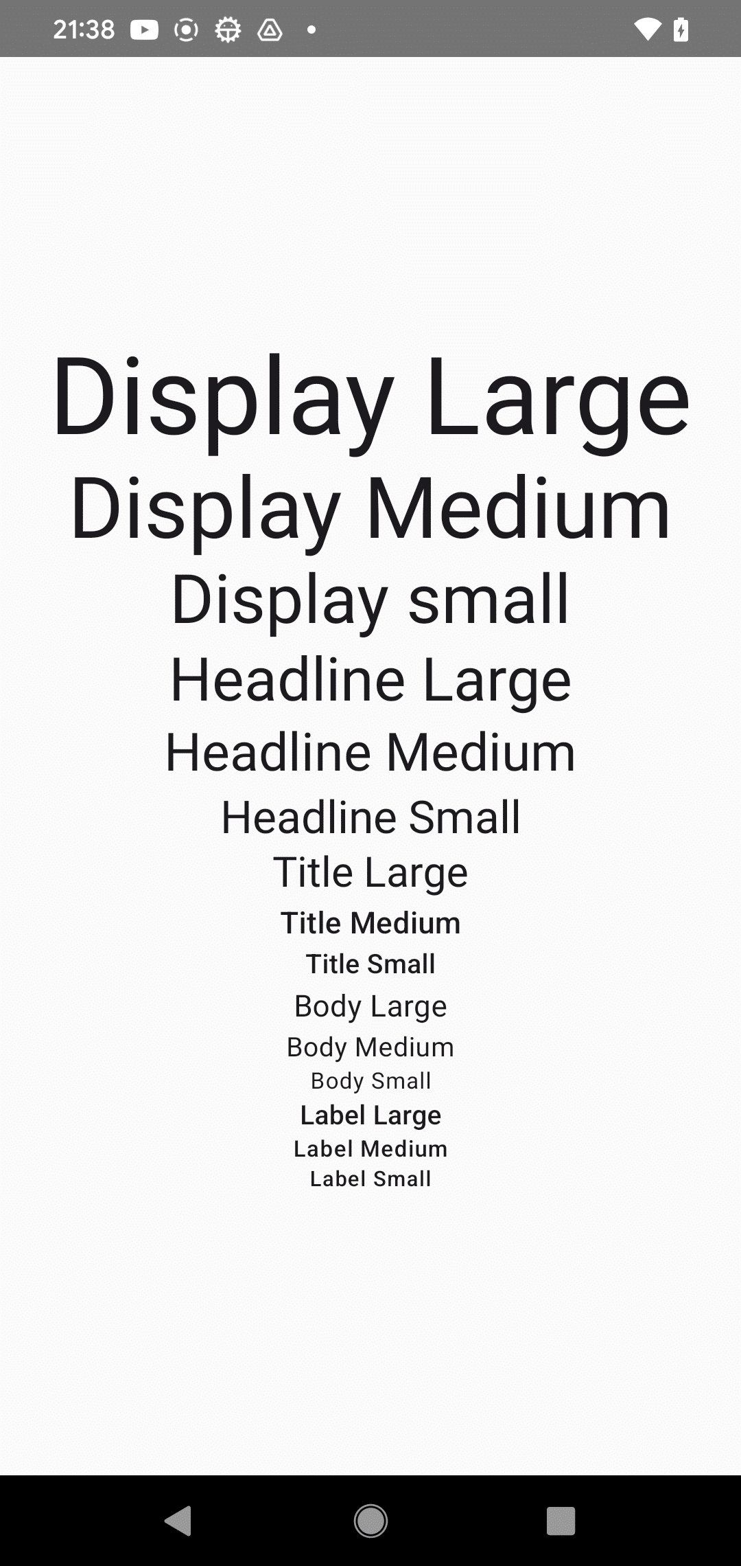
4-2. Button
import * as React from 'react';
import { Button } from 'react-native-paper';
import { SafeAreaView } from 'react-native';

// アプリ
const App: React.FC = () => {
  // UI
  return (
    <SafeAreaView style={{flex: 1, justifyContent: 'center', alignItems: 'center'}}>
      <Button icon="camera" mode="contained" onPress={() => console.log('Pressed')}>
        Press me
      </Button>
    </SafeAreaView>
  );
}

export default App;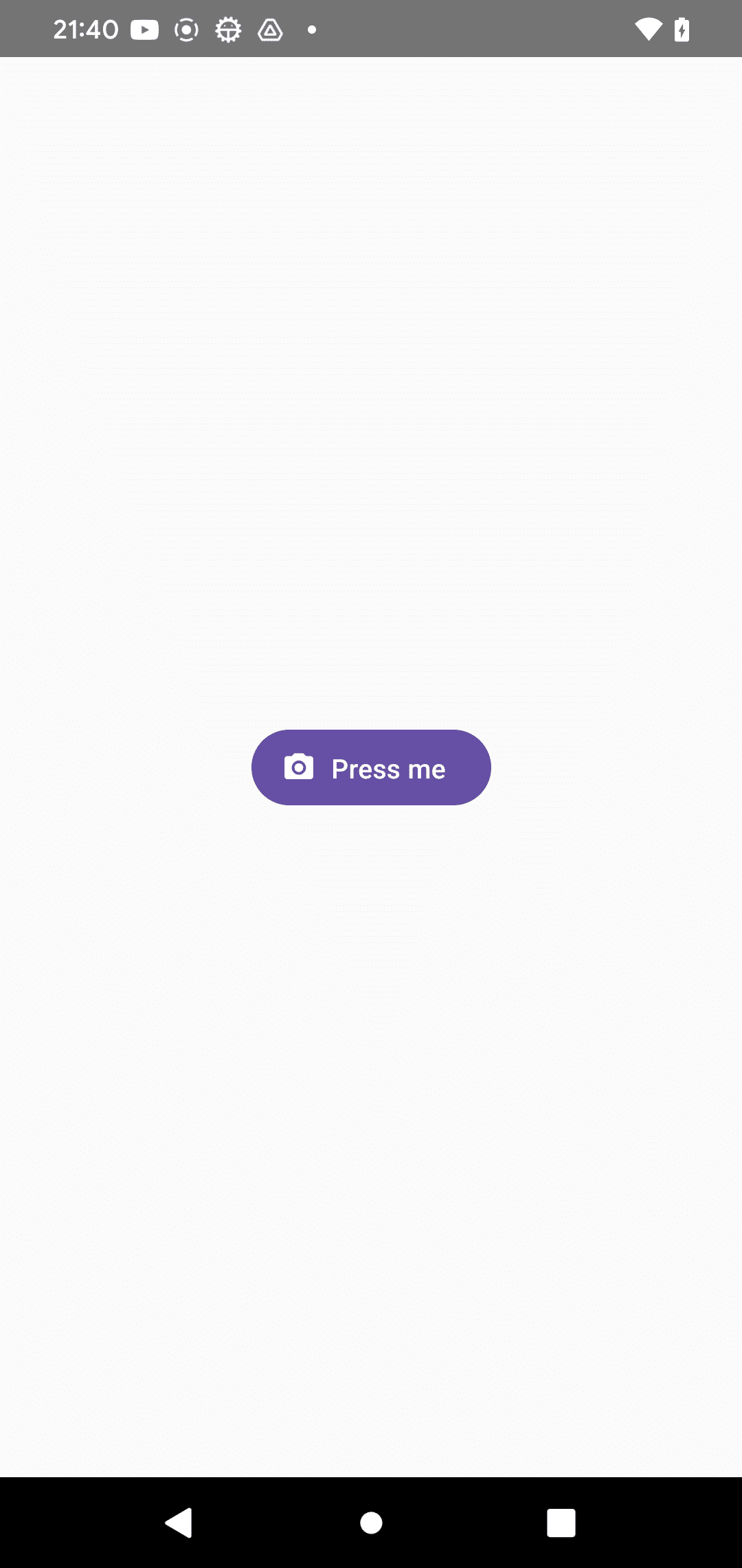
4-3. TextInput
import React from 'react';
import { TextInput } from 'react-native-paper';
import { SafeAreaView } from 'react-native';

// アプリ
const App = () => {
  const [text, setText] = React.useState("");

  // UI
  return (
    <SafeAreaView style={{ flex: 1 }}>
      <TextInput
        label="Email"
        value={text}
        onChangeText={text => setText(text)}
      />
    </SafeAreaView>
  );
};

export default App;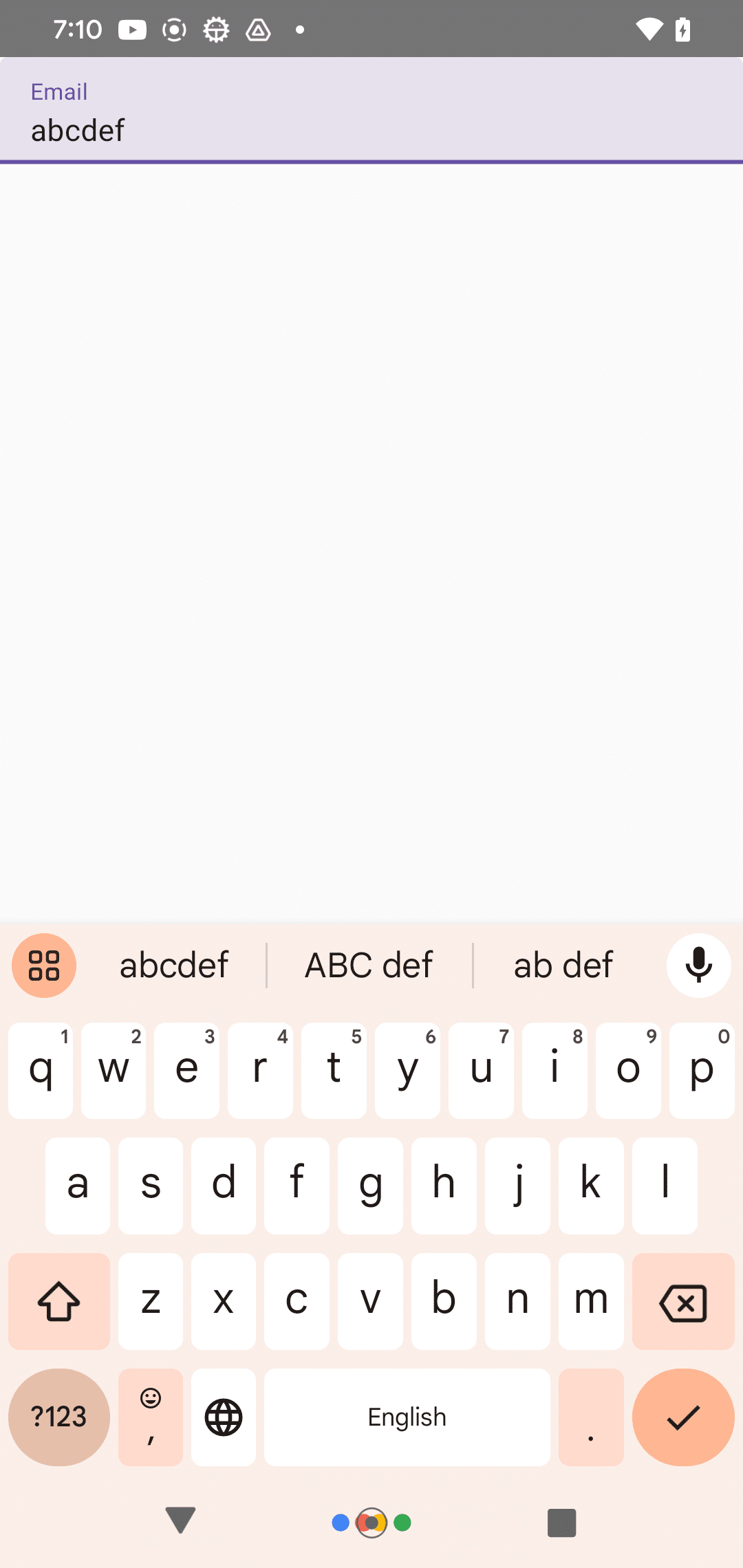
4-4. Dialog
import * as React from 'react';
import { Portal, Text, Button, Dialog } from 'react-native-paper';
import { View, SafeAreaView } from 'react-native';

// アプリ
const App: React.FC = () => {
  const [visible, setVisible] = React.useState(false);

  // ダイアログの表示
  const showDialog = () => setVisible(true);

  // ダイアログの非表示
  const hideDialog = () => setVisible(false);

  // UI
  return (
    <SafeAreaView style={{flex: 1, justifyContent: 'center', alignItems: 'center'}}>
      <View>
        <Button mode="contained" onPress={showDialog}>Show Dialog</Button>

        <Portal>
          <Dialog visible={visible} onDismiss={hideDialog}>
            <Dialog.Title>Alert</Dialog.Title>
            <Dialog.Content>
              <Text variant="bodyMedium">This is simple dialog</Text>
            </Dialog.Content>
            <Dialog.Actions>
              <Button onPress={hideDialog}>Done</Button>
            </Dialog.Actions>
          </Dialog>
        </Portal>
      </View>
    </SafeAreaView>
  );
}

export default App;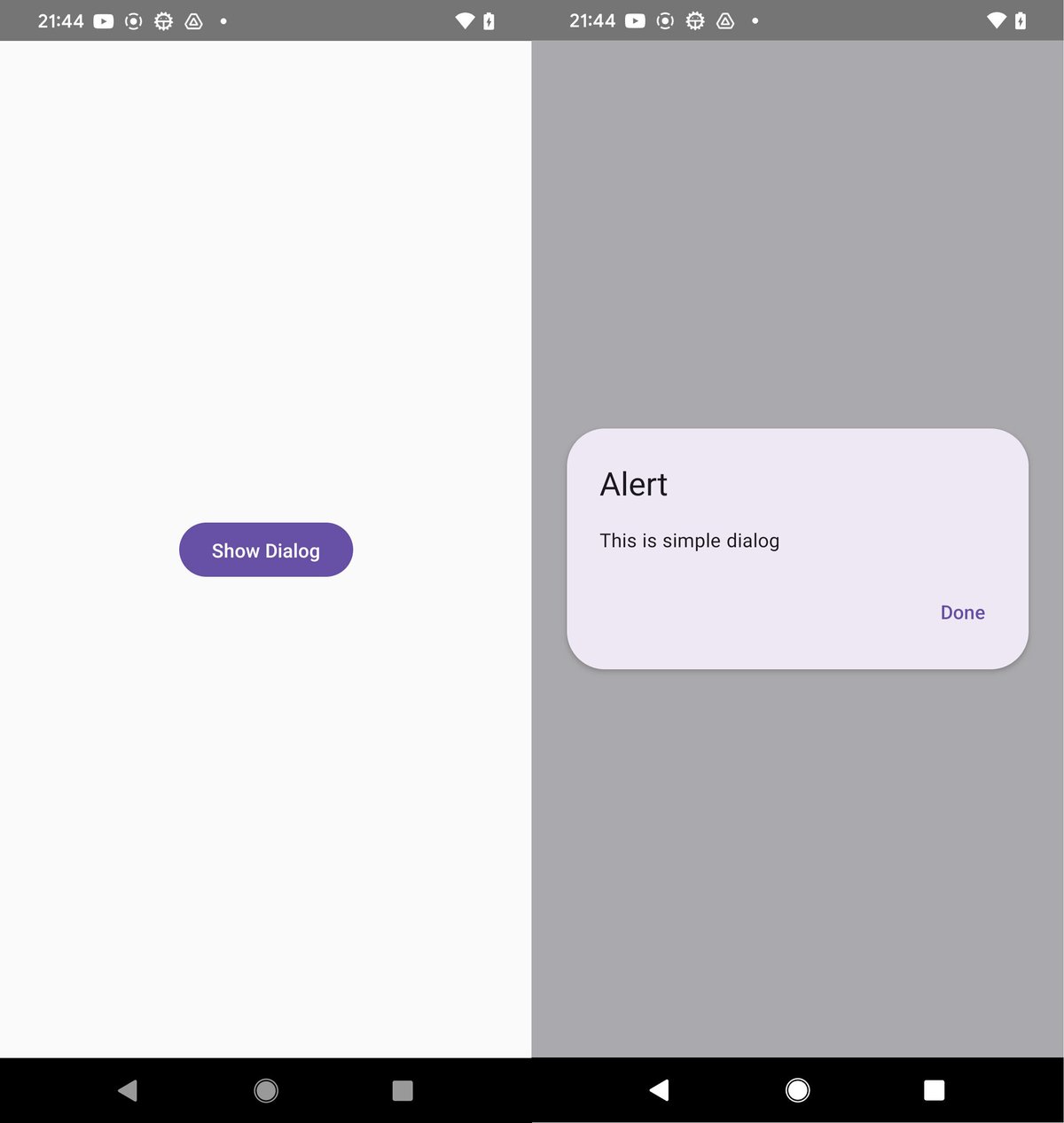
4-5. ActivityIndicator
import React from 'react';
import { ActivityIndicator, MD2Colors } from 'react-native-paper';
import { SafeAreaView } from 'react-native';

// アプリ
const App = () => {
  // UI
  return (
    <SafeAreaView style={{ flex: 1 }}>
      <ActivityIndicator animating={true} color={MD2Colors.red800} />
    </SafeAreaView>
  );
};

export default App;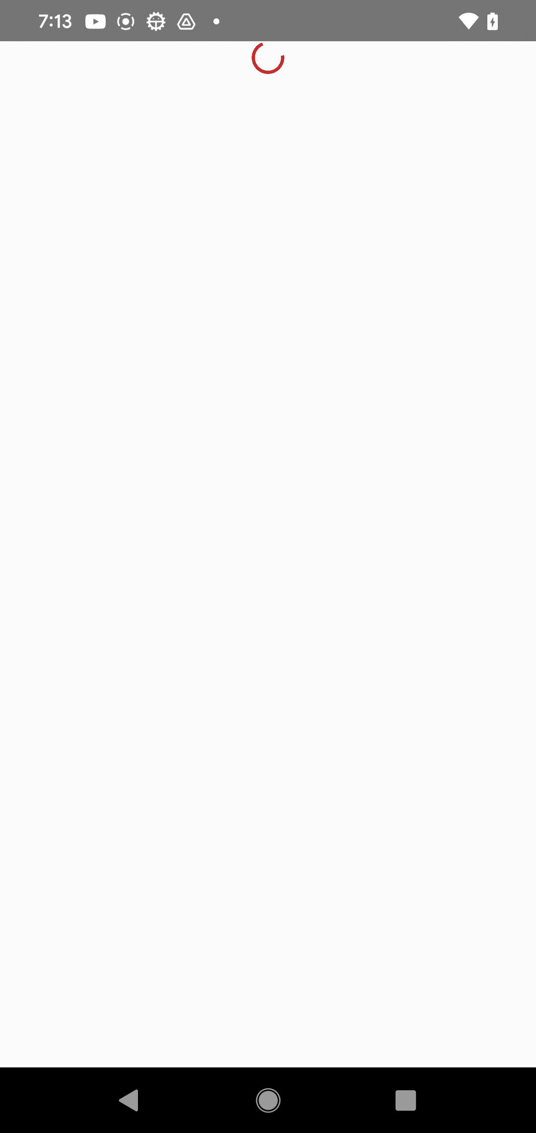
4-6. CheckBox
import * as React from 'react';
import { Checkbox } from 'react-native-paper';
import { SafeAreaView } from 'react-native';

// アプリ
const App: React.FC = () => {
  const [checked, setChecked] = React.useState(false);

  // UI
  return (
    <SafeAreaView style={{ flex: 1 }}>
      <Checkbox
        status={checked ? 'checked' : 'unchecked'}
        onPress={() => {
          setChecked(!checked);
        }}
      />
    </SafeAreaView>
  );
}

export default App;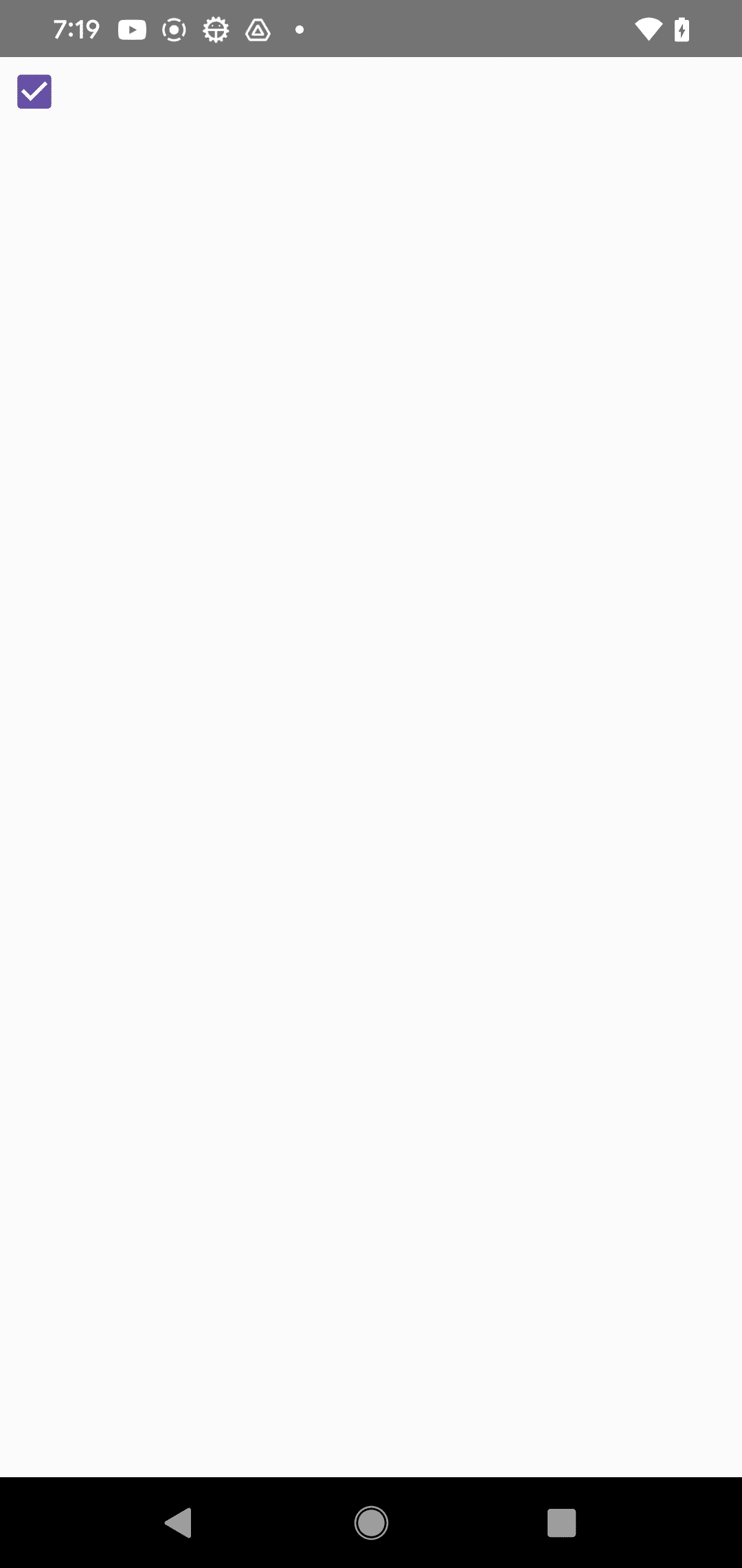
4-7. RadioButton
import React from 'react';
import { RadioButton } from 'react-native-paper';
import { SafeAreaView } from 'react-native';

// アプリ
const App = () => {
  const [checked, setChecked] = React.useState('first');

  // UI
  return (
    <SafeAreaView style={{flex: 1}}>
      <RadioButton
        value="first"
        status={ checked === 'first' ? 'checked' : 'unchecked' }
        onPress={() => setChecked('first')}
      />
      <RadioButton
        value="second"
        status={ checked === 'second' ? 'checked' : 'unchecked' }
        onPress={() => setChecked('second')}
      />
    </SafeAreaView>
  );
};

export default App;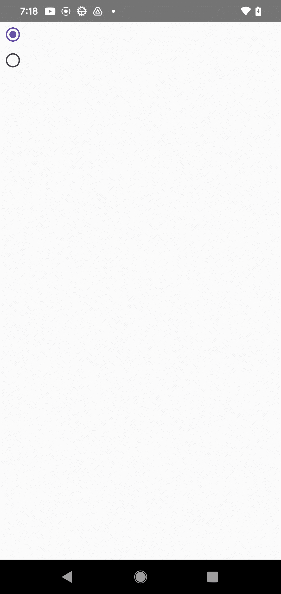
4-8. TouchableRipple
import React from 'react';
import { TouchableRipple, Text } from 'react-native-paper';
import { SafeAreaView } from 'react-native';

// アプリ
const App = () => {
  // UI
  return (
    <SafeAreaView style={{ flex: 1 }}>
      <TouchableRipple
        style={{ flex: 1 }}
        onPress={() => console.log('Pressed')}
        rippleColor="rgba(0, 0, 0, .32)"
      >
        <Text>Press anywhere</Text>
      </TouchableRipple>
    </SafeAreaView>
  );
};

export default App;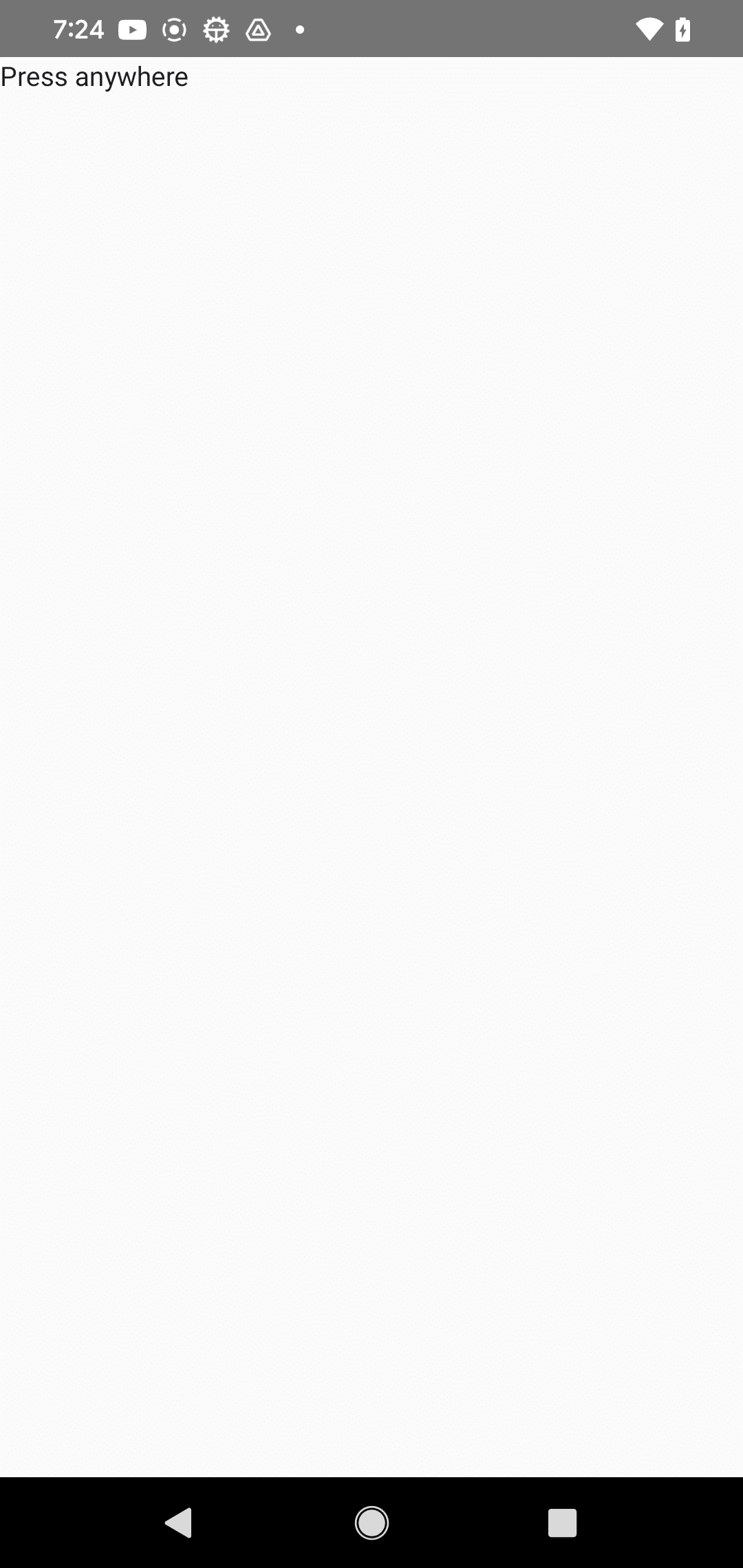
【おまけ】 Androidのリリースビルド
(1) release.keystoreの作成し、「android/app」に配置。
本番では安全なパスワードを指定してください。
keytool -genkey -v -keystore release.keystore -keyalg RSA -keysize 2048 -validity 10000 -alias androidreleasekeyキーストアのパスワードを入力してください: android
新規パスワードを再入力してください: android
姓名は何ですか。
[Unknown]: Taro
組織単位名は何ですか。
[Unknown]: Development
組織名は何ですか。
[Unknown]: Taro
都市名または地域名は何ですか。
[Unknown]: Tokyo
都道府県名または州名は何ですか。
[Unknown]: Tokyo
この単位に該当する2文字の国コードは何ですか。
[Unknown]: JP
CN=npaka, OU=Development, O=npaka, L=Tokyo, ST=Tokyo, C=JPでよろしいですか。
[いいえ]: Y(2) 「android/app/build.gradle」の編集。
・defaultConfig の基本設定を確認
    defaultConfig {
        applicationId "com.my_app"
        minSdkVersion rootProject.ext.minSdkVersion
        targetSdkVersion rootProject.ext.targetSdkVersion
        versionCode 1
        versionName "1.0"
    }
・signingConfigs にリリース用の設定を追加
    signingConfigs {
        release {
            storeFile file('release.keystore')
            storePassword 'android'
            keyAlias 'androidreleasekey'
            keyPassword 'android'
        }
・buildTypes にリリース用の設定を追加
    buildTypes {
        release {
            signingConfig signingConfigs.release
            minifyEnabled enableProguardInReleaseBuilds
            proguardFiles getDefaultProguardFile("proguard-android.txt"), "proguard-rules.pro"
        }
(3) ビルド。
「android/app/build/outputs/apk/release/」にリリースビルド(app-release.apk)が生成されます。
cd android
./gradlew assembleRelease
cd ..
(4) リリースビルド(app-release.apk)をAndroid端末にインストール。
Android端末とPCをUSB接続し、以下のコマンドを実行します。
adb install app-release.apk次回
この記事が気に入ったらサポートをしてみませんか?