UX to help the visually impaired

Stepping into Mixed Reality by using simple, yet effective tech to help visually impaired users to navigate Tokyo subway stations.
Just before joining Linkx, my actual workplace, I was researching the development of XR (Extended Reality) and its impact on our society and the forthcoming future. Among the fascinating content about AR and VR glasses, like Magic Leap, Microsoft Hololens, and NReal, few resources were talking about some other, let’s say less futuristic layers of MR — the use of voice commands, adaptive surfaces, and especially data and information flow across those technologies for example. It really caught my interest in how simple tech, based on XR could be used to bring solutions connected to our routines and daily life issues.
Among my projects, at Linkx I had the chance to join the team developing shikAI, an app that uses QR codes fixed on the floor to guide visually impaired people finding their ways through the normally huge and complicated Tokyo subway stations. The recipe is simple: QR codes are fixed across the yellow tactile paving aids at the station. Each QR code represents a unique position inside the station, in this way, the app, which uses voice over, keeps users aware of their position throughout the whole route. Instead of the need for memorizing the tactile map, usually distributed just in a few positions inside the station, shikAI allows visually impaired users to navigate the station map in real-time.
Simple technology, high effectiveness
shikAI is a simple app that reads QR codes. The navigation is both based on the in-app voice and the support of the iPhone voice-over function. Both technologies are essentially simple. However, two main things happen on top of shikAi infrastructure. First, the creation of a new layer of reality – a station map that exists between the physical world and the smartphone. Combining information on surfaces — the tactile yellow blocks–, and information generated through the voice-over, the system adds intangible, but useful assets to the environment. And this is one of the interesting aspects of MR that is usually underseen. In the MR world, AR and VR glasses are in the spotlight, but they are limited to those who can clearly see the things around them. shikAi embraces the core of Mixed Reality — the creation of a new dimension to deliver something useful by simply using an app to navigate well-organized navigation information.
Another interesting aspect of it is the cognitive level of usability. With the adoption of digital maps with GPS, mainly Google maps, we navigate our surroundings in a different way. Navigation apps reduce friction and allow users to arrive at their desired destination by following a flow that prevents errors by mainly representing the real world and the way we navigate through it— two important UX heuristics. As for those visually impaired or with low vision capabilities, things are not exactly the same. Tactile blocks help them navigate the city. But imagine in Tokyo, where some train stations, for example, have more than a hundred exits. Following a line might help them not to bump into a wall, but the location of ticket gates, platforms, ticket machines, and so on, depends on memorizing the information displayed on the tactile maps fixed in a few places across the station.

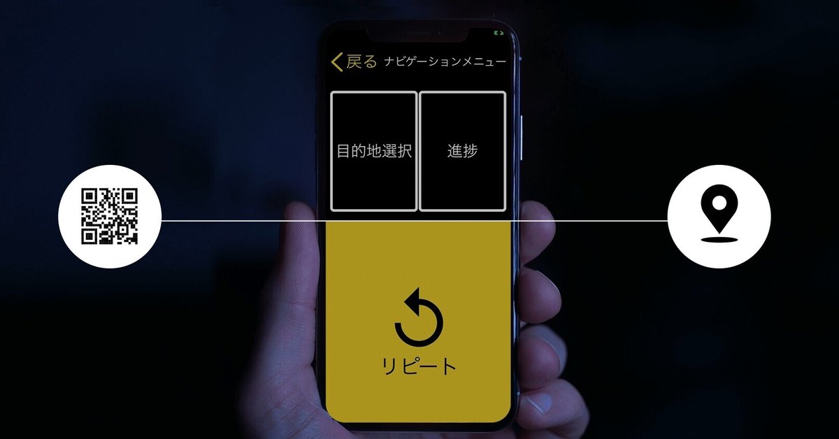
Some other Usability Heuristics
What shikAi does, is to deliver the same usability to the visually impaired. And it also checks some other UX heuristics boxes. It keeps the user aware of the system status at all times. This was achieved by adding the ‘repeat’ button in a big proportion of the most natural touch position on the screen. Besides that, the apps use voice commands together with sound alerts and vibrations to keep the users aware of their progress.
Error prevention is also something extremely important for those users. Since each QR code represents a unique position inside the station. Re-routing is easy. In this way, the users can either change their destinations if needed or correct their route if they had decided in a wrong direction by accident. When the only tool for checking the destination position inside a station is a tactile map fixed far away, any mistake can turn the journey into a nightmare.
The aesthetics of the app were also a key point in the development. Here the accessibility for usability plays a huge role. The dark background on the app is not just following the ‘dark mode’ trend in the industry. Dark backgrounds are easier to be read by users who are visually impaired but still have a certain level of vision. Keeping the home screen simple was also important. The app was designed to allow the users to navigate across the station, without even bother to look at the screen. With three main buttons that give constant voice-over feedback, it‘s easy to recognize the buttons’ positions instead of checking the screen for a recall.
Accessibility for a meaningful usability
Design is a tool for tackling issues. And technology boosts it on an exponential level. According to the Mainichi Shinbun “there were 9,465 train stations across Japan as of the end of fiscal 2019, and 48.2% of them, or 4,564, operated without a single station staff member”. Not just navigating complicated and huge stations in Japan is difficult, but some of them are becoming unmanned, which leaves the visually impaired users with even less support while commuting by train.
Solutions like shikAi, and others, not only help to tackle such issues but, by bringing accessibility to their core, they allow users with certain limitations to experience the world in a more meaningful and practical way.
この記事が気に入ったらサポートをしてみませんか?