
第6章 第3節 バイアスーバリアンス

今回はこちらのnotebookを解説していきます。
本記事では予測誤差について調査する。
調査方法は、簡単な時系列データを生成し、未学習、適正学習、過学習のそれぞれで予測誤差がどうなるのかについて着目していく。
バイアスーバリアンスとは?
モデルの予測誤差は、ノイズ、バリアンス、バイアスに分解できる。
観測値とy、予測値とy^とすると、期待二乗誤差はE[(y-y^)^2]と書ける。
こちらの記事が非常にわかりやすく書いている。式で定義すると以下の通りである。
ノイズ:Var[y]
バリアンス: Var[y^]
バイアス: (E[y] - E[y^])^2
インポートと設定
import warnings
warnings.filterwarnings('ignore')
%matplotlib inline
import numpy as np
from numpy.random import randint, choice, normal, shuffle
import pandas as pd
from scipy.special import factorial
from sklearn.linear_model import LinearRegression
from sklearn.metrics import mean_squared_error
import seaborn as sns
import matplotlib.pyplot as pltsns.set_style('whitegrid')サンプルデータを生成
今回のサンプルデータはy=sin(x)とsin(x)のテイラー展開の2つにします。
def f(x, max_degree=9):
   taylor = [(-1)**i * x ** e / factorial(e) for i, e in enumerate(range(1, max_degree, 2))]
   return  np.sum(taylor, axis=0)
max_degree = 5
fig, ax = plt.subplots(figsize=(14, 5))
x = np.linspace(-5, 5, 1000)
data = pd.DataFrame({'y': f(x, max_degree), 'x': x})
data.plot(x='x', y='y', legend=False, ax=ax)
pd.Series(np.sin(x), index=x).plot(ax=ax, ls='--', lw=2, label='sine')
plt.legend();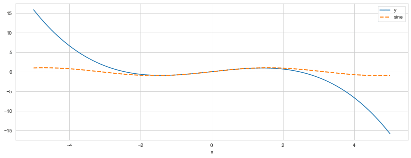
未学習 vs 過学習 : 視覚化の例
from collections import defaultdictfig, axes = plt.subplots(ncols=3, figsize=(15, 4))
x = np.linspace(-.5 * np.pi, 2.5 * np.pi, 1000)
true_function = pd.Series(np.sin(x), index=x)
n = 30
noise = .2
degrees = [1, 5, 15]
x_ = np.random.choice(x, size=n)
y_ = np.sin(x_)
y_ += normal(loc=0, scale=np.std(y_) * noise, size=n)
mse = defaultdict(list)
for i, degree in enumerate(degrees):
fit = np.poly1d(np.polyfit(x=x_, y=y_, deg=degree))
true_function.plot(ax=axes[i], c='darkred', lw=1, ls='--', label='True Function')
pd.Series(y_, index=x_).plot(style='.', label='Sample', ax=axes[i], c='k')
pd.Series(fit(x), index=x).plot(label='Model', ax=axes[i])
axes[i].set_ylim(-1.5, 1.5)
mse = mean_squared_error(fit(x), np.sin(x))
axes[i].set_title(f'Degree {degree} | MSE: {mse:,.2f}')
axes[i].legend()
axes[i].grid(False)
axes[i].axis(False)
sns.despine()
fig.tight_layout();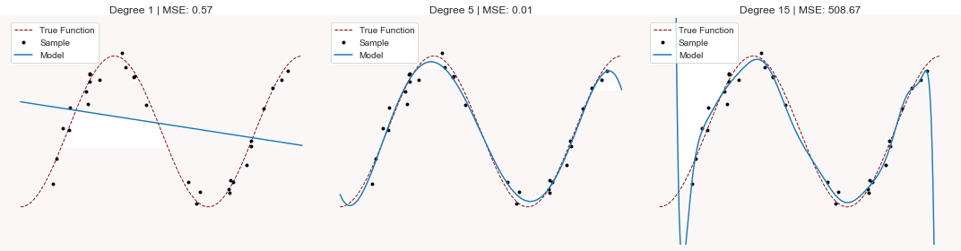
5次のテイラー展開の誤差はとても小さいですが、過学習した15次のテイラー展開は予測誤差がとても大きくなっています。過学習は予測誤差を大きくさせるんですね。
バイアスーバリアンス トレードオフ
モデルを訓練します。重回帰分析でフィッティングします。
ここで特徴量は直線とします。目的変数はsin(x)の5次のテイラー展開とします。sin(x)は周期性があるので、それを予測することが目的です。datasets = ['Train', 'Test']
X = {'Train': np.linspace(-1, 1, 1000), 'Test': np.linspace(1, 2, 500)}

models = {'Underfit': 1, 'Right Fit': 5, 'Overfit': 9}

sample, noise = 25, .01
result = []
for i in range(100):
   x_ = {d: choice(X[d], size=sample, replace=False) for d in datasets}
   y_ = {d: f(x_[d], max_degree=5) for d in datasets}
   y_['Train'] += normal(loc=0,
                         scale=np.std(y_['Train']) * noise,
                         size=sample)

   trained_models = {
       fit: np.poly1d(np.polyfit(x=x_['Train'], y=y_['Train'], deg=deg))
       for fit, deg in models.items()
   }

   for fit, model in trained_models.items():
       for dataset in datasets:
           pred = model(x_[dataset])
           result.append(
               pd.DataFrame(
                   dict(x=x_[dataset],
                        Model=fit,
                        Data=dataset,
                        y=pred,
                        Error=pred - y_[dataset])))
result = pd.concat(result)
結果のプロット
y = {d: f(X[d], max_degree=5) for d in datasets}
y['Train_noise'] = y['Train'] + normal(loc=0,
                                      scale=np.std(y['Train']) * noise,
                                      size=len(y['Train']))
colors = {'Underfit': 'darkblue', 'Right Fit': 'darkgreen', 'Overfit': 'darkred'}
test_data = result[result.Data == 'Test']
fig, axes = plt.subplots(ncols=2, figsize=(18, 7), sharey=True)
sns.boxplot(x='Model', y='Error', hue='Data', data=result, ax=axes[0], linewidth=2)
axes[0].set_title('In- vs Out-of-Sample Errors')
axes[0].axhline(0, ls='--', lw=1, color='k')
axes[0].set_ylabel('Symmetric Log Scale')
for model in colors.keys():
(test_data[(test_data['Model'] == model)]
.plot.scatter(x='x',
y='y',
ax=axes[1],
s=2,
color=colors[model],
alpha=.5,
label=model))
# pd.Series(y['Train'], index=X['Train']).sort_index().plot(ax=axes[1], title='Out-of-sample Predictions')
pd.DataFrame(dict(x=X['Train'], y=y['Train_noise'])).plot.scatter(x='x', y='y', ax=axes[1], c='k', s=1)
pd.Series(y['Test'], index=X['Test']).plot(color='black', lw=5, ls='--', ax=axes[1], label='Actuals')
axes[0].set_yscale('symlog')
axes[1].set_title('Out-of-Sample Predictions')
axes[1].legend()
axes[0].grid(False)
axes[1].grid(False)
sns.despine()
fig.tight_layout()
fig.suptitle('Bias - Variance Tradeoff: Under vs. Overfitting', fontsize=16)
fig.subplots_adjust(top=0.9)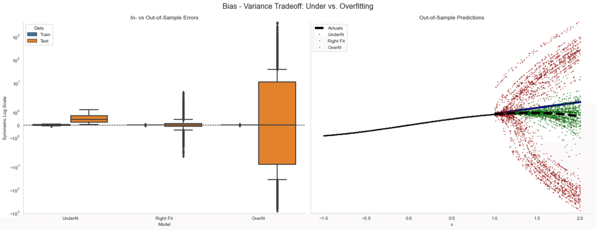
左の図では、バイアスとバリアンスの関係について見ています。着目すべきは過学習では訓練期間ではかなり精度が高いですが、テスト期間でのバリアンスが非常に大きくなります。
右図では時系列方向で予測誤差を可視化したものでありますが、赤い点が訓練期間中に過学習したモデルです。
学習曲線
ここでの条件について話します。
説明変数:直線
目的変数:sin(x)の5次のテイラー展開
モデル:線形回帰モデル
評価方法:K-fold CV (K=5)でRMSEの平均値で評価
特徴量のサイズは、未学習で一次元、適正で五次元、過学習で八次元でそれぞれ見ていきたいと思います。ここでは誤差と訓練データのサイズの関係を見ていきます。
def folds(train, test, nfolds):
   shuffle(train)
   shuffle(test)

   steps = (np.array([len(train), len(test)]) / nfolds).astype(int)
   for fold in range(nfolds):
       i, j = fold * steps
       yield train[i:i + steps[0]], test[j: j+steps[1]]
def rmse(y, x, model):
return np.sqrt(mean_squared_error(y_true=y, y_pred=model.predict(x)))def create_poly_data(data, degree):
return np.hstack((data.reshape(-1, 1) ** i) for i in range(degree + 1))train_set = X['Train'] + normal(scale=np.std(f(X['Train']))) * .2
test_set = X['Test'].copy()
sample_sizes = np.arange(.1, 1.0, .01)
indices = ([len(train_set), len(test_set)] *
sample_sizes.reshape(-1, 1)).astype(int)
result = []
lr = LinearRegression()
for label, degree in models.items():
model_train = create_poly_data(train_set, degree)
model_test = create_poly_data(test_set, degree)
for train_idx, test_idx in indices:
train = model_train[:train_idx]
test = model_test[:test_idx]
train_rmse, test_rmse = [], []
for x_train, x_test in folds(train, test, 5):
y_train, y_test = f(x_train[:, 1]), f(x_test[:, 1])
lr.fit(X=x_train, y=y_train)
train_rmse.append(rmse(y=y_train, x=x_train, model=lr))
test_rmse.append(rmse(y=y_test, x=x_test, model=lr))
result.append([label, train_idx,
np.mean(train_rmse), np.std(train_rmse),
np.mean(test_rmse), np.std(test_rmse)])
result = (pd.DataFrame(result,
columns=['Model', 'Train Size',
'Train RMSE', 'Train RMSE STD',
'Test RMSE', 'Test RMSE STD'])
.set_index(['Model', 'Train Size']))fig, axes = plt.subplots(nrows=3, sharey=True, figsize=(16, 9))
for i, model in enumerate(models.keys()):
result.loc[model, ['Train RMSE', 'Test RMSE']].plot(ax=axes[i], title=f'Model: {model}', logy=True, lw=2)
axes[i].set_ylabel('Log RMSE')
fig.suptitle('Learning Curves', fontsize=16)
fig.tight_layout()
sns.despine()
fig.subplots_adjust(top=.92);
学習の進行度合いに関しては、過学習でも予測誤差が小さくなるような傾向が見られます。未学習や適正な場合は、予測誤差に変化はそんなにないが、過学習に関しては、沢山学習させないと学習できないような状況が起きます。つまり、モデルの作成時には効率が悪い場合があります。
まとめ
本記事では予測誤差について勉強しました。皆さんもモデル訓練した時のモデルの評価に是非ご活用してみてください(*'ω'*)
この記事が気に入ったらサポートをしてみませんか?