
第10章:ベイジアンML-ダイナミックSR 第3節: ベイジアンシャープレシオ

はじめに
この記事では、シャープ比を確率モデルとして定義し、さまざまなリターン系列の結果の事後分布を比較する方法について紹介していきます。 2つのグループのベイズ推定は、効果サイズ、グループ平均とそれらの差、標準偏差とそれらの差、およびデータの正規性の信頼できる値の完全な分布を提供します。
主な使用例には、オルタナティブ戦略同士、または戦略のインサンプルの成績とアウトオブサンプルの成績との違いの分析が含まれます。ベイジアンSRはpyfolioのBayesian tearsheetに含まれます。
インポートと設定
import warnings
warnings.filterwarnings('ignore')
import numpy as np
import pandas as pd
import pandas_datareader.data as web
import seaborn as sns
import pymc3 as pm
from pymc3.plots import forestplot, plot_posterior,traceplot
from scipy import stats
import matplotlib.pyplot as plt
from matplotlib import gridspecbenchmark = web.DataReader('SP500', data_source='fred', start=2010)
benchmark.columns = ['benchmark']with pd.HDFStore('../data/assets.h5') as store:
stock = store['quandl/wiki/prices'].adj_close.unstack()['AMZN'].to_frame('stock')data = stock.join(benchmark).pct_change().dropna().loc['2010':]data.info()
'''
<class 'pandas.core.frame.DataFrame'>
DatetimeIndex: 1952 entries, 2010-08-17 to 2018-03-27
Data columns (total 2 columns):
# Column Non-Null Count Dtype
--- ------ -------------- -----
0 stock 1952 non-null float64
1 benchmark 1952 non-null float64
dtypes: float64(2)
memory usage: 45.8 KB
'''シャープレシオのモデリング
シャープレシオを確率論的モデルとしてモデリングするには、収益の分布と、この分布を支配するパラメーターについて事前に知る必要があります。
典型的な株価リターンは、正規分布よりもファットテイルになっていて、平均値に密度が寄っている形です。
スチューデントのt分布は、低自由度(degrees of freedom := df)の正規分布に比べてファットテールを表現することが出来て、株価リターンの側面を捉えるには妥当な選択です。
確率モデルの定義
したがって、この分布の3つのパラメーター(リターンの平均と標準偏差、および自由度)でモデル化する必要があります。平均と標準偏差から正規分布と一様分布をそれぞれ仮定、ファットテイルを実現するために十分低い期待値を持つ指数分布を想定します。リターンはこれらの確率的入力に基づいており、年換算のシャープレシオは標準的な計算から得られ、リスクフリーレートは無視されます(毎日の収益を使用)。
mean_prior = data.stock.mean()
std_prior = data.stock.std()
std_low = std_prior / 1000
std_high = std_prior * 1000

with pm.Model() as sharpe_model:
   mean = pm.Normal('mean', mu=mean_prior, sd=std_prior)
   std = pm.Uniform('std', lower=std_low, upper=std_high)

   nu = pm.Exponential('nu_minus_two', 1 / 29, testval=4) + 2.
   returns = pm.StudentT('returns', nu=nu, mu=mean, sd=std, observed=data.stock)

   sharpe = returns.distribution.mean / returns.distribution.variance ** .5 * np.sqrt(252)
pm.Deterministic('sharpe', sharpe)sharpe_model.model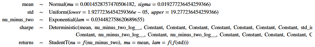
モデルを視覚化する。
pm.model_to_graphviz(model=sharpe_model)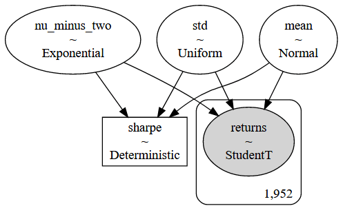
近似推論:Uターンのないサンプラーを使用したハミルトニアンモンテカルロ
tune = 2000
draws = 200
with sharpe_model:
   trace = pm.sample(tune=tune,
                     draws=draws,
                     chains=4,
                     cores=1)
痕跡調査
trace_df = pm.trace_to_dataframe(trace).assign(chain=lambda x: x.index // draws)
trace_df.info()
'''
<class 'pandas.core.frame.DataFrame'>
RangeIndex: 800 entries, 0 to 799
Data columns (total 5 columns):
#   Column        Non-Null Count  Dtype
---  ------        --------------  -----
0   mean          800 non-null    float64
1   std           800 non-null    float64
2   nu_minus_two  800 non-null    float64
3   sharpe        800 non-null    float64
4   chain         800 non-null    int64
dtypes: float64(4), int64(1)
memory usage: 31.4 KB
'''
traceplot(data=trace);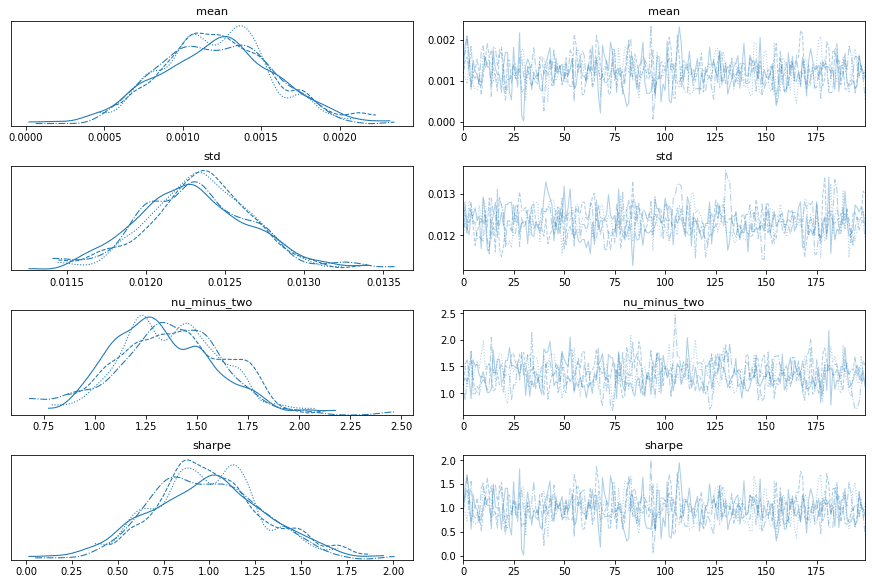
サンプリング継続
draws = 25000
with sharpe_model:
   trace = pm.sample(draws=draws,
                     trace=trace,
                     chains=4,
                     cores=1)
pm.trace_to_dataframe(trace).shape
'''
(100800, 4)
'''df = pm.trace_to_dataframe(trace).iloc[400:].reset_index(drop=True).assign(chain=lambda x: x.index // draws)
trace_df = pd.concat([trace_df.assign(run=1),
df.assign(run=2)])
trace_df.info()
'''
<class 'pandas.core.frame.DataFrame'>
Int64Index: 101200 entries, 0 to 100399
Data columns (total 6 columns):
# Column Non-Null Count Dtype
--- ------ -------------- -----
0 mean 101200 non-null float64
1 std 101200 non-null float64
2 nu_minus_two 101200 non-null float64
3 sharpe 101200 non-null float64
4 chain 101200 non-null int64
5 run 101200 non-null int64
dtypes: float64(4), int64(2)
memory usage: 5.4 MB
'''trace_df_long = pd.melt(trace_df, id_vars=['run', 'chain'])
trace_df_long.info()
'''
<class 'pandas.core.frame.DataFrame'>
RangeIndex: 404800 entries, 0 to 404799
Data columns (total 4 columns):
# Column Non-Null Count Dtype
--- ------ -------------- -----
0 run 404800 non-null int64
1 chain 404800 non-null int64
2 variable 404800 non-null object
3 value 404800 non-null float64
dtypes: float64(1), int64(2), object(1)
memory usage: 12.4+ MB
'''g = sns.FacetGrid(trace_df_long, col='variable', row='run', hue='chain', sharex='col', sharey=False)
g = g.map(sns.distplot, 'value', hist=False, rug=False)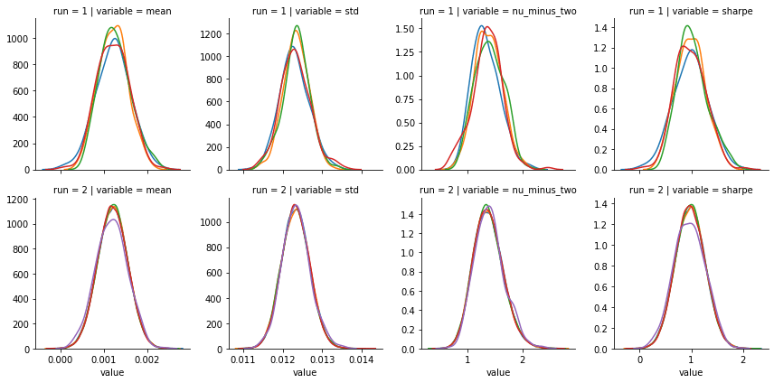
traceplot(data=trace);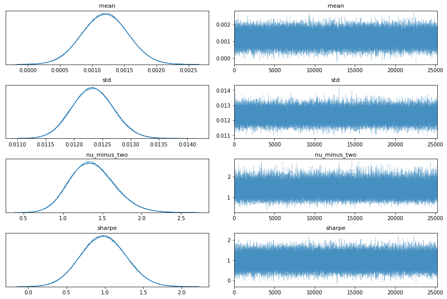
plot_posterior(data=trace)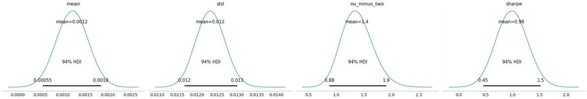
forestplot(data=trace);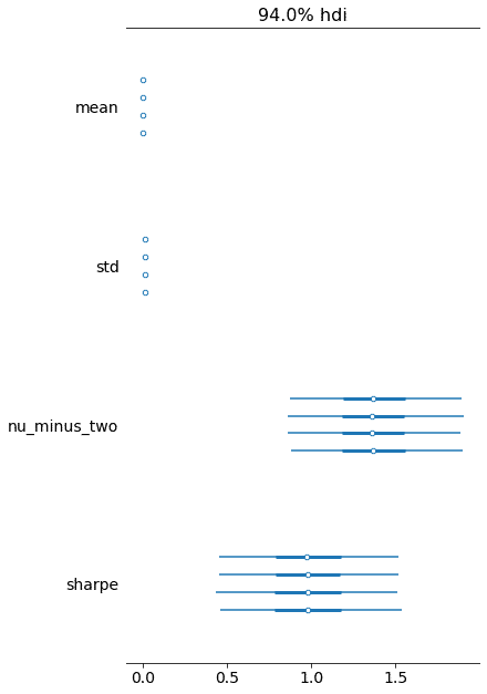
グループ平均の比較:T検定(BEST)をベイズ推定に取り替える。
このモデルは、ベイズ仮説検定を実行して、2つのリターン分布を比較します。リターンは、2つの異なるアセット、またはターゲット戦略のインサンプルおよびアウトオブサンプルのリターンの可能性があります。株価リターンはT分布を仮定しております。
さらに、両方のリターンシリーズの年率ボラティリティとシャープレシオを計算します。
モデルはBayesian Estimation Supersedes the t Test John Kruschke、Journal of Experimental Psychology、2012年に基づいております。
こちらもpyfolioのbayesian tearsheetに含まれています。
データ
data.describe()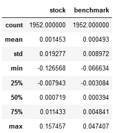
確率モデルとしてのシャープレシオの比較
group = {1: data.stock, 2: data.benchmark}
combined = pd.concat([g for i, g in group.items()])

# priors
mean_prior = combined.mean()
std_prior = combined.std()
std_low = std_prior / 1000
std_high = std_prior * 1000
T = 251 ** .5
mean, std, returns = {}, {}, {}
with pm.Model() as best:
   nu = pm.Exponential('nu_minus_two', 1 / 29, testval=4) + 2.
   for i in [1, 2]:
       mean[i] = pm.Normal(f'mean_g{i}', mu=mean_prior, sd=std_prior, testval=group[i].mean())
       std[i] = pm.Uniform(f'std_g{i}', lower=std_low, upper=std_high, testval=group[i].std())
       returns[i] = pm.StudentT(f'returns_g{i}', nu=nu, mu=mean[i], sd=std[i], observed=group[i])
       pm.Deterministic(f'vol_g{i}', returns[i].distribution.sd * T)
       pm.Deterministic(f'sharpe_g{i}', returns[i].distribution.mean / returns[i].distribution.sd * T)

   mean_diff = pm.Deterministic('mean diff', mean[1] - mean[2])
   pm.Deterministic('std diff', std[1] - std[2])
   pm.Deterministic('effect size', mean_diff / (std[i] ** 2 + std[2] ** 2) ** .5 / 2)
pm.model_to_graphviz(model=best)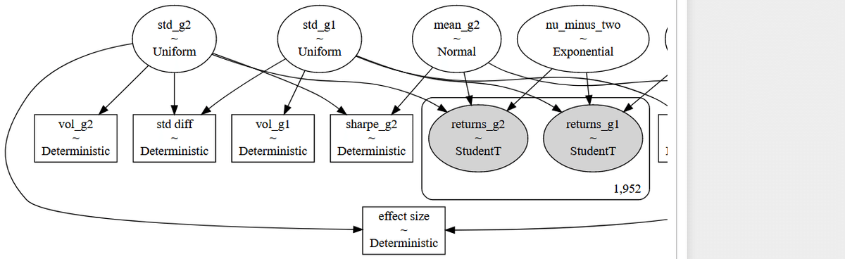
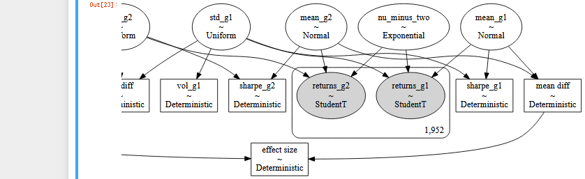
モデルが複雑なので、左と右で2枚に分けました。
HMC NUTS サンプリング
with best:
   trace = pm.sample(draws=10000,
                     tune=2500,
                     progressbar=True,
                     cores=1)
pm.trace_to_dataframe(trace).info()
'''
<class 'pandas.core.frame.DataFrame'>
RangeIndex: 20000 entries, 0 to 19999
Data columns (total 12 columns):
# Column Non-Null Count Dtype
--- ------ -------------- -----
0 mean_g1 20000 non-null float64
1 mean_g2 20000 non-null float64
2 nu_minus_two 20000 non-null float64
3 std_g1 20000 non-null float64
4 vol_g1 20000 non-null float64
5 sharpe_g1 20000 non-null float64
6 std_g2 20000 non-null float64
7 vol_g2 20000 non-null float64
8 sharpe_g2 20000 non-null float64
9 mean diff 20000 non-null float64
10 std diff 20000 non-null float64
11 effect size 20000 non-null float64
dtypes: float64(12)
memory usage: 1.8 MB
'''痕跡を評価する。
2つのリターン系列のパフォーマンスを比較するために、各グループのシャープレシオを個別にモデル化し、ボラティリティ調整されたリターン間の差として効果的なサイズを計算します。痕跡を視覚化すると、次のグラフに示すように、各メトリックの分布に対する詳細なパフォーマンスの洞察が明らかになります。
burn = 0
trace = trace[burn:]

fig = plt.figure(figsize=(14, 8), constrained_layout=True)
gs = gridspec.GridSpec(4, 2, wspace=0.1, hspace=0.4)
axs = [plt.subplot(gs[i, j]) for i in [0, 1, 2] for j in [0, 1]]
axs.append(plt.subplot(gs[3, :]))

def distplot_w_perc(trace, ax):
   sns.distplot(trace, ax=ax)
   ax.axvline(stats.scoreatpercentile(trace, 2.5), color='0.5', label='2.5 and 97.5 percentiles')
   ax.axvline(stats.scoreatpercentile(trace, 97.5), color='0.5')

for i in [1, 2]:
   label = f'Group {i}'
   sns.distplot(trace[f'mean_g{i}'], ax=axs[0], label=label)
   sns.distplot(trace[f'vol_g{i}'], ax=axs[2], label=label)
   sns.distplot(trace[f'sharpe_g{i}'], ax=axs[4], label=label)

distplot_w_perc(trace['mean diff'], axs[1])
distplot_w_perc(trace['vol_g1'] - trace['vol_g2'], axs[3])
distplot_w_perc(trace['sharpe_g1'] - trace['sharpe_g2'], axs[5])

sns.distplot(trace['effect size'], ax=axs[6])
for p in [2.5, 97.5]:
   axs[6].axvline(stats.scoreatpercentile(trace['effect size'], p), color='0.5')

for i in range(5):
   axs[i].legend(loc=0, frameon=True, framealpha=0.5)

axs[0].set(xlabel='Mean', ylabel='Belief', yticklabels=[])
axs[1].set(xlabel='Difference of means', yticklabels=[])
axs[2].set(xlabel='Annual volatility', ylabel='Belief', yticklabels=[])
axs[3].set(xlabel='Difference of volatility', yticklabels=[])
axs[4].set(xlabel='Sharpe', ylabel='Belief', yticklabels=[])
axs[5].set(xlabel='Difference of Sharpes', yticklabels=[])
axs[6].set(xlabel='Difference of means normalized by volatility', ylabel='Belief', yticklabels=[])
sns.despine()
fig.tight_layout()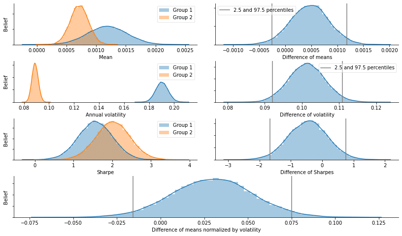
def plot_traces(traces, burnin=2000):
   '''
   Plot traces with overlaid means and values
   '''
   summary = pm.summary(traces[burnin:])['mean'].to_dict()
   ax = pm.traceplot(traces[burnin:],
                     figsize=(15, len(traces.varnames)*1.5),
                     lines=summary)

   for i, mn in enumerate(summary.values()):
       ax[i, 0].annotate(f'{mn:.2f}',
                         xy=(mn, 0),
                         xycoords='data',
                         xytext=(5, 10),
                         textcoords='offset points',
                         rotation=90,
                         va='bottom',
                         fontsize='large',
                         color='#AA0022')
plot_traces(trace, burnin=0)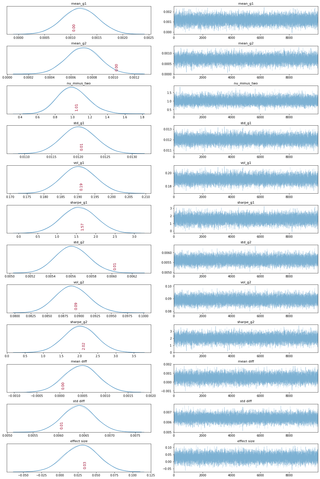
この記事が気に入ったらサポートをしてみませんか?