
Trying Data Science(14) : k平均法 & 主成分分析 (PCA)

はじめに
こんにちは、今日は「k平均法」と「主成分分析」について勉強します!二つの概念はデータのパタンを見出す方法です。
「k平均法」の概念と分析例
概念
k平均法はデータ内でグループ化する教師なし学習アルゴリズムです。ここで「K」は「クラスター」(Cluster)または「群集」(Cluster)という単語の最初の文字を表し、群集数を表す変数としてよく使われるアルファベットの一つです。
● 複数のクラスタ「K」を選択します
● 各ポイントをクラスタにランダムに割り当てます
● クラスタの変更が停止するまで、次の手順を繰り返します。
○ クラスタごとに、クラスタ内のポイントの平均ベクトルを取得して、クラスタ中心を計算
○ 各データポイントを、重心が最も近いクラスタに割り当て

● 「エルボー法」に基づいて「最適な」K値を選択します。
●「エルボー法」は群数を変化しながら、各群に割り当てられたデータポイントの距離の総合を表すグラフです。グラフがエルボーみたいに曲がる点が適切な群数です。

これがエルボー
ライブラリのインポート
import pandas as pd
import numpy as np
import matplotlib.pyplot as plt
import seaborn as sns
%matplotlib inline
データを読み込む
*注意すべき点は、「K平均法」は教師ない学習で、もともとはラベルないということです。ここでは、アルゴリズムの作動を理解するために使います。
df = pd.read_csv('College_Data',index_col=0)

#check the data
df.head()
df.info()
df.describe()
Private Apps Accept Enroll Top10perc Top25perc F.Undergrad P.Undergrad Outstate Room.Board Books Personal PhD Terminal S.F.Ratio perc.alumni Expend Grad.Rate
Abilene Christian University Yes 1660 1232 721 23 52 2885 537 7440 3300 450 2200 70 78 18.1 12 7041 60
Adelphi University Yes 2186 1924 512 16 29 2683 1227 12280 6450 750 1500 29 30 12.2 16 10527 56
Adrian College Yes 1428 1097 336 22 50 1036 99 11250 3750 400 1165 53 66 12.9 30 8735 54
Agnes Scott College Yes 417 349 137 60 89 510 63 12960 5450 450 875 92 97 7.7 37 19016 59
Alaska Pacific University Yes 193 146 55 16 44 249 869 7560 4120 800 1500 76 72 11.9 2 10922 15<class 'pandas.core.frame.DataFrame'>
Index: 777 entries, Abilene Christian University to York College of Pennsylvania
Data columns (total 18 columns):
Private 777 non-null object
Apps 777 non-null int64
Accept 777 non-null int64
Enroll 777 non-null int64
Top10perc 777 non-null int64
Top25perc 777 non-null int64
F.Undergrad 777 non-null int64
P.Undergrad 777 non-null int64
Outstate 777 non-null int64
Room.Board 777 non-null int64
Books 777 non-null int64
Personal 777 non-null int64
PhD 777 non-null int64
Terminal 777 non-null int64
S.F.Ratio 777 non-null float64
perc.alumni 777 non-null int64
Expend 777 non-null int64
Grad.Rate 777 non-null int64
dtypes: float64(1), int64(16), object(1)
memory usage: 115.3+ KB Apps Accept Enroll Top10perc Top25perc F.Undergrad P.Undergrad Outstate Room.Board Books Personal PhD Terminal S.F.Ratio perc.alumni Expend Grad.Rate
count 777.000000 777.000000 777.000000 777.000000 777.000000 777.000000 777.000000 777.000000 777.000000 777.000000 777.000000 777.000000 777.000000 777.000000 777.000000 777.000000 777.00000
mean 3001.638353 2018.804376 779.972973 27.558559 55.796654 3699.907336 855.298584 10440.669241 4357.526384 549.380952 1340.642214 72.660232 79.702703 14.089704 22.743887 9660.171171 65.46332
std 3870.201484 2451.113971 929.176190 17.640364 19.804778 4850.420531 1522.431887 4023.016484 1096.696416 165.105360 677.071454 16.328155 14.722359 3.958349 12.391801 5221.768440 17.17771
min 81.000000 72.000000 35.000000 1.000000 9.000000 139.000000 1.000000 2340.000000 1780.000000 96.000000 250.000000 8.000000 24.000000 2.500000 0.000000 3186.000000 10.00000
25% 776.000000 604.000000 242.000000 15.000000 41.000000 992.000000 95.000000 7320.000000 3597.000000 470.000000 850.000000 62.000000 71.000000 11.500000 13.000000 6751.000000 53.00000
50% 1558.000000 1110.000000 434.000000 23.000000 54.000000 1707.000000 353.000000 9990.000000 4200.000000 500.000000 1200.000000 75.000000 82.000000 13.600000 21.000000 8377.000000 65.00000
75% 3624.000000 2424.000000 902.000000 35.000000 69.000000 4005.000000 967.000000 12925.000000 5050.000000 600.000000 1700.000000 85.000000 92.000000 16.500000 31.000000 10830.000000 78.00000
max 48094.000000 26330.000000 6392.000000 96.000000 100.000000 31643.000000 21836.000000 21700.000000 8124.000000 2340.000000 6800.000000 103.000000 100.000000 39.800000 64.000000 56233.000000 118.00000探索的データ分析(EDA-Explanatory Data Analysis)
sns.set_style('whitegrid')
sns.lmplot('Room.Board','Grad.Rate',data=df,hue='Private',palette='coolwarm',size=6,aspect=1,fit_reg=false)
sns.set_style('whitegrid')
sns.lmplot('Outstate','F.Undergrad',data=df,hue='Private',palette='coolwarm',sie=6,aspect=1,fit_reg=False)
sns.set_style('darkgrid')
g = sns.FacetGrid(df,hue="Private",palette='coolwarm',size=6,aspect=2)
g = g.map(plt.hist,'Grad.Rate',bins=20,alpha=0.7)
右側を見ると、「Grad.Rate」が100以上の値があります。
df[df['Grad.Rate']]>100]Private Apps Accept Enroll Top10perc Top25perc F.Undergrad P.Undergrad Outstate Room.Board Books Personal PhD Terminal S.F.Ratio perc.alumni Expend Grad.Rate
Cazenovia College Yes 3847 3433 527 9 35 1010 12 9384 4840 600 500 22 47 14.3 20 7697 118大学名は「Cazenovia College」ですね。
値を修正しましょう。
df['Grad.Rate']['Cazenovia College'] = 100df[df['Grad.Rate']>100]Private Apps Accept Enroll Top10perc Top25perc F.Undergrad P.Undergrad Outstate Room.Board Books Personal PhD Terminal S.F.Ratio perc.alumni Expend Grad.Rate
いま、何の値もないです!
kmeansの生成
ライブラリをインポートします。
from sklearn.cluster import KMeans二つのクラスターを持っているインスタンスを生成しましょう。
kmeans = KMeans(n_clusters=2)「Private」を除いて、全てのデータをモデルへ!
kmeans.fit(df.drop('Private',axis=1)クラスターの中心のベクトル
kmeans.cluster_centers_array([[ 1.81323468e+03, 1.28716592e+03, 4.91044843e+02,
2.53094170e+01, 5.34708520e+01, 2.18854858e+03,
5.95458894e+02, 1.03957085e+04, 4.31136472e+03,
5.41982063e+02, 1.28033632e+03, 7.04424514e+01,
7.78251121e+01, 1.40997010e+01, 2.31748879e+01,
8.93204634e+03, 6.51195815e+01],
[ 1.03631389e+04, 6.55089815e+03, 2.56972222e+03,
4.14907407e+01, 7.02037037e+01, 1.30619352e+04,
2.46486111e+03, 1.07191759e+04, 4.64347222e+03,
5.95212963e+02, 1.71420370e+03, 8.63981481e+01,
9.13333333e+01, 1.40277778e+01, 2.00740741e+01,
1.41705000e+04, 6.75925926e+01]])評価
ラベルがないと、完璧な評価方法はなかなかないです。今回の記事にはラベルがありますが、実際の分析の状況にはこんあ贅沢はないですww
「private」 は1,そうではないと、0でします。
def converter(cluster):
 if cluster == 'Yes':
  return 1
 else:
return 0df['Cluster'] = df['Private'].apply(converter)
df.head()
混同行列(confusion matrix)とclassification reportを作成します。
from sklearn.metrics import confusion_matrix,classification_report
print(confusion_matrix(df['Cluster'],kmeans.labels_))
print(classification_report(df['Cluster'],kmreans_labels))[[138 74]
[531 34]]
precision recall f1-score support
0 0.21 0.65 0.31 212
1 0.31 0.06 0.10 565
avg / total 0.29 0.22 0.16 777まあまあの評価ですね。
precision(適合率): モデルが真と予測した数を分母,その中で実際に正解した数を分子にした値
precision=TP/TP+FP
recall(再現率): 正解データ中の真の数を分母,その中でモデルが正解した数を分子にした値
recall=TP/TP+NF
f1-score(F値):recisionとrecallの調和平均
2*precision*recall/precision+recall
support: 正解データに含まれている個数
「主成分分析」の概念と分析例
概念
主成分分析(PCA-Principal Conponents Analysis)とは多次元のデータを低次元へ縮小する技術です。データの主な変動を説明する主成分(Principal Component)を見出して、これによりでーたを新しい軸で変換します。そうすると、データの視覚化や分析がよりやすくなります。

ライブラリのインポート
import matplotlib.pyplot as plt
import pandas as pd
import numpy as np
import seaborn as sns
%matplotlib inline
データの探索
from sklearn.datasets import load_breast_cancer
cancer = load_breast_cancer()
cancer.keys()dict_keys(['DESCR', 'data', 'feature_names', 'target_names', 'target'])print(cancer['DESCR'])df = pd.DataFrame(cancer['data'],columns=cancer['feature_names'])
#(['DESCR', 'data', 'feature_names', 'target_names', 'target'])
    mean   radius	 mean texture	mean perimeter	mean area	mean smoothness	mean compactness	mean concavity	mean concave points	mean symmetry	mean fractal dimension	...	worst radius	worst texture	worst perimeter	worst area	worst smoothness	worst compactness	worst concavity	worst concave points	worst symmetry	worst fractal dimension
0	17.99	10.38	122.80	1001.0	0.11840	0.27760	0.3001	0.14710	0.2419	0.07871	...	25.38	17.33	184.60	2019.0	0.1622	0.6656	0.7119	0.2654	0.4601	0.11890
1	20.57	17.77	132.90	1326.0	0.08474	0.07864	0.0869	0.07017	0.1812	0.05667	...	24.99	23.41	158.80	1956.0	0.1238	0.1866	0.2416	0.1860	0.2750	0.08902
2	19.69	21.25	130.00	1203.0	0.10960	0.15990	0.1974	0.12790	0.2069	0.05999	...	23.57	25.53	152.50	1709.0	0.1444	0.4245	0.4504	0.2430	0.3613	0.08758
3	11.42	20.38	77.58	386.1	0.14250	0.28390	0.2414	0.10520	0.2597	0.09744	...	14.91	26.50	98.87	567.7	0.2098	0.8663	0.6869	0.2575	0.6638	0.17300
4	20.29	14.34	135.10	1297.0	0.10030	0.13280	0.1980	0.10430	0.1809	0.05883	...	22.54	16.67	152.20	1575.0	0.1374	0.2050	0.4000	0.1625	0.2364	0.07678
5 rows × 30 columns
データの前処理と視覚化
from sklearn.preprocessing import StandartScaler

# instantiate a PCA object
scaler = StandardScaler()

# find the principal components using the fit method
scaler.fit(df)

# apply the rotation and dimensionality reduction by calling transform().
scaled_date = scaler.transform(df)
StandardScaler()はデータの平均値を0で、標準偏差を1で調節して、データの分布を正規分布に近づけることができます。スケーリングされたデータはマシンラーニングモデルの学習に役立ちます。SVM、K-Nearest Neighbors、主成分分析(PCA)などのアルゴリズムで使われます。
*スケーリング(scaling)は データの単位を調節する過程です。
では、具体的にComponentの数をしていしましょう。
from sklearn.decomposition import PCA
pca = PCA(n_components=2)
pca.fit(scaled_data)

# transform scaled data to its first 2 principal components.
x_pca = pca.transform(scaled_data)
scaled_data.shape
(569, 30)x.pca.shape(569, 2)plt.figure(figsize=8,6)
plt.scatter(x_pca[:,0],x_pca[:,1],c=cancer['target'],cmap='plasma')
plt.xlabel('First principal component')
plt.ylabel('Second Principal Component')
二つの成分(component)を通じて、二つのグループで分けやすいです。
成分の解釈
pca.components_array([[-0.21890244, -0.10372458, -0.22753729, -0.22099499, -0.14258969,
-0.23928535, -0.25840048, -0.26085376, -0.13816696, -0.06436335,
-0.20597878, -0.01742803, -0.21132592, -0.20286964, -0.01453145,
-0.17039345, -0.15358979, -0.1834174 , -0.04249842, -0.10256832,
-0.22799663, -0.10446933, -0.23663968, -0.22487053, -0.12795256,
-0.21009588, -0.22876753, -0.25088597, -0.12290456, -0.13178394],
[ 0.23385713, 0.05970609, 0.21518136, 0.23107671, -0.18611302,
-0.15189161, -0.06016536, 0.0347675 , -0.19034877, -0.36657547,
0.10555215, -0.08997968, 0.08945723, 0.15229263, -0.20443045,
-0.2327159 , -0.19720728, -0.13032156, -0.183848 , -0.28009203,
0.21986638, 0.0454673 , 0.19987843, 0.21935186, -0.17230435,
-0.14359317, -0.09796411, 0.00825724, -0.14188335, -0.27533947]])上記の numpy行列で各行列は主成分(principal component)です。各列はもともとの特徴と繋がります。
ここでは、二つの行があります。一つ目の行は一つ目の主成分、二つ目の行は二つ目の主成分です。列は合わせて30個があります。
その関係を視覚化しましょう。
df_comp = pd.DataFrame(pca.components_,columns=cancer['feature_names'])plt.figure(figsize=(12,6))
sns.heatmap(df_comp,cmap='plasma',)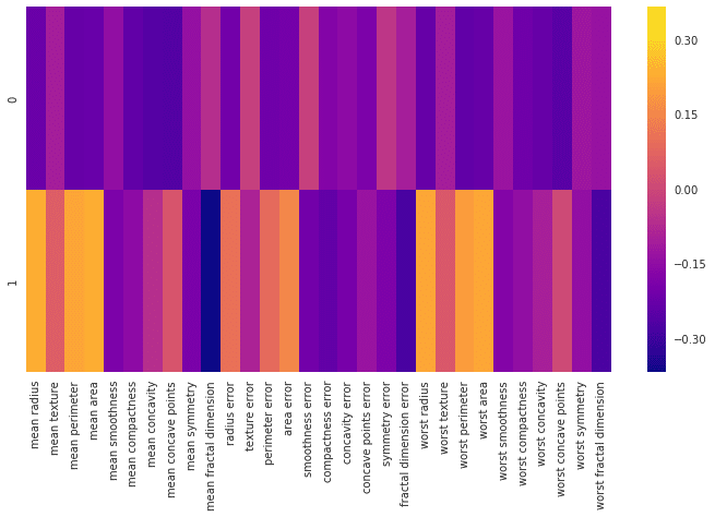
このヒートマップとカラーバーは、基本的にさまざまな特徴と主成分自体との相関関係を表します。ここで注目すべき点は主成分と各特徴と関連性の程度は「+・-」値ではなくて、「絶対値」だということです。
最後に
k平均法と主成分分析は教師なし学習です。だんだん、概念が大変むずかしくなりますが、理解できるまで頑張ります!
エンジニアファーストの会社 株式会社CRE-CO
ソンさん
【参考】
[Udemy] Python for Data Science and Machine Learning Bootcamp
【sklearn】Classification_reportの使い方を丁寧に(https://gotutiyan.hatenablog.com/entry/2020/09/09/111840)
この記事が気に入ったらサポートをしてみませんか?