Pythonで株価をチャートに描画する ~Matplotlib編~

Pythonで株価をチャートに描くために、いくつかのライブラリがありますが、ここではMatplotlibを使います。
私は時と場合に応じてライブラリを使い分けています。
Matplotlibはチャートをカスタマイズしたい時によく使います。
ソースコードと実行結果
import matplotlib.pyplot as plt
import matplotlib.dates as mdates

def plotChart(**kwargs):
    OHLCV = kwargs['ohlcv']
    start = kwargs['start']
    end = kwargs['end']
    label = kwargs['label']

    fig = plt.figure(figsize=(8,6))
    margin = 0.1
    ax_Price = fig.add_axes([0+margin, 0.5, 1-margin*2, 0.5-margin])
    ax_Indicator = fig.add_axes([0+margin, 0+margin, 1-margin*2, 0.5-margin], sharex=ax_Price)

    ax_Price.plot(OHLCV['Close'][start:end], color='black', marker='.')
    ax_Price.tick_params(labelright=True)
    ax_Price.grid(True)
    ax_Price.set_ylabel(label)

    ax_Indicator.plot((OHLCV['Close']-OHLCV['Close'].shift(1))[start:end], color='green')
    ax_Indicator.tick_params(labelright=True)
    ax_Indicator.grid(True)
    ax_Indicator.set_ylabel('indicator')

    ax_Indicator.set_xticks(OHLCV[start:end].index)
    ax_Indicator.set_xticklabels(ax_Price.get_xticks(), rotation=90, horizontalalignment='center', fontsize='small')
    ax_Indicator.xaxis.set_major_formatter(mdates.DateFormatter('%m/%d'))

    fig.show()
次のようにplotChart関数を呼び出して実行してください。
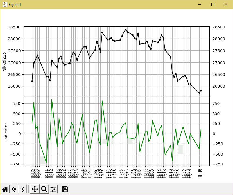
plotChart(ohlcv=OHLCV_N225, start='20221001', end=None, label='Nikkei225')すると、次のようなチャートが描画されます。
描画処理によってはうまく画面出力できない場合もあるため、画像出力する方法も紹介します。
反復処理するようになると画像出力する方が便利です。
画像出力する場合には、上のソースコードのfig.show()の代わりに次のように記述します。
フルパスの画像ファイル名は「\」を含むため先頭にrを付けてraw stringsとして与えます。
file = r'(フルパスの画像ファイル名、~.png)'
fig.savefig(file, format='png')
ソースコードの解説
株価データOHLCV_N225はpandas.DataFrame形式でインデックスがDatetimeIndexで列名にCloseがあれば動作します。
株価データ取得とpandas.DataFrameへの変換は次の記事をご覧ください。
関数の引数はすべて指定する必要がありますが、記述方法を少し工夫すれば任意指定にすることもできます。
今回はindicator枠には前日比の変動価格を描画しています。
この枠をお好みのインジケータに変えたり枠を増やして、自分の投資スタイルに合ったテクニカル分析をしてみてください。
この記事が気に入ったらサポートをしてみませんか?