[Shopify]色んなボタンセクション・10通り(Dawn)83/100

こんにちは。Shopify専門エンジニアのまりん(@crowd37cord)です。
ボタンだけのセクションを作ってみます♪
全部で10通りの可愛いボタンを作れるセクションにしてみました!
色や角を丸くしたりなどの組み合わせ次第で何十通りにもなります♪
対象テーマ:Dawn
✔︎今回のゴール
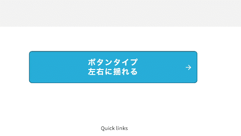
◆ボタンタイプは10種類

シンプル、立体、立体影付に加え、下記のようなアニメーションボタンも♪
◆左右に揺れる
◆上下に揺れる

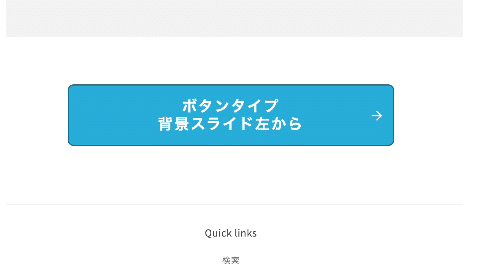
◆背景スライド左から
マウスをボタンの上に置くと左からスライドで色が変わる。
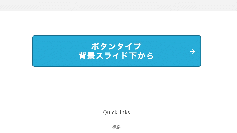
◆背景スライド下から
マウスをボタンの上に置くと下からスライドで色が変わる。
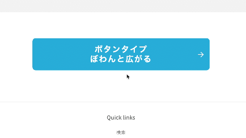
◆ぼわんと広がる
マウスをボタンの上に置くとボタンのまわりが波打つ
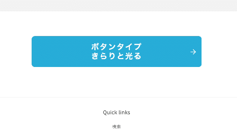
◆きらりと光る
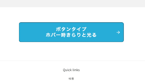
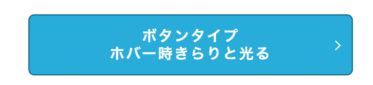
◆ホバー時きらりと光る
マウスをボタンの上に置いた時だけ、きらりと光る
========
矢印タイプ
========

◆矢印1 「→」

◆矢印2 「>」
◆CMSの特徴
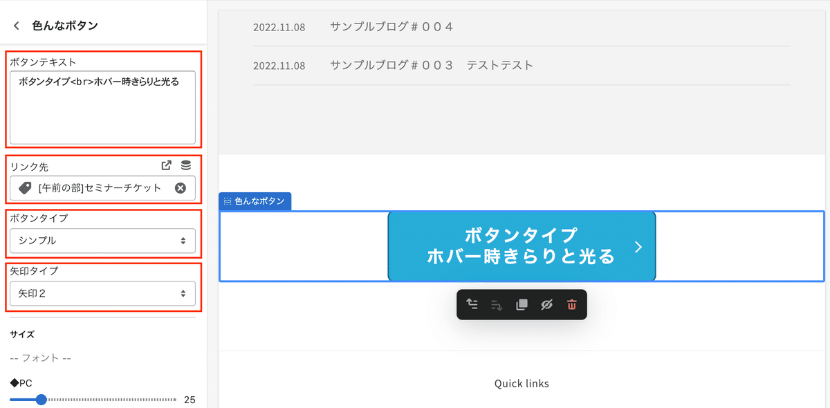
・ボタンテキスト
→改行はbrタグで。
・リンク先
・ボタンタイプ
・矢印タイプ

・フォントサイズ
・横幅
・縦幅
・ボタンの角
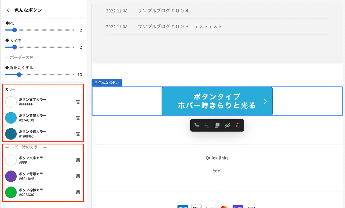
・通常のカラー
・ホバー時のカラー
✔︎設置手順
Step1 新規セクション作成
①管理画面>テーマ>コード編集>セクション>新規ファイル作成
セクションファイル名は何でもOKです
→custom-mult-btnにしてみました
②Schemaを追加
下記をコピペ
◆Schema
{% schema %}
{
"name": "色んなボタン",
"class": "section",
"tag": "section",
"settings": [
{
"type": "html",
"id": "link_label",
"label": "ボタンテキスト",
"default": "PUSH!"
},
{
"type": "url",
"id": "link",
"label": "リンク先"
},
{
"type": "select",
"id": "type",
"options": [
{
"value": "simple",
"label": "シンプル"
},
{
"value": "3d-1",
"label": "立体"
}, {
"value": "3d-2",
"label": "立体 影付"
},
{
"value": "a-1",
"label": "左右に揺れる"
},
{
"value": "a-2",
"label": "上下に揺れる"
},
{
"value": "slide-1",
"label": "背景スライド左から"
},
{
"value": "slide-2",
"label": "背景スライド下から"
},
{
"value": "cute-1",
"label": "ぼわんと広がる"
},
{
"value": "cute-2",
"label": "きらりと光る"
},
{
"value": "cute-3",
"label": "ホバー時きらりと光る"
}
],
"default": "3d-1",
"label": "ボタンタイプ"
},
{
"type": "select",
"id": "arrow",
"options": [
{
"value": "none",
"label": "矢印なし"
},
{
"value": "type-1",
"label": "矢印1"
},
{
"value": "type-2",
"label": "矢印2"
}
],
"default": "none",
"label": "矢印タイプ"
},
{
"type": "header",
"content": "サイズ"
},
{
"type": "paragraph",
"content": "-- フォント --"
},
{
"type": "range",
"id": "font_pc",
"min": 10,
"max": 100,
"step": 1,
"label": "◆PC",
"default": 16
},
{
"type": "range",
"id": "font_sp",
"min": 10,
"max": 100,
"step": 1,
"label": "◆スマホ",
"default": 16
},
{
"type": "paragraph",
"content": "-- 横幅 --"
},
{
"type": "range",
"id": "width_pc",
"min": 10,
"max": 100,
"step": 1,
"label": "◆PC",
"default": 30
},
{
"type": "range",
"id": "width_sp",
"min": 10,
"max": 100,
"step": 1,
"label": "◆スマホ",
"default": 100
},
{
"type": "paragraph",
"content": "-- 高さ --"
},
{
"type": "range",
"id": "pd_pc",
"min": 1,
"max": 10,
"step": 1,
"label": "◆PC",
"default": 2
},
{
"type": "range",
"id": "pd_sp",
"min": 1,
"max": 10,
"step": 1,
"label": "◆スマホ",
"default": 2
},
{
"type": "paragraph",
"content": "-- ボーダーの角 --"
},
{
"type": "range",
"id": "radius",
"min": 1,
"max": 50,
"step": 1,
"label": "◆角を丸くする",
"default": 1
},
{
"type": "header",
"content": "カラー"
},
{
"type": "color",
"id": "c_txt",
"default": "#000",
"label": "ボタン文字カラー"
},
{
"type": "color",
"id": "c_bg",
"default": "#27acd9",
"label": "ボタン背景カラー"
},
{
"type": "color",
"id": "c_bd",
"default": "#27acd9",
"label": "ボタン枠線カラー"
},
{
"type": "paragraph",
"content": "-- ホバー時のカラー --"
},
{
"type": "color",
"id": "c_txt_h",
"default": "#fff",
"label": "ボタン文字カラー"
},
{
"type": "color",
"id": "c_bg_h",
"default": "#27acd9",
"label": "ボタン背景カラー"
},
{
"type": "color",
"id": "c_bd_h",
"default": "#27acd9",
"label": "ボタン枠線カラー"
}
],
"presets": [
{
"name": "色んなボタン"
}
]
}
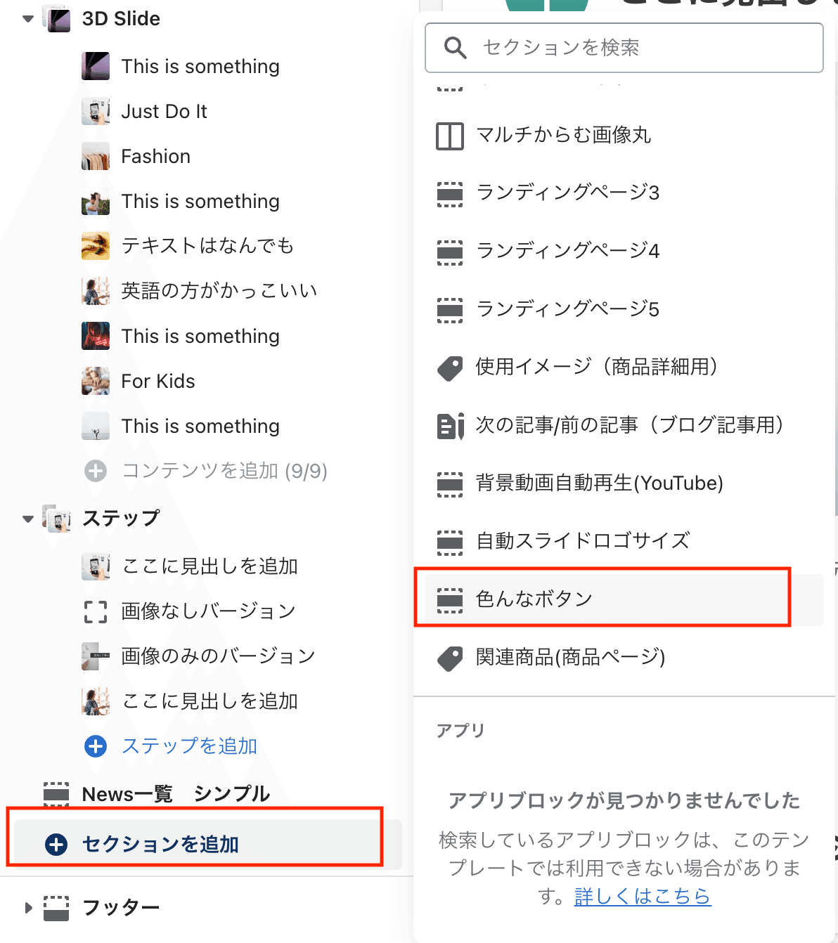
{% endschema %}先にCMSからセクション追加しておきます。
色んなボタンというセクションを選択しお好みの位置へ設置
③HTML部分を挿入します。
先ほどのセクションファイル内に下記をコピペ
◆HTML
<div class="malin__btnfeild">
  <div class="page-width">
    <div class="__wd">
      <a href="{{ section.settings.link }}" class="btn btn__{{ section.settings.type }}">
      <span>{{ section.settings.link_label }}</span>
      <span class="icon arrow__{{ section.settings.arrow }}"></span>
      </a>
    </div>
  </div>
</div>
あとはレイアウトを整えるだけ。
【ご注意】
※返金&サポートはしておりません。
※最新のDawnテーマ対象です。
※コードのみのご紹介で解説などはしておりません。
※2023.3.10時点のコードです。メンテナンスは今後する予定はありません。
※環境やバージョンによりレイアウト崩れることもありますので適当にCSSで調整していただければと思います。
ここから先は
この記事が気に入ったらサポートをしてみませんか?