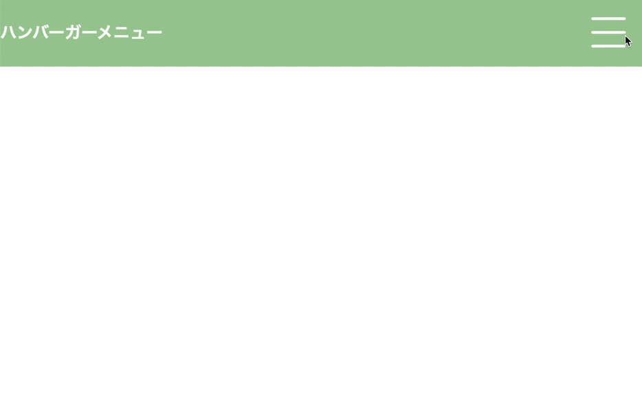
javascript ハンバーガーメニュー

こんにちは、fukuです。
今日はハンバーガーメニューを勉強したので
そのアウトプットとします。
流れとしては、
html、cssで基本的な形を作って
次に、クリックした時の
ハンバーガーとメニューの動きのクラスをcssで作る
そして、javascriptでクラスを付けたり消したりする。
説明は簡単だけど、途中で頭がこんがらがって
めっちゃ時間かかっちゃいました(>_<)
HTML
全体
<!DOCTYPE html>
<html lang="ja" dir="ltr">
 <head>
   <meta charset="utf-8">
   <link rel="stylesheet" href="index.css">
   <title></title>
 </head>
 <body>

   <section>
     <h1>ハンバーガーメニュー</h1>

     <div class="btn" id="btn01">
       <span></span>
       <span></span>
       <span></span>
     </div>

     <ul id="nav_list">
       <li><a href="#">記事1</a></li>
       <li><a href="#">記事2</a></li>
       <li><a href="#">記事3</a></li>
     </ul>

   </section>

   <script type="text/javascript">
     'use strict'

     const btn = document.getElementById('btn01');
     const nav_list = document.getElementById('nav_list')

     btn.onclick = function(){
       btn.classList.toggle('active');
       nav_list.classList.toggle('active');
     }

   </script>
 </body>
</html>
<div class="btn" id="btn01">
<span></span>
<span></span>
<span></span>
</div>spanで、バンバーガーの3本線の元を作る
<ul id="nav_list">
 <li><a href="#">記事1</a></li>
 <li><a href="#">記事2</a></li>
 <li><a href="#">記事3</a></li>
</ul>
メニューを作る
css
全体
@charset "UTF-8";
body{
 margin: 0;
}

h1{
 color: #fff;
}

section{
 display: flex;
 justify-content: space-between;
 align-items: center;
 background-color: #9fca99;
 height: 100px;
}

/*ハンバーガー*/
.btn{
 margin-right: 30px;
 position: relative;
 width: 50px;
 height: 44px;
 cursor: pointer;
}

/*ハンバーガー3本線*/
.btn span{
 position: absolute;
 width: 100%;
 height: 4px;
 background-color: #fff;
 border-radius: 4px;
}

.btn, .btn span{
 display: inline-block;
 transition: all 0.5s;
 box-sizing: border-box;
}

.btn span:nth-of-type(1){
 top: 0;
}

.btn span:nth-of-type(2){
 top: 20px;
}

.btn span:nth-of-type(3){
 bottom: 0;
}

#btn01.active span:nth-of-type(1){
 transform: translateY(20px) rotate(-45deg);
 -webkit-transform: translateY(20px) rotate(-45deg);
}

#btn01.active span:nth-of-type(2){
 opacity: 0;
}

#btn01.active span:nth-of-type(3){
 transform: translateY(-20px) rotate(45deg);
 -webkit-transform: translateY(-20px) rotate(45deg);
}

/* メニュー */
ul{
 margin: 0;
 list-style: none;
 background-color: #6ea7a1;
}

/* 閉じてる状態 */
#nav_list{
 position: fixed;
 top: 100px;
 right: -200px;
 width: 200px;
 text-align: center;
 padding: 0;
 transition: all 0.5s;
}

#nav_list li{
 height: 100px;
}

#nav_list a{
 text-decoration: none;
 color: #fff;
 font-size: 20px;
}

/* 開いた状態 */
#nav_list.active{
 position: absolute;
 right: 0px;
 display: block;
 padding: 0;
}
/*ハンバーガー*/
.btn{
margin-right: 30px;
position: relative;
width: 50px;
height: 44px;
cursor: pointer;
}
/*ハンバーガー*/
.btn span{
position: absolute;
width: 100%;
height: 4px;
background-color: #fff;
border-radius: 4px;
}
/*動き*/
.btn, .btn span{
display: inline-block;
transition: all 0.5s;
box-sizing: border-box;
}
/*ハンバーガーの押す前*/
/*1本目*/
.btn span:nth-of-type(1){
 top: 0;
}

/*2本目*/
.btn span:nth-of-type(2){
 top: 20px;
}

/*3本目*/
.btn span:nth-of-type(3){
 bottom: 0;
}
/*ハンバーガーの押した後*/
/*1本目*/
#btn01.active span:nth-of-type(1){
 transform: translateY(20px) rotate(-45deg);
 -webkit-transform: translateY(20px) rotate(-45deg);
}

/*2本目*/
#btn01.active span:nth-of-type(2){
 opacity: 0;
}

/*3本目*/
#btn01.active span:nth-of-type(3){
 transform: translateY(-20px) rotate(45deg);
 -webkit-transform: translateY(-20px) rotate(45deg);
}↑cssハンバーガーの部分
/*ハンバーガーの押す前*/
/*1本目*/
.btn span:nth-of-type(1){
top: 0;
}
/*2本目*/
.btn span:nth-of-type(2){
top: 20px;
}
/*3本目*/
.btn span:nth-of-type(3){
bottom: 0;
}
クリックする前
1本目、2本目、3本目を別々に高さを設定して
/*ハンバーガーの押した後*/
/*1本目*/
#btn01.active span:nth-of-type(1){
transform: translateY(20px) rotate(-45deg);
-webkit-transform: translateY(20px) rotate(-45deg);
}
/*2本目*/
#btn01.active span:nth-of-type(2){
opacity: 0;
}
/*3本目*/
#btn01.active span:nth-of-type(3){
transform: translateY(-20px) rotate(45deg);
-webkit-transform: translateY(-20px) rotate(45deg);
}クリックした後
#btn01に.activeを追加する(付けたり消えたりする用)
1本目と3本目をクロスさせる
2本目はopacityを0にする
/* メニュー */
ul{
 margin: 0;
 list-style: none;
 background-color: #6ea7a1;
}

/* 閉じてる状態 */
#nav_list{
 position: fixed;
 top: 100px;
 right: -200px;
 width: 200px;
 text-align: center;
 padding: 0;
 transition: all 0.5s;
}

#nav_list li{
 height: 100px;
}

#nav_list a{
 text-decoration: none;
 color: #fff;
 font-size: 20px;
}

/* 開いた状態 */
#nav_list.active{
 position: absolute;
 right: 0px;
 display: block;
 padding: 0;
}
↑メニュー部分
/* 閉じてる状態 */
#nav_list{
 position: fixed;
 top: 100px;
 right: -200px;
 width: 200px;
 text-align: center;
 padding: 0;
 transition: all 0.5s;
}

#nav_list li{
 height: 100px;
}

#nav_list a{
 text-decoration: none;
 color: #fff;
 font-size: 20px;
}
↑閉じてる状態
右に−200pxとしてる
/* 開いた状態 */
#nav_list.active{
 position: absolute;
 right: 0px;
 display: block;
 padding: 0;
}
↑ハンバーガーと同じように、.acriveをつける(付けたり消えたりする用)
クリックしたら
右の−200を0にして表示されるようにする。
javascript
全体
    <script type="text/javascript">
     'use strict'

     const btn = document.getElementById('btn01');
     const nav_list = document.getElementById('nav_list')

     btn.onclick = function(){
       btn.classList.toggle('active');
       nav_list.classList.toggle('active');
     }
   </script>
const btn = document.getElementById('btn01');
const nav_list = document.getElementById('nav_list') ↑ハンバーガーのidとメニューのidをそれぞれ定数にする
     btn.onclick = function(){
       btn.classList.toggle('active');
       nav_list.classList.toggle('active');
     }
↑ハンバーガーを押した時に(.onclick)
ハンバーガーの閉じた状態(avtiveクラス)を追加、削除を交互にする
(.classList.toggle)
メニューも同じく追加、削除を交互にする。
感想
一応?終わりました。
もしかしたら、もっといいやり方があるはずなので、
また改めて考えてみたいです。
まじで疲れた
もっと勉強しなくちゃいけないなー
あと、説明もめっちゃ下手w
後で見返しても「ん?」ってなりそうなレベルだわw
ここまでみてくれた方、ありがとうございました!
この記事が気に入ったらサポートをしてみませんか?