
ビットコイン急騰の予兆!オンチェーン分析で簡単にBTC、ETHのスイングトレードをマスターすべき。

先日の投稿通り、 ポジションロングをしてくれてる方は現状、
約2500USDT幅は取れてると思います。 TARSもしっかり急騰前に反応してくれてたから 安心できた、 赤の縦線、7月27日の16時が急騰前サイン

つまりクジラの仕込みですね、 このオンチェーンインジ使い方覚えれば BTC、ETHのスイングであればeasy Pi Cycle Top も向きと場所の位置GOOD
おまけ
上から順番に、
①
Indicator Overview In each of its major market cycles, Bitcoin's price historically bottoms out around the 200 week moving average. This indicator uses a colour heatmap based on the % increases of that 200 week moving average. Depending on the month-by-month % increase of the 200 week moving average, a colour is assigned to the price chart. Note: this is a slightly modified version of a concept created by
. Use the link below to learn more about the original.
②
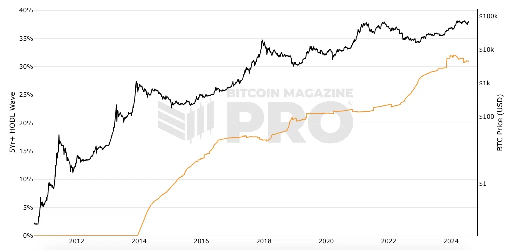
Indicator Overview This is the 5-year HODL wave. It shows the percentage of bitcoin that has not moved onchain for at least 5 years. This metric is also sometimes referred to as Bitcoin supply last active 5 years ago. It is the specific 5+ years data set taken from the HODL Waves chart.
③
Indicator Overview The Golden Ratio Multiplier is a bitcoin chart that explores Bitcoin's adoption curve and market cycles to understand how price may behave on medium to long term time frames. To do this it uses multiples of the 350 day moving average (350DMA) of Bitcoin's price to identify areas of potential resistance to price movements. Note: multiples are of the 350DMA's price values rather than its number of days. The multiples reference the Golden Ratio (1.6) and the Fibonacci sequence (0, 1, 1, 2, 3, 5, 8, 13, 21). These are important mathematical numbers.
④
What is this Bitcoin chart Showing? The number of addresses on the Bitcoin blockchain that either sent or received transactions. This is a useful metric to monitor over time as it shows the amount of activity happening on the Bitcoin network. As Bitcoin becomes more and more adopted over time, the number of active addresses increases. However, you can also see zooming in that during periods where the price drops, so too can active addresses as speculators hoping that $BTC price will go up, become less interested in bitcoin in the near term. That drop-off in speculation and general usage results in drops in the number of active addresses. The bitcoin chart above uses a 7 day moving average for the number of bitcoin active addresses to smooth out the daily fluctuations.


#CryptoTrading #NFT #HODL #Cry #Ethereum #Blockchain #DeFi #Cryptocurrenc #CryptoNews #Altco #Bitco #BTC #トレーダー #仮想通貨 #アルトコイン #半減期
この記事が気に入ったらサポートをしてみませんか?