
Python データの可視化 人口動態予測の巻

今回は世界の人口動態のオープンデータを使用して、各国の人口ピラミッドグラフを作成する。人口動態予測のデータにはかなりたくさんの種類があるが、今回はmedian variationを使用した。データは2022年~2100年で、比較データや推移のgif画像を作成して、人口推移が直観的に分かりやすいグラフを目指した。
アウトプットデータ
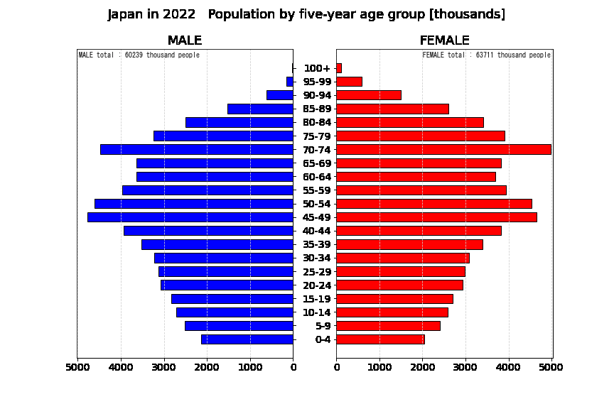
プログラムは各国すべてのデータをアウトプットするが、ここでは日本のグラフを参考に貼る。
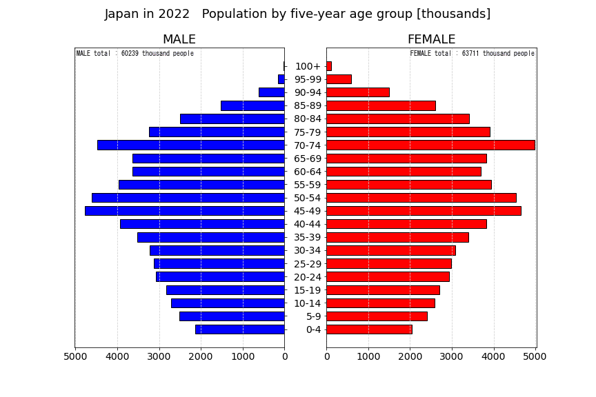
まずは2022年の人口グラフ。
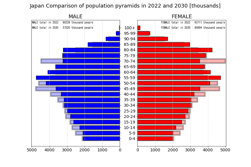
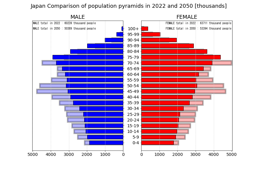
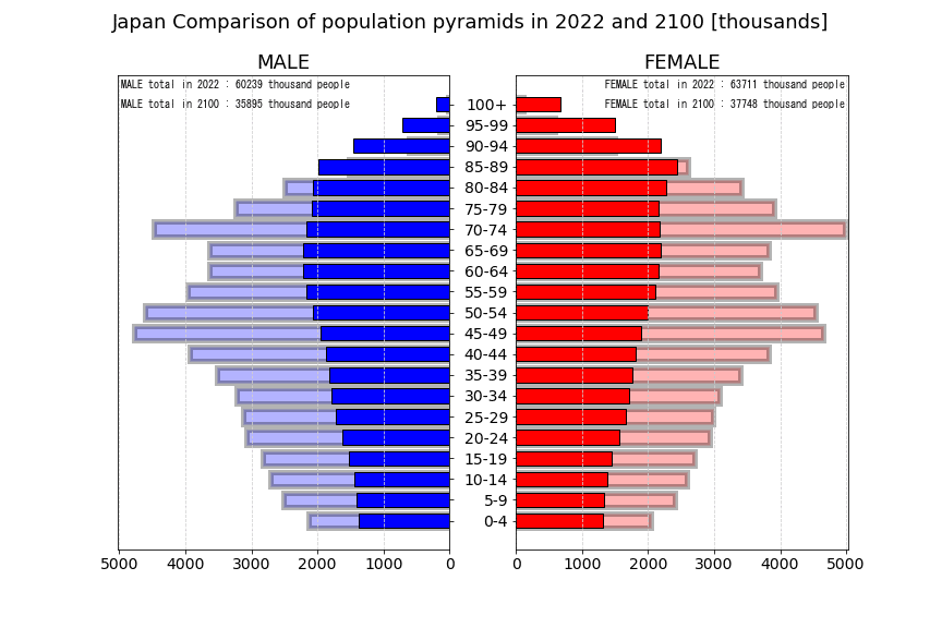
次に2022年と未来の比較。薄色が2022年、濃色が未来。
最後に2022年から2100年までの推移のアニメーション。
データの出典
Department of Economic and Social Affairs Population Division World Populaion Prospects 2022 のデータを使用した。
URL : https://population.un.org/wpp/
モジュールのimport
import numpy as np
import pandas as pd
import matplotlib.pyplot as plt
import os
from PIL import Image
#画像大量作成するときにメモリ消費が激しくなるため、以下をおまじないとして入れておく
import matplotlib
matplotlib.interactive(False)
データを読み込む。性別ごとのリストがダウンロードできる。
#index_col:最初の行を列名にする、usecols:使用する行を指定、skiprows:スキップする行を指定、skipfooter:使用する最後の行を指定
header = 16
sheet_name = 'Medium variant'
df_male = pd.read_excel('https://population.un.org/wpp/Download/Files/1_Indicators%20(Standard)/EXCEL_FILES/2_Population/WPP2022_POP_F02_2_POPULATION_5-YEAR_AGE_GROUPS_MALE.xlsx', header=header, sheet_name=sheet_name)
df_female = pd.read_excel('https://population.un.org/wpp/Download/Files/1_Indicators%20(Standard)/EXCEL_FILES/2_Population/WPP2022_POP_F02_3_POPULATION_5-YEAR_AGE_GROUPS_FEMALE.xlsx', header=header, sheet_name=sheet_name)
国名、地域名を抽出する。
country_list = df_male[df_male['Type'].str.contains('Country')]['Region, subregion, country or area *'].unique().tolist()各国の各年の人口ピラミッド作成
2022年~2100年の年ごとの人口動態予測をすべての国に対して作成する。画像数が多く実行にも時間がかかるので注意。
for country in country_list:
    df_male_country = df_male[df_male['Region, subregion, country or area *'] == country]
    df_female_country = df_female[df_female['Region, subregion, country or area *'] == country]
    os.mkdir(country)

    # グラフの軸サイズ用のデータ取得
    if df_male_country.max()[11:].max()<df_female_country.max()[11:].max():
        graph_max = df_female_country.max()[11:].max()
    else:
        graph_max = df_male_country.max()[11:].max()

    for i in range(len(df_male_country)):
        df_male_country_period= df_male_country.iloc[i].drop(df_male_country.iloc[i].index[range(11)])
        df_female_country_period= df_female_country.iloc[i].drop(df_female_country.iloc[i].index[range(11)])
        fig, ax = plt.subplots(ncols=2, figsize=(12,8))

        # グラフ作成
        # 男性人口
        ax[0].barh(df_male_country_period.index, df_male_country_period, color='b', height=0.7, label='male', alpha = 1, edgecolor = "#000000", linewidth = 1)
        ax[0].yaxis.tick_right() # 軸を右に
        ax[0].set_yticks(np.array(range(0,21,1))) # 10歳刻み
        ax[0].set_yticklabels([]) # こちらの軸ラベルは非表示
        ax[0].set_xlim([int(graph_max+graph_max/100),0])# x軸反転
        ax[0].set_title('MALE',fontsize=18)
        ax[0].text( 0.01, 0.99, "MALE total : " + str(int(df_male_country_period.sum())) + " thousand people" ,horizontalalignment='left', verticalalignment='top', family='MS Gothic', transform=ax[0].transAxes)
        ax[0].xaxis.grid(True, which = 'major', linestyle = '--', color = '#CFCFCF')
        plt.setp(ax[0].get_xticklabels(), fontsize=14)

        # 女性人口
        ax[1].barh(df_female_country_period.index, df_female_country_period, color='r', height=0.7, label='female', alpha = 1, edgecolor = "#000000", linewidth = 1)
        ax[1].set_yticks(np.array(range(0,21,1)))
        ax[1].set_xlim([0,int(graph_max+graph_max/100)])
        ax[1].set_title('FEMALE',fontsize=18)
        ax[1].xaxis.grid(True, which = 'major', linestyle = '--', color = '#CFCFCF')
        ax[1].text( 0.99, 0.99, "FEMALE total : " + str(int(df_female_country_period.sum())) + " thousand people" ,horizontalalignment='right', verticalalignment='top', family='MS Gothic', transform=ax[1].transAxes)

        fig.suptitle(country + " in " + str(int(period_list[i])) + " " + "  Population by five-year age group [thousands]" , size=18)
        plt.yticks(fontsize=14)
        plt.setp(ax[1].get_xticklabels(), fontsize=14)

        plt.savefig(country + "/" + str(int(period_list[i])) + "_" + country + "_" + 'graph.png')
        plt.close(fig)
各国の現在と未来のグラフ比較
例として2030年の人口と現在2022年の人口を比較。2022年の人口を背景に薄色で表示して、その上に2030年の人口を濃色で重ねる。
for country in country_list:
    df_male_country = df_male[df_male['Region, subregion, country or area *'] == country]
    df_female_country = df_female[df_female['Region, subregion, country or area *'] == country]

    # グラフの軸サイズ用のデータ取得
    if df_male_country.max()[11:].max()<df_female_country.max()[11:].max():
        graph_max = df_female_country.max()[11:].max()
    else:
        graph_max = df_male_country.max()[11:].max()

    # 2022年と2030年のデータを抽出。8を変更すれば他の年との比較も可能。
    df_male_country_period1= df_male_country.iloc[0].drop(df_male_country.iloc[0].index[range(11)])
    df_female_country_period1= df_female_country.iloc[0].drop(df_female_country.iloc[0].index[range(11)])
    df_male_country_period2= df_male_country.iloc[8].drop(df_male_country.iloc[8].index[range(11)])
    df_female_country_period2= df_female_country.iloc[8].drop(df_female_country.iloc[8].index[range(11)])
    fig, ax = plt.subplots(ncols=2, figsize=(12,8))

    # グラフ作成
    # 男性人口
    ax[0].barh(df_male_country_period1.index, df_male_country_period1, color='b', height=0.7, label='male', alpha = 0.3, edgecolor = "#000000", linewidth = 5)
    ax[0].barh(df_male_country_period2.index, df_male_country_period2, color='b', height=0.7, label='male', alpha = 1, edgecolor = "#000000", linewidth = 1)
    ax[0].yaxis.tick_right() # 軸を右に
    ax[0].set_yticks(np.array(range(0,21,1))) # 10歳刻み
    ax[0].set_yticklabels([]) # こちらの軸ラベルは非表示
    ax[0].set_xlim([int(graph_max+graph_max/100),0])# x軸反転
    ax[0].set_title('MALE',fontsize=18)
    ax[0].xaxis.grid(True, which = 'major', linestyle = '--', color = '#CFCFCF')
    ax[0].text( 0.01, 0.99, "MALE total in 2022 : " + str(int(df_male_country_period1.sum())) + " thousand people" ,horizontalalignment='left', verticalalignment='top', family='MS Gothic', transform=ax[0].transAxes)
    ax[0].text( 0.01, 0.95, "MALE total in 2030 : " + str(int(df_male_country_period2.sum())) + " thousand people" ,horizontalalignment='left', verticalalignment='top', family='MS Gothic', transform=ax[0].transAxes)

    plt.setp(ax[0].get_xticklabels(), fontsize=14)

    # 女性人口
    ax[1].barh(df_female_country_period1.index, df_female_country_period1, color='r', height=0.7, label='male', alpha = 0.3, edgecolor = "#000000", linewidth = 5)
    ax[1].barh(df_female_country_period2.index, df_female_country_period2, color='r', height=0.7, label='male', alpha = 1, edgecolor = "#000000", linewidth = 1)
    ax[1].set_yticks(np.array(range(0,21,1)))
    ax[1].set_xlim([0,int(graph_max+graph_max/100)])
    ax[1].set_title('FEMALE',fontsize=18)
    ax[1].xaxis.grid(True, which = 'major', linestyle = '--', color = '#CFCFCF')
    ax[1].text( 0.99, 0.99, "FEMALE total in 2022 : " + str(int(df_female_country_period1.sum())) + " thousand people" ,horizontalalignment='right', verticalalignment='top', family='MS Gothic', transform=ax[1].transAxes)
    ax[1].text( 0.99, 0.95, "FEMALE total in 2030 : " + str(int(df_female_country_period2.sum())) + " thousand people" ,horizontalalignment='right', verticalalignment='top', family='MS Gothic', transform=ax[1].transAxes)

    fig.suptitle(country + " Comparison of population pyramids in 2022 and 2030 [thousands]" , size=18)
    plt.yticks(fontsize=14)
    plt.setp(ax[1].get_xticklabels(), fontsize=14)

    plt.savefig(country + '/' + country + '_Comparison_in_2022_and_2030.png')
    plt.close(fig)
アニメーションgif作成
2022年から2100年までの人口動態予測をアニメーションにすると、どのような動き方をするのかが把握しやすくなる。
for country in country_list:
    pictures=[]

    # gifアニメ出力用の画像リストを作成
    for i in range(2022, 2101):
        pic_name = country + "/" + str(i) + "_" + country + "_" + 'graph.png'
        img = Image.open(pic_name).quantize()
        pictures.append(img)

    # gifアニメの出力
    pictures[0].save(country + "/" + str(i) + "_" + country + "_" + 'anime.gif',
                     save_all=True,
                     append_images=pictures[1:],
                     optimize=False,
                     duration=50,
                     loop=0,
    )