
Python グラフ作成 matplotlib pyplot

Pythonでグラフ作成するときにコピペして使えるコードたち。うまく使えばすぐそれなりのグラフが作成できるはず。
# モジュールインポート
print("実行環境")
import pandas as pd
import numpy as np
import matplotlib as mpl
import matplotlib.pyplot as plt
import itertools
!python -V
print('pandas ' + pd.__version__)
print('numnpy ' + np.__version__)
print('matplotlib ' +  mpl.__version__)
実行環境
Python 3.8.5
pandas 1.1.3
numnpy 1.19.2
matplotlib 3.3.2
seaborn 0.11.0各種プロットの方法でグラフを作成する。データはirisデータセットを使用する。
# データ読み込み
df = pd.read_csv('iris.csv')
# x,yにデータを割り振る
x = np.array(range(len(df)))
y_1 = np.array(df['y_1'])
y_2 = np.array(df['y_2'])
y_3 = np.array(df['y_3'])
y_4 = np.array(df['y_4'])
y_list = [y_1, y_2, y_3, y_4]
# データの確認
display(df.head())
display(df.tail())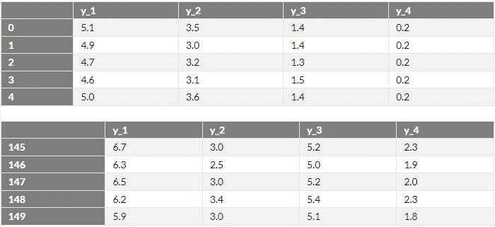
pyplotを用いた基本形
オプションなし
plt.figure(figsize=(12,8)) #グラフの表示サイズを変更。デフォルトは(6.4, 4.8)
plt.plot(x, y_1)
plt.plot(x, y_2)
plt.plot(x, y_3)
plt.plot(x, y_4);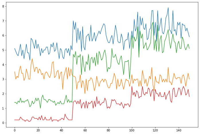
オプションの設定方法
plt.〇〇〇という記述でオプションをつけることができる。
plt.figure(figsize=(12,8))
# グラフ生成
plt.plot(x, y_1, label='y_1')
plt.plot(x, y_2, label='y_2', alpha=1.0, ls='--', color='m', lw=1.5, marker='+', mec='y', mew=8, mfc='r', ms=1, markevery=1)
plt.plot(x, y_3, label='y_3', alpha=0.8, ls=':', color='g', lw=1.2, marker='o', mec='g', mew=5, mfc='r', ms=3, markevery=4)
plt.plot(x, y_4, label='y_4', alpha=0.4, ls='-.', color='b', lw=0.5, marker='^', mec='r', mew=3, mfc='y', ms=1, markevery=9)
# ラベル生成
plt.title("Title") #タイトル
plt.xlabel('X_label', labelpad = 10,  size = 10, rotation = -30) #横軸
plt.ylabel('Y_label', style ='normal', fontweight='bold') # 縦軸
# 軸詳細設定
plt.xlim(0, 160) #横軸min,max
plt.ylim(0, 10) #縦軸min,max
plt.xticks([0, 80, 160], ['0'+'\n'+'min', '80'+'\n'+'center', '160'+'\n'+'max'], rotation = 30, size = 10) # 横軸表示細かさ
plt.yticks(range(11)) #縦軸表示細かさ
plt.minorticks_on() #主軸の補助目盛表示
plt.grid(which ="both", axis="x", ls='--', lw=1) #横軸直行補助目盛表示
plt.grid(which="major", axis="y", ls='--', lw=1) #縦軸直行補助目盛表示
plt.hlines(6.5, 0, len(df), colors='k', ls='-.', label='hlines') #任意の横軸直行線表示
plt.vlines(30, 0, 10, colors='k', ls='-.', label='vlines') #任意の縦軸直行線表示
plt.text(20, 9, 'text') #テキスト挿入
plt.legend(loc='upper right', borderaxespad=0.1 , fontsize=10); #凡例表示
# その他便利なオプション
# plt.xscale("log") #X軸をlogスケールへ変換
# plt.tight_layout() グラフのサイズが自動で最適化される
# オプション内のよく使う選択肢
# color = {'b', 'g', 'r', 'c', 'm', 'y', 'k', 'w'}
# loc = {'best', 'upper right', 'lower left', 'center', etc...}
# rotation = {'vertical'. 'horizontal'. value}
# style = {'normal'. 'italic'. 'oblique'}
# fontweight = {'ultralight', medium', 'bold','black', etc...}
# which = {'major'. 'minor'. 'both'}
オブジェクト指向な形式
オブジェクト指向な形式ではデータごとの軸分け、グラフ分け、整列など、詳細な設定が可能となる。
基本形
まずは上で示したpyplotを使った基本の形と同じグラフにする方法で記述する。
fig, ax = plt.subplots(figsize=(12,8))
# グラフ生成
ax.plot(x, y_1, label='y_1')
ax.plot(x, y_2, label='y_2', alpha=1.0, ls='--', color='m', lw=1.5, marker='+', mec='y', mew=8, mfc='r', ms=1, markevery=1)
ax.plot(x, y_3, label='y_3', alpha=0.8, ls=':', color='g', lw=1.2, marker='o', mec='g', mew=5, mfc='r', ms=3, markevery=4)
ax.plot(x, y_4, label='y_4', alpha=0.4, ls='-.', color='b', lw=0.5, marker='^', mec='r', mew=3, mfc='y', ms=1, markevery=9)
# ラベル生成
ax.set_title("Title") #タイトル
ax.set_xlabel('X_label', labelpad = 10,  size = 10, rotation = -30) #横軸
ax.set_ylabel('Y_label', style ='normal', fontweight='bold') # 縦軸
# 軸詳細設定
ax.set_xlim(0, 160) #横軸min,max
ax.set_ylim(0, 10) #縦軸min,max
ax.set_xticks([0, 80, 160]) # 横軸表示細かさ
ax.set_xticklabels(['0'+'\n'+'min', '80'+'\n'+'center', '160'+'\n'+'max'], rotation = 30, size = 10)
ax.set_yticks(range(11)) #縦軸表示細かさ
ax.minorticks_on() #主軸の補助目盛表示
ax.grid(which ="both", axis="x", ls='--', lw=1) #横軸直行補助目盛表示
ax.grid(which="major", axis="y", ls='--', lw=1) #縦軸直行補助目盛表示
ax.hlines(6.5, 0, len(df), colors='k', ls='-.', label='hlines') #任意の横軸直行線表示
ax.vlines(30, 0, 10, colors='k', ls='-.', label='vlines') #任意の縦軸直行線表示
ax.text(20, 9, 'text') #テキスト挿入
ax.legend(loc='upper right', borderaxespad=0.1 , fontsize=10); #凡例表示
単一グラフで2軸以上の作成
オブジェクト指向な形式では同一グラフ内に異なる軸を設定できる。
fig, ax1 = plt.subplots(figsize=(12,8))
ax1.plot(x, y_1, label='y_1 (ax_1)')
#第一軸作成・軸の設定
ax1.set_title("Title")
ax1.set_xlabel('X_label')
ax1.set_ylabel('Y_1, 4 label (ax_1)')
ax1.set_xlim(0, 160)
ax1.set_ylim(0, 10)
#第二軸作成・軸の設定
ax2 = ax1.twinx()
ax2.plot(x, y_2, label='y_2 (ax_2)', alpha=1.0, ls='--', color='m')
ax2.set_ylabel("y_2 label (ax_2)")
ax2.set_ylim(0, 6)
ax2.minorticks_on()
ax2.spines["right"].set_position(("axes", 0.95))
#第三軸・軸の設定
ax3 = ax1.twinx()
ax3.plot(x, y_3, label='y_3 (ax_3)', alpha=0.8, ls=':', color='g')
ax3.set_ylabel("y_3 label (ax_3)")
ax3.minorticks_on()
ax3.set_ylim(0, 8)
# y_4グラフは第一軸で描画
ax1.plot(x, y_4, label='y_4 (ax_1)', alpha=0.4, ls='-.', color='b')
# 横軸の設定
ax1.set_xticks([0, 80, 160])
ax1.minorticks_on() #主軸の補助目盛表示
ax1.grid(which ="both", axis="x", ls='--', lw=1)
ax1.grid(which="major", axis="y", ls='--', lw=1)
#凡例をまとめる
handler1, label1 = ax1.get_legend_handles_labels()
handler2, label2 = ax2.get_legend_handles_labels()
handler3, label3 = ax3.get_legend_handles_labels()
ax1.legend(handler1 + handler2 + handler3, label1 + label2 + label3, loc="upper left");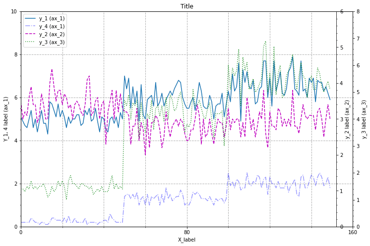
複数グラフの設定
複数のグラフを並べて表示する。このグラフでは縦横でそれぞれグラフの軸をそろえる設定としているが、sharex, shareyを変更することで個別、統一の設定も可能。
rowsno = 2; columnsno = 2
fig, axes = plt.subplots(rowsno, columnsno, figsize=(12, 8), sharex='col', sharey='row', constrained_layout=True)
for i, (ax, y, title) in enumerate(zip(axes.ravel(), y_list, df.columns.values.tolist())):
    ax.plot(x, y)
    ax.set_title(title)
    if i >= columnsno * (rowsno - 1):
        ax.set_xlabel('X_label')
    if i % columnsno == 0:
        ax.set_ylabel('Y_label')
    # 軸詳細設定
    ax.set_xlim(0, 160) #横軸min,max
    ax.set_xticks([0, 80, 160]) # 横軸表示細かさ
    ax.minorticks_on() #主軸の補助目盛表示
    ax.grid(which ="both", axis="x", ls='--', lw=1)
    ax.grid(which="major", axis="y", ls='--', lw=1)
# sharex, sharey = {'none', 'all', 'row', 'col'}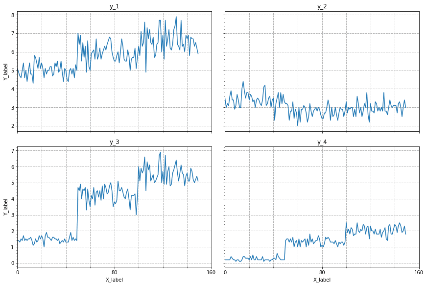
この記事が気に入ったらサポートをしてみませんか?