CSS「回転」アニメーションと背景の画像に重なっている部分の色を変える方法

CODEPENはOSやブラウザによってSVG画像が読み込まれないんですかね??「Result」に何も表示されていない場合は下記よりご覧ください。
SVGをtransformで回転させています。子要素span::beforeのbackground-imageに矢印のSVGを、span::afterのbackground-imageに回転させるSVGを指定します。
.rotating-animation span::before {
	width: 8px;
	height: 8px;
	background-image: url(矢印の画像パス);
}
.rotating-animation span::after {
position: absolute;
top: 0;
left: 0;
width: 100%;
height: 100%;
background-image: url(回転させる画像パス);
animation: rotating 10s linear infinite;
}「rotating」という@keyframesを作成し、transform:rotate()で回転を指定します。
@keyframes rotating {
0% {
transform: rotate(0deg);
}
100% {
transform: rotate(360deg);
}
}あとはspan::afterに10秒間隔で繰り返すように適用するだけです。
.rotating-animation span::after {
animation: rotating 10s linear infinite;
}手軽に作成できるので、デザインのアクセントに良いかもです!
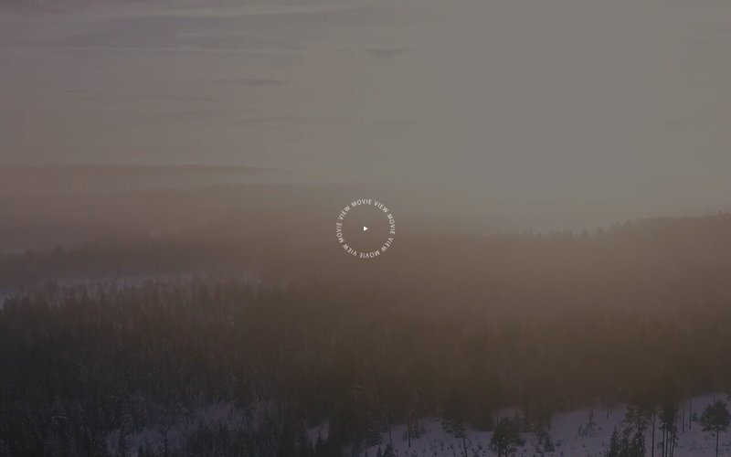
例1. 中心でクルクル
静止画や動画の中心にボタンを配置したパターン
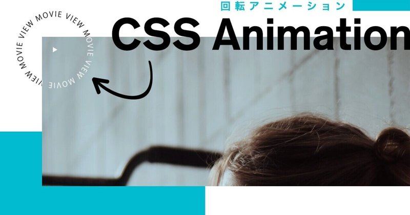
例2. 左上でクルクル
静止画や動画の左上に配置して重なる部分を白くするパターン

動画(画像)に重なる部分を白くする
「黒」のSVGの上に「白」のSVGを重ねて回転させ、「白」のみ動画(画像)からはみ出た部分をoverflow:hiddenで非表示にしています。それだけ!
HTML
<div class="visual-section">
<div class="rotating-animation"> <span></span> </div>
<div class="visual-section-inner">
<video src="ムービーのパス" loop muted autoplay></video>
<div class="rotating-animation rotate-white"> <span></span> </div>
</div>
</div>CSS
.visual-section {
position:relative;
}
.visual-section-inner {
position:relative;
overflow:hidden;
}
.rotating-animation {
position: absolute;
top: -40px;
left: -40px;
display: block;
width: 120px;
height: 120px;
cursor: pointer;
}
.rotating-animation span {
width: 100%;
height: 100%;
display: flex;
align-items: center;
justify-content: center;
}
.rotating-animation span::before, .rotating-animation span::after {
content: '';
display: block;
background-size: contain;
background-position: center;
background-repeat: no-repeat;
}
.rotating-animation span::before {
width: 8px;
height: 8px;
background-image: url(矢印の画像パス);
}
.rotating-animation span::after {
	position: absolute;
	top: 0;
	left: 0;
	width: 100%;
	height: 100%;
	background-image: url(回転させる画像パス);
	animation: rotating 10s linear infinite;
}
.rotate-white span::before {
background-image: url(矢印の画像(白)パス);
}
.rotate-white span::after {
background-image: url(回転させる画像(白)パス);
}
@keyframes rotating {
0% {
transform: rotate(0deg);
}
100% {
transform: rotate(360deg);
}
}「例2. 左上でクルクル」のCSSはこちらからご覧いただけます。
この記事が気に入ったらサポートをしてみませんか?