
[Python]医療費データを主成分分析してみた(続き2)

こんにちは。機械学習勉強中のあおじるです。
前回の記事で、協会けんぽの過去10年間、47都道府県別の医療費データの主成分分析(PCA)の結果を3次元プロットしました。
今回は3次元プロットを(あまり意味はないですが)アニメーションにして角度を変えながら見てみます。
今回も、Python、Google Colaboratoryを使用します。
主成分分析の結果を3Dアニメーション表示
# データ
import pandas as pd
df = pd.read_csv('./df_yt_C10_sn.csv')
print(df.shape)
# (470, 162)
print(df.columns)
# Index(['y', 't', 'KperP_1_1_1', 'KperP_1_1_2', 'KperP_1_1_3', 'KperP_1_1_4',
#        'KperP_1_1_5', 'KperP_1_1_6', 'KperP_1_1_7', 'KperP_1_1_8',
#        ...
#        'TperN_4_1_7', 'TperN_4_1_8', 'TperN_4_2_1', 'TperN_4_2_2',
#        'TperN_4_2_3', 'TperN_4_2_4', 'TperN_4_2_5', 'TperN_4_2_6',
#        'TperN_4_2_7', 'TperN_4_2_8'],
#       dtype='object', length=162)

# 数値部分のみ取り出し
X = df.iloc[:,2:]
print(X.shape)
# (470, 160)

# スケーリング
from sklearn import preprocessing
scaler_y = preprocessing.MinMaxScaler()
X = scaler_y.fit_transform(X)
print(X.shape)
# (470, 160)

%matplotlib inline
import matplotlib.pyplot as plt
import seaborn as sns
from sklearn import preprocessing
le = preprocessing.LabelEncoder()
# 年度y
label_y = le.fit_transform(df['y'])
cp = sns.color_palette("hls", n_colors=10+1)
color_y = [cp[x] for x in label_y]
# 都道府県t
label_t = le.fit_transform(df['t'])
cp = sns.color_palette("hls", n_colors=47+1)
color_t = [cp[x] for x in label_t]
PCAの結果を3次元プロットします。
まず、第1主成分~第3主成分を3次元プロットします(PC1×PC2×PC3)。
# PCA
from sklearn.decomposition import PCA
pca = PCA(n_components=160)
PCn = pca.fit_transform(X)
print(PCn.shape) # (470, 160)

# 3次元プロット
import matplotlib.pyplot as plt
from mpl_toolkits.mplot3d import Axes3D
i = 0
j = 1
k = 2
print('PC{} x PC{} x PC{}'.format(i+1,j+1,k+1))
fig = plt.figure(figsize=(12, 5))
ax = fig.add_subplot(1, 2, 1, projection='3d')
ax.scatter(PCn[:,i], PCn[:,j], PCn[:,k], c=color_y, s=5, alpha=0.8)
ax.set_title('PC{} x PC{} x PC{}, colored by y'.format(i+1,j+1,k+1))
ax.set_xlabel('PC{}'.format(i+1))
ax.set_ylabel('PC{}'.format(j+1))
ax.set_zlabel('PC{}'.format(k+1))
ax.w_xaxis.set_ticklabels([])
ax.w_yaxis.set_ticklabels([])
ax.w_zaxis.set_ticklabels([])
ax = fig.add_subplot(1, 2, 2, projection='3d')
ax.scatter(PCn[:,i], PCn[:,j], PCn[:,k], c=color_t, s=5, alpha=0.8)
ax.set_title('PC{} x PC{} x PC{}, colored by t'.format(i+1,j+1,k+1))
ax.set_xlabel('PC{}'.format(i+1))
ax.set_ylabel('PC{}'.format(j+1))
ax.set_zlabel('PC{}'.format(k+1))
ax.w_xaxis.set_ticklabels([])
ax.w_yaxis.set_ticklabels([])
ax.w_zaxis.set_ticklabels([])
plt.show()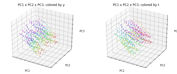
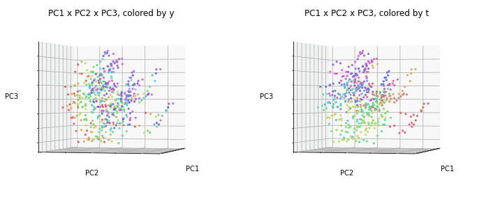
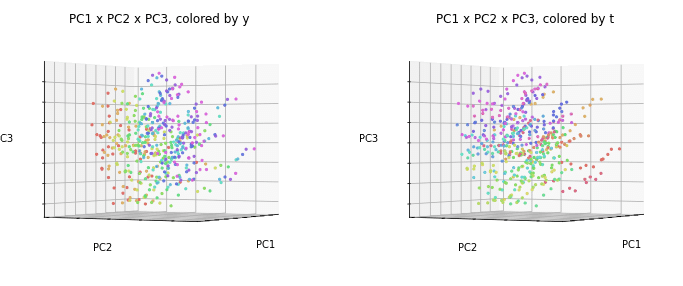
今回はこの3次元プロットの向きを回転させます。
3次元プロットの回転
3次元プロットの表示角度(仰角elevと方位角azim)をそれぞれ15度ずつ変えてアニメーションのもととなる図を作成します。
参考:
Python 3次元グラフのテーマカラー,グラフの表示角度を変更 - Qiita
mplot3d API — Matplotlib 2.0.2 documentation
# 3次元プロットの回転
import matplotlib.pyplot as plt
from mpl_toolkits.mplot3d import Axes3D
i = 0
j = 1
k = 2
filenames = []
for e in range(0,90+15,15):
  for a in range(0, 360+15, 15):
    print('PC{} x PC{} x PC{}'.format(i+1,j+1,k+1))
    fig = plt.figure(figsize=(12, 5))
    ax = fig.add_subplot(1, 2, 1, projection='3d')
    ax.scatter(PCn[:,i], PCn[:,j], PCn[:,k], c=color_y, s=5, alpha=0.8)
    ax.set_title('PC{} x PC{} x PC{}, colored by y'.format(i+1,j+1,k+1))
    ax.set_xlabel('PC{}'.format(i+1))
    ax.set_ylabel('PC{}'.format(j+1))
    ax.set_zlabel('PC{}'.format(k+1))
    ax.view_init(elev=e, azim=a)
    ax.w_xaxis.set_ticklabels([])
    ax.w_yaxis.set_ticklabels([])
    ax.w_zaxis.set_ticklabels([])
    ax = fig.add_subplot(1, 2, 2, projection='3d')
    ax.scatter(PCn[:,i], PCn[:,j], PCn[:,k], c=color_t, s=5, alpha=0.8)
    ax.set_title('PC{} x PC{} x PC{}, colored by t'.format(i+1,j+1,k+1))
    ax.set_xlabel('PC{}'.format(i+1))
    ax.set_ylabel('PC{}'.format(j+1))
    ax.set_zlabel('PC{}'.format(k+1))
    ax.view_init(elev=e, azim=a)
    ax.w_xaxis.set_ticklabels([])
    ax.w_yaxis.set_ticklabels([])
    ax.w_zaxis.set_ticklabels([])
    filename='tmp/pca_'+str(e)+'_'+str(a)+'.png'
    print(filename)
    filenames.append(filename)
    plt.savefig(filename)
    plt.show()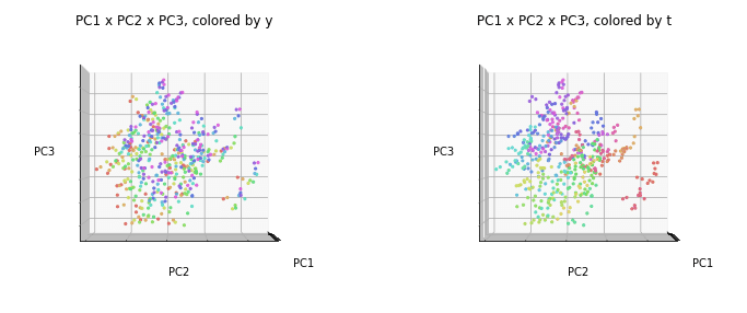
このように15度ずつずらした図が作成されました。
APNGアニメーションの作成
APNG (Animated PNG) を使ってアニメーションPNGファイルを作ってみます。
アニメーションのもとになる各コマのPNGファイルを作成しておき、APNGを使って1つのアニメーションのファイルにします。
参考:
Google Colaboratory上でアニメーションを表示する - Qiita
GitHub - eight04/pyAPNG: A Python module to deal with APNG files.
pyAPNG API reference — Python documentation
APNGはGoogle Colaboratoryにインストールされていないようなので、インストールしてから用います。
# APNGのインストール
!pip install APNG
上で作成した図をすべて使っても良いのですが、重くなるので、仰角は30度ずつelev = 0, 30, 60のみを使うことにします。
# アニメーションに使用するファイル
filenames = []
for e in range(0,60+30,30):
  for a in range(0, 360+15, 15):
    filename='tmp/pca_'+str(e)+'_'+str(a)+'.png'
    filenames.append(filename)
print(filenames)

# APNGアニメーションの作成
from apng import APNG
APNG.from_files(filenames, delay=500).save('pca_PC123_animation.png')

# 作成したAPNGアニメーションの表示
import IPython
IPython.display.Image('pca_PC123_animation.png')
これでアニメーションができて、Google Colaboratory上では動いて見えるのですが、残念ながら、APNGはnote上では動かないようですので、GIFアニメーションを作成することにしました。
GIFアニメーションの作成
参考:
Python, PillowでアニメーションGIFを作成、保存 | note.nkmk.me
【Python】PillowでAPNGを作る - みずー工房 (hatenablog.com)
Image file formats — Pillow (PIL Fork) 9.1.0.dev0 documentation
# GIFアニメーションの作成
from PIL import Image
images = list(map(lambda file: Image.open(file), filenames))
images[0].save('pca_PC123_animation.gif',
               save_all=True, append_images=images[1:],
               duration=500, loop=0)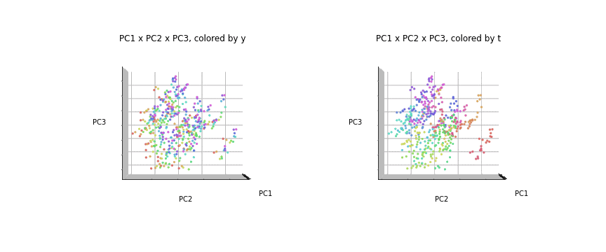
GIFアニメーションはnote上でも動きました。
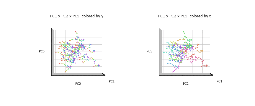
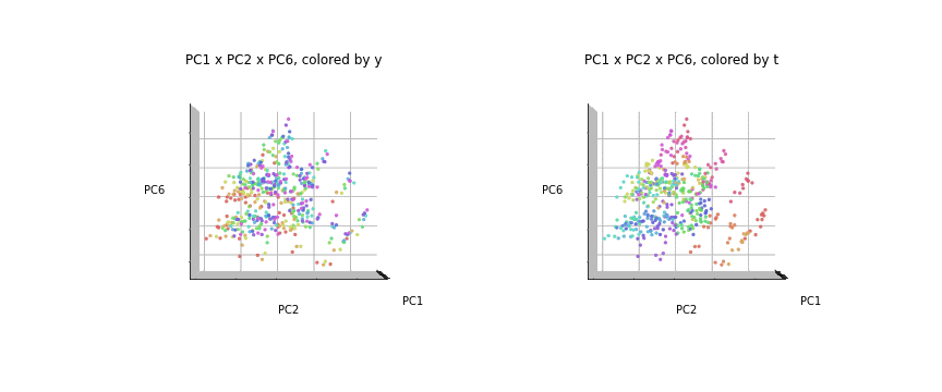
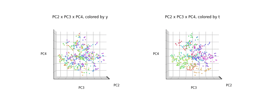
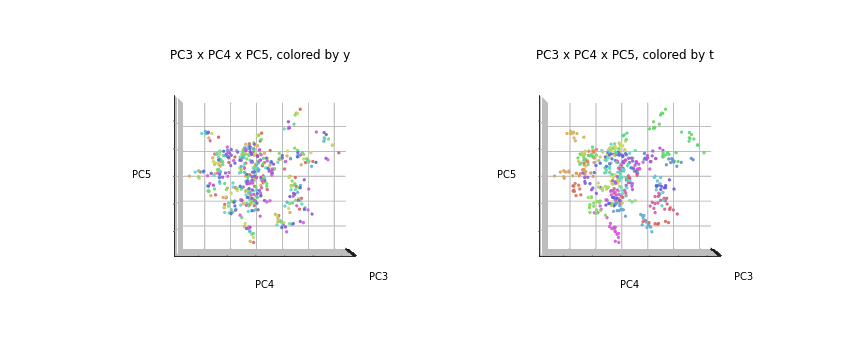
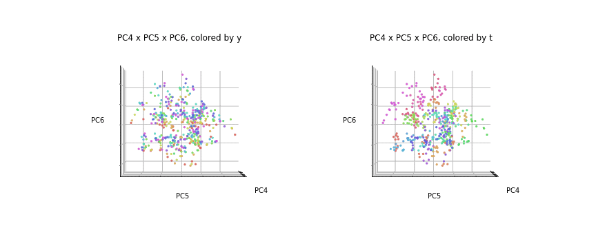
PC1×PC2×PC3と同様にして、PC1×PC2×PC4、PC1×PC2×PC5、PC1×PC2×PC6、PC2×PC3×PC4、PC3×PC4×PC5、PC4×PC5×PC6についてもアニメーションを作成しました。
# 3次元アニメーション
import matplotlib.pyplot as plt
from mpl_toolkits.mplot3d import Axes3D
i = 0
j = 1
k = 3
filenames = []
for e in range(0,60+30,30):
  for a in range(0, 360+15, 15):
    print('PC{} x PC{} x PC{}'.format(i+1,j+1,k+1))
    fig = plt.figure(figsize=(12, 5))
    ax = fig.add_subplot(1, 2, 1, projection='3d')
    ax.scatter(PCn[:,i], PCn[:,j], PCn[:,k], c=color_y, s=5, alpha=0.8)
    ax.set_title('PC{} x PC{} x PC{}, colored by y'.format(i+1,j+1,k+1))
    ax.set_xlabel('PC{}'.format(i+1))
    ax.set_ylabel('PC{}'.format(j+1))
    ax.set_zlabel('PC{}'.format(k+1))
    ax.view_init(elev=e, azim=a)
    ax.w_xaxis.set_ticklabels([])
    ax.w_yaxis.set_ticklabels([])
    ax.w_zaxis.set_ticklabels([])
    ax = fig.add_subplot(1, 2, 2, projection='3d')
    ax.scatter(PCn[:,i], PCn[:,j], PCn[:,k], c=color_t, s=5, alpha=0.8)
    ax.set_title('PC{} x PC{} x PC{}, colored by t'.format(i+1,j+1,k+1))
    ax.set_xlabel('PC{}'.format(i+1))
    ax.set_ylabel('PC{}'.format(j+1))
    ax.set_zlabel('PC{}'.format(k+1))
    ax.view_init(elev=e, azim=a)
    ax.w_xaxis.set_ticklabels([])
    ax.w_yaxis.set_ticklabels([])
    ax.w_zaxis.set_ticklabels([])
    filename='tmp/pca_'+str(e)+'_'+str(a)+'.png'
    print(filename)
    filenames.append(filename)
    plt.savefig(filename)
    plt.show()

output_filename = 'pca_PC'+str(i+1)+str(j+1)+str(k+1)+'_animation'

# GIFアニメーションを作成
from PIL import Image
images = list(map(lambda file: Image.open(file), filenames))
images[0].save(output_filename+'.gif',
               save_all=True, append_images=images[1:],
               duration=500, loop=0)

# APNGアニメーションを作成
from apng import APNG
APNG.from_files(filenames, delay=500).save(output_filename+'.png')

# 作成したAPNGアニメーションを表示
import IPython
IPython.display.Image(output_filename+'.png')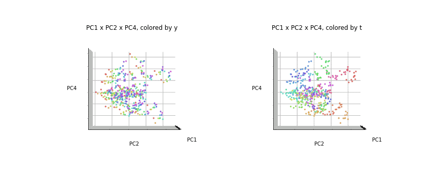
おわりに
今回は、主成分分析の結果の3次元プロットを角度を変えながら回転させて見てみました。2次元で見ていると重なって見えていたところが、ちゃんと分離されているのがわかりました。
最後まで読んでいただき、ありがとうございました。
お気づきの点等ありましたら、コメントいただけますと幸いです。
#医療費 , #医療費の3要素 , #医療費の地域差 , #地域差 , #地域間格差 , #協会けんぽ , #主成分分析 , #PCA, #3次元プロット , #3Dアニメーション , #アニメーション
この記事が気に入ったらサポートをしてみませんか?