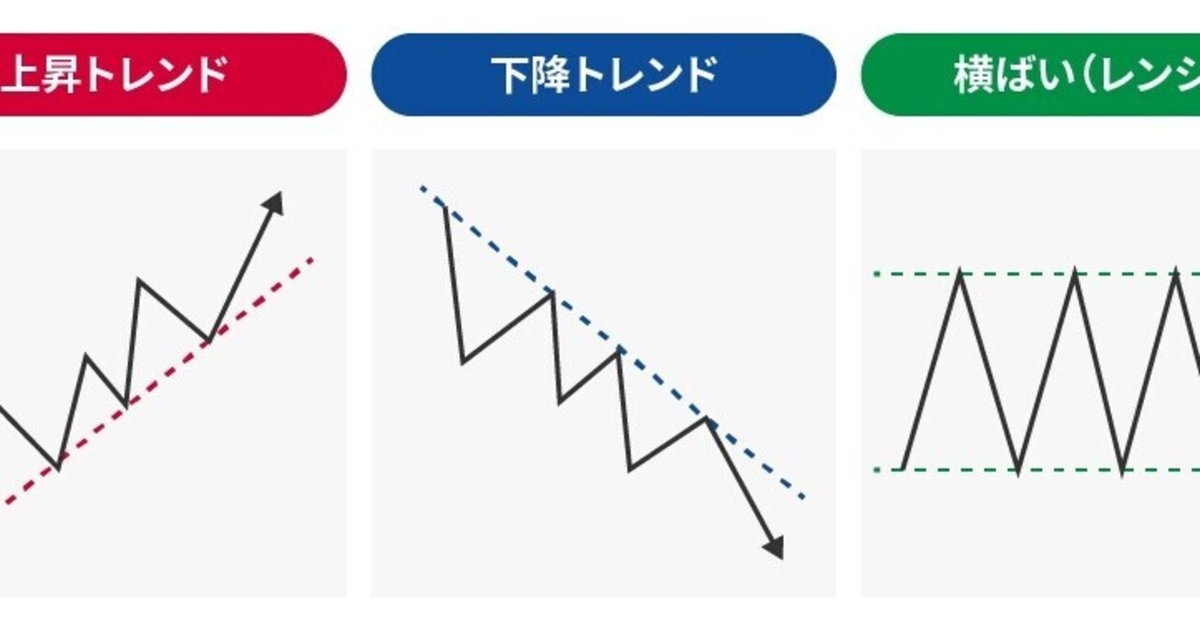
超簡単Pythonで株価トレンドラインチャート&シグナル作成

Pythonで株価トレンドラインチャートとシグナルを超簡単に作成
1. ツールインストール
$ pip install yfinance statsmodels matplotlib2. トレンドライン作成
trend.py
import matplotlib.pyplot as plt
import numpy as np
import statsmodels.api as sm
import yfinance as yf
from statsmodels import regression

df = yf.download("AAPL", start="2010-11-01", end="2020-11-01")
X = np.arange(len(df))
x = sm.add_constant(
    X
)
model = regression.linear_model.OLS(df["Close"], x).fit()
a = model.params[0]
b = model.params[1]
df["Y"] = X * b + a
plt.figure(figsize=(15, 7))
plt.plot(df["Close"])
plt.plot(df["Y"])
plt.xlabel("Time")
plt.ylabel("Price")
plt.legend(["AAPL", "Trendline"])
plt.savefig("trend.png")
実行
$ python trend.py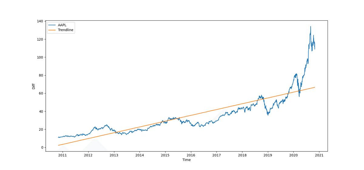
3. シグナル作成
signal.py
import matplotlib.pyplot as plt
import numpy as np
import statsmodels.api as sm
import yfinance as yf
from statsmodels import regression

df = yf.download("AAPL", start="2010-11-01", end="2020-11-01")
X = np.arange(len(df))
x = sm.add_constant(
    X
)
model = regression.linear_model.OLS(df["Close"], x).fit()
a = model.params[0]
b = model.params[1]
df["Y"] = X * b + a
plt.figure(figsize=(15, 7))
plt.plot((df["Close"] - df["Y"]).values)
plt.hlines(
    np.mean(df["Close"] - df["Y"]),
    0,
    len(df),
    colors="r",
)
plt.hlines(
    np.std(df["Close"] - df["Y"]),
    0,
    len(df),
    colors="r",
    linestyles="dashed",
)
plt.hlines(
    -np.std(df["Close"] - df["Y"]),
    0,
    len(df),
    colors="r",
    linestyles="dashed",
)
plt.xlabel("Time")
plt.ylabel("Diff")
plt.savefig("signal.png")
実行
$ python signal.py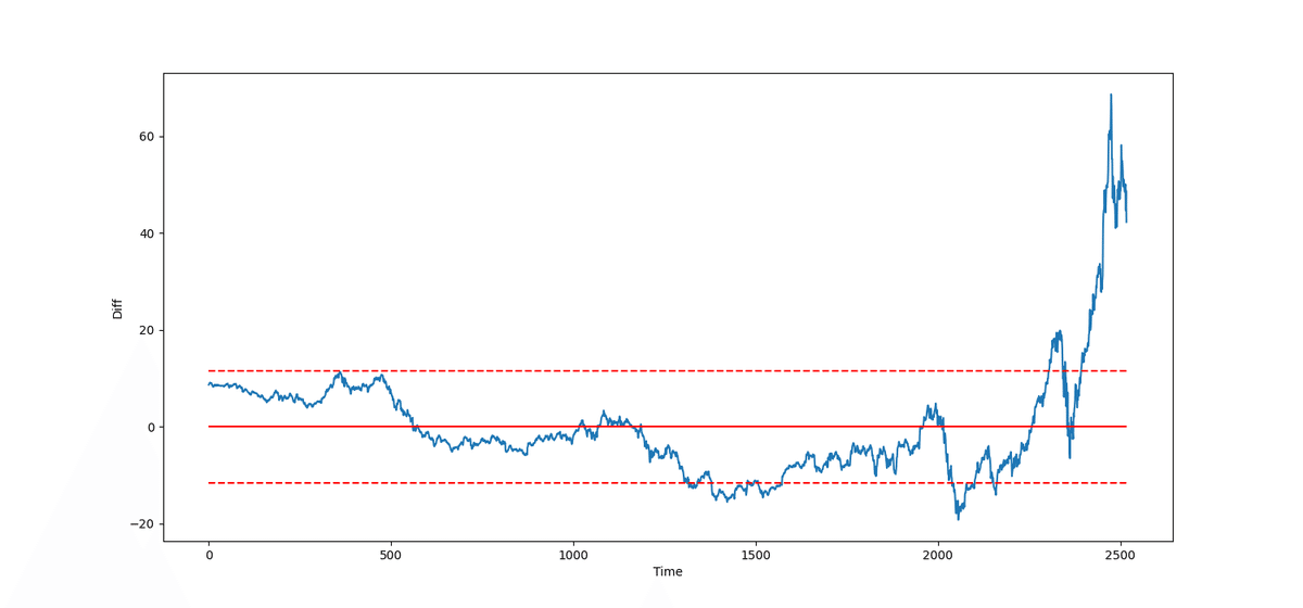
以上、超簡単!