四谷アートフェスティバルでの審査員評

2024年2月23~25日、3月1~3日に新宿区四谷で開催された
四谷アートフェスティバルにて、平面作品を出品し
2点セットで大賞を頂きました。
大人になってから何かの賞をもらうのは初めてなんじゃないかな。
(入選はいくつかあるけど)
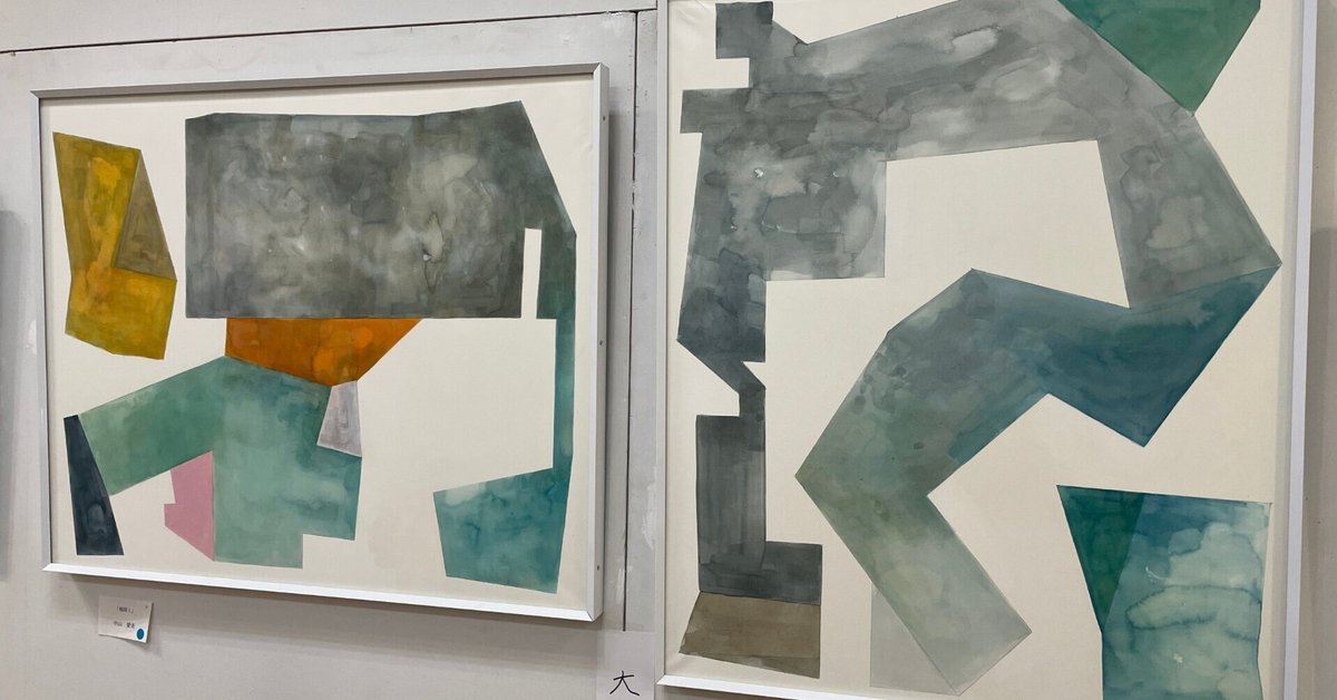
・作品タイトル:地図Ⅰ、地図Ⅱ
・サイズF25号 木製パネルに水彩紙、アクリル水彩
審査員長の日比野克彦先生の講評を、後日録画で拝見したので
その音声を書き起こしてここに記録したいと思います。↓
・Googleマップの地図のようなパースペクティブな(遠近感、奥行き、距離感を感じる)印象を受ける。
・白の下地(地の水彩紙)と水彩絵の具の紙への染み込み具合など
響きが心地よい爽やかな作品
・幾何学形態のバランスにセンスを感じる
・作品2点で呼応し合っている事で作者の世界観がより表現されている
ということで今回は2点1セットで受賞。
という事で、大変ありがたいお言葉を頂戴しました。
考えてみれば、大人になってから何かで褒められる事って滅多にないし
自分の好きな分野だと尚更、人から意見をもらう機会ってそう多くない
ので、今回はほんとに応募してよかったなと思いました。
日比野先生(といってもお互い面識は一切ありません。)は
尊敬する現代美術家の一人でもあるので、芸大生でもない大人が
作品を見てもらえたのは貴重な機会に恵まれたな、と。
何よりびっくりしたのが、日比野先生のイメージ力が半端ないという
事でした。作品を少し観察しただけで作者以上に作品を理解してるんじゃ
ないかと思うくらいでした。
作者本人からのコンセプト
・元から幾何学形態を組み合わせて描くのが好きなのですが、
今回のシリーズはタイトルにあるように地図や建築図面、区画のような
そんなイメージから来ています。水彩を始めてから、自然の色や
日常にあるような質感を想像しながら絵の具の扱いや筆のおき方など
色々試していた中でできた作品です。
私はもともと、作品自体に圧があるような作風が苦手で
なるべく(水彩であれば)その質感や色味が生かされるような
ナチュラルでゆったりしたものを描きたいと思っていました。
現在私には2人の幼い子供がおりますが、子供たちの絵や
一緒に読んでいる絵本から結構インスパイアされてると思います。
メインの制作ステートメントである「透明な場所(世界)」も
上記の作品同様、私にとって心地のよいものを求めているのかもしれません。
Aimi Nakayama
On 23-25 February and 1-3 March 2024, I exhibited a two-dimensional work at the Yotsuya Art Festival in Yotsuya, Shinjuku, and received the grand prize for a set of two pieces. I think this is the first time I have received any kind of award since I became an adult. (I have received a few Honorable Mentions.).
Title of work: Map I, Map II, size F25, watercolour paper and acrylic watercolour on wooden panel.
I watched the critique by the head of the jury, Mr Katsuhiko Hibino, later in the day in a recording, so I would like to transcribe the audio and record it here. ↓.
The work gives the impression of perspective (a sense of perspective, depth and distance), like a Google map. The work is a refreshing work with a white base (watercolour paper) and pleasant echoes such as the way the watercolours soak into the paper, and I feel a sense of balance in the geometric forms.
I was very grateful for the kind words. When I think about it, it's not very often that you get praised for something as an adult, and even more so when it's in a field you like, so I'm really glad I entered the competition this time. Mr Hibino (although we don't know each other at all) is one of the contemporary artists I respect. I felt that it was a valuable opportunity for an adult who is not a student at an art university to have his work looked at.
What surprised me most of all was that Mr Hibino's imaginative power is unparalleled. Just by observing his work for a little while, I thought he understood it better than the artist.
The artist's concept: I have always liked to combine geometric forms in my paintings, and this series, as the title suggests, comes from such images as maps, architectural drawings and plots. Since I started watercolour painting, I have been experimenting with the handling of paint and brush placement while imagining the colours of nature and the textures of everyday life. I have always been uncomfortable with a style in which the work itself has pressure, and I wanted to paint something natural and relaxed, in which the textures and colours could be used as much as possible (if using watercolours). I currently have two young children and I think I am quite inspired by their drawings and the books we read together. My main production statement, 'Transparent Place (World)', may also be a search for something comfortable for me, as in the above work.
Aimi Nakayama
この記事が気に入ったらサポートをしてみませんか?