
A conversation with Yoshiaki Irobe on co-creating city design

The “TokyoYard PROJECT”, a large-scale urban development scheme in the Shinagawa area, has just launched. It promotes the idea of a “global gateway” and aims to create a community that will continue on for a century. We invite Yoshiaki Irobe, the graphic designer responsible for the logo design for the project, to talk about the role of graphics and logos within cities.
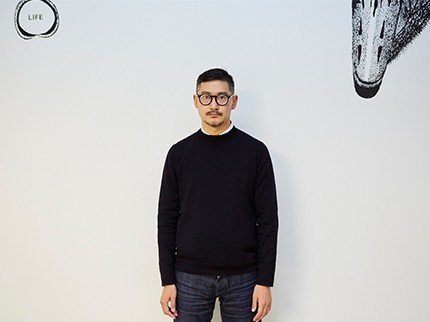
Yoshiaki Irobe profile
Yoshiaki Irobe is a graphic designer, art director, part-time instructor at Tokyo University of Arts, and CEO of Nippon Design Center, Inc. He is also head of Irobe Design Institute, which is part of the Nippon Design Center. Irobe has conducted branding for Ichihara Lakeside Museum and national parks, as well as the Sukagawa Civil Exchange Center TETTE. With graphic design as his base, Irobe has produced a wide range of designs including 2D, 3D, spatial design and film. He received the Japan Graphic Designers Association (JAGDA)’s “21st Yusaku Kamekura Design Award” for his 2018 CI plan for “Osaka Metro”.
Design as a co-creator of a city
ー Irobe-san, you have been part of this Tokyo Yard PROJECT since the very initial discussion phase. You also designed the project logo.
It’s been two years since you first contacted me, hasn’t it? At the time the project didn’t even have a name. The TokyoYard PROJECT is much more than the conventional urban development. It rethinks the uniqueness of the community from day one. It was exciting for me to be able to be part of such a project from the very beginning.
It’s quite rare to bring in the visual design perspective into urban development at the initial stage. Usually we designers are called in much later; our task is to use visual design to “add the meat” to a readymade framework (building). For me, the thought of using design to co-design this new city with the team was appealing.
It is also not common in Japan for visual design to be part of city building on a 3D scale. As someone who works with visual design – a primarily 2D form of communication – I had always wanted to experiment with this kind of approach.

ー For the TokyoYard PROJECT, what was the process of incorporating design?
With any project, the first step is to look for resources that can spark ideas that can only be born from the particular project. Sometimes we look into the resources that the client provides, and sometimes we do our own research for ideas; but because I had joined later in this project, I deepened my understanding of the project and gathered ideas through the discussions. For example, “where ‘let’s try’ turns into reality” and “an experimental playground to start new things” were great key words for this project. I started gathering these ideas together to work on the design.
ー The Tokyo Yard PROJECT logo includes visual aspects of “Takanawa Gateway Station” and the history of the general area being a “railway yard ruin”.
I was pulled into the word “yard,” which refers to railway yards and workspaces in wide, open spaces. I think it perfectly points out the history of the location, as well as the concept of the project that it is constantly unfinished. From there, I realized the initials of Tokyo Yard have a strong visual correspondence with a station roof; this became the core of the logo design. Although the connection between these three components was a coincidence, it was a cross-point that could have only appeared in this particular project. The font is a result of bringing together sources of ideas throughout the process.
I did not want to make it simply industrial; the font design reflects the excitement and enthusiasm one feels when new ideas are growing strongly.

ー You worked on not only the TokyoYard PROJECT logo design, but also the color scheme. What was the thought process for the design?
The key color that was chosen was a rusty iron color. I was inspired by warehouses and the industrial feel.
When using iron material in buildings, there is usually a matte-textured coating of rust-prevention under the surface painting. Warehouses and factories however, usually are not painted in the end so the anticorrosion layer serves as the surface. This is why I decided to keep the matte texture of rusty iron. Instead of simply focusing on the numerical values of color, I also incorporated the message that the texture conveys about the location’s history.
Digging beyond the surface and into the deeper layers is precisely why I was able to make a historical link when creating the TokyoYard PROJECT font design. I think this can only be achieved when members of development and design work together to co-create.
Letting the community’s uniqueness reach
the capillaries of the city
ー It is often said that city-design in Tokyo is lagging behind compared to cities overseas. When working on the logo design on the TokyoYard PROJECT, were there any particular foreign cities that you used as a reference?
The example of Bristol in the UK was a benchmark. Bristol has its own unique city font and signage system. Being inspired by this, when I organized my own exhibition in 2016, I tried making Tokyo city street signs as well as a font made specifically for that purpose. I collaborated with a type-project group that develops city font ideas. Together we proposed the “Tokyo City Font,” full of characteristics of Tokyo, and with it we developed new road sign designs for the city blocks of Tokyo. Road signages by themselves seems like small things, but if you count all the signs throughout the city it adds up to quite a number. If you take a bird’s-eye-view of that, it’s like sprinkling the city with “flavors of the city story.” Like powdering sprinkles over the whole city, I very much valued the idea of using micro components to shape the macro (city) design.
ー What is the effect of using fonts and not just logos?
Logos don’t function very well, and I’ve seen examples where they are not widely used. For example, in most cases it is only used on the local government website. In contrast, a city font is something that is used even in the smallest pieces of information. It can easily be used by thousands, even tens of thousands of people; this means that it is easy to create a situation in which the design, which incorporates the community story, is spread to all corners of the city. In that sense, compared to logos that are only one-point things, text is much more useful in that they can reach the capillaries. Providing a situation for the community’s characteristics to reach all the capillaries of the city…I think this approach is most effective and efficient in creating a unique community.
ー How do you hope the designs you created will be used in the community?
It would be exciting if the logo and font spreads all around the city, and creates an environment like a “kintaro-ame” (a Japanese candy that, when cut, shows an identical image at every cross-section). Whichever part of the city you cut into, you find that it is “playable”. I would also love to work on road signs like I mentioned earlier, as well as TokyoYard pictograms that express the rules of the city. I want to take part in wide applications of the design that incorporate the various voices of the city.
What I do is visual communication, so I want to use my expertise to realize things that have not been experimented elsewhere. In the discussions for the project, an issue that was brought up frequently was that there are not enough spaces to experiment in Tokyo. My hope is that this new city will also turn out to provide a space that allows experiments in design as well.
Providing space instead of forcing the power of design

ー You mentioned the word “experiment”. From the perspective of city design, what kind of city do you think Tokyo is?
The information design in Tokyo is intertwined in a way that seems impossible to organize. It’s not something that can be easily changed. For one, there is an overload of information, and the fact that the city was not created with a plan in mind is also a big factor. The highways above Nihonbashi is a typical example...
On the other hand, I think that this is also what makes the city unique. Sometimes cities that are pre-planned are not interesting. In the past, most architects and designers had the style of forcing everything to follow their design code. However, the designers/architects of the new age proactively take inspiration from outside of their own creative minds, and connect them to invent new forms of architecture and design. They realized that it is more sustainable that way, and opens possibilities for both the city and its users. They accept the fact that they cannot control when they shape the program of design. Creators tend to want to control and regulate, but a piece created by one designer/architect alone has no space for involvement and participation. I think it is much more natural and interesting to not overcontrol and instead leave space for things to grow on their own.
This is also my personal attitude towards design. Instead of forcing the power of design onto the community, I like to bring out the unique and likable elements of the project and make it into something that can be easily shared by many. This is extremely important for the relationship between design and cities as well.

ー Finally, what is the future of the TokyoYard PROJECT, “the place where ‘let’s try’ becomes reality”?
For example, in the visual design on the TokyoYard PROJECT, I left parts where the lines do not connect. I call these “open points” and I included it in the visuals to communicate that TokyoYard is “always unfinished,” a place that is meant for people to get involved and continue to change.
Having space means being flexible to change. For example, for this new city building, it could be interesting to conduct a 2 to 3-year test for street signages. I think it’s good if the question “what is experimentation for design?” is constantly asked. As a designer, I of course want my creations to be used for a long time, but I also believe that designs should grow while maintaining its core ideas. I think that this is an example of what design can be for a city.
In that sense, I think that the TokyoYard PROJECT is never supposed to finish. It’s not important for the current state to be maintained for 100 years; what’s more important is for it to keep changing. I think that what we are doing now is preparing good soil for such a future, and planting seeds for interesting trees to grow. With the theme “creating the unseen” in mind, I want to make many “let’s trys” come true.
Text by Takuya Wada
Photographs by Hayato Takahashi
#TokyoYard #TokyoYardPROJECT #TakanawaGatewayStation #urbandevelopment #Tokyo #YoshiakiIrobe #NipponDesignCenterInc #IrobeDesignInstitute
この記事が気に入ったらサポートをしてみませんか?