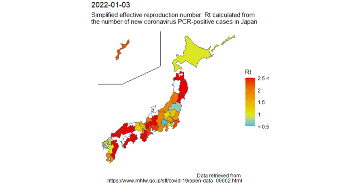
【R/ggplot2】Visualization of the simplified effective reproduction number (Rt) of the number of new coronavirus positive cases by prefecture on a map of Japan.

I would like to visualize the increase or decrease of the number of new coronavirus positive cases in Japan at the regional level.
Therefore, I visualized the simplified effective reproduction number (Rt) of the number of new coronavirus-positive cases by R on a map of Japan by prefecture.
The simplified effective reproduction number (Rt) was calculated by the formula shown in the following page.
The code to create the above image is as follows.
if(!require("pacman")){
  install.packages("pacman", dependencies=TRUE)
}
pacman::p_load("tidyverse",
               "lubridate",
               "NipponMap",
               "animation",
               "sf",
               "scales",
               "zoo"
)

# okinawa zoom function https://rpubs.com/ktgrstsh/775867
shift_okinawa <-
  function(data,
           col_pref = "name",
           pref_value = "Okinawa",
           geometry = "geometry",
           zoom_rate = 3,
           pos = c(4.5, 17.5)) {
    row_okinawa <- data[[col_pref]] == pref_value
    geo <- data[[geometry]][row_okinawa]
    cent <- sf::st_centroid(geo)
    geo2 <- (geo - cent) * zoom_rate + cent + pos
    data[[geometry]][row_okinawa] <- geo2
    return(sf::st_as_sf(data))
  }
layer_autoline_okinawa <- function(
  x = c(129, 132.5, 138),
  xend = c(132.5, 138, 138),
  y = c(40, 40, 42),
  yend = c(40, 42, 46),
  size = ggplot2::.pt / 15
){
  ggplot2::annotate("segment",
                    x = x,
                    xend = xend,
                    y = y,
                    yend = yend,
                    size = .pt / 15
  )
}

# get data
url <- "https://covid19.mhlw.go.jp/public/opendata/newly_confirmed_cases_daily.csv"
dat_x <- readr::read_csv(url,
                         locale = locale(encoding = "utf8"))

# plot map function
rt_map <- function(df , day = as.Date(Sys.Date() - 2), gt = 2){
  dat_l <- df %>%
    filter(Date >= day- 15) %>% # keep only the necessary data
    pivot_longer(col = -c(Date), names_to = "name", values_to = "p") %>%
    group_by(name) %>%
    mutate(
      ma7 = rollmean(p, 7L, align = "right", fill = 0),
      Rt = ma7 / lag(ma7, n = gt, default = 0, fill = 0)
    ) %>%
    filter(., Date == day) %>%
    mutate(Rt = ifelse(Rt >= 2.5, 2.5, Rt))

  map_df <-
    read_sf(system.file("shapes/jpn.shp", package = "NipponMap")[1],
            crs = "WGS84") %>%
    left_join(dat_l, by = "name")

  map_g <- map_df %>%
    shift_okinawa() %>%
    ggplot() +
    layer_autoline_okinawa() +
    geom_sf(aes(fill = Rt)) +
    scale_fill_gradientn(colours = c("#00bae9", mid = "#dde900", high = "#e90000"),
                         na.value="transparent",
                         limits = c(0.5, 2.5), values = rescale(c(0.5, 1, 2.5)),
                         labels = c("2.5 <", "2", "1.5", "1", "< 0.5"), breaks = c(2.5, 2, 1.5, 1, 0.5)
    ) +
    labs(fill = "Rt",
         title = paste(day),
         subtitle = "Simplified effective reproduction number: Rt calculated from \nthe number of new coronavirus PCR-positive cases in Japan",
         caption = "Data retrieved from \nhttps://www.mhlw.go.jp/stf/covid-19/open-data_00002.html"
         ) +
    theme_void() +
    theme(legend.position = "right")
  plot(map_g)
}

# plot last data
day = as.Date(Sys.Date()-2)
rt_map(dat_x, day = day, gt =5)

# create gif
saveGIF({
  for(i in 1:45){
    day = Sys.Date() - 47 + i
    rt_map(dat_x, day = day, gt =5)
  }
}, movie.name="sample3.gif", interval = 1)
Reference sites