
動くグラデーション背景を作る

完成版の確認
こういうものを作っていきます
こんなの作ってみました
— 高菜こんぶ (@takana_konbu912) June 28, 2024
どこかにまとめようかな??
HTMLとCSSだけで構成しています pic.twitter.com/bJN8jDLyG8
背景にグラデーションを設定し、そのグラデーションが一定時間で色が変わっていくというものです
また同時にHTMLでアイコンを使用する方法も見ていきましょう
HTMLとCSSの基本的な構文は理解しているということが前提です
HTMLとCSSの基礎資料をご用意しておりますので基礎構文がわからない方は活用してください
無料です
また変わらないタグやプロパティは一度ご自身で調べてみてください
HTMLの記述
まずはindex.htmlファイルを作って記述していきます
アイコンも表示させていきましょう
<!DOCTYPE html>
<html lang="en">
<head>
    <meta charset="UTF-8">
    <meta name="viewport" content="width=device-width, initial-scale=1.0">
    <title>Gradient Background Animation</title>
    <link rel="stylesheet" href="https://cdnjs.cloudflare.com/ajax/libs/font-awesome/6.0.0-beta3/css/all.min.css">
    <link rel="stylesheet" href="style.css">
    <style>

    </style>
</head>
<body>
    <div class="gradient-background">
        <div class="content">
            <h1>新規会員登録</h1>
            <div class="social-buttons">
                <a href="#" class="x"><i class="fa-brands fa-twitter"></i>X</a>
                <a href="#" class="line"><i class="fa-brands fa-line"></i>LINE</a>
                <a href="#" class="facebook"><i class="fa-brands fa-facebook-f"></i>Facebook</a>
                <a href="#" class="google"><i class="fa-brands fa-google"></i>Google</a>
            </div>
        </div>
    </div>
</body>
</html>
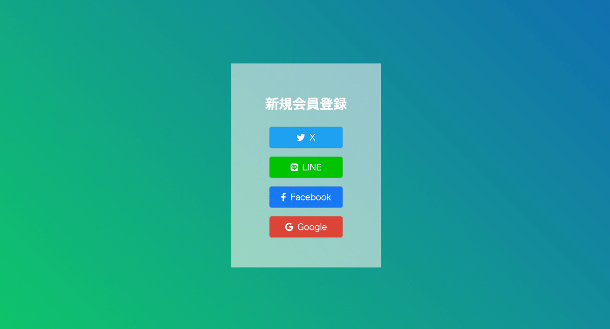
保存してブラウザを確認するとこの様になります

では解説していきます
<link rel="stylesheet" href="https://cdnjs.cloudflare.com/ajax/libs/font-awesome/6.0.0-beta3/css/all.min.css">こちらのコードでアイコンを使えるようにしています
アイコンはFont Awesomeのアイコンを使用しています
Font Awesomeは多数の無料で使用できるアイコンを提供する人気のアイコンライブラリです
アイコン自体は、以下のようにHTML内で使用します
<i class="fa-brands fa-twitter"></i>  <!-- Twitterのアイコン -->
<i class="fa-brands fa-line"></i>     <!-- LINEのアイコン -->
<i class="fa-brands fa-facebook-f"></i> <!-- Facebookのアイコン -->
<i class="fa-brands fa-google"></i>   <!-- Googleのアイコン -->
これらの<i>タグ内のクラスは、Font Awesomeの特定のアイコンを指定するものです
fa-brandsはFont Awesome Brandsを表し、その後に続くクラス名が具体的なアイコンを示します
アイコン名などはここから見ることができます
使いたいアイコンをクリックするとコードが出てくるのでそれをコピペしたらOKです
CSSの記述
style.cssファイルを作って記述していきます
ではこのように記述してください
body {
    margin: 0;
    padding: 0;
}
.gradient-background {
    width: 100%;
    height: 100vh;
    background: linear-gradient(45deg, #ff0000, #00ff00, #0000ff);
    background-size: 600% 600%;
    animation: gradientAnimation 30s ease infinite;
    display: flex;
    justify-content: center;
    align-items: center;
    text-align: center;
}
.content {
    color: white;
    background-color: rgba(255, 255, 255, 0.5);
    padding: 50px 80px;
}
h1{
    margin-bottom: 30px;
}
.social-buttons {
    margin-top: 20px;
}
.social-buttons a {
    display: block;
    margin: 20px 10px;
    padding: 10px 20px;
    font-size: 20px;
    color: white;
    text-decoration: none;
    border-radius: 5px;
    transition: background-color 0.3s ease;
}
.social-buttons a i {
    margin-right: 10px;
}
.social-buttons a.x { background-color: #1da1f2; } /* Twitter color */
.social-buttons a.line { background-color: #00c300; } /* LINE color */
.social-buttons a.facebook { background-color: #1877f2; } /* Facebook color */
.social-buttons a.google { background-color: #db4437; } /* Google color */
.social-buttons a:hover { opacity: 0.8; }

@keyframes gradientAnimation {
    0% { background-position: 0% 50%; }
    50% { background-position: 100% 50%; }
    100% { background-position: 0% 50%; }
}
では保存して確認しましょう
このようになりました
もちらはスクショですが背景の色が変わっていくことを確認してください
ではCSSの解説をしていきます
.gradient-background {
    width: 100%;
    height: 100vh;
    background: linear-gradient(45deg, #ff0000, #00ff00, #0000ff);
    background-size: 600% 600%;
    animation: gradientAnimation 30s ease infinite;
    display: flex;
    justify-content: center;
    align-items: center;
    text-align: center;
}
width: 100%;
要素の幅を親コンテナの幅いっぱいに広げます
height: 100vh;
要素の高さをビューポートの高さ(画面の高さ)と同じに設定します
background: linear-gradient(45deg, #ff0000, #00ff00, #0000ff);
45度の角度で赤、緑、青のグラデーションを設定します
background-size: 600% 600%;
背景画像を縦横ともに6倍に拡大し、アニメーションのスムーズな変化を可能にします
animation: gradientAnimation 30s ease infinite;
gradientAnimationキーアニメーションを30秒かけて実行し、繰り返します
easeはアニメーションのスピードを滑らかに変化させるためのタイミング関数です
display: flex;
フレックスボックスを使用して内部の要素を配置します
justify-content: center;
内部のコンテンツを水平方向に中央揃えにします
align-items: center;
内部のコンテンツを垂直方向に中央揃えにします
text-align: center;
テキストを中央揃えにします
.content {
    color: white;
    background-color: rgba(255, 255, 255, 0.5);
    padding: 50px 80px;
}
color: white;
テキストの色を白に設定します
background-color: rgba(255, 255, 255, 0.5);
背景色を白の50%透明に設定します(RGBA形式のカラー値)
padding: 50px 80px;
コンテンツの内側に50pxの上下パディングと80pxの左右パディングを追加します
h1 {
    margin-bottom: 30px;
}
margin-bottom: 30px;
<h1>要素の下に30pxの余白を追加します
.social-buttons {
    margin-top: 20px;
}
margin-top: 20px;
.social-buttonsクラスの上に20pxの余白を追加します
.social-buttons a {
    display: block;
    margin: 20px 10px;
    padding: 10px 20px;
    font-size: 20px;
    color: white;
    text-decoration: none;
    border-radius: 5px;
    transition: background-color 0.3s ease;
}
display: block;
各リンクボタンをブロックレベル要素として表示し、縦に並べます
margin: 20px 10px;
リンクボタンの上下に20px、左右に10pxの余白を追加します
padding: 10px 20px;
リンクボタンの内側に10pxの上下パディングと20pxの左右パディングを追加します
font-size: 20px;
フォントサイズを20pxに設定します
color: white;
テキストの色を白に設定します
text-decoration: none;
リンクの下線を削除します
border-radius: 5px;
ボタンの角を5pxの半径で丸めます。
transition: background-color 0.3s ease;
背景色の変化を0.3秒かけて滑らかにします
.social-buttons a i {
    margin-right: 10px;
}
margin-right: 10px;
アイコンとテキストの間に10pxのスペースを追加します
.social-buttons a.x { background-color: #1da1f2; } /* Twitter color */
.social-buttons a.line { background-color: #00c300; } /* LINE color */
.social-buttons a.facebook { background-color: #1877f2; } /* Facebook color */
.social-buttons a.google { background-color: #db4437; } /* Google color */
それぞれのリンクボタンに対して、特定の背景色を設定します
.social-buttons a:hover { opacity: 0.8; }リンクボタンにマウスを重ねたときに、透明度を80%に設定します
@keyframes gradientAnimation {
    0% { background-position: 0% 50%; }
    50% { background-position: 100% 50%; }
    100% { background-position: 0% 50%; }
}
@keyframes gradientAnimation
背景グラデーションの位置を時間とともに変化させるアニメーションを定義します
0% { background-position: 0% 50%; }
アニメーションの開始時に背景の位置を設定します
50% { background-position: 100% 50%; }
アニメーションの中間時に背景の位置を設定します
100% { background-position: 0% 50%; }
アニメーションの終了時に背景の位置を設定します(開始位置に戻る)
これにより、グラデーション背景が30秒かけてスムーズに変化し、指定したスタイルでリンクボタンが表示されます
START UP
最後にちょっと宣伝です
現在プログラミングの未経験者、初学者を対象に様々な言語のプログラミング入門資料を作りそのサブスク「START UP」を運営しております
980円から学べるサブスクです
資料の個別販売もしておりますが資料を2個買うくらいならサブスクの方がお得にしています
また一部プランでは就活、転職、営業などのアドバイスやポートフォリをのアドバイスなど様々なサポートをさせていただいております
資料は全部で40種以上揃えております
今後資料の追加、更新などに一切追加料金が発生することはありません
そして不定期ですが動画教材も出しております
これも追加料金は発生しませんのでご安心ください
START UPの詳しい内容はこちら
https://docs.google.com/presentation/d/1aJAaScAljKl2v3AZhDjBoxkHsD_TCVF91on-l_HnLtk/edit?usp=sharing
START UPはnoteのメンバーシップで行っております
この記事が気に入ったらサポートをしてみませんか?