SwiftUIのProgressViewをカスタマイズ

ProgressViewとは?
ProgressViewはiOS 14以上から利用でき、タスク完了までの進捗状況を表すことができる。
struct ContentView: View {
    @State private var progress = 0.5

    var body: some View {
        ProgressView("Downloading...", value: progress)
    }
}
スタイル
ProgressViewにはデフォルトで用意されているスタイル(ProgressViewStyle)があり、シーンに応じて表示スタイルを指定することができる。
DefaultProgressViewStyle:コンテキストに応じてスタイルを自動選択
CircularProgressViewStyle:UIActivityIndicatorのような円形のスタイル
LinearProgressViewStyle:横棒で表示されるスタイル
CircularProgressViewStyle
.progressViewStyle(.circular)で指定できるが、init()だけでも自動的に円形スタイルとなる。また、カラーを変更したい場合は.tintや.backgroundでColorを指定すればよい。
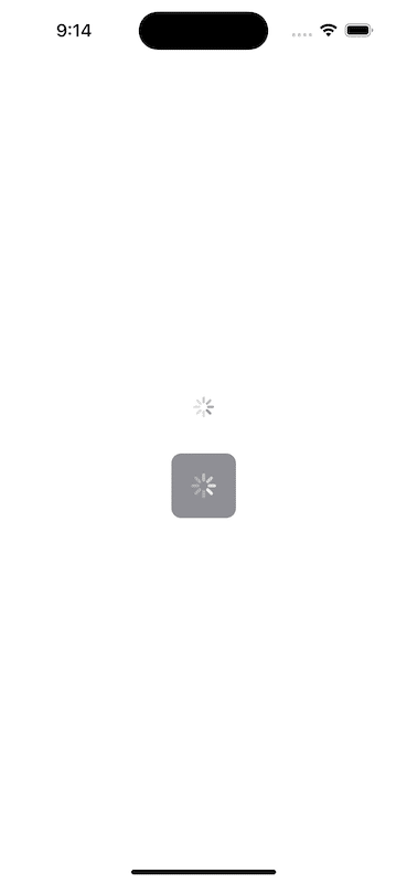
struct ContentView: View {
    var body: some View {
        VStack(spacing: 40) {
            // initだけの場合は、自動的に円形スタイルになる
            ProgressView()

            // アクセントカラーなどを指定してカスタマイズできる
            ProgressView()
                .progressViewStyle(.circular)
                .padding()
                .tint(Color.white)
                .background(Color.gray)
                .cornerRadius(8)
                .scaleEffect(1.2)
        }
        .padding()
    }
}
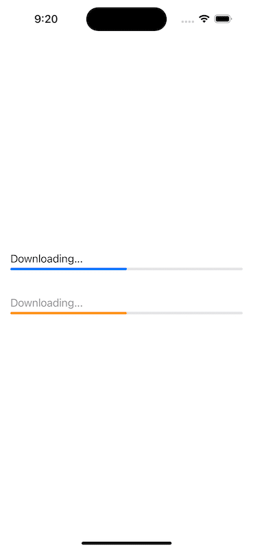
LinearProgressViewStyle
.progressViewStyle(.linear)で横棒スタイルを指定でき、上記と同様にラベルやアクセントカラーなどを変更できる。
struct ContentView: View {
    @State private var progress = 0.5

    var body: some View {
        VStack(spacing: 40) {
            // ラベル付きで進捗率を示す
            ProgressView("Downloading...", value: progress)

            // ラベルやアクセントカラーなどを指定してカスタマイズできる
            ProgressView("Downloading...", value: progress)
                .progressViewStyle(.linear)
                .foregroundColor(.gray)
                .tint(Color.orange)
        }
        .padding()
    }
}
カスタムスタイル
より自由にProgressViewをカスタマイズしたい場合は、ProgressViewStyleプロトコルに準拠したスタイルを定義して、makeBody(configuration:)を実装すればよい。
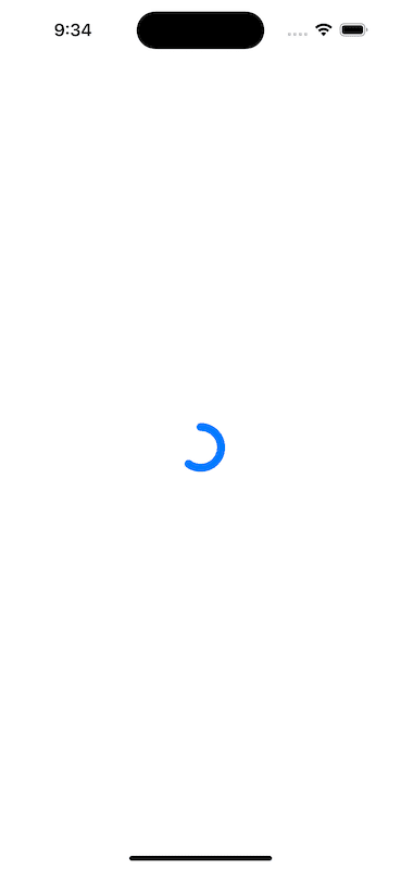
struct GaugeProgressStyle: ProgressViewStyle {
    var color: Color
    var lineWidth: CGFloat

    func makeBody(configuration: Configuration) -> some View {
        let fractionCompleted = configuration.fractionCompleted ?? 0

        return ZStack {
            Circle()
                .trim(from: 0, to: fractionCompleted)
                .stroke(color, style: StrokeStyle(lineWidth: lineWidth, lineCap: .round))
                // trimでは右が起点なので、反時計回りに90°回転させる
                .rotationEffect(.degrees(-90))
        }
    }
}

struct ContentView: View {
    @State private var progress = 0.6

    var body: some View {
        VStack(spacing: 40) {
            ProgressView(value: progress)
                .progressViewStyle(GaugeProgressStyle(color: .blue, lineWidth: 8))
                .frame(width: 40, height: 40)
        }
        .padding()
    }
}
補足
UIActivityIndicatorのような円形スタイルは、valueなしのProgressViewで実現できるが、iOS13以下もサポートする場合はProgressViewが使えないので、UIActivityIndicatorViewをラップする方法がある。
import SwiftUI

struct ActivityIndicator: UIViewRepresentable {
    var style: UIActivityIndicatorView.Style = .medium

    func makeUIView(context: UIViewRepresentableContext<ActivityIndicator>) -> UIActivityIndicatorView {
        UIActivityIndicatorView(style: style)
    }

    func updateUIView(_ uiView: UIActivityIndicatorView, context: UIViewRepresentableContext<ActivityIndicator>) {
        uiView.startAnimating()
    }
}

struct ContentView: View {
    var body: some View {
        ActivityIndicator()
    }
}
サンプルコード
参考
この記事が気に入ったらサポートをしてみませんか?