matplotlib 箱ひげ図

箱ひげ図を描きます。
分かっている前提でのコードなので、箱ひげ図ときいて、ハテナの人はググってもらえますと助かります(ごめんなさいね)。
箱ひげ図を1つ描く
ax.boxplot()を使った基本的な方法です。
test = [100, 82, 65, 50, 63, 88, 98, 35, 78, 69]
としたうえで、テストの成績を描いてみましょう。
%matplotlib inline
import matplotlib.pyplot as plt

test = [100, 82, 65, 50, 63, 88, 98, 35, 78, 69]
fig, ax = plt.subplots()
ax.boxplot(test)
ax.set_xticklabels(['test'])

plt.show()
実行結果:
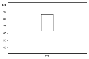
fig,ax = plt.subplots()で、土台を作成します。
ax.boxplot()で図が描けます。
ax.set_xticklabels(['test'])は箱ひげ図のラベルになります。
複数の箱ひげ図
箱ひげ図は並べて作成することも可能です。
test1 = [100, 82, 65, 50, 63, 88, 98, 35, 78, 69]
test2 = [58, 33, 38, 100, 73, 23, 16, 21, 30, 42]
test=(test1,test2)
とテストを2つ用意して、testという変数に格納します。
%matplotlib inline
import matplotlib.pyplot as plt

test1 = [100, 82, 65, 50, 63, 88, 98, 35, 78, 69]
test2 = [58, 33, 38, 100, 73, 23, 16, 21, 30, 42]
test=(test1,test2)
fig, ax = plt.subplots()
ax.boxplot(test)
ax.set_xticklabels(['test1','test2'])

plt.show()
実行結果:
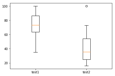
test2のデータに1点外れ値があります。著しくデータから外れているので、その点のみをプロットしているのです。
pythonのmatplotlibでは、特に外れ値を定義しなくても、自動で判別してくれので便利です。
この記事が気に入ったらサポートをしてみませんか?