Information design of object-oriented UI オブジェクト指向UIの情報設計

I took a course on object-oriented UI in an online UI design community called BONO. I had actually read the book "Object-oriented UI design" before joining BONO, but had only gained a conceptual understanding. This time, a senior UI designer, Kaikun-san explained the concepts in a more practical way, and I was able to gain a more practical understanding by analyzing UIs with Figma based on his explanations.
BONOというオンラインUIデザインコミュニティのオブジェクト指向UIの講座を受けました。実は「オブジェクト指向UIデザイン」はBONOに参加する前に読んだことがあったのですが、概念的な理解しか得られていませんでした。今回、シニアUIデザイナーのKaikunさんがよりその概念を実践に落とし込んだ形で解説してくださったので、その解説を基に手を動かしてみることで、より実践的な理解を得ることができました。
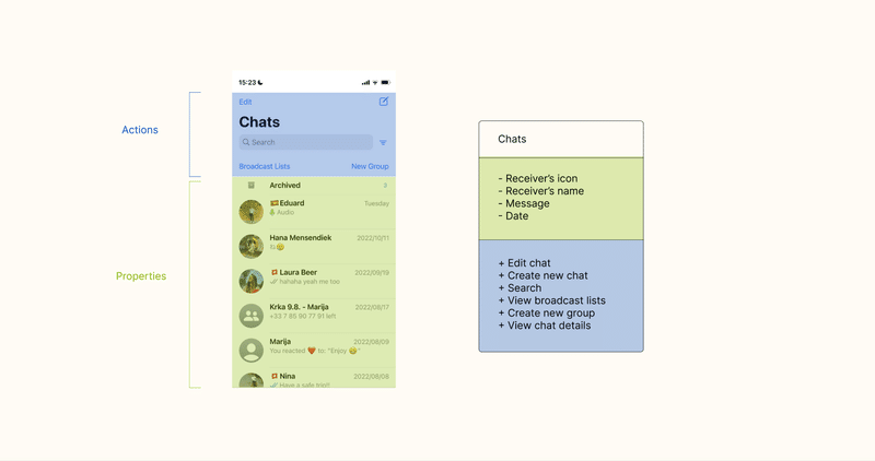
Once I put the UI into a class diagram, it became easier to organize the objects, their properties, and actions. Also, with the class diagram, I can now grasp the coding followed, how there is a Chats class, and how the variables and methods are. This was the moment when I felt glad that I had worked with Java and Apex, which are object-oriented languages.
UIをクラス図に落とし込むと、オブジェクトとそのプロパティ、アクションが整理しやすくなりました。Chatsクラスがあって、変数とメソッドはこうなるのか、というように、その後のコーディングのイメージもかなり湧きやすいです。オブジェクト指向言語のJavaやApexをやってきてよかったと思った瞬間でした。
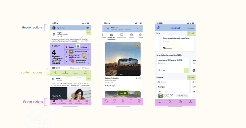
I have organized the action placement of the LinkedIn, Airbnb and Quizlet by color coding. Although the three UIs above look different at first glance, the structures of the information architecture are similar. With an understanding of the structure, I can recognize and analyze elements from the perspective of information architecture even when looking at different UIs. I would like to use this structural perspective to analyze and refer to various UI information architectures when considering information architecture in the future.
LinkedIn, Airbnb and Quizletのアクションの配置を色分けして整理してみました。上の3つのUIは一見異なる見た目ですが、情報設計の構造が類似しています。構造を理解したことで、異なるUIを見たときにも情報設計という視点で要素認識・分析することができるようになりました。この構造の観点で、今後情報設計の検討の際、色々なUIの情報設計を分析して参考にしていきたいです。
この記事が気に入ったらサポートをしてみませんか?