QML Tutorial 和訳

QML Tutorial
This tutorial gives an introduction to QML, the language for Qt Quick UIs. It doesn't cover everything; the emphasis is on teaching the key principles, and features are introduced as needed.
Through the different steps of this tutorial we will learn about QML value types, we will create our own QML component with properties and signals, and we will create a simple animation with the help of states and transitions.
Chapter one starts with a minimal "Hello world" program and the following chapters introduce new concepts.
The tutorial's source code is located in the examples/quick/tutorials/helloworld directory.
Tutorial chapters:
1.Value Types
2.QML Components
3.States and Transitions
このチュートリアルはQMLの紹介をするもので、Qt Quick UIsのための言語です。全てをカバーしません。:強調したいのは、主要な原理を教えること、そして機能が必要に応じて紹介されるということです。
このチュートリアルの異なるステップを通してQML値の型について学びますが、プロパティとシグナルで独自のQMLコンポーネントを作りますし、ステートと遷移を利用して単純なアニメーションを作ります。第一章は最小限の"Hello World"プログラムで始め、次の章は新しい概念を紹介します。
チュートリアルのソースコードは、examples/quick/tutorials/helloworldディレクトリにあります。
チュートリアル 章:
1.値 型
2.QML コンポーネンツ
3.ステート(状態)と遷移
QML Tutorial 1 - Value Types
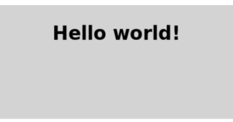
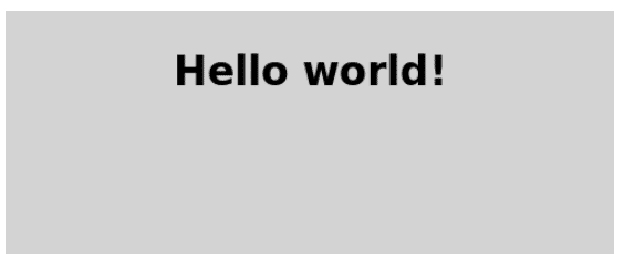
This first program is a very simple "Hello world" example that introduces some basic QML concepts. The picture below is a screenshot of this program.
この最初のプログラムはとてもシンプルな"Hello World"エグザンプルで、いくつかの基本的なQMLの概念を紹介するものです。下記の図がこのプログラムのスクリーンショットです。
Here is the QML code for the application:
こちらがそのアプリケーションのQMLコードです。
import QtQuick

Rectangle {
    id: page
    width: 320; height: 480
    color: "lightgray"

    Text {
        id: helloText
        text: "Hello world!"
        y: 30
        anchors.horizontalCenter: page.horizontalCenter
        font.pointSize: 24; font.bold: true
    }
}
Walkthrough
(ウォークスルー:<内部を歩くなどのシミュレーションができるコンピュータによる建物のモデル映像>)
Import
First, we need to import the types that we need for this example. Most QML files will import the built-in QML types (like Rectangle, Image, ...) that come with Qt, using:
最初に、私たちはこのエグザンプルのために必要な型をインポートする必要があります。ほとんどのQMLファイルはQtについている組み込み型のQML型をインポートします。(Rectangle, Image, …のように)
import QtQuickRectangle Type
Rectangle {
    id: page
    width: 320; height: 480
    color: "lightgray"
We declare a root object of type Rectangle. It is one of the basic building blocks you can use to create an application in QML. We give it an id to be able to refer to it later. In this case, we call it "page". We also set the width, height and color properties. The Rectangle type contains many other properties (such as x and y), but these are left at their default values.
我々はRectangle型のルートオブジェクトを宣言します。QMLでアプリを作るために使うことのできる基本的な構築ブロックの一つです。我々は後でそれを参照できるようにするためのidを与えます。この場合、それに"page"と名付けます。width,heightそしてcolorプロパティも設定します。Rectangle型は多くの他のプロパティ(例えばxとy)を持ちますが、これらはデフォルト値のままにしています。
Text Type
    Text {
        id: helloText
        text: "Hello world!"
        y: 30
        anchors.horizontalCenter: page.horizontalCenter
        font.pointSize: 24; font.bold: true
    }
We add a Text type as a child of the root Rectangle type that displays the text 'Hello world!'.
The y property is used to position the text vertically at 30 pixels from the top of its parent.
The anchors.horizontalCenter property refers to the horizontal center of an type. In this case, we specify that our text type should be horizontally centered in the page element (see Anchor-Based Layout).
The font.pointSize and font.bold properties are related to fonts and use the dot notation.
Rectangle型の子として"Hello World!"を表示する加えText型を加えます。
yプロパティはその親の上部から垂直に30ピクセルの場所にテキストを配置するために使います。
anchors.horizontalCenterプロパティはある型の垂直の中央を参照します。この場合、私たちはテキスト型がページ要素内で水平線上に中心にあるべきということを指定します。(Anchor-Based Layoutを見てください。)
font.pointSizeとfont.boldプロパティはフォントに関連するプロパティで、ドット表記を利用します。
Viewing the Example
To view what you have created, run the qml tool (located in the bin directory) with your filename as the first argument. For example, to run the provided completed Tutorial 1 example from the install location, you would type:
あなたが作成したものを見るために、最初の引数としてファイルの名前でqml tool(binディレクトリ内にあります)を実行します。例えば、インストールの場所から提供され、完成したチュートリアル1のエグザンプルを実行するには、
qml tutorials/helloworld/tutorial1.qmlとタイプします。
QML Tutorial 2 - QML Components
This chapter adds a color picker to change the color of the text.
この章はテキストの色を変えるためのカラーピッカーを加えます。

Our color picker is made of six cells with different colors. To avoid writing the same code multiple times for each cell, we create a new Cell component. A component provides a way of defining a new type that we can re-use in other QML files. A QML component is like a black-box and interacts with the outside world through properties, signals and functions and is generally defined in its own QML file. (For more details, see the Component documentation). The component's filename must always start with a capital letter.
私たちのカラーピッカーは異なる色で6つのセルから成っています。それぞれのセルで同じコードを何回も書くのを避けるために、新しいCellコンポーネントを作ります。コンポーネントは他のQMLファイルで再利用できる新しい型を定義する方法を提供します。QMLコンポーネントはブラックボックスのようであり、プロパティ、シグナルそして関数を通して外の世界と相互作用し、一般的にそれ自体のQMLファイルの中で定義されます。(詳細には、Componentドキュメントを見てください。)コンポーネントのファイル名は常にキャピタルレターで始めなければなりません。
Here is the QML code for Cell.qml:
import QtQuick

Item {
    id: container
    property alias cellColor: rectangle.color
    signal clicked(cellColor: color)

    width: 40; height: 25

    Rectangle {
        id: rectangle
        border.color: "white"
        anchors.fill: parent
    }

    MouseArea {
        anchors.fill: parent
        onClicked: container.clicked(container.cellColor)
    }
}
Walkthrough
The Cell Component
Item {
    id: container
    property alias cellColor: rectangle.color
    signal clicked(cellColor: color)

    width: 40; height: 25
The root type of our component is an Item with the id container. An Item is the most basic visual type in QML and is often used as a container for other types.
私たちのコンポーネントのルート型はid:containerのアイテムです。あるItemは最も基本的なQML内の可視型で、他の型のコンテナとしてよく利用されます。
property alias cellColor: rectangle.colorWe declare a cellColor property. This property is accessible from outside our component, this allows us to instantiate the cells with different colors. This property is just an alias to an existing property - the color of the rectangle that compose the cell (see Property Binding).
私たちはcellColorプロパティを宣言します。このプロパティはコンポーネントの外からアクセス可能であり、これは異なる色でセルを生成することができます。このプロパティは存在しているプロパティ-セルを構成する矩形の色(Property Bindingを見てください)のちょうどエイリアスになります。
signal clicked(cellColor: color)We want our component to also have a signal that we call clicked with a cellColor parameter of type color. We will use this signal to change the color of the text in the main QML file later.
我々はコンポーネントが型色のcellColorパラメータでclickedを呼ぶシグナルも持ってほしいと思います。このシグナルを後でain QMLファイル内のテキストの色を変更するために使います。
 Rectangle {
        id: rectangle
        border.color: "white"
        anchors.fill: parent
    }
Our cell component is basically a colored rectangle with the id rectangle.
The anchors.fill property is a convenient way to set the size of a visual type. In this case the rectangle will have the same size as its parent (see Anchor-Based Layout).
セルコンポーネントは基本的にid rectangleで色付けされた矩形です。anchors.fillプロパティは可視型のサイズを設定する便利な方法です。この場合矩形はその親と同じサイズを持ちます。(Anchor Based Layoutを見てください。)
 MouseArea {
        anchors.fill: parent
        onClicked: container.clicked(container.cellColor)
    }
In order to change the color of the text when clicking on a cell, we create a MouseArea type with the same size as its parent.
A MouseArea defines a signal called clicked. When this signal is triggered we want to emit our own clicked signal with the color as parameter.
セルをクリックするときにテキストの色を変化させるため、親として同じサイズでMouseArea型を作ります。MouseAreaはclickedと呼ばれるシグナルを定義します。このシグナルが発行されるとき、我々は引数として色で、独自のclickedシグナルを発行したいです。
The Main QML File
In our main QML file, we use our Cell component to create the color picker:
main QMLファイル内で、カラーピッカーを作るためのセルコンポーネントを使います。
import QtQuick

Rectangle {
    id: page
    width: 320; height: 480
    color: "lightgray"

    Text {
        id: helloText
        text: "Hello world!"
        y: 30
        anchors.horizontalCenter: page.horizontalCenter
        font.pointSize: 24; font.bold: true
    }

    Grid {
        id: colorPicker
        x: 4; anchors.bottom: page.bottom; anchors.bottomMargin: 4
        rows: 2; columns: 3; spacing: 3

        Cell { cellColor: "red"; onClicked: helloText.color = cellColor }
        Cell { cellColor: "green"; onClicked: helloText.color = cellColor }
        Cell { cellColor: "blue"; onClicked: helloText.color = cellColor }
        Cell { cellColor: "yellow"; onClicked: helloText.color = cellColor }
        Cell { cellColor: "steelblue"; onClicked: helloText.color = cellColor }
        Cell { cellColor: "black"; onClicked: helloText.color = cellColor }
    }
}
We create the color picker by putting 6 cells with different colors in a grid.
グリッド内で異なる色で6セルを置くことによってカラーピッカーを作ります。
Cell { cellColor: "red"; onClicked: helloText.color = cellColor }When the clicked signal of our cell is triggered, we want to set the color of the text to the cellColor passed as a parameter. We can react to any signal of our component through a property of the name 'onSignalName' (see Signal Attributes).
セルのclickedシグナルが発行されるとき、テキストの色を、引数として渡されるcellColorへ設定したい。'onSignalName'(Signal Attributesを見てください)名のプロパティを通してコンポーネントのいくつかのシグナルに反応できます。
QML Tutorial 3 - States and Transitions
In this chapter, we make this example a little bit more dynamic by introducing states and transitions.
We want our text to move to the bottom of the screen, rotate and become red when clicked.
この章では、ステート(状態)とトランジション(遷移)を紹介することによってちょっとだけより動的なエグザンプルを作ります。
我々はクリックされた時、テキストがスクリーンの底へ移動し、そして赤くなるようになってほしいです。

Here is the QML code:
こちらがQMLのコードです。
import QtQuick

Rectangle {
    id: page
    width: 320; height: 480
    color: "lightgray"

    Text {
        id: helloText
        text: "Hello world!"
        y: 30
        anchors.horizontalCenter: page.horizontalCenter
        font.pointSize: 24; font.bold: true

        MouseArea { id: mouseArea; anchors.fill: parent }

        states: State {
            name: "down"; when: mouseArea.pressed == true
            PropertyChanges {
                helloText {
                    y: 160
                    rotation: 180
                    color: "red"
                }
            }
        }

        transitions: Transition {
            from: ""; to: "down"; reversible: true
            ParallelAnimation {
                NumberAnimation { properties: "y,rotation"; duration: 500; easing.type: Easing.InOutQuad }
                ColorAnimation { duration: 500 }
            }
        }
    }

    Grid {
        id: colorPicker
        x: 4; anchors.bottom: page.bottom; anchors.bottomMargin: 4
        rows: 2; columns: 3; spacing: 3

        Cell { cellColor: "red"; onClicked: helloText.color = cellColor }
        Cell { cellColor: "green"; onClicked: helloText.color = cellColor }
        Cell { cellColor: "blue"; onClicked: helloText.color = cellColor }
        Cell { cellColor: "yellow"; onClicked: helloText.color = cellColor }
        Cell { cellColor: "steelblue"; onClicked: helloText.color = cellColor }
        Cell { cellColor: "black"; onClicked: helloText.color = cellColor }
    }
}
Walkthrough
states: State {
            name: "down"; when: mouseArea.pressed == true
            PropertyChanges {
                helloText {
                    y: 160
                    rotation: 180
                    color: "red"
                }
            }
        }
First, we create a new down state for our text type. This state will be activated when the MouseArea is pressed, and deactivated when it is released.
The down state includes a set of property changes from our implicit default state (the items as they were initially defined in the QML). Specifically, we set the y property of the text to 160, the rotation to 180 and the color to red.
最初に、我々はテキスト型のために新しい"down"ステートを作ります。このステートはMouseAreaが押されるときにアクティブ化され、そして放されるときに非アクティブ化されます。"down"ステートは暗黙的なデフォルトのステート(状態)(それらが最初にQML内で定義されているアイテム)から変化する1セットのプロパティを含みます。特に、テキストのyプロパティを160に設定し、180度の回転と、色を赤にします。
transitions: Transition {
            from: ""; to: "down"; reversible: true
            ParallelAnimation {
                NumberAnimation { properties: "y,rotation"; duration: 500; easing.type: Easing.InOutQuad }
                ColorAnimation { duration: 500 }
            }
        }
Because we don't want the text to appear at the bottom instantly but rather move smoothly, we add a transition between our two states.
from and to define the states between which the transition will run. In this case, we want a transition from the default state to our down state.
Because we want the same transition to be run in reverse when changing back from the down state to the default state, we set reversible to true. This is equivalent to writing the two transitions separately.
The ParallelAnimation type makes sure that the two types of animations (number and color) start at the same time. We could also run them one after the other by using SequentialAnimation instead.
For more details on states and transitions, see Qt Quick States and the states and transitions example.
我々は瞬時に底辺にテキストが現れてほしくないが、かなりスムーズに動いて、二つの状態の間に遷移を加えます。
from と to は遷移が走る両者間の状態を定義します。この場合、初期状態からdownステートへ遷移してほしいです。我々はdownステートから初期ステートへ戻るように変化するとき、逆に同じ遷移を実行したいので、reversibleをtrueに設定します。これは二つの遷移を別別に記述することと同じです。ParallelAnimation型がアニメーションの二つの型(数と色)が同時にスタートすることを保証してくれます。我々はSequentialAnimationを代わりにりようすることで、次から次へひとつずつそれらを実行することもできます。状態と遷移の詳細は、Qt Quick Statesと states and transitions exampleを見てください。
この記事が気に入ったらサポートをしてみませんか?