AIと作るtailwind cssのデザイン

↑でセットアップしたものを使う
で、これ今さすがに
<html lang="en">
  <head>
    <meta charset="UTF-8">
    <meta http-equiv="X-UA-Compatible" content="IE=edge">
    <meta name="viewport" content="width=device-width, initial-scale=1.0">
    <title>Test</title>
    <link rel="stylesheet" href="../dist/output.css">
  </head>
  <body class="bg-blue-500 text-white">
    <h1 class="text-2xl">This is a test</h1>
    <h2 class="m-2 border">This is a test2</h2>
  </body>
</html>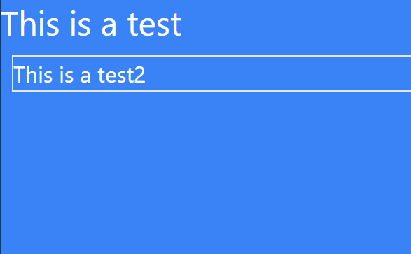
これでは厳しいからAIに頑張ってもらうテスト
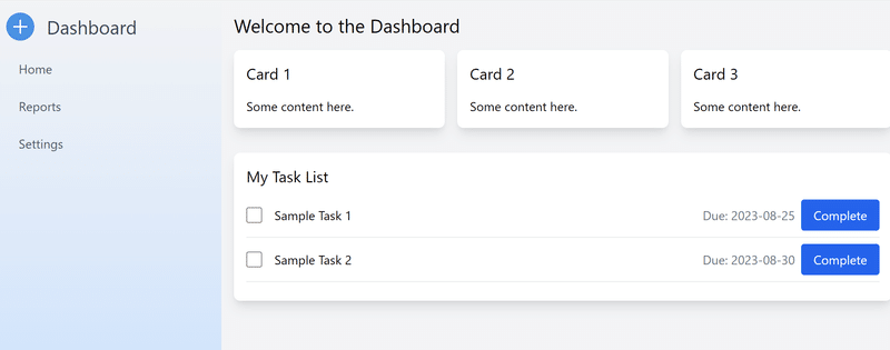
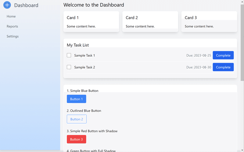
Dashboardを作らせる
以下のようにモダンなdashboardを作って!とかいう無謀な要求を行ってもまあまあ答えてくれる
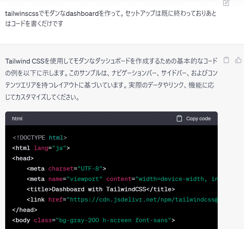
どれどれ
<!DOCTYPE html>
<html lang="ja">
<head>
    <meta charset="UTF-8">
    <meta name="viewport" content="width=device-width, initial-scale=1.0">
    <title>Dashboard with TailwindCSS</title>
    <link href="https://cdn.jsdelivr.net/npm/tailwindcss@2.2.19/dist/tailwind.min.css" rel="stylesheet">
</head>
<body class="bg-gray-200 h-screen font-sans">

<div class="flex flex-row h-full">

    <!-- Sidebar -->
    <div class="bg-gray-800 w-1/4 h-full p-4">
        <h1 class="text-white text-2xl mb-4">Dashboard</h1>
        <nav>
            <ul>
                <li class="my-2">
                    <a href="#" class="text-gray-400 hover:text-white block py-2 px-4">Home</a>
                </li>
                <li class="my-2">
                    <a href="#" class="text-gray-400 hover:text-white block py-2 px-4">Reports</a>
                </li>
                <li class="my-2">
                    <a href="#" class="text-gray-400 hover:text-white block py-2 px-4">Settings</a>
                </li>
            </ul>
        </nav>
    </div>

    <!-- Main Content -->
    <div class="flex-1 bg-gray-100 p-4">
        <h1 class="text-2xl mb-4">Welcome to the Dashboard</h1>
        <div class="grid grid-cols-3 gap-4">
            <!-- Sample Card -->
            <div class="bg-white p-4 shadow-lg rounded-lg">
                <h2 class="text-xl">Card 1</h2>
                <p>Some content here.</p>
            </div>
            <!-- Sample Card -->
            <div class="bg-white p-4 shadow-lg rounded-lg">
                <h2 class="text-xl">Card 2</h2>
                <p>Some content here.</p>
            </div>
            <!-- Sample Card -->
            <div class="bg-white p-4 shadow-lg rounded-lg">
                <h2 class="text-xl">Card 3</h2>
                <p>Some content here.</p>
            </div>
        </div>
    </div>

</div>

</body>
</html>

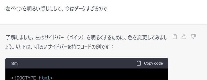
左のダークみが気にいらなかったとしたら…
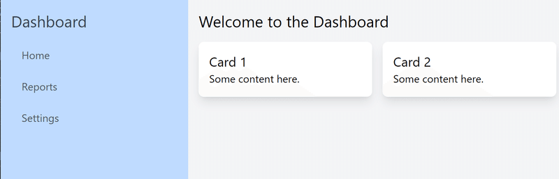
うーむ、この色は….まあ失敗もあるか。

まあ微妙っちゃ微妙だけどまあいいかなと。こんな形で大雑把にチューニングしていく分にはbootstrapよりはるかに自由度「は」高い。それが仇になる可能性は多いにある(そもそもコードが長ぇ)

ロゴのgenerateはさすがに得意みを感じないですね。
右ペインに表でも作る
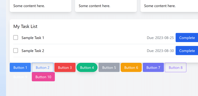
TODOリストっぽいものを作れという指示を入れている
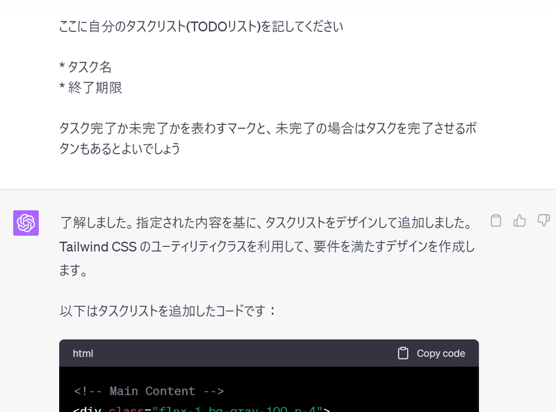
それなりに見た目だけはいい表が出来ましたね。
とまあTailwind cssの事は何一つわからんでもとりあえずAIが適当に吐いてくれたりする。
もう少し小さいパーツ単位での作業
たとえばCompleteのボタンが微妙だなーという時
<input type="checkbox" class="form-checkbox h-5 w-5 text-blue-600">
これは青いボタンですが、いろいろなタイプのボタンを10種類くらい作ってください。エフェクトがかかっていたりかかってなかったり、アウトラインがあったり丸みがあったり
尋ね方はいろいろあると思う。
すると
これはさすがにナシだろという感じだったので
説明書きも含めて出力してください。まだ出力もそれぞれのボタン並べた時に整列し、
うまい事ボタンを紹介するように体裁を整えてください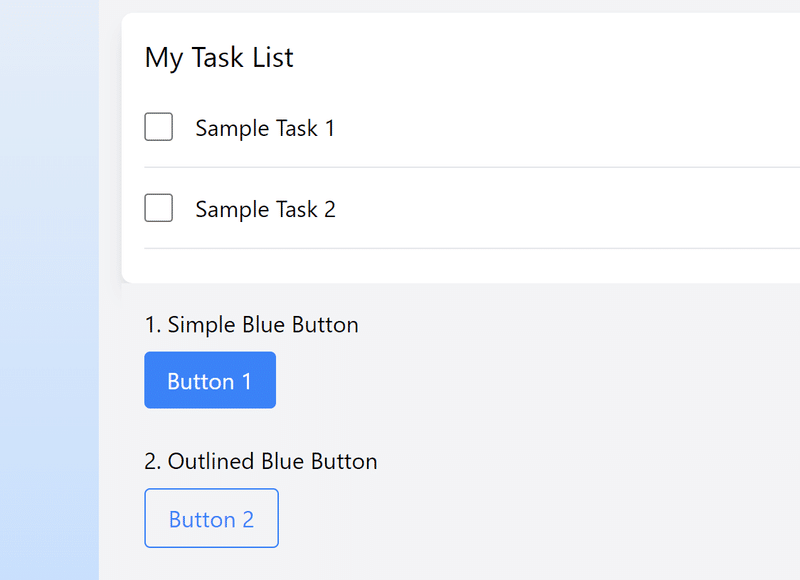
うーん、もう1つか
ボタンの外枠 <div class="p-4 bg-gray-100 space-y-6"> の背景を白にし、角を丸めてください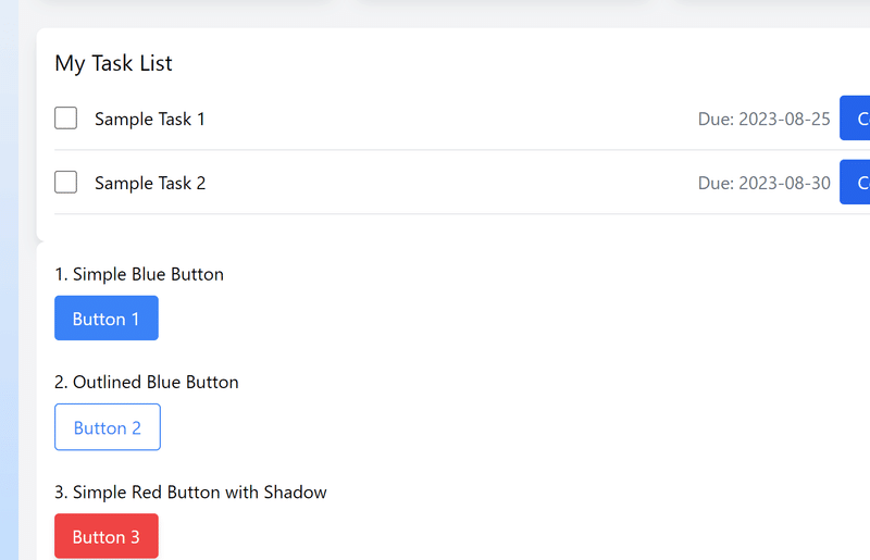
とまあまあよくなった。ただ、タスクリストと今結合しちゃってるからマージンを取る。これくらいは手修正しよう
<div class="p-4 bg-white space-y-6 rounded-lg">となっていたので
<div class="mt-8 p-4 bg-white space-y-6 rounded-lg">マージントップに8を設定した(mt-8を追記)。
とまあこんな具合にTailwind cssのTの字もわからなくてもまあまあ何とかなっちゃうのがTailwind cssらしいのであるが、
このチートシートが微修正する時に役に立ちそうである。まああとvscodeで補完もある程度できるっぽい(何故か)。エクステンションもあるみたいだけど、まだ入れていない。
tailwind cssの可能性と限界
あくまでcssだけなのでbootstrapのようにjsを使ったトリガーは使えない。デザイン面のみなのでCSSを越えたことはできないようである。でまあユーティリティーファーストと言っているので、コンポーネントベースのCSS(それこそbootstrapとか)っぽい見た目はユーティリティーの組合せで可能となっている。たとえば
bootstrapのcardっぽいレイアウトのダミーと、その中に
bootstrapのprimaryおよびinfoボタンっぽいデザインをtailwind cssで作成ください
みたいに投げたときの出力は以下の通りであった(ちょっとだけ微修正はしとります)。
<div class="min-h-screen bg-gray-100 flex items-center justify-center">
<!-- Card Layout -->
<div class="bg-white p-6 rounded-lg shadow-md w-64">
  <!-- Card Header or Image -->
  <div class="mb-4">
    <img src="https://via.placeholder.com/150" alt="Dummy Image" class="rounded-lg w-full h-32 object-cover">
  </div>

  <!-- Card Body -->
  <div class="mb-4">
      <h2 class="text-xl font-semibold mb-2">Card Title</h2>
      <p class="text-gray-600">This is some sample card content. You can replace this with your own content.</p>
  </div>

  <!-- Card Footer or Buttons -->
  <div>
      <!-- Primary Button -->
      <button class="bg-blue-500 text-white px-4 py-2 rounded hover:bg-blue-600 focus:outline-none focus:ring-2 focus:ring-blue-500 focus:ring-opacity-50">
          Primary
      </button>

      <!-- Info Button -->
      <button class="ml-2 bg-teal-500 text-white px-4 py-2 rounded hover:bg-teal-600 focus:outline-none focus:ring-2 focus:ring-teal-500 focus:ring-opacity-50">
          Info
      </button>
  </div>
</div>
</div>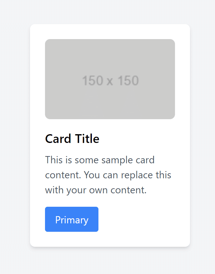
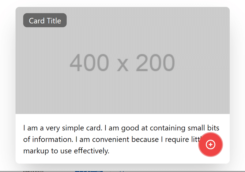
頑張ってMaterializeっぽくしてみた例
などなど、割と頑張れば頑張れるというかジブンが頑張ったわけでもないんだけど…
まあいずれもうちょい掘っていってみよう。
この記事が気に入ったらサポートをしてみませんか?