
【第17回】Wordpress自作テーマ練習。トップページ作成

引き続きWordpress自作テーマ作成の練習をしていきます。
前回の内容はこちら↓
↓こちらの参考書を参考にしながら自作テーマの練習をしています。
本日の内容
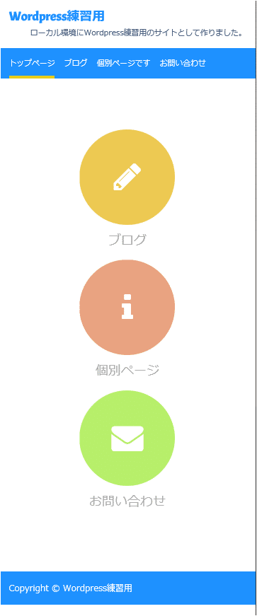
トップページを作成して、ビジネス風のサイト構造にします。

↑こんな感じのトップページです。
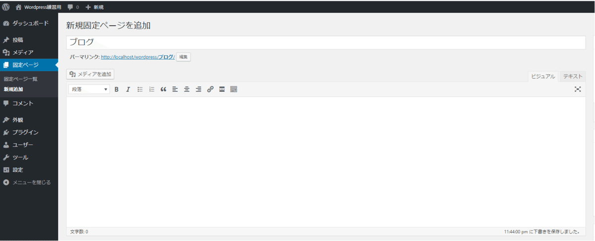
トップページを「個別ページ」から作成する
まずトップページを個別ページから作成します。

中身は何も書かなくても良いです。
次に、サイトにアクセスした際に「トップページ」が出るようにします。

※この設定により投稿ページ一覧のページのURLが存在しなくなったため、個別ページで「ブログ」という名前のページを作っておきます。
投稿ページには、「ブログ」と設定します。

ナビゲーションの表示の設定
次に、「外観」→「メニュー」からナビゲーションの表示の設定を以下にします。
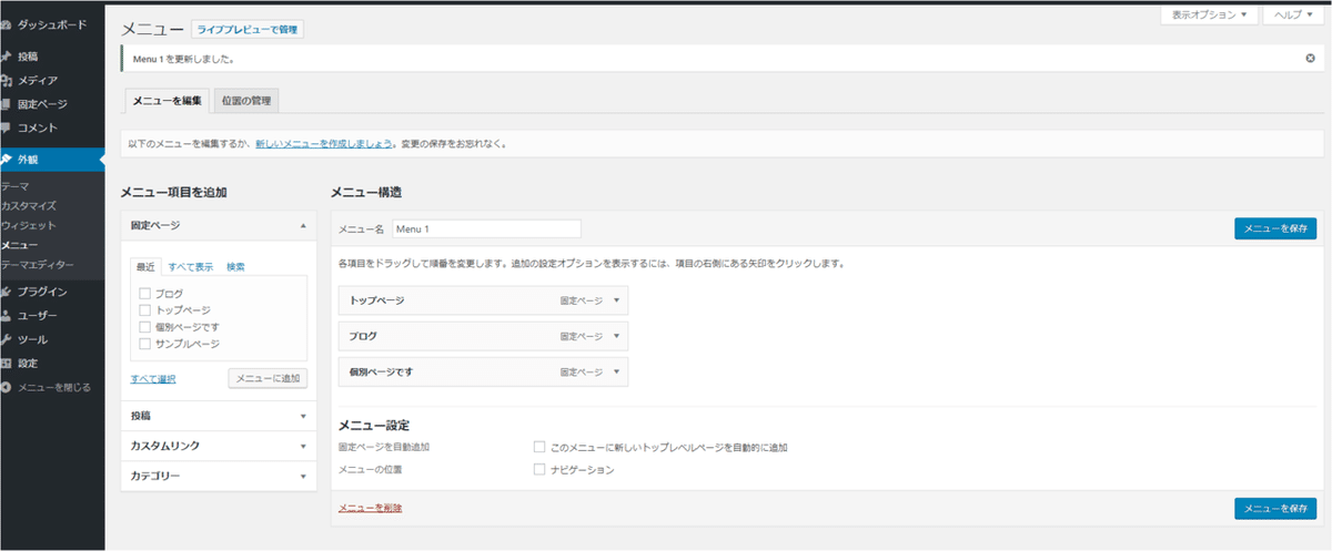
これでナビゲーションの表示は以下のようになりました。

トップページ(ホームページ)専用のfront-page.phpを用意する
page.phpでは固定ページ全てに反映されてしまうのですが、
front-page.phpはトップページ(ホームページ)専用のPHPファイルとなっています。
「mythema」の中にfront-page.phpを作成しましょう。
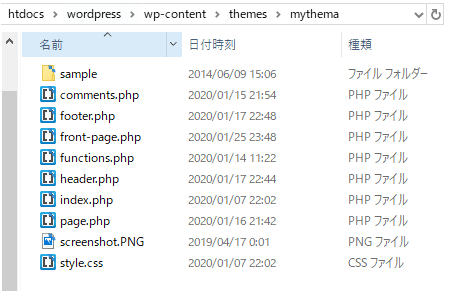
fron-page.php
<?php get_header(); ?>


<div class="topmenu">
<div class="container">

<div class="link">
<a href="<?php echo get_permalink( get_page_by_title( 'ブログ' )->ID ); ?>">
<i class="fa fa-pencil"></i>ブログ
</a>
</div>

<div class="link">
<a href="<?php echo get_permalink( get_page_by_title( '個別ページ' )->ID ); ?>">
<i class="fa fa-info"></i>個別ページ
</a>
</div>

<div class="link">
<a href="<?php echo get_permalink( get_page_by_title( 'お問い合わせ' )->ID ); ?>">
<i class="fa fa-envelope"></i>お問い合わせ
</a>
</div>

</div>
</div>


<?php get_footer(); ?>
font-page.phpは、上記のこのようにしておきます。
<i class="fa fa-pencil"></i>などは、↓「Font Awosome」を使っています。
デザインをあてる
デザインは以下のようにします。
style.css
@charset "UTF-8";
/*
Theme Name: MY THEME (Chapter 8-B2)
Author: TRAVEL SKETCH
Description: This is my original theme.
Version: 1.0
*/


body	{margin: 0;
	font-family: 'メイリオ', 'Hiragino Kaku Gothic Pro', sans-serif}

.container	{max-width: 650px;
	margin-left: auto;
	margin-right: auto;
	padding-left: 15px;
	padding-right: 15px}


/* 記事 */
article	{margin-bottom: 40px;
	overflow: hidden}

article h1	{margin: 0;
	font-size: 32px;
	font-weight: normal}

article h1 a	{color: #000000;
	text-decoration: none}


/* 記事の付加情報 */
.postinfo	{margin-top: 15px;
	font-size: 14px}

.postinfo a	{color: #000000;
	text-decoration: none}

.postinfo .postcat	{margin-left: 20px}

.postinfo .postcom	{margin-left: 20px}

.postinfo i	{color: #888888}


/* 前後の記事へのリンク */
.pagenav a	{padding: 5px 10px;
	border: solid 1px #cccccc;
	border-radius: 10px;
	color: #666666;
	font-size: 12px;
	text-decoration: none}

.pagenav .old a	{float: left}

.pagenav .new a	{float: right}

.pagenav	{overflow: hidden;
	margin-top: 40px;
	margin-bottom: 40px;
	clear: both}


/* ヘッダー */
header	{margin-bottom: 40px;
	background-color: #1e90ff;
	color: #ffffff}

header a	{color: #ffffff;
	text-decoration: none}

.siteinfo	{overflow: hidden;
	padding-top: 14px;
	padding-bottom: 14px;
	background-color: #ffffff;
	color: #4a5f7e}

.siteinfo a	{color:  #1e90ff}

.siteinfo h1	{float: left;
	margin: 0;
	font-family: 'Acme', sans-serif;
	font-size: 20px}

.siteinfo p	{float: right;
	margin: 0;
	margin-top: 5px;
	font-size: 12px}


/* ヘッダー画像 */
header img	{width: 100%;
	height: auto;
	vertical-align: bottom}


/* ナビゲーションメニュー */
nav ul	{list-style: none;
	margin: 0;
	padding: 0;
	font-size: 12px;
	overflow: hidden}

nav li	{float: left;
	margin-right: 15px}

nav li a	{display: block;
	padding-top: 15px;
	padding-bottom: 10px;
	border-bottom: solid 5px transparent}

nav li a:hover	{border-bottom-color: #00ccff}

nav li.current-menu-item a
	{border-bottom-color: #e6cc1c}


/* フッター */
footer	{margin-top: 40px;
	padding-top: 14px;
	padding-bottom: 14px;
	background-color: #1e90ff;
	color: #ffffff}


/* 本文中の画像 */
article img	{border: none;
	max-width: 100%;
	height: auto}

.aligncenter	{display: block;
	margin-top: 30px;
	margin-bottom: 30px;
	margin-left: auto;
	margin-right: auto}

.alignright	{float: right;
	margin-bottom: 30px;
	margin-left: 30px}

.alignleft	{float: left;
	margin-bottom: 30px;
	margin-right: 30px}

.wp-caption	{max-width: 100%}

.wp-caption-text	{margin: 0;
	color: #666666;
	font-size: 14px;
	text-align: center}


/* メニュー */
.blogmenu ul	{margin: 0;
	padding: 0;
	list-style: none}

.blogmenu .widget	{margin-bottom: 30px;
	padding: 20px;
	background-color: #e8e8e8}

.blogmenu .widgettitle	{margin-top: 10px;
	margin-bottom: 20px;
	border-right: solid 10px #4a5f7e;
	color: #4a5f7e;
	font-size: 14px}

.blogmenu li a	{display: block;
	padding: 10px 5px;
	color: #666666;
	font-size: 14px;
	text-decoration: none}

.blogmenu li a:hover	{background-color: #ffffff}


/* 見出し */
.archive-title	{margin-top: 0;
	margin-bottom: 40px;
	background-color: #eeeeee;
	font-size: 14px;
	font-weight: normal}

.archive-title i	{padding: 15px;
	background-color: #4a5f7e;
	color: #ffffff}


/* コメント投稿フォーム */
#respond p	{margin-top: 0;
	margin-bottom: 20px;
	font-size: 12px}

#respond label	{font-size: 14px}

#respond input,
#respond textarea	{width: 100%;
	padding: 5px;
	-moz-box-sizing: border-box;
	-webkit-box-sizing: border-box;
	box-sizing: border-box}

#respond input[type="submit"]
	{width: 200px;
	padding: 10px;
	border: none;
	background-color: #e6cc1c;
	-webkit-appearance: none;
	cursor: pointer}

#respond input[type="submit"]:hover
	{background-color: #ffaa00}

#respond .required	{color: #ff0000}


/* コメント */
#comments footer	{background: none;
	margin: 0;
	color: #000000;
	font-size: 12px}

#comments footer a	{color: #000000}

#comments footer div	{display: inline}

#comments ul	{list-style: none;
	margin: 0;
	padding: 0}

#comments article	{border: dotted 1px #aaaaaa;
	margin-bottom: 10px;
	padding: 10px 20px 20px 20px}

#comments .comment-content	{margin-left: 30px}


/* お問い合わせフォーム */
.wpcf7 input,
.wpcf7 textarea	{width: 100%;
	padding: 5px;
	-moz-box-sizing: border-box;
	-webkit-box-sizing: border-box;
	box-sizing: border-box}

.wpcf7 input[type="submit"]
	{width: 200px;
	padding: 10px;
	border: none;
	background-color: #e6cc1c;
	-webkit-appearance: none;
	cursor: pointer}

.wpcf7 input[type="submit"]:hover
	{background-color: #ffaa00}

/* メディアクエリの設定 */
@media (min-width: 768px) {

/* 2段組 */
.container	{max-width: 1000px;
	overflow: hidden}

.contents	{width: 65%;
	float: left}

.blogmenu	{width: 30%;
	float: right}

/* ナビゲーションメニュー */
nav li	{margin-right: 40px}

}

/* 記事の概要 */
.excerpt p	{font-size: 14px}

.excerpt .more a	{padding: 5px 20px;
	border: solid 1px #cccccc;
	border-radius: 5px;
	color: #000000;
	text-decoration: none;}

.excerpt .more a:hover
	{background-color: #e6cc1c}

.excerpt .more i	{margin-left: 10px;
	color: #cccccc}

.excerpt img{
	display:block;
	margin-left:auto;
	margin-right:auto;
}

@media (min-width: 500px) {
.excerpt img	{float: left;
	margin-right: 20px;
	width: 40%}
}

@media (max-width: 499px) {
.excerpt img	{display: block;
	margin-left: auto;
	margin-right: auto}
}

/* トップページのメニュー */
.topmenu	{
	padding-top: 40px;
	padding-bottom: 40px;
}

.link	{
	text-align: center;
	margin-bottom: 15px;
}

.link a	{
	color: #aaaaaa;
	font-size: 20px;
	text-decoration: none;
}

.link i	{
	display: block;
	margin-left: auto;
	margin-right: auto;
	margin-bottom: 10px;
	width: 150px;
	line-height: 150px;
	border-radius: 75px;
	background-color: #ecc952;
	color: #ffffff;
	font-size: 50px;
}

.link:nth-child(2) i{
	background-color: #e8a380;
}

.link:nth-child(3) i{
	background-color: #b7ef6b;
}

@media (min-width: 500px) {
.topmenu	{
	overflow: hidden;
	}

.link	{
	float: left;
	width: 33.3333%;
	}
}
追加したのは以下の部分です。
/* トップページのメニュー */
.topmenu	{
	padding-top: 40px;
	padding-bottom: 40px;
}

.link	{
	text-align: center;
	margin-bottom: 15px;
}

.link a	{
	color: #aaaaaa;
	font-size: 20px;
	text-decoration: none;
}

.link i	{
	display: block;
	margin-left: auto;
	margin-right: auto;
	margin-bottom: 10px;
	width: 150px;
	line-height: 150px;
	border-radius: 75px;
	background-color: #ecc952;
	color: #ffffff;
	font-size: 50px;
}

.link:nth-child(2) i{
	background-color: #e8a380;
}

.link:nth-child(3) i{
	background-color: #b7ef6b;
}

@media (min-width: 500px) {
.topmenu	{
	overflow: hidden;
	}

.link	{
	float: left;
	width: 33.3333%;
	}
}
●@media (min-width: 500px) :500pxより画面幅がい小さい場合の設定
●500px以上の画面幅の場合

aタグで各ページに飛ぶようにリンク付けしています(^^)/
Twitter➡@t_kun_kamakiri
ブログ➡宇宙に入ったカマキリ(物理ブログ)
この記事が気に入ったらサポートをしてみませんか?