Space, grids, and layouts #2

FigmaのDesign Systemに掲載されている記事をよんでみました。
#1の続編です。元記事は→Spacing, grids, and layouts (designsystems.com)
和訳はDeppL / chat GPTで行ってみました。個人的に重要そうなところは太字にしてみています。
What is a grid? グリッドとは何か
Spatial systems define the rules of sizing and spacing while grids help you arrange your content into structured propositions. Early print designers utilized grids to organize text blocks and images into pleasing visual hierarchies that aided readability. As design has evolved, the same basic principles still apply to the two-dimensional organization of information.
和訳:空間システムは、サイズと間隔のルールを定義し、グリッドはコンテンツを構造化された配置するのに役立ちます。初期の印刷デザイナーは、テキストブロックや画像を整理し、読みやすさを助ける魅力的な視覚的階層に配置するためにグリッドを活用しました。デザインが進化しても、情報の二次元的な構成には同じ基本原則が適用されています。
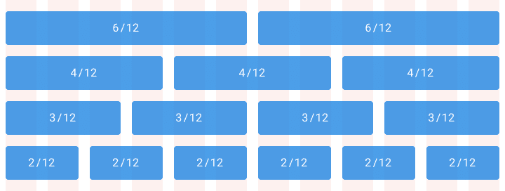
1. Column grid カラムグリッド
A column grid helps you organize content into evenly spaced vertical columns. The space between columns is referred to as the gutter size. Applying your spatial system rules to the gutters will help drive home a consistent rhythm in your designs. A common example is the 12 column grid because it allows you to divide the given area into half, thirds, fourths, sixths.
和訳:カラムグリッドは、コンテンツを均等に配置された垂直のカラムに整理するのに役立ちます。カラム間のスペースはガッターサイズと呼ばれます。ガッターに空間システムのルールを適用することで、デザインに一貫したリズムを持たせるのに役立ちます。一般的な例として、12カラムグリッドがあります。これは、与えられた領域を半分、三分の一、四分の一、六分の一に分割できるため、使い勝手が良いです。
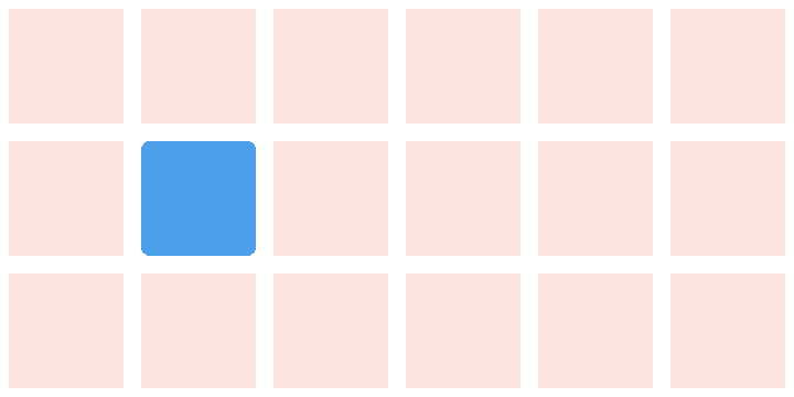
2. Modular grids モジュラーグリッド
A modular grid takes columns and rows into account to organize content into a matrix structure. Modular grids are ideal for a strict format layout like a book but can break down for a relative sized responsive web layout. Keep in mind this doesn’t have to encompass the entire page layout. Modular grids are an organizational tool. You decide where it starts and stops.
和訳:モジュラーグリッドは、カラムと行を考慮してコンテンツを行列構造に整理するのに役立ちます。モジュラーグリッドは、本などの厳格なフォーマットのレイアウトには理想的ですが、相対的なサイズのレスポンシブウェブレイアウトでは適用しづらいことがあります。ただし、これは必ずしもページ全体のレイアウトを包括する必要はありません。モジュラーグリッドは組織のツールであり、開始と終了を決定するのはあなた次第です。
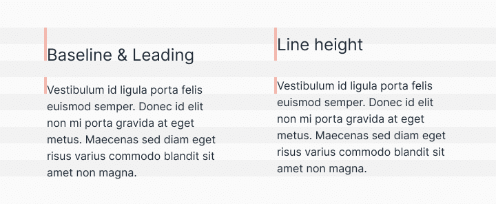
3. Baseline grid ベースライングリッド
Traditionally in graphic design, a baseline grid was used to set the leading from one line of text to the next. However, on the web, we place text by line-heights instead of the baseline. It’s a subtle difference but you should be aware of it when designing across platforms. Regardless of how your typography is measured, the same basic principle applies—setting the typography onto a consistent grid will be easier to organize, create vertical rhythm, and be aesthetically pleasing.
和訳:伝統的に、グラフィックデザインではベースライングリッドが使用され、テキストの1行から次の行への行送りを設定するために使われていました。しかし、ウェブではテキストをベースラインではなく行送り(line-height)で配置します。これは微妙な違いですが、異なるプラットフォームでデザインする際には意識しておくべきです。タイポグラフィの測定方法に関係なく、同じ基本原則が適用されます。タイポグラフィを一貫したグリッドに配置することは、整理しやすく、垂直リズムを作り出し、美的に魅力的になります。
今回はこのあたりにしたいと思います。
また続きがんばります
この記事が気に入ったらサポートをしてみませんか?