Space, grids, and layouts #1

FigmaのDesign Systemに掲載されている記事をよんでみました
元記事は→Spacing, grids, and layouts (designsystems.com)
和訳はDeppL / chat GPTで行ってみました。個人的に重要そうなところは太字にしてみています。
序文
The organization of space is key to every great design. Spatial systems, grids, and layouts provide rules that give your designs a consistent rhythm, constrain decision making, and help teams stay aligned. This foundational scaffolding is a requirement for all design systems. In this guide, we’ll walk through the basics of defining spatial base units, creating relationship rules with grids, and bringing it all together for modern UI layouts.
和訳:
空間の構成は、すべての優れたデザインにとって鍵です。空間システム、グリッド、およびレイアウトは、デザインに一貫したリズムを提供し、意思決定を制約し、チームを整列させるルールを提供します。この基本的な骨組みは、すべてのデザインシステムに必要です。このガイドでは、空間の基本単位を定義し、グリッドを使った関係規則を作成し、モダンなUIレイアウトを作成する基本を説明します。
What is a spatial system?
Designers make spatial decisions every day from the height of a button to the space around an icon. A spatial system is a set of rules for how you measure, size, and space your UI elements. Uniformity on a spatial level allows your product to be more consistent, your team to communicate better, and reduce the number of decisions designers have to make in a day. One example of a spatial system is “the 8pt grid.” However, there are many variations and configurations to choose from.
和訳:
デザイナーは、ボタンの高さからアイコンの周囲のスペースまで、毎日空間に関する決定を行います。空間システムは、UI要素の測定、サイズ設定、配置に関するルールのセットです。空間レベルでの一貫性は、製品をより一貫性のあるものにし、チーム間のコミュニケーションを向上させ、デザイナーが1日に行わなければならない決定の数を減らすのに役立ちます。空間システムの一例として「8ptグリッド」がありますが、選択肢として多くのバリエーションと構成があります。
As an example, notice how the login form feels when it does not have an immediately recognizable spatial pattern. To users, the design can feel cheap, inconsistent, and generally untrustworthy. The predictability of a rhythm is visually pleasing and something you’ve come to expect from brands you trust.
和訳:
例として、ログインフォームが即座に認識できる空間パターンを持っていない場合、どのように感じるかに注意してください。ユーザーにとって、そのデザインは安っぽく、一貫性がなく、一般的に信頼性がないと感じることがあります。リズムの予測可能性は視覚的に魅力的で、信頼するブランドから期待することです。

When this same login form is adjusted to follow an 8pt spatial system the rhythm becomes predictable and visually pleasing. For users, the experience is polished and predictable. This increases trust and affection for the brand.
No matter who is working on the design, there’s now a consistent spatial language and the choices you have to make are greatly reduced. You can easily pick up where another designer left off or comfortably build in parallel. Since these decisions are also captured in the codebase you save time on red-lining for engineers.
和訳:
同じログインフォームを8ptの空間システムに合わせて調整すると、リズムが予測可能で視覚的に魅力的になります。ユーザーにとって、その体験は洗練されており、予測可能です。これにより、ブランドへの信頼と愛着が高まります。
デザインを担当する人物に関係なく、一貫した空間言語が確立され、選択肢が大幅に削減されます。他のデザイナーが残した作業を簡単に引き継いだり、快適に並行して作業したりできます。また、これらの決定はコードベースにも反映されているため、エンジニアのための変更箇所に印をつける時間を節約できます。
How do you start a spatial system?
Defining your base unit will allow you to create the scale of supported sizes in your spatial system. Looking at different products around the web you’ll see a few different approaches to this. You’ll see 4pt, 5pt, 6pt, 8pt, 10pt increment systems. There is no wrong answer here as long as you are aware of what some of these directions promote and prevent.
和訳:
基本単位を定義することで、あなたの空間システムでサポートされるサイズのスケールを作成することができます。ウェブ上のさまざまな製品を見ると、これに対するいくつかの異なるアプローチを見ることができます。4pt、5pt、6pt、8pt、10ptなどです。これらの方向性が何を促進し、何を妨げるかを認識している限り、ここに間違った答えはありません。
My preferred method is an 8pt linear scale for elements with a 4pt half step for spacing icons or small text blocks. I prefer a 4pt baseline grid for my typography which means the line-heights of my font choices will always be divisible by 4. This system is meant to reduce confusion but also be easy to implement.
和訳:
私のお気にいりの方法は、要素には8ptのリニアスケールを使い、アイコンや小さなテキストブロックのスペーシングには4ptのハーフステップを使うことです。私はタイポグラフィのベースライングリッドを4ptにすることを好んでおり、これはフォントのラインハイトが常に4で割り切れることを意味する。このシステムは、混乱を減らすだけでなく、簡単に実施できることを意図している

Be reasonable about your needs as you explore building your own spatial system. Here are some things to consider:
和訳:
あなた自身の空間システムを構築することを模索するとき、あなたのニーズを合理的に考えてください。以下は、検討すべき事項です
1. User needs ユーザーニーズ
Think about your design’s users and the general brand aesthetic you’re going for. Do you want a spacious UI with large font styles and a limited number of actions? Do you need to build for information density with intricate data tables and multiple actions for a technical user? Survey your existing designs and create a mood board to get clarity and alignment for you and your team.
和訳:
あなたのユーザーと、あなたが目指しているブランドの美学について考えてみてください。大きなフォントスタイルとアクション数を制限したUIが望みですか?少数のテクニカルユーザーのために、複雑で込み入ったデータと複数のアクションを構築する必要がありますか?
既存のデザインを調査して、あなたとチームのために明瞭性と整合性を得てください
2. Number of variables 変数の数
Choosing a smaller base unit like 4pt, 5pt, or 6pt can open you up to too many variables in your system. It becomes more difficult to eyeball the difference between a 12pt and 16pt padding difference, which can make it hard to enforce consistency across a team. I find that 8pt increments are the right balance of being visually distant while having a reasonable number of variables. I also utilize a half unit of 4pts for spacing icons or adjusting small blocks of text.
和訳:
4pt、5pt、6ptのような小さな基本単位を選ぶと、システム内で多くの変数が生じる可能性があります。12ptと16ptの余白の違いを目で見て判断することが難しくなり、チーム全体に強い一貫性を持たせることが難しくなります。私は8pt刻みが、適度な変動幅を持ちながら、視覚的に離れているちょうどいいバランスだと感じている。また、アイコンの間隔を空けたり、小さなテキストブロックを調整したりする場合は、4ptの半単位を利用しています。
3. Odd numbers 奇数
Introducing odd numbers, like a 5pt base, into spatial rules can make it difficult to center elements without splitting pixels. For example, centering text and icons in a 25px height button could create blurry split pixels for some users. On a similar front, scaling UIs for different mobile and desktop screens that require 1.5x scale will result in split pixel blurriness.
和訳:
空間ルールに5ptベースのような奇数を導入すると、ピクセルを分割せずに要素を中央に配置することが難しくなります。例えば、高さ25pxのボタンでテキストやアイコンを中央に配置すると、一部のユーザーにとっては不鮮明な分割ピクセルが生じる可能性があります。同様に、1.5倍のスケールを必要とする異なるモバイルとデスクトップ画面用にUIをスケーリングすると、分割ピクセルのぼやけが生じます。
How do I apply a spatial system? 空間システムにどのように適用するか
Applying the spatial scale to your UI elements can come in the form of padding, margin, height, and width definitions. The following examples show that sometimes your paddings cannot be enforced at the same time as a strict height definition.
和訳:
UI要素に空間スケールを適用するには、余白、マージン、高さ、ワイドを定義します。次の例では、余白は厳密な高さの定義と同時に、一貫性を強くできないことがあることを示しています。

In this example, you can see that the line-height of this text is 20px but if I used an 8px padding on the top and bottom, the button will have a height of 36px. Which measurement should I prioritize? There are two ways to address this:
和訳:
この例では、テキストの行の高さは20pxですが、上下に8pxの余白を使用すると、ボタンの高さは36pxになることがわかります。どちらの測定を優先すべきでしょうか?これには2つの方法があります
1. Element first (strict element sizing) エレメント優先
In this approach, the sizing of solid elements takes priority when matched to your predetermined spatial system.. This includes things like buttons and form inputs. These elements are more likely to have predictable content and are key to creating rhythm in the overall composition.
和訳:
このアプローチでは、ソリッドエレメントのサイジングは、あらかじめ決められた空間システムに合わせることが優先されます。これには、ボタンやフォーム入力などが含まれます。これらのエレメントは、予測可能なコンテンツをの可能性が高く、全体の構成にリズムを生み出す鍵となります。

2. Content first (strict internal padding) コンテンツ優先
When the content is less predictable and we care about its display, we will want to enforce strict internal padding and allow element sizes to be dictated by their content. These element’s sizes may still fall into your spatial system’s rules but that is secondary to the spacing around the content. This is useful for tables with indeterminate user content.
和訳:
コンテンツの予想がつきにくく表示に配慮する場合は、内側に強い余白の設定をを適用し、エレメントのサイズは内容によって決まるようにします。
これらのエレメントのサイズは、空間システムのルールに合致するかもしれませんが、それはコンテンツの周囲のスペーシングに次ぐものです。これは、ユーザーコンテンツが不確定なテーブルに役立ちます。

Border placement inside or outside 線の配置は内側か外側か
Outlined elements like buttons or cards can throw a wrench in things. How do you count that 2px border? It’s counted differently in code than it is in Figma. Which one is your source of truth?
和訳:
ボタンやカードのような外枠があるエレメントは問題を複雑にすることがあります。2pxの線はどのように数えますか?コードとFigmaでは異なる方法で数えられます。どちらが正しいでしょうか?
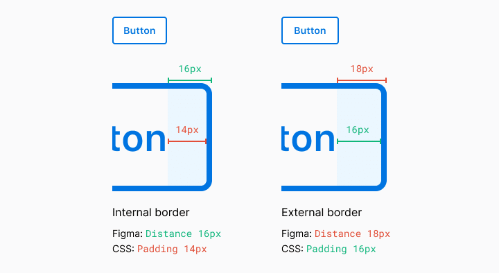
Figma measures the element and not its border. On the web, this is handled in two different ways. The box-sizing property can be border-box or content-box. To see it in action check out this codepen and read this article to learn more. The TL;DR here is that most of the modern web runs on border-box.
和訳:Figmaは要素を測定しますが、境界線は測定しません。ウェブ上では、これは2つの異なる方法で処理されます。box-sizing プロパティには、border-box と content-box があります。実際に使用されている様子を見るには、このコードペンをチェックし、詳細についてはこの記事をお読みください。TL;DRここでは、現代のウェブのほとんどはborder-boxで実行されるということです。

You can almost always wrangle the code to be pixel perfect but you may be sacrificing simplicity and extensibility if you’re not aligned with your team on the implementation. Again, have these conversations with your team to define your own position.
和訳:
ほとんどの場合、コードはピクセル単位で調整できますが、実装に関してチームとアラインがとれていないと、シンプルさと拡張性を犠牲にしてしまうかもしれない。繰り返しになるが、チームと話し合いをして、あなたたちのポジションを明確にしましょう。
#1はこの辺りで終わりたいと思います。ChatGPTとDeeplを使いましたが、訳されたものをそのまま読むと意味が分からないものが多く、AIに訳してもらったものをみながら、自分でも訳してみたりして時間がかかってしまいました。和訳も完璧ではないと思うのであしからずご了承ください。
この記事が気に入ったらサポートをしてみませんか?