
Is the GOOD DESIGN EXHIBITION truly “good”? The path to Change for Good

The GOOD DESIGN EXHIBITION 2022 will be held from Friday, October 7 to Sunday, November 6. Under the theme of “Change for Good,” this year’s exhibition strives to make the exhibition itself even “better” in addition to displaying award-winning works. This report will reveal the behind-the-scenes story leading up to the establishment of the GOOD DESIGN EXHIBITION conducted by Seiichi Saito, the General Director.
“Can we say the present Good Design Award is ‘good’?”
In the spring of 2022, Seiichi Saito, who had been holding the posts of judge and vice chairperson for seven years, was feeling that something was not quite right.
The Good Design Award had been capturing design of the times and had also been defining the “goodness” of those times. The scope of screening covered a wide range of designs, and discussions in the screening process often went beyond just designs, and more and more frequently were extended to deeper meanings, social values, and social significance.
Witnessing such changes, he thought “the Good Design Award itself needs more changes.”

For example, in fields such as products and fashion that deal with “items,” environmental or social impacts are naturally brought into discussions. In other words, the entire design, including supply chain and materials, is to be questioned.
Therefore, the Good Design Award itself should be designed to be “good” for society and the planet. What Saito took particular note of was the annual exhibition in which award-winning works of the “Good Design Best 100” are displayed and all award winners are announced. Saito, who had been involved in many entertainment projects, felt the importance of designing a temporary occasion like this to be “better.”
With this thought in his mind, Saito decided to take on the position of General Director of the GOOD DESIGN EXHIBITION 2022. The theme was set to “Change for Good,” with a wish to consider the boundaries of ever-changing design, to determine what would be GOOD or BAD, and to create an opportunity to take an action even with uncertainty.
To achieve these goals, top creators in various domains, such as graphics, spatial design, and materials, were invited to join in the team. Then, he commenced the project to question the meaning of “good.”
The Good Design Award, an event that should send out a strong message
“I want to bring up an issue in a manner that goes further into a discussion on true sustainability, instead of just adding the prefix ‘re’ at the beginning of a word for convenience.”
One day in June 2022. Toshiyuki Konishi, a copywriter and creative director, who was invited to the online kickoff meeting as concept director, expressed his determination.
There was a four-month preparation period up until the exhibition in October. The plan was not the same as had happened in the previous years. At the time of the kickoff, there was not ample time to work on this challenge of questioning the past. However, Konishi’s words were full of enthusiasm for thorough change without compromising despite such a restriction.
Konishi “For example, I think that not allocating too many human resources will result in contributing to sustainability. I want to raise a more fundamental issue than the idea of ‘reusing whatever materials.’ The Good Design Award is well recognized by all generations. That is exactly why it should send a strong message.”

Konishi, who was in charge of the concept, presented the “four viewpoints” that would be the pivot of the GOOD DESIGN EXHIBITION immediately after the kickoff.
◆ Viewpoint 1: How the Good Design Award itself should be
Evaluate whether the design is clearly for being “good,” without overly focusing on being good-looking. Make the exhibition a place to express such a fundamental change of policy.
◆ Viewpoint 2: Messages from the Good Design Award to the exhibition
Not just displaying award-winning works, but also being a source to send messages about the way the exhibition design should be. In doing so, express strong messages, such as “rejection of unpreferable future.”
◆ Viewpoint 3: Try to introduce a new perspective from this exhibition
Design an experience that can make visitors think over far in the future or distance, not just about pleasures right in front of them at this moment.
◆ Viewpoint 4: Do not try to make anything new
For example, just like graffiti or blackboard art, add something to things that are already there then erase it afterward. Or, use design that we do not have to newly produce, for example, reusing bottles or posters.
The project team was to form an exhibition that embodies these viewpoints. These concepts acted like action guidelines for the team. This already seemed like a difficult challenge, but Saito went on further and said, “I would like to add some more words here.”
Saito “I hope we will be able to write recipes for preparing new exhibitions. If we break down things we should or shouldn’t do when preparing for an event, just like writing recipes, the Good Design Award will change and also we will be able to send stronger messages to society.”

Saito was even considering building a long-lasting mechanism starting from this project, without ending it by just “presenting” like one-off fireworks.
The approach of maximizing effectiveness with minimal efforts
On the other hand, the members in charge of graphics, spatial design, and decorations who actually “implemented” these concepts were conducting research in their fields. What they had in their mind in common was the necessity for reviewing “materials.”
Graphic designer Yoshiaki Irobe, the art director of this project, started a discussion by citing actual cases that utilized recyclable and reusable materials for spatial structures and that used scrap materials.
These cases included the shop design of the bag brand “FREITAG” from Switzerland, “notebooks that used to be books,” which reuse the paper from books, and the stool “VALUE,” which uses discarded bills as the seat surface...... There were many examples that can be great references for the future, even though they might not be directly applied to this year’s GOOD DESIGN EXHIBITION.
In addition, Irobe was emphasizing the significance of digitalization from the beginning.
Irobe “Like the challenge at ‘VIRTUAL TOKYO ART BOOK FAIR,’ thorough digitalization would be a possibility. This would also let us reduce paper use. In addition, digitalized materials can be amended easily and contribute to sustainability in the sense of reducing the energy consumption of humans.”

Yuko Nagayama, an architect who serves as spatial director, agreed with the idea of “reducing the energy consumption of humans.”
Nagayama “Reusing materials may look energy saving at a glance but often turns out unsustainable because it requires a lot of energy in the background. Isn’t it important to get the maximum effect with less effort and energy?
For example, spatial design may be defined by graphics rather than elaborating it......While listening to other members’ opinions, I was wondering if there was any clever combination that enables us to create a beautiful space and a special ambience with little effort.”

“A clever combination that creates a beautiful space and a special ambience with little effort” ── This phrase became a keystone idea of this project.
It may not be that difficult if they just used good materials in terms of environmental impact. However, no matter how sustainable the materials are, if the quality and unity of the entire exhibition is lost, it will all come to nothing. Presenting an ideal way with fewer impacts while presenting high quality. This will be a difficult challenge for all type of designs in the future, not just for exhibitions.
Irobe also introduced other examples, such as “Hudson River Park” of New York City, the “New York City Marathon,” the British winery “Rathfinny,” and Minnesota’s “Nicollet” sign, and continued, “The key is how to design with less volume, such as lines, dots, and bars, instead of covering up the surface.”
Through these cases, members deepened their understanding of discussions and gradually determined the direction to follow.
Following the discussions made up until then, Jin Kuramoto, who was invited to be the material director, brought up the significance of “colors” from the perspective of “circulation.”
Kuramoto “In addition to reducing the environmental impact of materials, we must think about the circulation of materials and fixtures in which finished materials can be transformed into something else. However, it is difficult to create an attention-drawing expression by simply using ordinary reusable materials. Therefore, ‘colors’ are important. I felt that I started to see the question of where and what colors should be allocated to create eye-catching and interesting designs.”

Saito agreed with his perspective.
Saito “Even waste materials after use can be transformed into signs by attaching stickers, identities, or stencils. How can we build an identity in the small area, or how can we transform existing items into signs just by adding a few add-ons or mimics? These will have significant meanings.”
Based on the discussion so far,
what Irobe suggested next was the idea of graphic/sign design inspired by “red,” which is the key color of the Good Design Award.
He suggested two patterns. One approach was to form an expression by layering panels. Another was the draft plan of the design which is currently published on the website and various graphics. It is the simplest idea consisting of only line tapes.
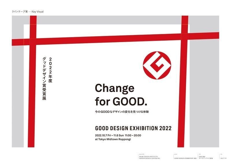

Simultaneously with Irobe’s suggestion, Nagayama also suggested a spatial design based on the previous discussion. This was also a simple approach using single pipes wrapped with red tights.

Responding to these two suggestions, Saito answered, “What about going for the one using line tapes” from the perspective that it might become a contact point of graphics and spatial design.
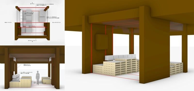
Nagayama also seemed to draw inspiration from Irobe’s suggestion and Saito’s response and started to draw rough sketches of spatial designs using tapes on the spot.
Nagayama “Rather than adding things, it is better to only give it the role to define a space visually. It may be better with only tapes. For example, because this place has a lot of depth, we can put tape looping all along the room and attach words related to each zone and theme.

The discussion was expanded from abstract concepts to details. It was decided to improve the visibility of the entire space by lowering the display tables to knee level. Explicit discussions were held on the site, including the way to express written information and the review of the detailed carry-in route.
Conflicts between meaning, message, and quality of creativity
During the month following month that, the production process progressed rapidly.
The graphic was displayed on signboards and panels in the venue at the same time as the submission of the manuscript of posters and other publicity materials. On the other hand, sketch-based ideas were incorporated into the implementation of the design, adjustments and restrictions with the building and surrounding tenants that manage the venue were confirmed, and the results were reflected in the space design.
At first glance, it seemed to be a steady process of implementation, but again, it was essential to discuss how it could be realized sustainably.

For example, commissioned face materials and fixtures were preferred. However, there was an opinion that materials to make these face materials and fixtures should be commissioned from related factories instead of event vendors. This opinion was based on the thought that they might be able to demonstrate “circulation” by showing the texture of objects.
On the other hand, some pointed out that “When it comes out right, it can show the meaning and message, but when the balance is off, it can look shabby.” Likewise, opinions on sustainability and quality clashed many times.
Whether the ribbon should be made of tape or fabric, and how close the color of the material should be to the G Mark red...... The details were discussed one by one by balancing the specific materials and realistic schedule and cost.

This design image was crystallized to a considerable extent by mid-August. The designs of the GOOD DESIGN AWARD Ceremony, the GRAND AWARD Election, and the pop-up shop, as well as the GOOD DESIGN EXHIBITION, became more and more concrete based on the consistent thought.
The chest emblem (rosette) to be worn by the award winners at the ceremony was carefully selected from the materials. After thorough research, Kuramoto decided to use a material called REAMIDE® produced by REFINVERSE Group, Inc., a recycled material manufacturer.

The key object” that raised controversy at the last minute
However, one big issue emerged at the meeting in mid-September.
It was about the main panel which was to be used as a photo-shoot background at the GOOD DESIGN AWARD Ceremony.

Considering the concept of “Change for Good,” this symbolic panel was meant to be made of recycled materials to make sense. However, thinking that this was for a grand occasion, would it really be appropriate to use reused panels (with visible traces of previous users materials removed) here?
It was natural that such concerns raised, “Recycled materials in the fanciest spot would be conspicuous.”
But for Saito, this panel is also nonnegotiable. He once again claimed that it had a significant meaning considering the concept.
Saito “......If we don’t change here, we won’t be able to achieve Change for Good. This is the frontline of the event, and therefore we should use reused panels in order to communicate our message. I really want to secure this spot.”
After many back-and-forth discussions, they ran out of time in regular meetings and ended up having an extra meeting. The exhibition was only a few weeks away.
In this way, the members of the project continued to have discussions without compromise until the very last possible moment, and moved forward one step at a time to realize the GOOD DESIGN EXHIBITION that would reexamine the nature of the exhibition.
Seeking the best answers one by one, fluctuating between sustainability and creativity. How will they achieve their ideal form of the GOOD DESIGN EXHIBITION in the remaining time?
We will witness it during the period from Friday, October 7 to Sunday, November 6. We hope everyone will come around and see it.