Trying Data Science(5) : Cramming Data Visualizaion - Matplotlib

Hello, everyone!
Starting today, I'm going to talk about data visualization that looks cool. I've only learned a little bit, but can create various graphs through Matplotlib, which is an 2D and 3D graphics library for generating scientific figures.
Merits of Matplotlib?
Generally easy to get started for simple plots
Support for custom labels and texts
High-quality output in many formats
Importing
import matplotlib.pyplot as plt
%matplotlib inline
Creating a Plot
We can create a very simple line plot.
plt.plot(x, y, 'r') # 'r' is the color red
plt.xlabel('X Axis Title Here')
plt.ylabel('Y Axis Title Here')
plt.title('String Title Here')
plt.show()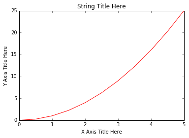
Creating Multiplots
We can create multiplots by subplot on same canvas.
#plt.subplot(nrows, ncols, plot_number)
plt.subplot(1,2,1)
plt.plot(x, y, 'r--') # More on color options later
plt.subplot(1,2,2)
plt.plot(y, x, 'g*-');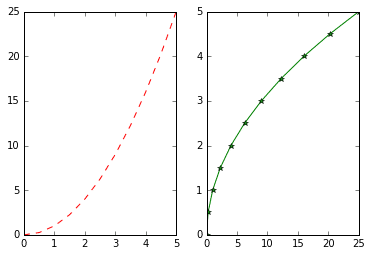
You can see subplots above. A subplot is a plot area divided into several small areas. Subplot allows you to perform visualization tasks by placing various small graphs or diagrams within a single plot.
Matplotlib Object Oriented Method
We will instantiate figure objects and then call methods or attributes from that object.
# Create Figure (empty canvas)
fig = plt.figure()

# Add set of axes to figure
axes = fig.add_axes([0.1, 0.1, 0.8, 0.8])
# left, bottom, width, height (range 0 to 1)

# Plot on that set of axes
axes.plot(x, y, 'b')
axes.set_xlabel('Set X Label')
axes.set_ylabel('Set y Label')
axes.set_title('Set Title')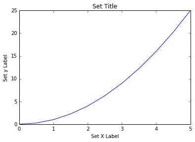
We can easily add more than one axis to the figure.
# Creates blank canvas
fig = plt.figure()

axes1 = fig.add_axes([0.1, 0.1, 0.8, 0.8]) # main axes
axes2 = fig.add_axes([0.2, 0.5, 0.4, 0.3]) # inset axes

# Larger Figure Axes 1
axes1.plot(x, y, 'b')
axes1.set_xlabel('X_label_axes2')
axes1.set_ylabel('Y_label_axes2')
axes1.set_title('Axes 2 Title')

# Insert Figure Axes 2
axes2.plot(y, x, 'r')
axes2.set_xlabel('X_label_axes2')
axes2.set_ylabel('Y_label_axes2')
axes2.set_title('Axes 2 Title');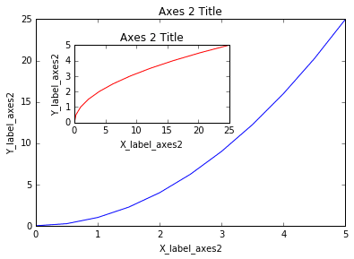
A common issue with matplolib is overlapping subplots or figures. We can use fig.tight_layout() or plt.tight_layout() method, which automatically adjusts the positions of the axes.
fig, axes = plt.subplots(nrows=1, ncols=2)

for ax in axes:
    ax.plot(x, y, 'g')
    ax.set_xlabel('x')
    ax.set_ylabel('y')
    ax.set_title('title')

fig
plt.tight_layout()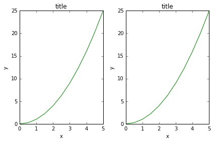
Let's see one more example of subplot.
fig, axes = plt.subplots(nrows=1, ncols=2,figsize=(12,2))

axes[0].plot(x,y,color="blue", lw=5)
axes[0].set_xlabel('x')
axes[0].set_ylabel('y')

axes[1].plot(x,z,color="red", lw=3, ls='--')
axes[1].set_xlabel('x')
axes[1].set_ylabel('z')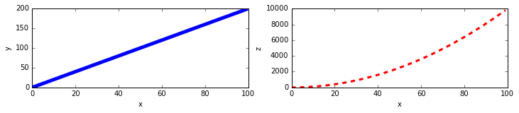
You can see 'figsize' above. It is a tuple of the width and height of the figure in inches.
Legends
The legend adds a legend(in Japanese 凡例) to the graph. The legend serves to describe elements such as lines, dots, and colors used in the graph.
fig = plt.figure()
ax = fig.add_axes([0,0,1,1])

ax.plot(x, x2, label="x2")
ax.plot(x, x3, label="x3")
ax.legend()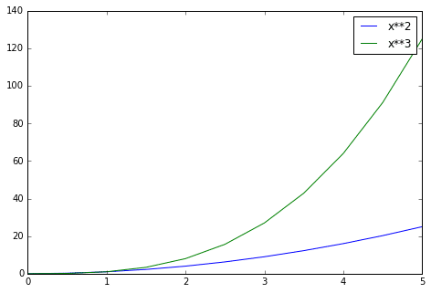
The legend () is the part that adds a legend to the graph. There are series for x2 and x3, respectively, and we use legends to separate them by labels.
Conclusion
Matplotlib offers a wide range of features, from simple plots to custom labels, text, and high-quality outputs. To create a graph, you can use the default Matplotlib command, and you can create a subplot to display multiple graphs at once. You can also use object-oriented methods to create and graph plots and axis objects. Now let's use Matplotlib to make our data visualizable.
エンジニアファーストの会社 株式会社CRE-CO
ソンさん
この記事が気に入ったらサポートをしてみませんか?