
Data Visualizaion - Choropleth Map

Intro
Hello, everyone!
Last time, I've posted about Seaborn, which can generates various plots. This time I'm going to learn how to visualize geographical data on maps. I will share some information about Choropleth maps.
What is a Choropleth map?
Choropleth map is a visualization method in which specific indicators or data values of geographic areas are represented in color.
Action speaks louder than words! Just have a look at it below.

Importing
# Import plotly
import chart_studio.plotly as py
import plotly.graph_objs as go
from plotly.offline import download_plotlyjs, init_notebook_mode, plot, iplot
init_notebook_mode(connected=True)

# Import pandas
import pandas as pd
Import plotly. Plotly is a library that allows you to create interactive plots that you can use in websites.
Import pandas to read the csv file.
How to use Choropleth map?
We need to begin to build data dictionary.
The way to do this is to use the dict() function.
There are some arguments in dict() function.
data = dict(type = 'choropleth',
            locations = ['AZ','CA','NY'],
            locationmode = 'USA-states',
            colorscale= 'Portland',
            text= ['text1','text2','text3'],
            z=[1.0,2.0,3.0],
            colorbar = {'title':'Colorbar Title'})
type = 'choropleth',
locations = list of states
locationmode = 'USA-states'
colorscale= 'pairs' | 'Greys' | 'Greens' | 'Bluered' | 'Hot' | 'Picnic' | 'Portland' | 'Jet' | 'RdBu' | 'Blackbody' | 'Earth' | 'Electric' | 'YIOrRd' | 'YIGnBu' and so on
text= list or array of text to display per point
z= array of values on z axis (color of state)
colorbar = {'title':'Colorbar Title'})
After making data, create the layout nested dictionary.
layout = dict(geo = {'scope':'usa'})Then, set up the object that finally gets passed into iplot()
choromap = go.Figure(data = [data],layout = layout)
iplot(choromap)
Practice1 : US Agriculture Exports
1. Read data and check it.
df = pd.read_csv('2011_US_AGRI_Exports')
df.head()
2. Make data dictionary with some arguments.
data = dict(type='choropleth',
            colorscale = 'ylorbr',
            locations = df['code'],
            z = df['total exports'],
            locationmode = 'USA-states',
            text = df['text'],
            marker = dict(line = dict(color = 'rgb(255,255,255)',width = 2)),
            colorbar = {'title':"Millions USD"}
            )
3. Make layout dictionary with some arguments.
layout = dict(title = '2011 US Agriculture Exports by State',
              geo = dict(scope='usa',
                         showlakes = True,
                         lakecolor = 'rgb(85,173,240)')
             )
4. Set up an object(choromap) that gets passed into iplot() and call it.
choromap = go.Figure(data = [data],layout = layout)
iplot(choromap)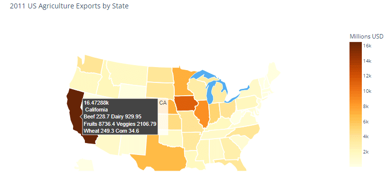
Practice2 : World Power Consumption
1. Read data and check it.
df = pd.read_csv('2014_World_Power_Consumption')
df.head()
2. Make data dictionary with some arguments.
data = dict(
        type = 'choropleth',
        colorscale = 'Viridis',
        reversescale = True,
        locations = df['Country'],
        locationmode = "country names",
        z = df['Power Consumption KWH'],
        text = df['Country'],
        colorbar = {'title' : 'Power Consumption KWH'},
      )
3. Make layout dictionary with some arguments.
layout = dict(title = '2014 Power Consumption KWH',
                geo = dict(showframe = False,projection = {'type':'mercator'})
             )
4. Set up an object(choromap) that gets passed into iplot() and call it.
choromap = go.Figure(data = [data],layout = layout)
plot(choromap,validate=False)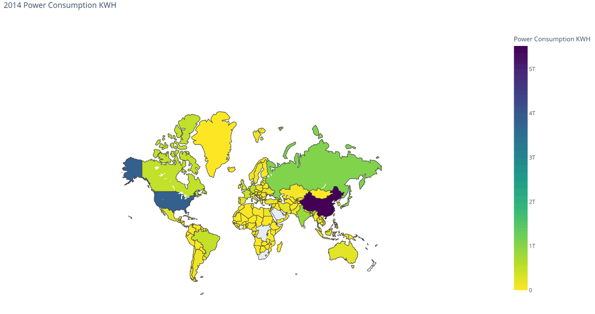
Outro
As what I discussed above, the Choropleth maps can display population density, convenience location, tourism information. As such, It is very useful and attractive. The following picture is a population distribution map of Seoul, Korea, at 1 p.m by using the Choropleth maps. Do you get the hang of it?

※ The picture source: https://story.pxd.co.kr/1408
エンジニアファーストの会社 株式会社CRE-CO
ソンさん
この記事が気に入ったらサポートをしてみませんか?