LangGraphのグラフ可視化機能で複雑なタスクの流れを一目で把握

はじめに
LangChain のLangGraphの新機能としてグラフの作成機能がアナウンスされました。
https://github.com/langchain-ai/langgraph/blob/main/examples/visualization.ipynb
🦜🕸️LangGraph Updates
— LangChain (@LangChainAI) March 7, 2024
3 big quality-of-life improvements to LangGraph over the past few weeks:
🖼️Automatic visualization of the created graph
↔️Conditional entry points
🔧Prebuilt Tool Calling Executor
What do these mean?
🖼️Automatic rendering of the created graph
This was a… pic.twitter.com/FKrJTfnhVA
エージェントアプリケーションの開発において、複雑なロジックを持つステートマシンを設計することは避けられません。しかし、ステートマシンが大規模になるにつれ、その動作を理解し、デバッグすることが困難になります。そこで、LangGraphの新しいグラフ可視化機能が威力を発揮します。グラフの可視化は、エージェントアプリケーションの動作を視覚的に表現することで、開発者がアプリケーションのロジックを直感的に理解できるようにします。
実装
まずシンプルな例としてLangGraphのQuick Startを実行して、グラフの可視化を試しました。
※Colabにて実行しました。
# グラフの定義以前のコードをを省略しています。
from langgraph.graph import StateGraph, END
# Define a new graph
workflow = StateGraph(AgentState)
# Define the two nodes we will cycle between
workflow.add_node("agent", call_model)
workflow.add_node("action", call_tool)
# Set the entrypoint as `agent`
# This means that this node is the first one called
workflow.set_entry_point("agent")
# We now add a conditional edge
workflow.add_conditional_edges(
# First, we define the start node. We use `agent`.
# This means these are the edges taken after the `agent` node is called.
"agent",
# Next, we pass in the function that will determine which node is called next.
should_continue,
# Finally we pass in a mapping.
# The keys are strings, and the values are other nodes.
# END is a special node marking that the graph should finish.
# What will happen is we will call `should_continue`, and then the output of that
# will be matched against the keys in this mapping.
# Based on which one it matches, that node will then be called.
{
# If `tools`, then we call the tool node.
"continue": "action",
# Otherwise we finish.
"end": END
}
)
# We now add a normal edge from `tools` to `agent`.
# This means that after `tools` is called, `agent` node is called next.
workflow.add_edge('action', 'agent')
# Finally, we compile it!
# This compiles it into a LangChain Runnable,
# meaning you can use it as you would any other runnable
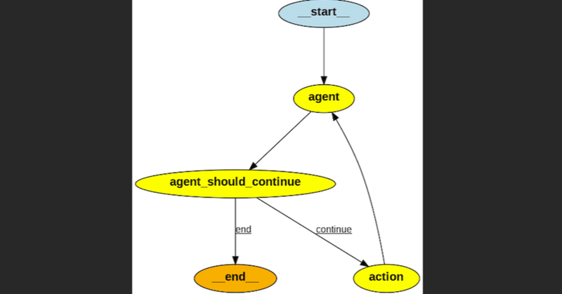
app = workflow.compile()ASCII形式でのグラフの可視化
LangGraphでは、ワークフローをASCII形式で簡単に可視化できます。以下のようなコードを実行するだけで、グラフの構造を表現できます。
!pip install grandalf

app.get_graph().print_ascii()
                    +-----------+
                    | __start__ |
                    +-----------+
                          *
                          *
                          *
                      +-------+
                      | agent |
                     *+-------+*
                   **           ***
                 **                **
               **                    **
+-----------------------+              **
| agent_should_continue |               *
+-----------------------+               *
            *           *****           *
            *                ****       *
            *                    ***    *
       +---------+                +--------+
       | __end__ |                | action |
       +---------+                +--------+
PNG形式でのグラフの可視化
より詳細で視覚的に分かりやすいグラフ表現として、PNG形式での可視化も可能です。以下のようなコードを実行することで、グラフをPNG画像として出力できます。
#!apt-get install graphviz libgraphviz-dev pkg-config
#!pip install pygraphviz

from IPython.display import Image
Image(app.get_graph().draw_png())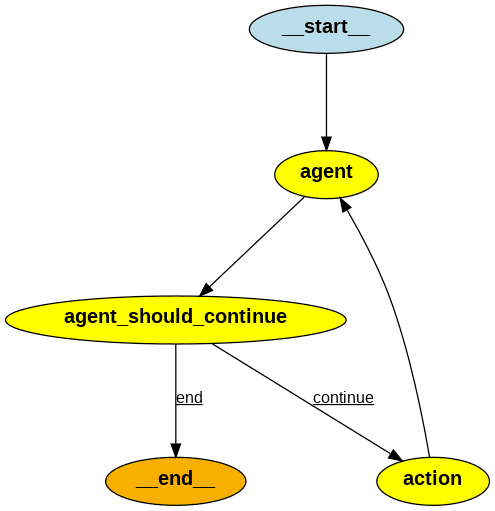
より複雑なグラフの可視化を試す
基本的なマルチエージェントコラボレーションの例です。以下のダイアグラムを実装して、LangGraphで実装して、可視化機能を試します。
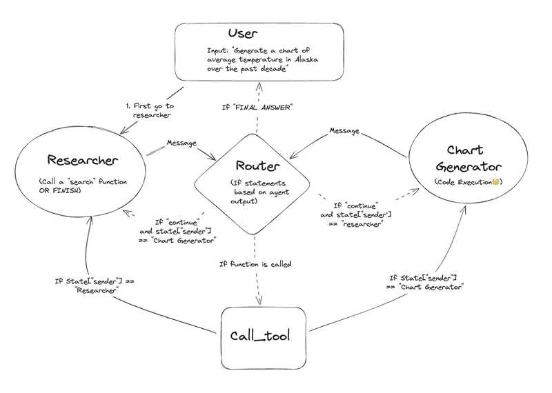
このグラフのアーキテクチャを簡単に説明しますと、単一のエージェントは、通常、単一のドメイン内で少数のツールを使用して効果的に動作できますが、「gpt-4」のような強力なモデルを使用しても、多くのツールを使用するのは難しい場合があります。複雑なタスクへのアプローチの1つは、「分割統治」アプローチです。つまり、タスクやドメインごとに専門のエージェントを作成し、タスクを適切な「エキスパート」にルーティングするのです。
Ascii
                                                                                  +-----------+
                                                                                  | __start__ |
                                                                                  +-----------+
                                                                                        *
                                                                                        *
                                                                                        *
                                                                                 +------------+
                                                                                 | Researcher |********
                                                                            *****+------------+     *****************
                                                                       *****                                ******** **************
                                                                  *****                                             ********       **************
                                                               ***                                                          ********             **************
                                               +-------------------+                                                                *****                      ********
                                              *| Researcher_router |***                                                                 *                             *
                                       ******* +-------------------+   *******                                                          *                             *
                              *********         **                            *********                                                 *                             *
                       *******               ***                                       *******                                          *                             *
                  *****                   ***                                                 *********                                 *                             *
+-----------------+                     **                                                             ****                        ******                             *
| Chart Generator |*****                *                                                                 *              **********                                   *
+-----------------+     ***********     *                                                                 *    **********                                             *
          *                        ***********                                                      ***********                                                       *
          *                             *     ***********                                 **********      *                                                           *
          *                             *                ******                     ******                *                                                           *
          *                             **                  +------------------------+                   **                                                           *
          *                               **                | Chart Generator_router |                 **                                                             *
          *                                 ***             +------------------------+              ***                                                               *
          *                                    ***              **               **              ***                                                                  *
          *                                       **         ***                   ***         **                                                                     *
          *                                         **     **                         **     **                                                                       *
          *******                                 +-----------+                     +---------+                                                                 *******
                 **************                   | call_tool |**                   | __end__ |                                                   **************
                               *************      +-----------+  *****              +---------+                                      *************
                                            *************             ******                                            *************
                                                         **************     *****                         **************
                                                                       *******   ***               *******
                                                                             +--------------------+
                                                                             | call_tool_<lambda> |
                                                                             +--------------------+
PNG
LangGraphによる実装と元のダイアグラムの比較
Claude 3 の画像認識機能で、元のダイアグラムとLangGraphで作成したダイアグラムを比較して、LangGraphで正しく実装されているかを評価しました。
共通点:
どちらもResearcherノードから開始し、Chart Generatorノードで終了しています。
Researcherノードから始まり、Researcher_routerノードで分岐し、Chart Generatorノードに至るフローが同じです。
Chart GeneratorノードからChart Generator_routerノードで分岐し、endノードとcall_toolノードに至るフローも一致しています。
call_toolノードからcall_tool_<lambda>ノードを経由して、ResearcherノードとChart Generatorノードに戻るフローも同じです。
相違点:
LangGraphの実装では、Startノードが追加されています。これは実装上必要な部分で、元のダイアグラムにはありません。
LangGraphの実装では、endノードが単独で存在しますが、元のダイアグラムではendノードとcall_toolノードが直接繋がっています。ただし、これは実装上の違いであり、フローとしては同等と言えます。
ノードの配置が若干異なりますが、これはツールによる自動レイアウトの差異によるものと考えられ、フローには影響しません。
評価: LangGraphによる実装は、元のダイアグラムのフローを正確に再現できていると評価できます。追加されたStartノードや、endノードの配置の違いはありますが、これらは実装上の差異であり、全体的なフローは一致しています。Researcherノードから始まり、適切な分岐を経て、Chart Generatorノードに至り、最終的にはendノードで終了する一連の流れが正しく表現されています。
まとめ
LangGraphのグラフ可視化機能は、マルチエージェントコラボレーションにおいて非常に強力なツールです。ASCII形式やPNG形式でワークフローを可視化することで、複雑なタスクの流れを一目で把握できます。また、LangGraphを用いて実装されたワークフローが、元のダイアグラムと比較して正確であることが確認できました。可視化のメリットを活用することで、開発者はシステムをより深く理解し、効率的に開発を進められます。本記事で紹介した手法を応用して、様々な分野での複雑なタスク解決にLangGraphを活用していただければ幸いです。
この記事が気に入ったらサポートをしてみませんか?